 Helpful Posts: 0
Results 21 to 40 of 100
-
14th May 2010, 06:25 PM #21
Re: 1.25 pounds of bananas
-
14th May 2010, 07:38 PM #22

- Join Date
- Mar 2009
- Posts
- 2,522
Re: Eggistentialism
Rob, I genuinely like all the shots you have posted here but the sensual eggs....just superb. I love it when images just feel right. It is an eggscellent demonstration of how simplicity of subject and composition produces the most striking images. But for gods sake clone out the spray on serial number in the 2nd image.Eggistentialism
Steve (Arith)
Congratulations on the new camera. After reading your struggle in trying to decide on the 'right' camera in other threads I really believe you have made the right choice.
Steve
-
14th May 2010, 08:18 PM #23
Re: Eggistentialism
Cheers steve; it will take some time to get used to it. Already I've noticed maybe DPP is better than ACR, I've used the RGB histograms to get perfect exposure which became blown in ACR but later I tried DPP and it was ok. The one here was the first underexposed attempt. Oh well it is going to be fun.
-
14th May 2010, 08:21 PM #24
Re: Eggistentialism
Hi Rob,
As a replied on Flickr, I absolutely love your vision on photography and your eye for the extraordinary shot in the ordinary subjects. You really encourage me to look further than some kind of standard naïvety everybody (me also, though I tend to get rid of) seems to looks at things around them.
But with these shots you tempt to draw me away from my favourite thing in the kitchen, creativity in cooking, and drive my family nuts by turning the whole kitchen upside down to photograph things they can't even imagine as being a nice subject to shoot . To me they suit the image of the naïve everybody very well...
but anyways, you seem to like the new camera very much . Well go ahead and keep doing these beautiful things.
Last edited by JK6065; 14th May 2010 at 08:22 PM. Reason: typo :)
-
14th May 2010, 10:52 PM #25

- Join Date
- Aug 2009
- Location
- Canada
- Posts
- 3,113
- Real Name
- Wendy
Apple
First of all I just want to say that for me these things are incredibly difficult, and I don't have an eye for it at all, so C&C on composition, lighting, cropping is greatly appreciated.
I'm already aware that this shot is quite noisy (forgot to reset ISO to 200 )
)
I kind of like the lighting in this one, but wonder if I should black out or crop the background.
These are just experiments, and a learning exercise for me. I'm working with a 75W halogen floodlight (not photographic) clamped to a step ladder. I have another one of these lights but nothing to clamp it to at the moment. I had the white balance set to Auto, but had to adjust it quite a bit in LR, as the colour was way to yellow (still is actually). I'm pretty sure I have a grey card around here somewhere in one of the Kelby books. I'll try to find it for the next series.
Any help or suggestions on this or any other shot I post in this thread (there are more to come) is appreciated.
Thanks Wendy
1/60s: f18: ISO 800: 18mm: Spot -1 (which made it too dark, but otherwise I had blown highlights)
-
14th May 2010, 10:55 PM #26

- Join Date
- Aug 2009
- Location
- Canada
- Posts
- 3,113
- Real Name
- Wendy
-
14th May 2010, 11:03 PM #27

- Join Date
- Aug 2009
- Location
- Canada
- Posts
- 3,113
- Real Name
- Wendy
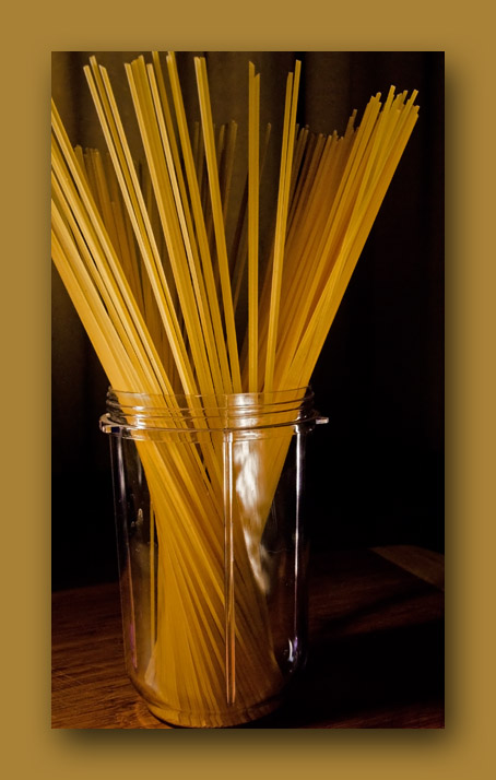
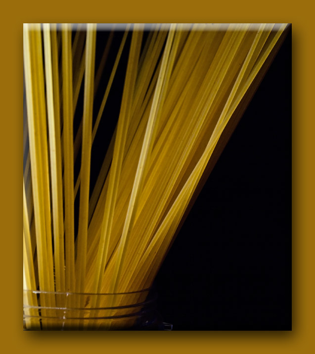
Spaghetti Series
1/40s: f11: ISO 800: 55mm: Spot
Colour not corrected. This is what I get with WB set to auto with this Halogen bulb. I left it as is for this because I liked it

1/100s: f11: ISO 800: 18mm: Spot -2/3
White balance corrected. This is closer to actuality

1/80s: f11: ISO 800: 44mm: Spot -2/3
C&C Welcome
That's it for now. I think for the next set, I will try to copy some of the ones that have been posted already and see if I can duplicate the lighting and DOF on the ones I like
Wendy
-
14th May 2010, 11:14 PM #28
-
14th May 2010, 11:15 PM #29
-
14th May 2010, 11:37 PM #30

- Join Date
- Oct 2009
- Location
- Maryland, USA
- Posts
- 1,015
- Real Name
- Rick
Re: Spaghetti Series
Hi, Wendy;
You're doing great with these. The apple shot, I was troubled by the yellow on the skin: I'd love the overall composition, looking like a still life painting, with a perfect, red apple. With the yellow, what about backlighting it, so the skin is hinted at, rather than central?
The spaghetti are all quite interesting. I like the third best: #1 is interesting, but somewhat abstract (which is fine, of course). #2 is very practical. #3 is a great blend, with the focus on all the intersecting lines, but the mouth of the jar to give it context.
Cheers,
Rick
-
15th May 2010, 12:11 AM #31

- Join Date
- Aug 2009
- Location
- Canada
- Posts
- 3,113
- Real Name
- Wendy
-
15th May 2010, 12:20 AM #32

- Join Date
- Aug 2009
- Location
- Canada
- Posts
- 3,113
- Real Name
- Wendy
Re: Spaghetti Series
Yes, this whole shot is still too yellow looking. Thanks for the suggestions. I will definitley keep playing around with these, and try another with a nice uncut red apple. I have to play around with the lighting too.
Thanks Rick: the spaghetti surprised me a bit. I actually like them. You should see the ones I tried with a cucumber slice sitting on top of a white opaque tupperware container that was placed over a night lite. LOL they were quite horrifying.The spaghetti are all quite interesting. I like the third best: #1 is interesting, but somewhat abstract (which is fine, of course). #2 is very practical. #3 is a great blend, with the focus on all the intersecting lines, but the mouth of the jar to give it context.
Rick
Wendy
-
15th May 2010, 01:09 AM #33

- Join Date
- Oct 2009
- Location
- Maryland, USA
- Posts
- 1,015
- Real Name
- Rick
-
15th May 2010, 03:33 AM #34
Re: Spaghetti Series
really strange shots you got here, all of you. I like them
-
15th May 2010, 04:32 AM #35

- Join Date
- Aug 2009
- Location
- Canada
- Posts
- 3,113
- Real Name
- Wendy
-
15th May 2010, 04:40 AM #36

- Join Date
- Aug 2009
- Location
- Canada
- Posts
- 3,113
- Real Name
- Wendy
-
15th May 2010, 07:00 AM #37Moderator


- Join Date
- Feb 2009
- Location
- Glenfarg, Scotland
- Posts
- 21,402
- Real Name
- Just add 'MacKenzie'
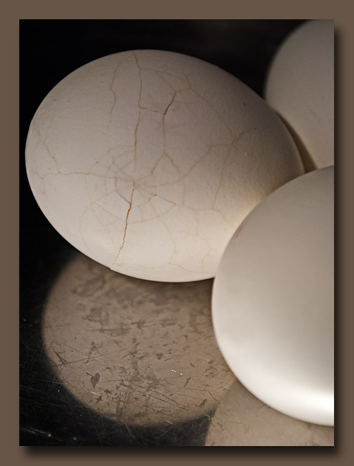
Re: Eggistential Crisis
Wendy
Have you still got that cracked egg? If so, how about it alone, on a matt surface, in landscape format? First impression was that that could produce an amzing image.
-
15th May 2010, 08:01 AM #38

- Join Date
- Aug 2009
- Posts
- 4,049
Re: Apple
A hot-light is fine. The only problem is that it is not very good for flower shots as the heat willl cause wiliting after a while. But it's fine here. I like the composition - makes me think of warm summer evenings outdoors. I might have cut a thin slice off the apple and placed it on the table so you could see the detail.
Last edited by carregwen; 15th May 2010 at 08:07 AM.
-
15th May 2010, 08:03 AM #39

- Join Date
- Aug 2009
- Posts
- 4,049
-
15th May 2010, 08:06 AM #40

- Join Date
- Aug 2009
- Posts
- 4,049


 Reply With Quote


