Results 1 to 20 of 21
Thread: Lighthouse in Maine... (HDR)
-
3rd June 2010, 08:09 AM #1
-
3rd June 2010, 09:35 AM #2

- Join Date
- Dec 2008
- Location
- New Zealand
- Posts
- 17,660
- Real Name
- Have a guess :)
Re: Lighthouse in Maine...
Hi Dan,
Great that you popped across and "checked us out" -- a big warm CiC welcome to you
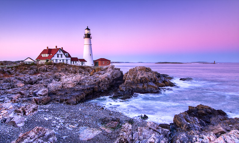
Good job on the image - the only thing that bothers me slightly about it is the lack of neutrality in the grays. Give me a sec and I'll see if I can show you what I mean.
-
3rd June 2010, 10:00 AM #3

- Join Date
- Dec 2008
- Location
- New Zealand
- Posts
- 17,660
- Real Name
- Have a guess :)
-
3rd June 2010, 10:25 AM #4
Re: Lighthouse in Maine...
Show off

Looks awesome man! Reminds me of how much I have to learn. But I have came a long way since you first helped me. Much to learn yet and that is a good thing. One of my favorite aspects of photography is that it always presents challenges and never bores. Few things in life can be given these attributes. Women, billiards, chess, with little else worth mentioning qualify. Ha ha...
-Dan
-
3rd June 2010, 11:15 AM #5
Re: Lighthouse in Maine...
Yep, pure quality.
-
3rd June 2010, 11:54 AM #6
Re: Lighthouse in Maine...
Hi Dan,
While I do prefer Colin's WB, it doesn't alter the great composition of your shot.
Hmmm, looking at your username, does that mean you live there?
I hope you continue to learn from Colin (and us all) here at CiC in future now you've joined
Anyway, welcome to the CiC forums from ....
-
3rd June 2010, 12:36 PM #7
Re: Lighthouse in Maine...
Thanks Dave. I am from Rockingham,NC and there is a NASCAR race track nicknamed "The Rock" 4 miles from my home. My wife and I are travel Emergency Room nurses working on Nantucket,Mass and have been here for 3.5 years. In that time we have traveled to Maine six times and enjoyed photographing the coastline while there. A bit of history, I got my first DSLR 2.5 years back and Colin was patient enough to guide some early purchase decisions and also educated me on RAW capture, DNG conversion, and the basics of workflow. Basic now, but back then I was in deep water having only used point and shoot cameras prior. I have got lots out of his initial efforts and that is what brought me here today. I will look forward to visiting the forum. Just finished my 12 hour shift at the hospital and plan to spend some time reading the wonderful tutorials today as I am off work. Thanks to all who have contributed. This site has much to offer budding photographers as myself.
-Dan
-
3rd June 2010, 10:47 PM #8

- Join Date
- Jan 2009
- Location
- Sydney, Australia
- Posts
- 362
Re: Lighthouse in Maine...
Dear Dan,
Welcome to CiC and nice to see your lighthouse shot. This picture has a nice composition overall. I do prefer Colin's version which looks more natural. One thing you may consider probably is to capture some details in the foreground which may be useful to provide something interesting to fianlly lead to the main subject lighthouse.
Regards,
Yan
-
3rd June 2010, 10:56 PM #9
-
3rd June 2010, 11:15 PM #10

- Join Date
- Dec 2008
- Location
- New Zealand
- Posts
- 17,660
- Real Name
- Have a guess :)
-
5th June 2010, 03:31 AM #11
Re: Lighthouse in Maine...
Colin has set the bar high and I have about 12 versions of this lighthouse to prove it. ha ha...
Something is still off and I can't quite put my finger on it.
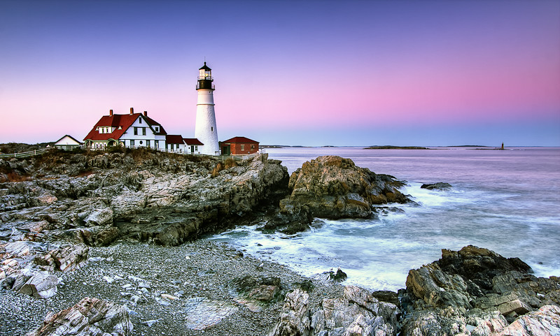
I reworked the "final" version a few more times and below is the result. I tried to work on the purple/blue cast on the rocks in an effort to be more like Colin. Didn't work, but the rocks are not as purple as they were. I also tried to make the contrast more realistic. I made an effort to show more detail in the mortar cracks of the lighthouse. At the same time, I increased the saturation in the sky, but already doubt my judgement on that one. Seems I have a halo growing around the crown of my lighthouse.
Any thoughts on the original up top, versus the new version below it? Better? Worse? Any thoughts at all appreciated as usual. Just trying to get better, so be honest. However, any comparisions to Colins version should be said out loud and not typed. I am already losing sleep over this botched post process. No need to salt the wound
Too many moving parts perhaps. Just started using LR2 the other week and this morning downloaded the complete 5 plug in bundle of Nik software for Lightroom.


-
5th June 2010, 04:52 AM #12

- Join Date
- Dec 2008
- Location
- New Zealand
- Posts
- 17,660
- Real Name
- Have a guess :)
Re: Lighthouse in Maine...
Hi Dan,
Because of the colour issues I did my edit in Photoshop's LAB mode - with the primary adjustments done by varying the slope of the A (green/magenta) and B (Blue/Yellow) colour opponent channels.
The biggest issues I'm seeing with your latest versions is still too much magenta (or tint if working in ACR). The other thing you could try is desaturating the whole image a bit - get the stones looking more neutral - and then play with the water and sky with the sponge tool.
-
5th June 2010, 02:11 PM #13
Re: Lighthouse in Maine...
Thanks Colin. I will work on these parameters a bit for sure. As for the sponge, does it matter if it is wet or dry? Not sure how this will change the image, but I will wipe down the screen and see what happens.
I do appreciate the input
-Dan
-
5th June 2010, 09:52 PM #14

- Join Date
- Dec 2008
- Location
- New Zealand
- Posts
- 17,660
- Real Name
- Have a guess :)
-
6th June 2010, 02:47 AM #15
Re: Lighthouse in Maine...
Been there done that

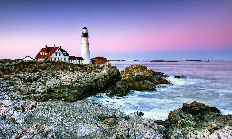
Worked on the image today and made big improvements. Lost my internet and tv here on Nantucket today as we had a nasty storm with high winds. If all is well when I get home in the morning, I will post the new version. Mostly used Niks viveza to put control points on all the rocks, dropped saturation, then put in Niks color efex and added the pro contrast filter to it. Then in LR2, use the targeted adjustment tool (TAT) to drop the purple/magenta and blue saturation in the skyline. The image looks far more natural. Why am I still talking about this? Sorry guys. Will post pic soon as I can.
-
6th June 2010, 04:59 AM #16

- Join Date
- Dec 2008
- Location
- New Zealand
- Posts
- 17,660
- Real Name
- Have a guess :)
-
6th June 2010, 12:01 PM #17
-
6th June 2010, 12:08 PM #18

- Join Date
- Dec 2008
- Location
- New Zealand
- Posts
- 17,660
- Real Name
- Have a guess :)
Re: Lighthouse in Maine...
Hi Dan,
It's definately better cast wise, but to be honest, the new version has so much colour above the horizon, and so little below it, it doesn't quite look natural to me. Can you saturate the rocks a bit more?
-
6th June 2010, 12:27 PM #19
-
6th June 2010, 04:15 PM #20

- Join Date
- Mar 2010
- Location
- East Coast of Canada
- Posts
- 873
- Real Name
- Myra
Re: Lighthouse in Maine...
Hi Dan,
Absolutely gorgeous photo. Just popping in to comment on the sky. The bottom part is very earthy and real (love it); the sky, though, seems more bubble gum and cotton candy. Would there be a way to tone it (and the reflection) down without destroying the look you were after?
Myra

 Helpful Posts:
 Reply With Quote


