Results 1 to 19 of 19

Thread: Street

  1. #1
    Tejal's Avatar
    Join Date
    Mar 2015
    Location
    India
    Posts
    2,069
    Real Name
    Tejal

    Street

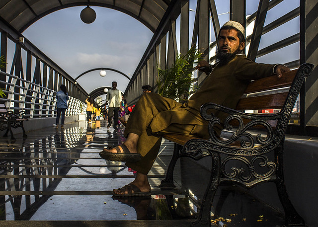
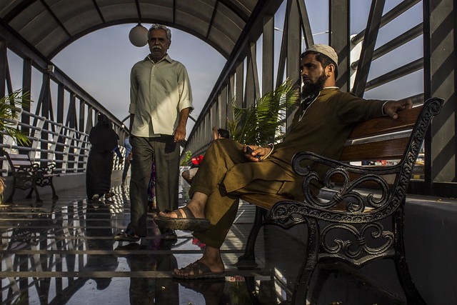
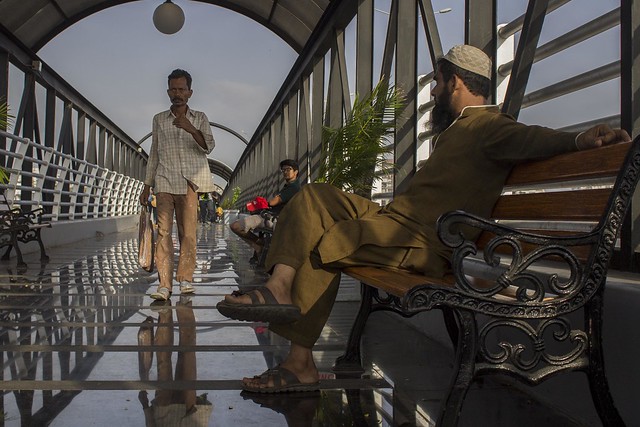
    While passing through a bridge, I have tried to capture some moments in my camera. Following are three shots.

    Kindly share your C & C for my betterment.

    Thanks - Tejal

    StreetIMG_4246 as Smart Object-1 by tejalmewar, on Flickr

    StreetIMG_4248 as Smart Object-1 by tejalmewar, on Flickr

    StreetIMG_4250 as Smart Object-1 by tejalmewar, on Flickr

  2. #2
    gregj1763's Avatar
    Join Date
    Jul 2011
    Location
    Launceston Tasmania
    Posts
    1,929
    Real Name
    Greg

    Re: Street

    I like them all Tejal, and the poses of the guy sitting. Left, front and right. Lucky coincidence or a friend.
    Either way some very good images

  3. #3
    Moderator Manfred M's Avatar
    Join Date
    Mar 2012
    Location
    Ottawa, Canada
    Posts
    22,161
    Real Name
    Manfred Mueller

    Re: Street

    Tejal - these are not working as well for me as many of your other postings.

    For an image to work well, you need the lighting and composition to work together, and lighting is probably the more important factor here (poor lighting will hurt an image with great composition). The light looks like it is around mid-day and is quite harsh and uninteresting. Compositionally, I assume the main subject is the man on the bench, but there is so much else going on in this shot, that we are distracted from your subject.

    I suspect that you would have had a stronger composition without all of the people and things in the background, but then the light is not working all that well either.

  4. #4
    Tejal's Avatar
    Join Date
    Mar 2015
    Location
    India
    Posts
    2,069
    Real Name
    Tejal

    Re: Street

    Quote Originally Posted by gregj1763 View Post
    I like them all Tejal, and the poses of the guy sitting. Left, front and right. Lucky coincidence or a friend.
    Either way some very good images
    Thanks Greg .... Not my friend .... He was from the public only. Unknown.... but yes patience worked here. I was there for quite a long time.

  5. #5
    Tejal's Avatar
    Join Date
    Mar 2015
    Location
    India
    Posts
    2,069
    Real Name
    Tejal

    Re: Street

    Quote Originally Posted by GrumpyDiver View Post
    Tejal - these are not working as well for me as many of your other postings.

    For an image to work well, you need the lighting and composition to work together, and lighting is probably the more important factor here (poor lighting will hurt an image with great composition). The light looks like it is around mid-day and is quite harsh and uninteresting. Compositionally, I assume the main subject is the man on the bench, but there is so much else going on in this shot, that we are distracted from your subject.

    I suspect that you would have had a stronger composition without all of the people and things in the background, but then the light is not working all that well either.
    Thanks Manfred for your valuable feedback. It was actually morning time, may be around 8-9 am. I will keep your suggestions in my mind for next time.

  6. #6
    gregj1763's Avatar
    Join Date
    Jul 2011
    Location
    Launceston Tasmania
    Posts
    1,929
    Real Name
    Greg

    Re: Street

    Quote Originally Posted by Tejal View Post
    Thanks Greg .... Not my friend .... He was from the public only. Unknown.... but yes patience worked here. I was there for quite a long time.
    In that case, very well done great work

  7. #7
    Tejal's Avatar
    Join Date
    Mar 2015
    Location
    India
    Posts
    2,069
    Real Name
    Tejal

    Re: Street

    Quote Originally Posted by gregj1763 View Post
    In that case, very well done great work
    thanks

  8. #8
    Shadowman's Avatar
    Join Date
    Dec 2009
    Location
    WNY
    Posts
    36,716
    Real Name
    John

    Re: Street

    Nicely done, the light looks like it is filtered through the glass (perhaps tinted) and that is what gives this image a polarized effect. Your angle of capture really adds to this composition as well. Are you kneeling or ascending a flight of stairs?

  9. #9
    Tejal's Avatar
    Join Date
    Mar 2015
    Location
    India
    Posts
    2,069
    Real Name
    Tejal

    Re: Street

    Thanks John. Here no no filter I have used. It is natural light only. N the bars n roof helped in filtering lights. I was sitting down on the floor
    Generally I don't bother much about the place when I want to get desired angle.
    Quote Originally Posted by Shadowman View Post
    Nicely done, the light looks like it
    is filtered through the glass (perhaps tinted) and that is what gives this image a polarized effect. Your angle of capture really adds to this composition as well. Are you kneeling or ascending a flight of stairs?

  10. #10
    Shadowman's Avatar
    Join Date
    Dec 2009
    Location
    WNY
    Posts
    36,716
    Real Name
    John

    Re: Street

    Quote Originally Posted by Tejal View Post
    Thanks John. Here no no filter I have used. It is natural light only. N the bars n roof helped in filtering lights. I was sitting down on the floor
    Generally I don't bother much about the place when I want to get desired angle.
    Hi Tejal,

    I meant the overhead glass acted as a filter, direct sunlight would have been too harsh on the subjects otherwise. The only area where direct sunlight appears is further in the background; but I could be mistaken.

    Regarding the angle, I knew some sort of body distortion was needed to get that exact positioning.

  11. #11
    Tejal's Avatar
    Join Date
    Mar 2015
    Location
    India
    Posts
    2,069
    Real Name
    Tejal

    Re: Street

    Oh sorry.... I understood it wrongly. Yes it would have been difficult otherwise
    Quote Originally Posted by Shadowman View Post
    Hi Tejal,

    I meant the overhead glass acted as a filter, direct sunlight would have been too harsh on the subjects otherwise. The only area where direct sunlight appears is further in the background; but I could be mistaken.

    Regarding the angle, I knew some sort of body distortion was needed to get that exact positioning.

  12. #12
    Moderator Dave Humphries's Avatar
    Join Date
    May 2008
    Location
    Windsor, Berks, UK
    Posts
    16,748
    Real Name
    Dave Humphries :)

    Re: Street

    Hi Tejal,

    For me, only the third one works as an arrangement of people for a balanced composition.

    Street
    Here I'd say the subject is the chap approaching with the bag, he's close enough, but not too close as to compete (as #2 does).
    The man on the bench is observing him, so he's not the subject, despite being large in the frame.

    There is one bit of PP I'd do to #3 to improve it further; I would clone out the bright red thing, but some may not agree with me, given the genre.

    Hope that helps, Dave

  13. #13
    Tejal's Avatar
    Join Date
    Mar 2015
    Location
    India
    Posts
    2,069
    Real Name
    Tejal

    Re: Street

    Thnx for sharing your feedback...Nicely explained. . Red part could be cloned...yes. I didnt do it as for street, I generally avid editing of pic. Try to keep the frame as it is.

    Quote Originally Posted by Dave Humphries View Post
    Hi Tejal,
    B
    For me, only the third one works as an arrangement of people for a balanced composition.


    Here I'd say the subject is the chap approaching with the bag, he's close enough, but not too close as to compete (as #2 does).
    The man on the bench is observing him, so he's not the subject, despite being large in the frame.

    There is one bit of PP I'd do to #3 to improve it further; I would clone out the bright red thing, but some may not agree with me, given the genre.

    Hope that helps, Dave
    Last edited by Tejal; 22nd May 2015 at 05:19 PM.

  14. #14

    Join Date
    Dec 2013
    Location
    Turkey
    Posts
    12,779
    Real Name
    Binnur

    Re: Street

    Hi Tejal +1 to Dave's comment. I would also try to clone the globe lamp above the man's head.

    PS. Sorry about forgetting to write the word 'clone' Tejal, I have just corrected it
    Last edited by bnnrcn; 22nd May 2015 at 04:47 PM.

  15. #15
    Tejal's Avatar
    Join Date
    Mar 2015
    Location
    India
    Posts
    2,069
    Real Name
    Tejal

    Re: Street

    Thanks Binnur!! Thnx for sharing your views. Its always a great learning.

    Quote Originally Posted by bnnrcn View Post
    Hi Tejal +1 to Dave's comment. I would also try the globe lamp above the man's head.
    Last edited by Tejal; 22nd May 2015 at 05:16 PM.

  16. #16
    IzzieK's Avatar
    Join Date
    Dec 2013
    Location
    Chesterfield, Missouri/Melbourne, Australia
    Posts
    17,827
    Real Name
    Izzie

    Re: Street

    I like this scene...In #1 the guy on the bench noticed you taking pictures. Then he decided to pose for you in #2. Then he saw it wasn't him who is the star of your shot, he looked away...I like to write stories about the images and that is what makes this series unique...I like the colours too.

    Dave...that red thing in the shot is an added bonus to break the browns...I like the last shot better because of the head on the knee of the guy sitting down on the bench nearer the camera is a bit distracting to me...at least on the last image, the guy with the red something (hat?) is finally revealed...

  17. #17
    James G's Avatar
    Join Date
    Dec 2009
    Location
    Birmingham UK
    Posts
    1,471
    Real Name
    James Edwards

    Re: Street

    Tejal,
    I'm a bit late reviewing this sequence, I'd agree with previous comments concerning the lighting. As regards composition, none of these really work for me, but that is probably that I'm not really into 'street scenes'.

    That said, the first image in the sequence interests me... rather than concentrate on the seated gentleman I would have been looking to the symmetry of the 'oval' reflection further down the walkway. Combined with the illumination to the left, I would have been trying to develop that scene as an image.

  18. #18
    Tejal's Avatar
    Join Date
    Mar 2015
    Location
    India
    Posts
    2,069
    Real Name
    Tejal

    Re: Street

    Quote Originally Posted by IzzieK View Post
    I like this scene...In #1 the guy on the bench noticed you taking pictures. Then he decided to pose for you in #2. Then he saw it wasn't him who is the star of your shot, he looked away...I like to write stories about the images and that is what makes this series unique...I like the colours too.

    Dave...that red thing in the shot is an added bonus to break the browns...I like the last shot better because of the head on the knee of the guy sitting down on the bench nearer the camera is a bit distracting to me...at least on the last image, the guy with the red something (hat?) is finally revealed...
    ha ha ha.....too good..... ...actually, he must have realized that i am not taking him in my frame. And many thanks for sharing your view

  19. #19
    Tejal's Avatar
    Join Date
    Mar 2015
    Location
    India
    Posts
    2,069
    Real Name
    Tejal

    Re: Street

    Quote Originally Posted by James G View Post
    Tejal,
    I'm a bit late reviewing this sequence, I'd agree with previous comments concerning the lighting. As regards composition, none of these really work for me, but that is probably that I'm not really into 'street scenes'.

    That said, the first image in the sequence interests me... rather than concentrate on the seated gentleman I would have been looking to the symmetry of the 'oval' reflection further down the walkway. Combined with the illumination to the left, I would have been trying to develop that scene as an image.
    Thanks James for sharing your thoughts.

Posting Permissions

  • You may not post new threads
  • You may not post replies
  • You may not post attachments
  • You may not edit your posts
  •