Results 1 to 16 of 16
Thread: Pow Wow
-
24th May 2015, 03:10 AM #1
Pow Wow
Last edited by Manfred M; 24th May 2015 at 04:54 AM.
-
24th May 2015, 08:03 AM #2
Re: Pow Wow
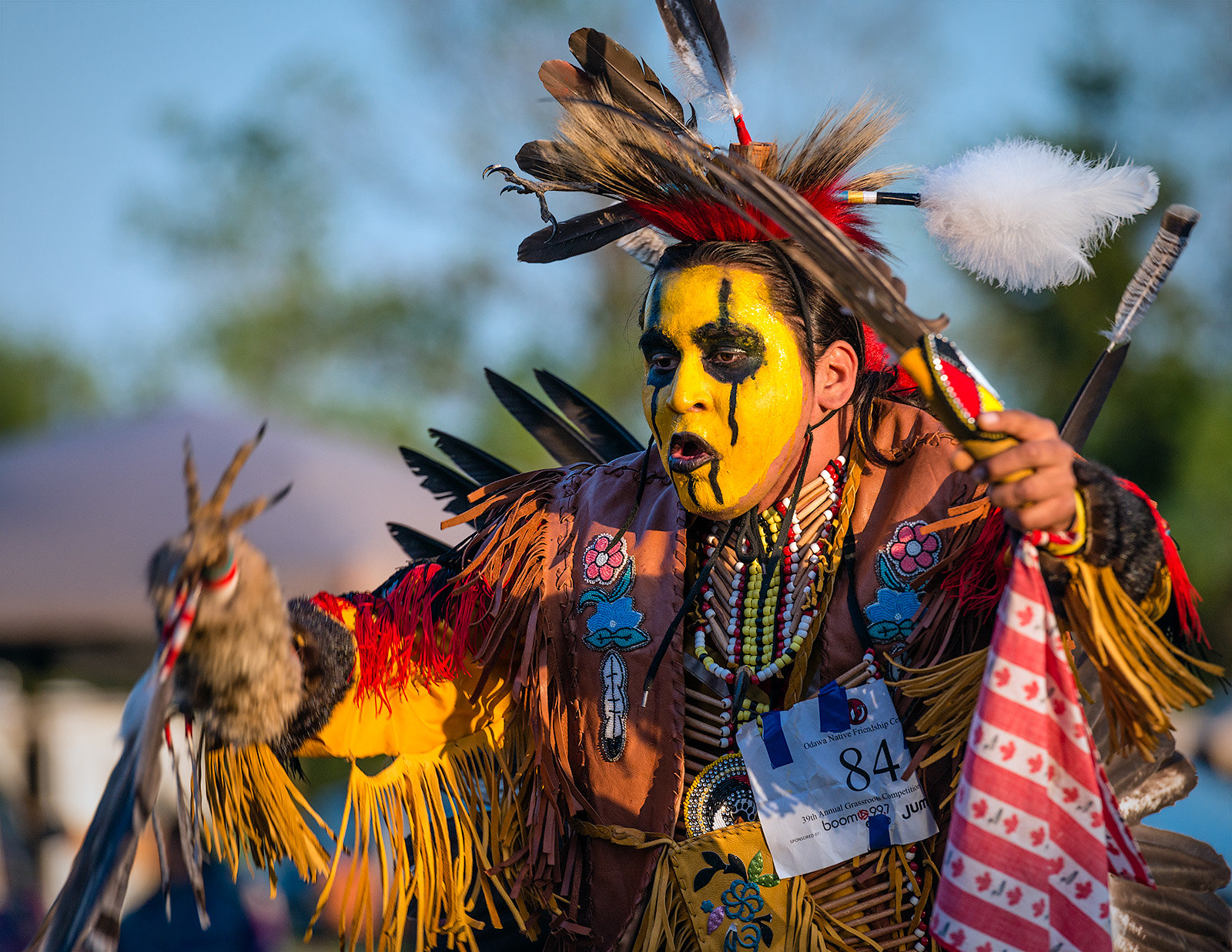
Nicely captured series, the action shot (2nd) has a lot of energy. Nice portrait.
-
24th May 2015, 08:10 AM #3

- Join Date
- Dec 2013
- Location
- Turkey
- Posts
- 12,779
- Real Name
- Binnur
Re: Pow Wow
Nice soft light indeed Manfred
 #2 is very colorful and energetic and #3 is a very nice portrait.
-
24th May 2015, 08:50 AM #4


- Join Date
- Dec 2013
- Location
- Chesterfield, Missouri/Melbourne, Australia
- Posts
- 17,827
- Real Name
- Izzie
Re: Pow Wow
I like all of them, Manfred -- #1 for its colourful attire; #2 for the action and #3 for the portrait shot. All of them have colours and bright but my favourite is #1 for its boldness of red and nearer colours to red.
-
24th May 2015, 09:00 AM #5

- Join Date
- Jun 2013
- Location
- North West of England
- Posts
- 7,178
- Real Name
- John
Re: Pow Wow
Beautiful light Manfred, particularly the soft modelling in the third image. Lovely quality in all of them.
-
24th May 2015, 12:18 PM #6

- Join Date
- May 2012
- Location
- northern Virginia suburb of Washington, DC
- Posts
- 19,064
Re: Pow Wow
Terrific images! Love the colors (and I'm not referring only to the colors of the clothing).
-
24th May 2015, 05:33 PM #7Moderator


- Join Date
- Feb 2009
- Location
- Glenfarg, Scotland
- Posts
- 21,402
- Real Name
- Just add 'MacKenzie'
Re: Pow Wow
They are all good images, but that of the young woman is, I think, spectacularly striking. Her pose, the colours, her isolation from the background. Wonderful.
-
24th May 2015, 05:53 PM #8
Re: Pow Wow
Manfred, very nice images.
Bruce
-
24th May 2015, 10:07 PM #9

- Join Date
- May 2012
- Location
- northern Virginia suburb of Washington, DC
- Posts
- 19,064
Re: Pow Wow
After reviewing these a second time, I'm convinced the last one is so good that it merits taking the time to take it to the next level by eliminating the background item behind the subject's shoulder and the area of blue sky that forms a dark swoop in the top right area. That area of the sky mimics the shape of the woman's feather so much that, ironically, it detracts from the feather rather than complements it.
-
25th May 2015, 11:32 AM #10

- Join Date
- May 2015
- Location
- Colombo, Sri Lanka
- Posts
- 163
- Real Name
- Gayathrie Senaratne
Re: Pow Wow
nice captures
 I like #3 most
-
25th May 2015, 12:10 PM #11

- Join Date
- Jan 2015
- Posts
- 236
Re: Pow Wow
Excellent captures - well taken.
-
25th May 2015, 12:48 PM #12
-
25th May 2015, 12:59 PM #13

- Join Date
- Sep 2012
- Location
- BC Canada
- Posts
- 566
- Real Name
- Irene Eva
Re: Pow Wow
AlL are great images and the portrait one being my favorite and I do prefer it with the soft mottled background.
Irene
-
25th May 2015, 02:46 PM #14

- Join Date
- May 2012
- Location
- northern Virginia suburb of Washington, DC
- Posts
- 19,064
Re: Pow Wow
I was referring only to the wisp of blue sky that is similar in shape to the feather and that appears only in the upper right corner. One solution would be to make that area of blue sky larger. Another would be to eliminate it but only in that area. I agree that eliminating the blue tones throughout the entire sky is less desirable than the original image.
-
25th May 2015, 06:14 PM #15


- Join Date
- Dec 2013
- Location
- Chesterfield, Missouri/Melbourne, Australia
- Posts
- 17,827
- Real Name
- Izzie
Re: Pow Wow
I do still like the original better too, Manfred...it is more appealing.
-
25th May 2015, 07:08 PM #16

- Join Date
- Dec 2013
- Location
- Turkey
- Posts
- 12,779
- Real Name
- Binnur

 Helpful Posts:


 Reply With Quote

