Jyotirling is a devotional object representing the god Shiva. Jyoti means 'radiance' and lingam the 'mark or sign' of Shiva, Jyotir Ling thus means the The Radiant sign of The Almighty.
There are twelve traditional Jyotirling shrines in India.
It is believed that Lord Shiva first manifested himself as a Jyotirlinga on the night of the Aridra Nakshatra, thus the special reverence for the Jyotirlinga. There is nothing to distinguish the appearance, but it is believed that a person can see these lings as columns of fire piercing through the earth after he reaches a higher level of spiritual attainment.
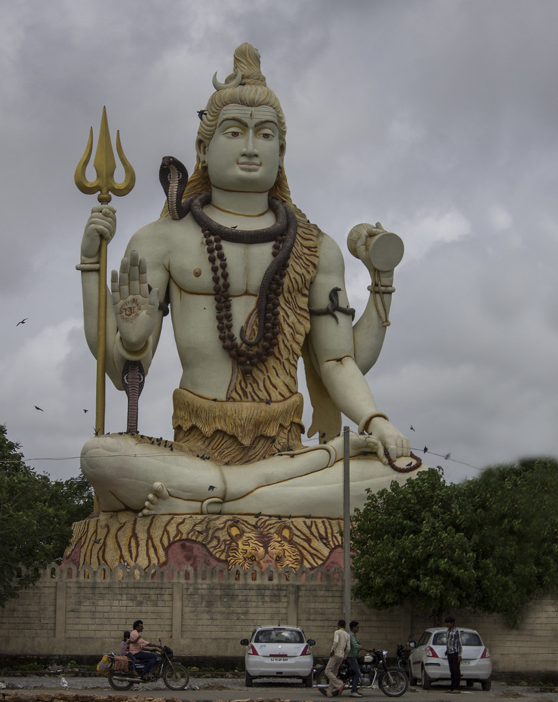
This one is called Nageshwar Jyotirling. This pic is taken out side the main temple, where big statue of Lord Shiva is placed. Inside the temple, we are not allowed to take photographs.
Tejal Mewar - Jyotirling by Tejal Imagination, on Flickr
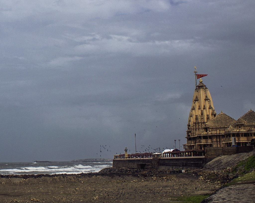
Here is one more. This temple is Somnath temple.
Tejal Mewar- Somnath Temple1 by Tejal Imagination, on Flickr
Tejal Mewar- Somnath Temple by Tejal Imagination, on Flickr
Kindly share your C&C.
Regards,
Tejal
Results 1 to 20 of 23
Thread: Nageshwar jyotirling
-
14th August 2015, 09:41 AM #1
Nageshwar jyotirling
-
14th August 2015, 09:56 AM #2
-
14th August 2015, 09:56 AM #3
Re: Nageshwar jyotirling
Hi Tejal,
The three shots vary between 2/3 and almost two stops under exposed - although perhaps you were trying to preserve the skies(?). I think there is a balance to be struck which might retain the sky while improving exposure.
There's a unnatural looking smudged/blurred area in trees in #1 (on right), as if you have cloned over something nasty.
#2 might stand a small clockwise rotation to level it.
I always find your posts informative, thanks - in general, I like the compositions too.
Dave
-
14th August 2015, 09:58 AM #4
-
14th August 2015, 10:03 AM #5
Re: Nageshwar jyotirling
Thanks Dave for your input. Yes, pis are looking under exposed. You have very much correct. It could be corrected during PP. And I will do that
 .
.
Due to rainy season and cloudy atmosphere light was quite less. That might be the reason. Shots are one year old, so as of now I really dont remember whether technically I had taken care while taking pic or not.
-
14th August 2015, 11:33 AM #6
-
14th August 2015, 11:40 AM #7
-
14th August 2015, 02:20 PM #8
-
14th August 2015, 04:28 PM #9
Re: Nageshwar jyotirling
I especially like #1 and #3,
When I started to view #1, I saw an idol on my monitor and thought "Ho-Hum" just another image of a statue but, as I scrolled down, the people on the street came into view and that changed the entire look of the image. The people became a reference point showing how large is the statue and, IMO, really make the image.
The people in image #3 also are references to the size of the building and the area you photographed. They also add color to the image.
I would warm up the images a TAD and perhaps add some contrast and maybe a bit of saturation. That might compensate for the original under exposure. I selected the sky and added some structure which brings out the clouds, I also selected both groups of people in the foreground and brightened then and added a bit of saturation.

This might not have been they way you saw the area but I do like it a bit better. There is some noise in the new image but that, IMO, stems from starting with a small image that I copied from your post. If I started in RAW, I would have added some noise reduction from the start.
BTW: I really like the triangular formation of the groups of people and the canopy forming leading lines up to the tall temple.
-
16th August 2015, 12:53 AM #10

- Join Date
- Apr 2012
- Location
- Dunedin New Zealand
- Posts
- 2,697
- Real Name
- J stands for John
Re: Nageshwar jyotirling
In Paint Shop Pro I have the ability to add an adjustment layer/curves which gives me what looks like a histogram image and when this does not occupy the whole area I do what I believe Adobe users do .. adjust the white and black points inwards to each end of the 'histogram' which changes a muddy looking image into a better version in most cases. In all three images the 'histogram' ended at the 3/4 line before adjusting the white point inwards.
If I could do a screen capture I would show you this but sadly that is a skill I have yet to master
-
16th August 2015, 08:31 AM #11


- Join Date
- Dec 2013
- Location
- Chesterfield, Missouri/Melbourne, Australia
- Posts
- 17,827
- Real Name
- Izzie
Re: Nageshwar jyotirling
If you have a software called Jing (free copy) then you can copy to your clipboard or save it as an image for further studies. I have the paid version of it...SnagIt. Both are from Tech Smith and I had used Jing for many years now. I only bought SnagiT this year because there are tutorials I want to watch later on that I can copy and save on my harddrive...Jing can also do this but on very limited megabytes...
-
16th August 2015, 08:35 AM #12


- Join Date
- Dec 2013
- Location
- Chesterfield, Missouri/Melbourne, Australia
- Posts
- 17,827
- Real Name
- Izzie
Re: Nageshwar jyotirling
Tejal...very nice series...I particularly like #1 although there are so much to be done there to remove line and the pole, which if this is mine, I would remove them...it seems that like in most places, the birds know where to rest too and do their things...
 not just here...it does not matter what "holy" means to them either...
-
17th August 2015, 06:42 AM #13
Re: Nageshwar jyotirling
Agree with you. During my initial days, I used to be very scared of boosting ISO. But today I have learnt a little, how to hand such situation.
 . I generally visit same place of my town in a gap of say 3-4 months or so and every time, I notice the change in my photography. Every day is a learning day for me
  .
.
-
17th August 2015, 06:47 AM #14
-
17th August 2015, 06:56 AM #15
-
17th August 2015, 06:57 AM #16
-
17th August 2015, 06:58 AM #17
-
17th August 2015, 04:47 PM #18
Re: Nageshwar jyotirling
Windows 7 and (I think) later Windows issues have the Snip It tool built in. This is a very handy tool to copy part or all of a screen.
http://windows.microsoft.com/en-us/w...#1TC=windows-7
Full screen capture:

Last edited by rpcrowe; 17th August 2015 at 04:52 PM.
-
17th August 2015, 06:01 PM #19

- Join Date
- Aug 2015
- Location
- Swakopmund, Namibia
- Posts
- 39
- Real Name
- Helen
-
17th August 2015, 07:10 PM #20

- Join Date
- Dec 2013
- Location
- Turkey
- Posts
- 12,779
- Real Name
- Binnur
Re: Nageshwar jyotirling
`Nice compositions Tejal


 Helpful Posts:


 Reply With Quote
 Helen
Helen
