 Helpful Posts: 0
Results 1 to 20 of 43
-
9th July 2010, 11:28 AM #1

- Join Date
- Dec 2008
- Location
- New Zealand
- Posts
- 17,660
- Real Name
- Have a guess :)
Day 10: July 2010 Photo-a-Day Thread
-
10th July 2010, 12:04 AM #2

- Join Date
- Oct 2009
- Location
- Maryland, USA
- Posts
- 1,015
- Real Name
- Rick
Makin' Sawdust
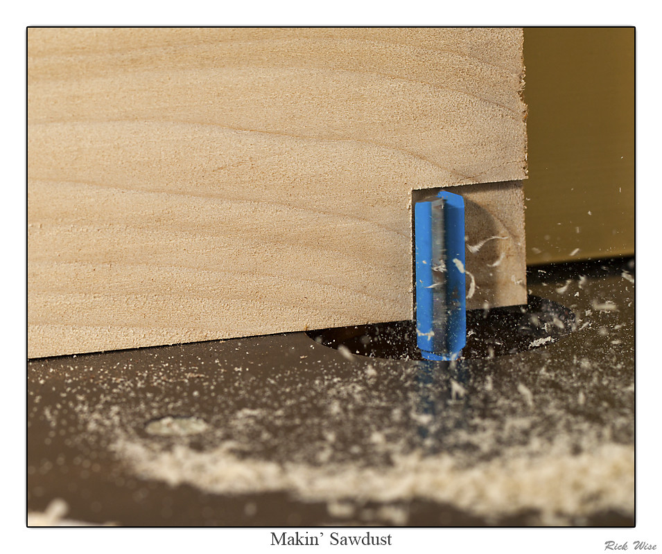
Canon 500D, EF100mm f/2.8L Macro IS USM, Full EXIF, PAD slideshow.
I'm still trying to get the shot of woodworking that shows frozen action, but action. I used two flashes, 580EX on a cord, 430EX slaved. I'm not sure how much power, because I wanted to use ETTL. I wanted to have the flashes running directly from the camera instead of RF slaved, because I was shooting with continuous remote, and if it doesn't know it's using the flash, you just get a lot of dark shots. But it was probably fairly short, since the router turns at 30,000 rpm.
This is better than the shots of the table saw I took a few months back, but I still want to do more.
C&C are welcome.
Cheers,
Rick
-
10th July 2010, 01:31 AM #3
Re: Makin' Sawdust
Hi Rick,
I think the answer is to shoot *, or crop in, closer to the action:This is better than the shots of the table saw I took a few months back, but I still want to do more.

Hope you don't mind.
Crop, LCE, Levels, Sharpen, selective sharpen.
* Might want to 'bag' the lens and camera to prevent sawdust ingress if shooting closer to the action
Cheers,
-
10th July 2010, 04:13 AM #4

- Join Date
- Oct 2009
- Location
- Maryland, USA
- Posts
- 1,015
- Real Name
- Rick
Re: Makin' Sawdust
Excellent!! Thanks, Dave, this is much better. It's definitely worth going out to the shop and shooting closer. I think I will wait, though, until I get my UV filter for this lens. I've been saying for a while that I need one, but hadn't gotten around to it: I ordered one today.
I can also use my shop vac on exhaust mode to make an air curtain: I did that when I was shooting water droplets and didn't want splatter hitting the lens all the time.
Cheers,
Rick
-
10th July 2010, 09:12 AM #5
Day 10: July 2010 Photo-a-Day Thread.
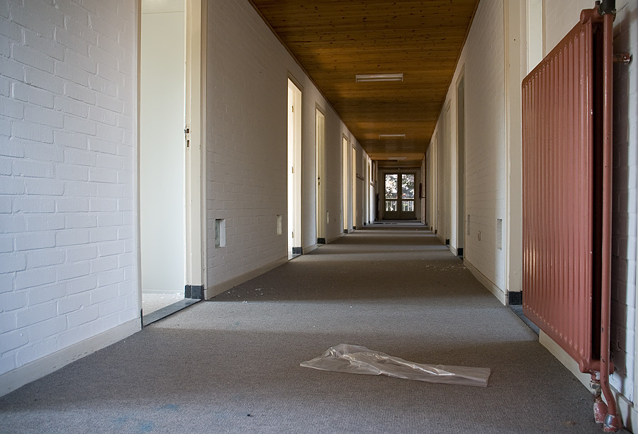
Two versions of one image today. If you'd like to, I'd welcome feedback on which you prefer and why. Or that you don't like 'em at all, if that be the case - my skin is thick enough to take it.

Won't post usual exif, as these are generated from 4 images. All shot with D80 and Sigma 10-20mm F4-5.6 EX DC HSM at 15mm, f/8, ISO 200. The 4 were 1/6th, 1/25th, 1/100th and 1/400th sec. Time was 17.56, just before the sun went down behind the buildings.
Used SNS hdr to generate the final image and then some more general levels, curves, desat.
Larry doesn't work here anymore.
-
10th July 2010, 09:23 AM #6Moderator


- Join Date
- Feb 2009
- Location
- Glenfarg, Scotland
- Posts
- 21,402
- Real Name
- Just add 'MacKenzie'
Re: Day 10: July 2010 Photo-a-Day Thread.
Kit
What about a crop at the bottom, just at the front of the concreted area in front of the workshop? I suppose I'm questioning whether the gravelled area at the front actually adds anything. That crop maybe puts more attention on the workshop and the sky.
As you've probably noted, I'm into B & W and NOT the HDR thing. But, not only because of that (and with the crop I suggest - if you agree) the B & W is more stark, which is what the subject matter demands.
ps - Sorry to hear about Larry
-
10th July 2010, 10:25 AM #7

- Join Date
- Dec 2008
- Location
- New Zealand
- Posts
- 17,660
- Real Name
- Have a guess :)
-
10th July 2010, 10:28 AM #8

- Join Date
- Aug 2009
- Posts
- 4,049
Re: Day 10: July 2010 Photo-a-Day Thread.
Kit
It's a good subject and a good shot, I agree with Donald. This is a good subject, but it's best suited to BW. In the HDR version that area of yellowish sky in TL corner distracts from the building. Also, the windows look as if they are lit, yet Larry is supposed not to be there any more.
One of the problems with ultra-wide lenses such as the Sigma 10-20 and the Tokina 11-16 is that you have to stand in exactly the right spot to avoid distortion - unless, of course, you want distortion. In your shot I don't think you intended any distortion but it looks to me as if the right side of the building is closer to the camera than the left. It's not sufficient to look deliberate, so once noticed it's hard to ignore. Do you have 'lens correction' in your CS version? That will fix it. I did a quick edit to demonstrate, and also did the crop Donald suggested. It's not a very good edit, I think ideally you should have been dead-centre of the building, a few steps back, and pointing the camera more skywards. But I could be wrong.
The sky is good, which is why I'd like to see it forming a greater part of the shot, and the contrasts in the building are well caught.

-
10th July 2010, 10:34 AM #9

- Join Date
- Aug 2009
- Posts
- 4,049
Re: Six of the best from today
Colin
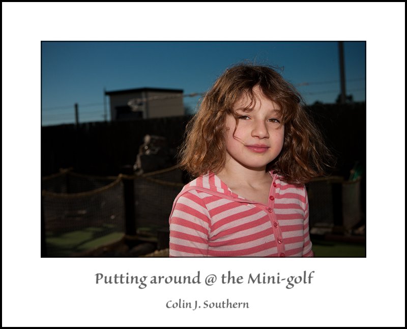
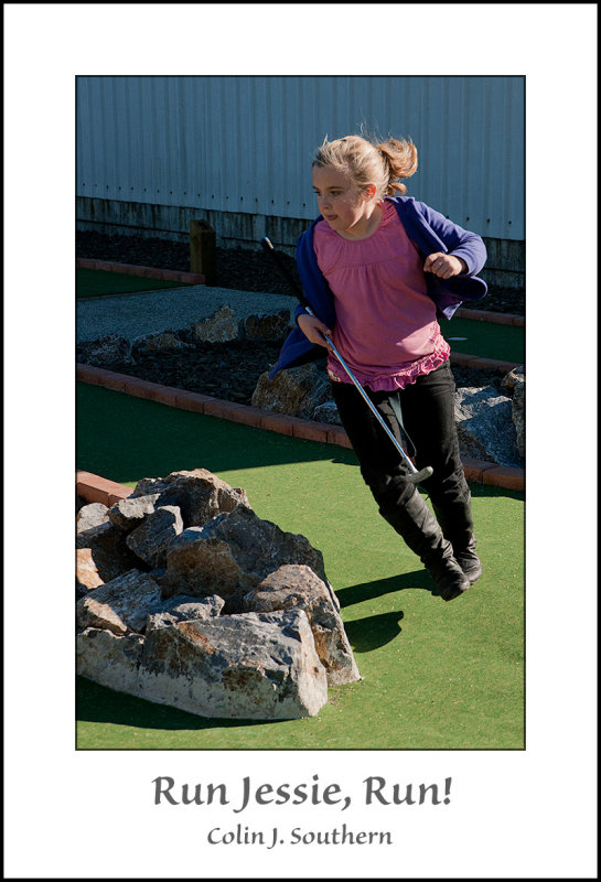
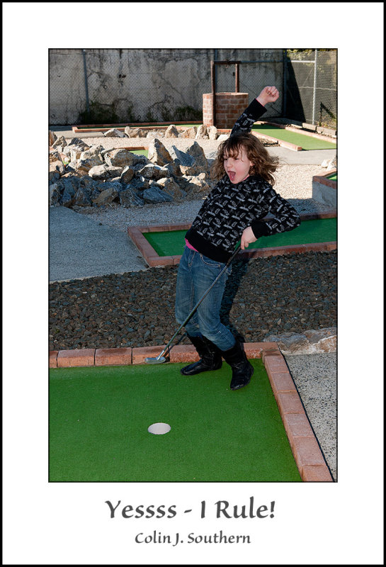
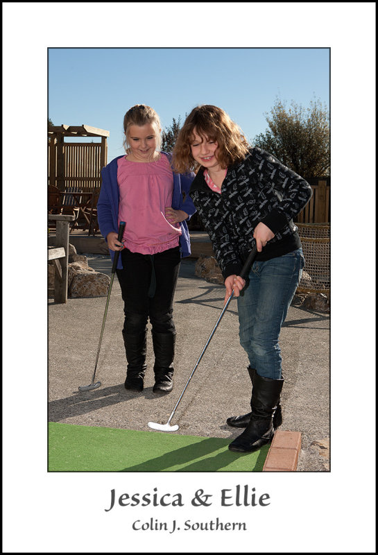
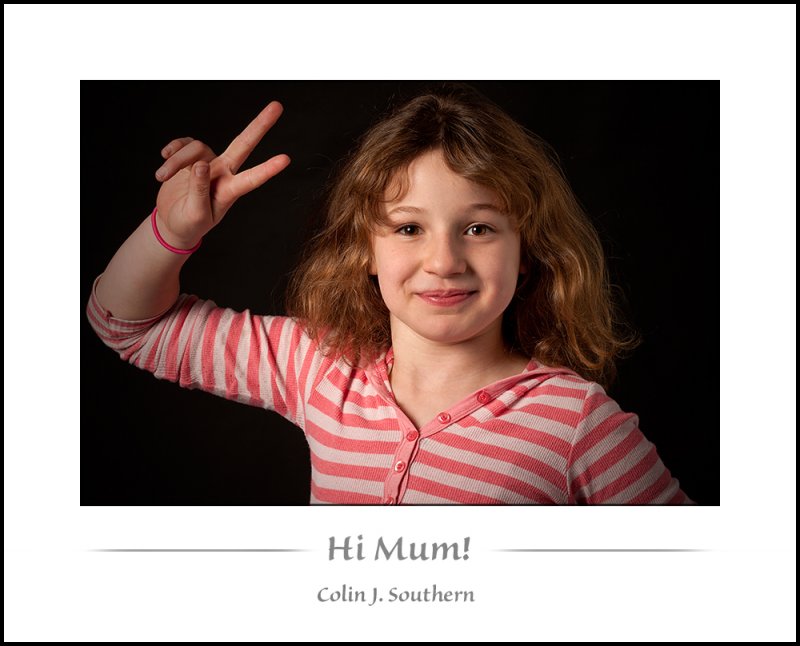
I think this is the best, I like it a lot. She makes a bold model. I'm dreadfully ignorant of 21st century 'yewth' sub-culture with its dizzying range of yewth-speak, signs, symbols, in-words, looks, and non-looks. So what exactly does that hand gesture mean? Or, as Donald suggested yesterday about something else - 'is it rude?'
-
10th July 2010, 10:38 AM #10

- Join Date
- Dec 2008
- Location
- New Zealand
- Posts
- 17,660
- Real Name
- Have a guess :)
Re: Six of the best from today
-
10th July 2010, 10:57 AM #11
-
10th July 2010, 11:05 AM #12
Re: Day 10: July 2010 Photo-a-Day Thread
Donald & Rob - thanks for your feed-back and input. Glad you prefer the b & w. I do too. More gritty and suggestive of abandonment and dereliction. It was hdr generated too, just a clone of the other one, then desaturated. I like the suggested crop off the bottom, too. I was trying to get the 2/3rds thing working and didn't really look to see if it actually did.
Rob - must admit I had to stare a bit going between your version and mine to see what you mean about the distortion, but it finally clicked. I was standing in the middle, but must have been pointing the lens a little more to one side than the other. I did manage to straighten up the sides, but need to learn to look further and more critically.
Re the apparent lights in the windows - that's some old board that Larry musta put up before he left. Just as well, or his electric bill would be way high by now.
-
10th July 2010, 11:08 AM #13

- Join Date
- Dec 2008
- Location
- New Zealand
- Posts
- 17,660
- Real Name
- Have a guess :)
-
10th July 2010, 11:11 AM #14

- Join Date
- Aug 2009
- Posts
- 4,049
-
10th July 2010, 11:59 AM #15
-
10th July 2010, 12:04 PM #16

- Join Date
- Dec 2008
- Location
- New Zealand
- Posts
- 17,660
- Real Name
- Have a guess :)
-
10th July 2010, 12:20 PM #17Moderator


- Join Date
- Feb 2009
- Location
- Glenfarg, Scotland
- Posts
- 21,402
- Real Name
- Just add 'MacKenzie'
Re: Six of the best from today
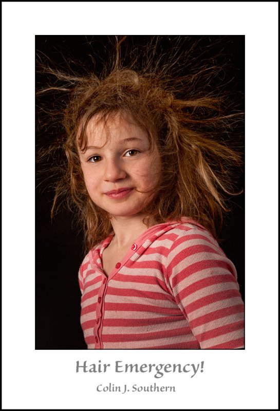
God, you've got more hair than me as well. Is there no justice?
-
10th July 2010, 12:21 PM #18

- Join Date
- Aug 2009
- Posts
- 4,049
-
10th July 2010, 12:22 PM #19

- Join Date
- Dec 2008
- Location
- New Zealand
- Posts
- 17,660
- Real Name
- Have a guess :)
-
10th July 2010, 12:24 PM #20

- Join Date
- Aug 2009
- Posts
- 4,049


 Reply With Quote