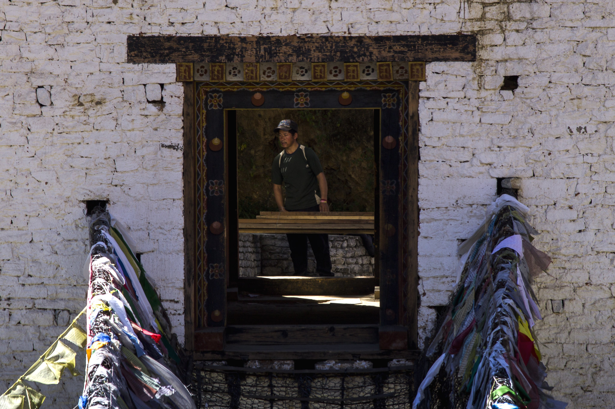
Please share your C&C on my below pic.
Thanks,
Tejal
IMG_0401 as Smart Object-1 by Tejal Imagination, on Flickr
Results 1 to 13 of 13
-
27th November 2015, 05:42 AM #1
Frame within Frame - C & C are welcome
-
27th November 2015, 10:51 AM #2
Re: Frame within Frame - C & C are welcome
Nicely framed and processed, the dark notch on the right is very pronounced but I would leave as is, my gaze is drawn to it but the colors are vibrant enough and the reflection interesting enough so that my attention moves freely.
-
27th November 2015, 11:50 AM #3
-
27th November 2015, 12:09 PM #4
Re: Frame within Frame - C & C are welcome
Tejal, the very bright areas bottom left and right are quite distracting to me, and that leads me to wonder of your choice of frame is too large - perhaps a square crop to remove most of those bright areas and then tone down the bit of them that remains?
Cheers.
PhilipLast edited by MrB; 27th November 2015 at 12:18 PM.
-
27th November 2015, 03:27 PM #5
-
27th November 2015, 06:55 PM #6

- Join Date
- Jan 2009
- Location
- South Devon, UK
- Posts
- 14,547
Re: Frame within Frame - C & C are welcome
Yes, a pity that there is such a strong variation in light levels.
Cropping to concentrate on the main subject might work and a 4 x 5 ratio could be an alternative to going square.
-
28th November 2015, 06:50 AM #7
-
28th November 2015, 10:34 AM #8

- Join Date
- Jun 2013
- Location
- North West of England
- Posts
- 7,178
- Real Name
- John
Re: Frame within Frame - C & C are welcome
Last edited by John 2; 28th November 2015 at 01:59 PM.
-
28th November 2015, 11:20 AM #9


- Join Date
- Dec 2013
- Location
- Chesterfield, Missouri/Melbourne, Australia
- Posts
- 17,827
- Real Name
- Izzie
Re: Frame within Frame - C & C are welcome
I very much like the edit of John (2). It is now stronger...and yet still have the title correct, Tejal...Very nicely done, Tejal...
-
28th November 2015, 01:48 PM #10
Re: Frame within Frame - C & C are welcome
I very much like this image. The crop by John improves it IMO.
Dave
-
30th November 2015, 05:05 AM #11
-
30th November 2015, 05:06 AM #12
-
30th November 2015, 05:07 AM #13

 Helpful Posts:

 Reply With Quote

