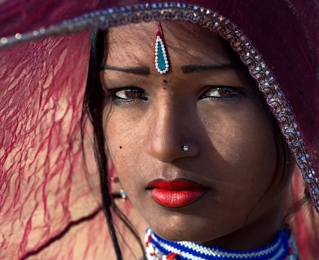
Hi, going forward on my photography venture I stopped and clicked another shot. Can you please review it and let me know what exactly is missing for it to make it much better?
Here I have used Harsh light to get some textured shadows, depth and dimension in the face. In processing I havnt done much apart from minor contrast adjustments and WB. She is approx 13 Years of age. She is also a nomad like the previous gal and they do makeup and dress up like that only for the fair.
Please provide your views and suggestion with composition, frame, crops and processing.
Thank You
PS : Please click on the image for lightbox screen view (Highly recommended)
Results 1 to 13 of 13
Thread: Pushkar Gal #2. C&C Welcome
-
29th November 2015, 06:04 PM #1

- Join Date
- Apr 2013
- Location
- India
- Posts
- 1,348
- Real Name
- Raj
Pushkar Gal #2. C&C Welcome
Last edited by fotugraphy; 29th November 2015 at 06:22 PM.
-
29th November 2015, 06:40 PM #2
Re: Pushkar Gal #2. C&C Welcome
Nicely captured, interesting use of shadow and pattern.
-
29th November 2015, 08:41 PM #3

- Join Date
- Dec 2013
- Location
- Turkey
- Posts
- 12,779
- Real Name
- Binnur
Re: Pushkar Gal #2. C&C Welcome
Hi Raj
 I'm not a portrait shooter but I want to say my opinion .I like the image. I would crop it from the LHS and go for a nearly square crop as her scarf competes with her face .
-
29th November 2015, 08:48 PM #4
Re: Pushkar Gal #2. C&C Welcome
Another beautiful shot, Raj. You seem to have a better at the camel fair than I did. I have lots of pictures of camels!

When I first saw this image my initial concern was all that hair on your subject's forehead, until I realized that these were shadows cast by patterns in the scarf she is holding away from her head. Let me show you two possibilities for a crop and then my thoughts on how to edit. The edits are pretty well identical, other than the crop.
Edit 1 - using the scarf to frame the model

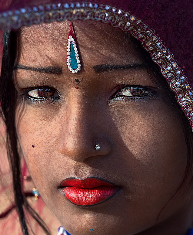
Edit 2 - A more traditional headshot framing.

As for the edits; your exposure was right on; but I did a tiny tweak of the black point and white point. I found that the skin tones looked a bit too warm. I suspect that this might be due to the light coming through the red scarf warming things up, so I cooled things down a bit. I do prefer portraits to be a bit on the warm side, but not quite that warm.
The contrasty lighting give a nice look to the image, but has two or three side effects I countered. The shadows were a bit too heavy, so I dodged those areas a bit to kill the shadows there a touch. Harsh lighting will also accentuate the pores in the skin and will introduce specular highlights on the skin. I softened the skin a bit and reduced the reflections on the skin. I also touched out a few hairs, especially the ones over her camera right eye.
As for the crops; I prefer the first one that uses the scarf to frame the subject's face. I found that your framing was a bit too wide. We want the scarf to complement the face, without competing with it. There was a white area on the right side of the image; I cropped that out. On the left side, I found that the green in the bottom left corner and the area of wall or ceiling at the top left corner just added another element of distraction, so I cropped both of them out. This left less scarf in the image. I think this amount helps frame the face and helps explain the shadows being cast on the face without competing too much with the face.
The second image is more of a classical head shot, but I don't think it is as strong as the first crop.
-
30th November 2015, 01:13 AM #5

- Join Date
- Jan 2015
- Location
- Kingsville, Texas
- Posts
- 877
- Real Name
- Dean
Re: Pushkar Gal #2. C&C Welcome
Very well done, Raj.
-
30th November 2015, 02:19 AM #6

- Join Date
- Apr 2013
- Location
- India
- Posts
- 1,348
- Real Name
- Raj
-
30th November 2015, 02:20 AM #7

- Join Date
- Apr 2013
- Location
- India
- Posts
- 1,348
- Real Name
- Raj
-
30th November 2015, 04:42 PM #8

- Join Date
- Dec 2013
- Location
- Turkey
- Posts
- 12,779
- Real Name
- Binnur
Re: Pushkar Gal #2. C&C Welcome
Manfred's first crop is what I had in mind Raj. May be I would crop the scarf just a tiny bit more but it is personal preference
 Manfred's second crop is a traditional one as he already mentioned but it is also nice. I think if the image was mine I would keep both versions
-
30th November 2015, 05:06 PM #9
Re: Pushkar Gal #2. C&C Welcome
Excellent documentary portrait. I do like a square crop. However, on this shot, I think that a very slight bit of skin smoothing might make her image more flattering...
It would all depend on the use of the final result. In pure documentary imagery, the original is far superior. But, if I were shooting this image for the young lady, I might consider this version...

Last edited by rpcrowe; 1st December 2015 at 05:52 PM.
-
1st December 2015, 12:20 PM #10

- Join Date
- Apr 2013
- Location
- India
- Posts
- 1,348
- Real Name
- Raj
-
1st December 2015, 12:21 PM #11

- Join Date
- Apr 2013
- Location
- India
- Posts
- 1,348
- Real Name
- Raj
-
1st December 2015, 12:22 PM #12

- Join Date
- Apr 2013
- Location
- India
- Posts
- 1,348
- Real Name
- Raj
-
1st December 2015, 12:22 PM #13

- Join Date
- Apr 2013
- Location
- India
- Posts
- 1,348
- Real Name
- Raj

 Helpful Posts:

 Reply With Quote
