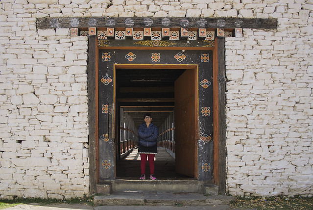
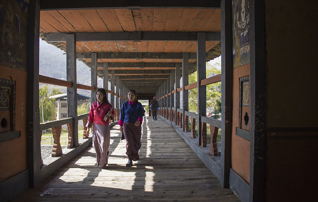
Your C&C are most welcome.
IMG_0669 as Smart Object-1 by Tejal Imagination, on Flickr
Results 1 to 20 of 25
-
2nd December 2015, 04:50 AM #1
Frame within Frame - C & C are welcome
-
2nd December 2015, 05:16 AM #2

- Join Date
- Oct 2012
- Location
- Australia
- Posts
- 1,166
- Real Name
- Griddi
Re: Frame within Frame - C & C are welcome
Nice capture, and also seen nice.......I also like the colours.......
Griddi.....
-
2nd December 2015, 05:19 AM #3
-
2nd December 2015, 07:31 AM #4

- Join Date
- May 2014
- Location
- amsterdam, netherlands
- Posts
- 3,182
- Real Name
- George
-
2nd December 2015, 07:56 AM #5
Re: Frame within Frame - C & C are welcome
-
2nd December 2015, 08:47 AM #6

- Join Date
- May 2014
- Location
- amsterdam, netherlands
- Posts
- 3,182
- Real Name
- George
-
2nd December 2015, 08:50 AM #7
-
2nd December 2015, 09:43 AM #8
Re: Frame within Frame - C & C are welcome
Nicely done, a good effect.
-
2nd December 2015, 09:47 AM #9
-
2nd December 2015, 10:21 AM #10
Re: Frame within Frame - C & C are welcome
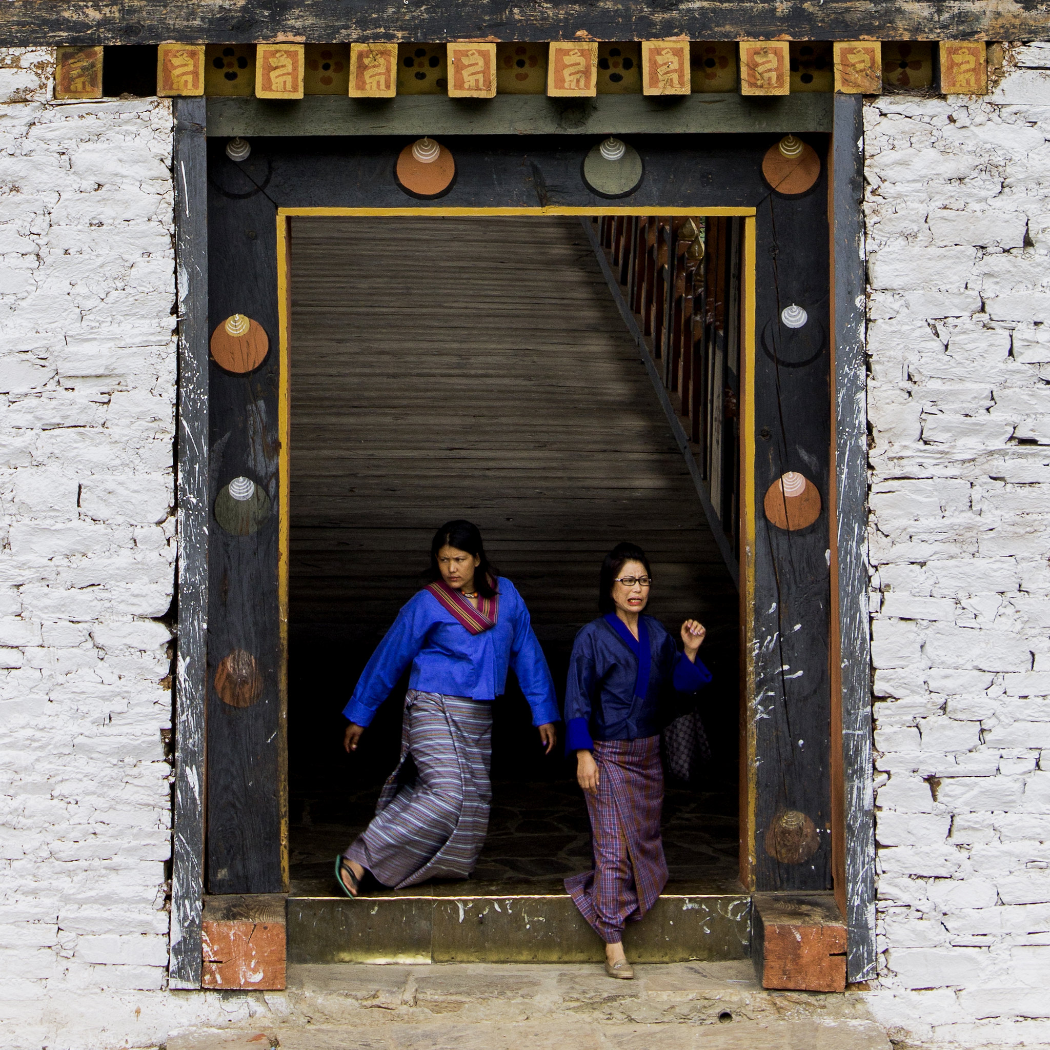
This is a tough shot to present, given that the structure is painted white and the part of the bridge you are showing is darker than the walls. This means our eyes are drawn to the bright white at the edges and tend to miss the action happening in the relatively darker centre of the frame.
Your timing on the shot was quite good, catching the two women in traditional Bhutanese dress just coming out into the light, which brightens them up. The woman on the left side of the image is still a bit in shade and I might be tempted to dodge her a tiny bit.
-
2nd December 2015, 10:25 AM #11
-
2nd December 2015, 10:27 AM #12
Re: Frame within Frame - C & C are welcome
Tejal - do you have a picture showing a side view of the bridge crossing the river that you could post in this thread? That might help answer George's question and would give the other viewers of this thread an idea of what they are looking at.
-
2nd December 2015, 11:01 AM #13
Re: Frame within Frame - C & C are welcome
Here are two SOCS of the similar bridge. The bridge looks like this -

IMG_1151 by Tejal Imagination, on Flickr

IMG_1152 by Tejal Imagination, on Flickr
-
2nd December 2015, 03:22 PM #14New Member

- Join Date
- Apr 2012
- Posts
- 3
Re: Frame within Frame - C & C are welcome
Hi, Tejal.
I find the firts picture in the post nice: the framing you adopted works good. Lines are straight and perpendicular, no distortion appears in the picture. Unfortunately the expression on the woman's face on the left is totally out of contest and - IMHO - detracts greatly from the shot's value. Sorry to sound a little abrupt but that's the only approach which I think can really help you to improve. Bye
-
2nd December 2015, 04:40 PM #15
-
3rd December 2015, 01:30 AM #16


- Join Date
- Dec 2013
- Location
- Chesterfield, Missouri/Melbourne, Australia
- Posts
- 17,827
- Real Name
- Izzie
Re: Frame within Frame - C & C are welcome
Welcome to CiC Filgalli...
Tejal may I ask what may happen if you crop off the top of the frame with the tiles on it? Would it make a better image? Just asking...you might want to look into it. The two women just emerging to the light is really nice apart from the expression on the face of the woman on the right, otherwise, they are nicely framed and exposed.
-
3rd December 2015, 04:27 AM #17
Re: Frame within Frame - C & C are welcome
Thanks Izzie for your comment. The top brown color part, above mustered yellow blocks is the part of wooden frame, so I kept it as it is. And as you suggested, yes the crop without that part will also work very well as it will bring the subject more closer
 . I have some more frames too, where i have tried to take transaction of human elements through such type of gates. I will post those in coming days.
-
4th December 2015, 06:19 PM #18
-
5th December 2015, 05:07 AM #19
-
7th December 2015, 10:56 AM #20

- Join Date
- Nov 2015
- Posts
- 11
Re: Frame within Frame - C & C are welcome
Although the two women coming out of the gate are definitely the more interesting subject, I like the composition of this picteu more. I know the white wall as a frame has been criticised above, I enjoy its texture and feel it adds to the frame within a frame theme for it to be wider. I find my eye drawn to the gate and bridge, rather than the wall and then later drawn to the textual element the wall adds.

 Helpful Posts:

 Reply With Quote

