Dear All,
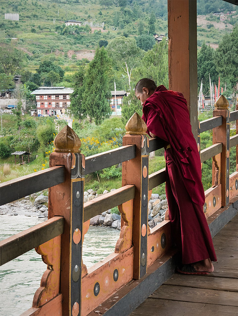
Yesterday I had posted one pic of a monk stepping down. I have some other crops too of the same shot, which are as follows. Please share your view, which is better.
Regards,
Tejal
a by Tejal Imagination, on Flickr
b by Tejal Imagination, on Flickr
IMG_0684 as Smart Object-1 by Tejal Imagination, on Flickr
Results 1 to 12 of 12
-
4th December 2015, 05:23 AM #1
Stepping down - C&C are most welcome
-
4th December 2015, 06:07 AM #2
Re: Stepping down - C&C are most welcome
Tejal - I'm afraid none of these work particularly well.
The dark "hole" at the top of the stairs is a compositional element that doesn't work as is adds nothing to the image. This covers the top and middle image.
The bottom image, I covered yesterday. It just doesn't have any balance and the monk is too far over on one side.
That being said, that place looks familiar. I think I got up those stairs just a few minutes before the monastery was closing to the visitors for the day. One of my favourite shots from Bhutan was taken of a monk on the same bridge you used in some of your images.

-
4th December 2015, 06:43 AM #3
Re: Stepping down - C&C are most welcome
Thanks Manfred for your valuable input. To be very honest with you, for the last two days i am stuck up on this picture and was feeling that something is missing or some where something is wrong. At the time of taking the picture, the monk and the pattern of the wooden staircase, to create a BG (or environment of the frame), were there in my mind, but it seems it couldnt work properly.
 .
.
Yes, the picture which posted is of the same dzong, Punakha Dzong. From this bridge, we can have a nice view of the river where we had enjoyed river rafting too .
.
-
4th December 2015, 08:05 AM #4
Re: Stepping down - C&C are most welcome
If I make the crops as follows, then any of them could work ?

y by Tejal Imagination, on Flickr

x by Tejal Imagination, on Flickr
-
4th December 2015, 11:19 AM #5
Re: Stepping down - C&C are most welcome
For me that last crop is the best. It is more close up and more balanced.
-
4th December 2015, 11:22 AM #6
-
4th December 2015, 11:50 AM #7
Re: Stepping down - C&C are most welcome
Very nice series, I could see that first shot taken with a shorter focal length to emphasize the massiveness of the structure and the seemingly perseverance of the monk. The interior is impressive and details could be brought out, but doing an edit of the interior might compete with the vision outside. I tried moving the third image around in Lightbox but the crops don't work as well as the original.
-
4th December 2015, 11:58 AM #8
-
4th December 2015, 02:41 PM #9

- Join Date
- Dec 2013
- Location
- Turkey
- Posts
- 12,779
- Real Name
- Binnur
Re: Stepping down - C&C are most welcome
+1 to John's comment

-
4th December 2015, 04:03 PM #10
-
4th December 2015, 06:16 PM #11
Re: Stepping down - C&C are most welcome
Perhaps a bit closer crop on the monk might be in order.
-
5th December 2015, 05:08 AM #12

 Helpful Posts:


 Reply With Quote
