For the past few days, the weather has been rather dreary. Completely featureless dark grey cloudy sky, the occasional light shower or snow flurry and a damp cold mist hanging in the air. Good time to sit at home with a hot cup of cocoa, visit web sites of the CiC members that I look up to and see what I could learn from them. This naturally brought me to Donald's site. As I was admiring his beautiful black and white scenes of misty Scotland, it occurred to me that I should be out there taking pictures of dreary misty Ottawa!
I finished my cocoa, packed up my kit and headed for what I thought would be the perfect spot to capture the dreariness of the past few days. As luck would have it, by the time I got there the clouds were thinning out and taking shape. The odd patch of blue sky also made an appearance and the mist dissipated. So much for capturing "dreary". Lesson #1 - If the conditions are good, DO IT NOW!
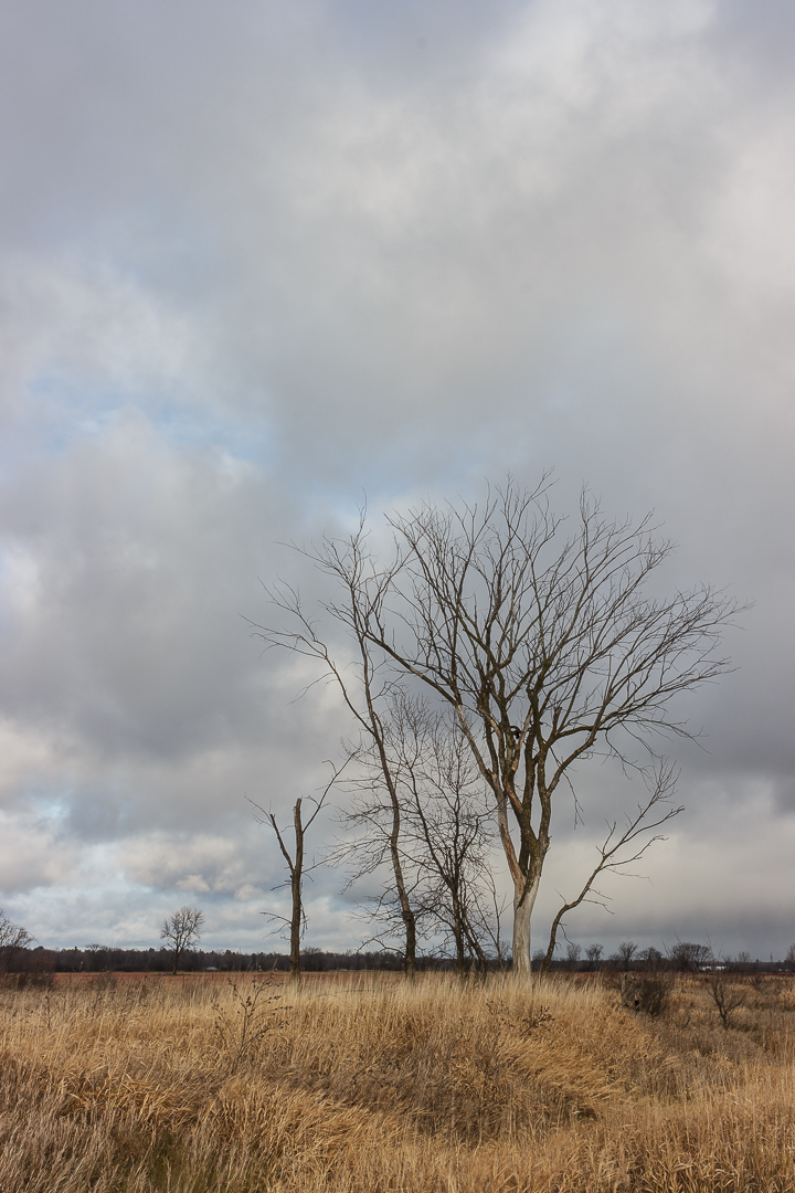
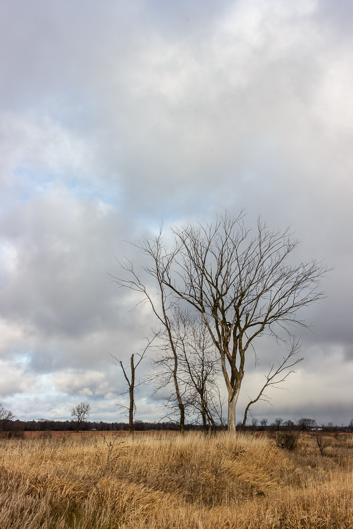
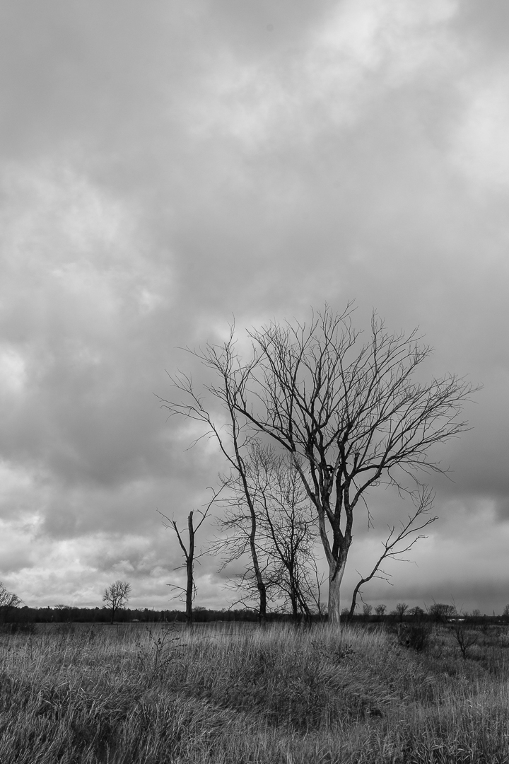
The scene was no longer what I had anticipated but it was still a nice scene. I took a few shots including one of a rather dead looking tree which turned out quite good. Post processing it exposed (no pun intended) a new dilemma. After I adjusted the black point and the white point, something I now do routinely, as per Manfred's suggestions, I ended up with a crisper photo but it seems to me that it lost some of the mood of the original. Perhaps the original scene doesn't have any real white or black in it.
I do like both versions but to me they convey slightly different feelings.
#1 - Original shot
#2 - Adjusted Black and White Point
#3- I also tried a B&W conversion.
As usual C & C welcomed.
Andre
Results 1 to 20 of 24
Thread: Dreary Day
-
4th December 2015, 03:45 PM #1
Dreary Day
-
4th December 2015, 04:23 PM #2
Re: Dreary Day
Nice capture and processing.
-
4th December 2015, 04:57 PM #3
Re: Dreary Day
All the versions are fine

-
4th December 2015, 07:18 PM #4

- Join Date
- Jan 2009
- Location
- South Devon, UK
- Posts
- 14,556
Re: Dreary Day
I wonder if you need so much sky to create a dreary day effect?
How about a 4 x 5 ratio and losing a bit from the top, possibly a fraction from the bottom as well?
I suspect there are several options with this scene.
-
4th December 2015, 10:37 PM #5

- Join Date
- Sep 2015
- Location
- Virginia - USA
- Posts
- 884
- Real Name
- Sam
Re: Dreary Day
I agree with Geoff. I like the B&W best.
-
4th December 2015, 10:37 PM #6
Re: Dreary Day
The B&W version looks suitably dreary Andre,

I agree with Geoff about the amount of sky, if you crop 20% (image height) off the top, I'd have thought it would fit your aim?
The post processed colour one almost looks sunny, which as you say, is still a pleasant image, the amount of sky sits better in the PP'd colour one, although it still works fairly well with say, 15% (image height) cropped off the top.
Cheers, DaveLast edited by Dave Humphries; 5th December 2015 at 10:37 AM.
-
5th December 2015, 12:32 AM #7
Re: Dreary Day
+1 to Geoff as well.
With all that blue in the clouds, you look like you picked one of the less than totally dreary days. I would definitely say that there is black in the image, white quite possibly not, but getting close to white is some of the cloud edges. The black and white points are important, but not if it is not the image you are looking for, you can always back off a bit.
I'm also a bit puzzled by the use of portrait / vertical orientation. Landscapes usually look "better" in landscape / horizontal orientation. By the time you finish all the trimming, you are going to be getting close to that (or at least close to square format). If you are not sure which way to go while out taking pictures, use the old stock photographer's trick and take one in horizontal and one in vertical format, so each shot.
As for dreary, the B&W conversion certainly gives your that. I personally prefer the coloured versions.
-
5th December 2015, 01:53 PM #8
Re: Dreary Day
Thank you all for your comments. They are much appreciated.
It appears that I was not very clear in my opening post and left the impression that the shots that I posted were an attempt to capture a dreary day. The damp, gray and gloomy weather is what got me off the couch and out shooting but by the time I took those shots, the weather had turned out quite nice.
The main reason that I posted the two color versions is that I realised for the first time that setting the white point and the black point might not be the right thing to do. It works in this case but I wonder if it would have had I succeeded in capturing a dreary day.
As per Geoff, Sam, Dave and Manfred's suggestion, here is a 4x5 cropped version of shot #2. I only cropped the sky and left the grass intact.
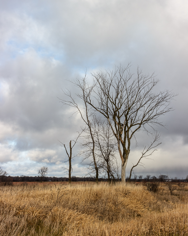
I would have to agree that the crop result in a much better crafted photo.
Manfred - Why I chose portrait orientation is difficult to answer. The simplistic answer is that landscape did not work. I was standing on the shoulder of a main road so camera right would show street lights, roadway and cars. Nothing very interesting on the left either. In reality it is more complicated than that.
The vast majority of my photos are landscapes. When I compose my shots, I look at both orientations and pick the one that works best which is usually the horizontal orientation. However, once in a while, I pick portrait without really knowing why. When I do, I usually end up with a photo that breaks "composition rules" and that have a lot of negative space but somehow appeal to me. This is one of those shots. Maybe someday I will figure out why they work for me.
Again thank you all for your comments. They make me a better photographer and more importantly make me think and this is why I like this forum.
Andre
-
5th December 2015, 07:17 PM #9

- Join Date
- Jan 2009
- Location
- South Devon, UK
- Posts
- 14,556
Re: Dreary Day
Yes that version looks good to me. Just what I had in mind.
Sometimes a 'landscape' scene shot in portrait format can work well, particularly when there is a tall main subject such as a tree. I often shoot the same scene in both options then decide which to keep when I see the results on my computer screen.
For me, negative space is very tricky to get working well. It can be effective but I prefer any negative space to be exactly that. Totally negative and not containing any distracting background items.
-
6th December 2015, 06:39 AM #10

- Join Date
- Feb 2012
- Location
- Texas
- Posts
- 6,956
- Real Name
- Ted
Re: Dreary Day
Perhaps our terminology is not quite right. The human tendency to classify in this instance implies that there are only 'portrait' and 'landscape' scenes with their separate rules, whereas it could be just called a rural scene where the main subjects are deciduous or dead trees - and 'portrait' or 'landscape' are simply terms defining the camera's orientation.
Not sure I expressed that thought particularly well . . . aieee, Corona !
-
6th December 2015, 10:36 AM #11
Re: Dreary Day
Indeed, and what utterly stupid words to use for that, given they already have other meanings!
Not that I'm having a go at you Ted, or Geoff - almost all of us do it, myself included.
Ubiquity strikes again.
We're not gonna change the world (ever, let alone overnight), but 'vertical format' and 'horizontal format' would be better used to describe the camera's orientation, although we mustn't forget 'square format'.
That leaves the words 'portrait' and 'landscape' free to describe the subject matter (alone), which is as it should be.
Of course, the problem is that the confusion/contradiction of statements like "a 'landscape' scene shot in portrait format" will only disappear after everyone has got used to the better way of describing camera orientation - and that's unlikely to happen.
Don't get me started, I feel an attack of GOM syndrome coming on (Grumpy Old Man)
Last edited by Dave Humphries; 6th December 2015 at 11:14 AM.
-
6th December 2015, 11:03 AM #12
-
7th December 2015, 09:39 AM #13
Re: Dreary Day
This is a wonderful photo, Andre, and I agree with all those who suggest cropping it. I would crop it harder with a 10 x 8 aspect ratio (width to height). I would retain the original width of the photo (retaining the foreground tree on the "third point") but vertically I would remove half of the foreground bushes and stop my crop just above end of the top branch of the tree.
-
7th December 2015, 05:03 PM #14


- Join Date
- Dec 2013
- Location
- Chesterfield, Missouri/Melbourne, Australia
- Posts
- 17,827
- Real Name
- Izzie
Re: Dreary Day
I call it PMS, Dave... men have them too...Don't get me started, I feel an attack of GOM syndrome coming on (Grumpy Old Man)

Anyway, moving on...I like the black and white conversion, Andre because it has more drama in it than the coloured version. who said you can't photograph anything on dreary days? I will have some on my post soon.
-
7th December 2015, 08:05 PM #15
Re: Dreary Day
-
7th December 2015, 08:28 PM #16
Re: Dreary Day
Ted and Dave.
I don't think that the confusion in my previous post is a problem of terminology. There are plenty of words in the English language that have many meanings. I can think of at least four different meanings for the word "school" for example (Not to mention that it isn't pronounced the way it is spelled!). The problem stems from me using different meanings of "landscape" or "portrait" without providing adequate context or qualifications for the reader to know which one I meant. My old English teacher is probably rolling over in his grave right now!
Andre
-
7th December 2015, 08:41 PM #17
Re: Dreary Day
Thank you Martin for your encouraging comment and cropping suggestions.
As Geoff pointed out earlier, that picture offers many possibilities. Is this crop that you suggested?
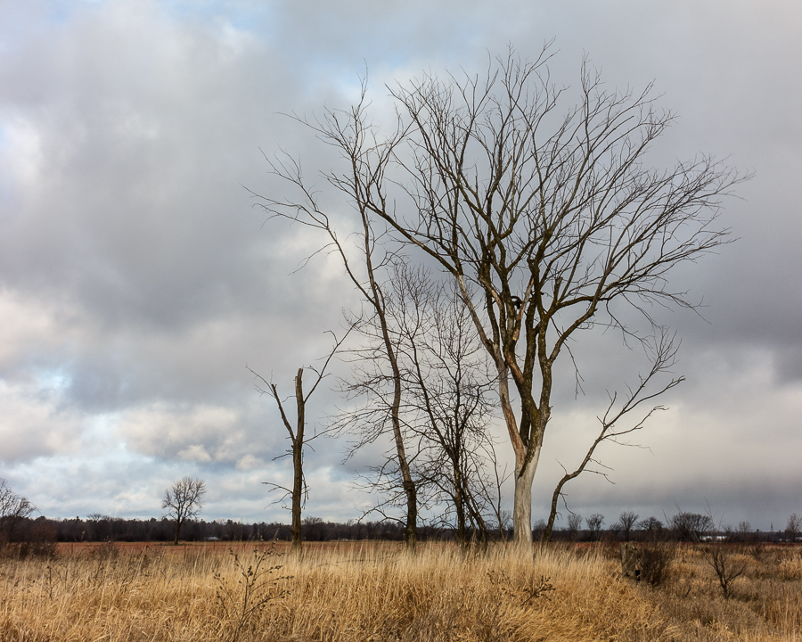
If so, it also works quite well.
As I mentioned to Geoff, I suspect that I will eventually settle on a crop between my original photo and the vertical 4:5 crop. The reason for doing so is that my original crop has too much sky but the more I crop, the more the tree dominates the scene.
Andre
-
7th December 2015, 08:47 PM #18
-
7th December 2015, 09:02 PM #19
-
8th December 2015, 12:30 PM #20

 Helpful Posts:

 Reply With Quote


