 Helpful Posts: 0
Results 1 to 9 of 9
Thread: Wind Surfing on Loch Lomond
-
27th July 2010, 12:09 PM #1Moderator


- Join Date
- Feb 2009
- Location
- Glenfarg, Scotland
- Posts
- 21,402
- Real Name
- Just add 'MacKenzie'
Wind Surfing on Loch Lomond
-
27th July 2010, 02:12 PM #2
Re: Wind Surfing on Loch Lomond
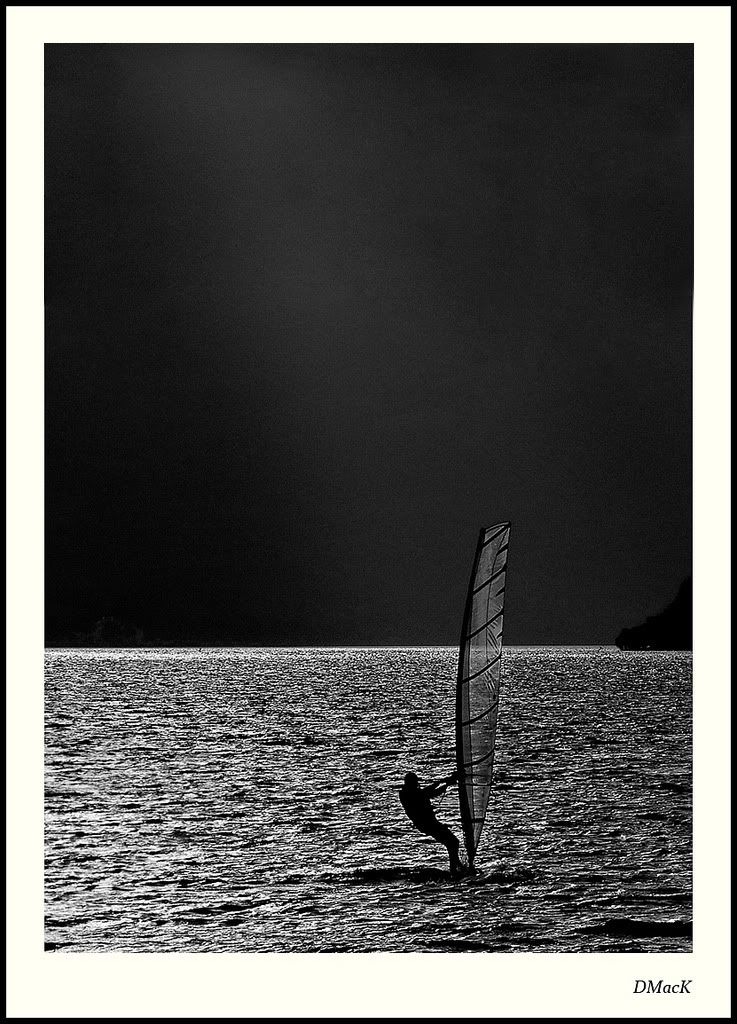
Top one is brill.

-
27th July 2010, 10:56 PM #3
Re: Wind Surfing on Loch Lomond
Very nice, especially the b & w format.
-
28th July 2010, 05:11 AM #4
Re: Wind Surfing on Loch Lomond
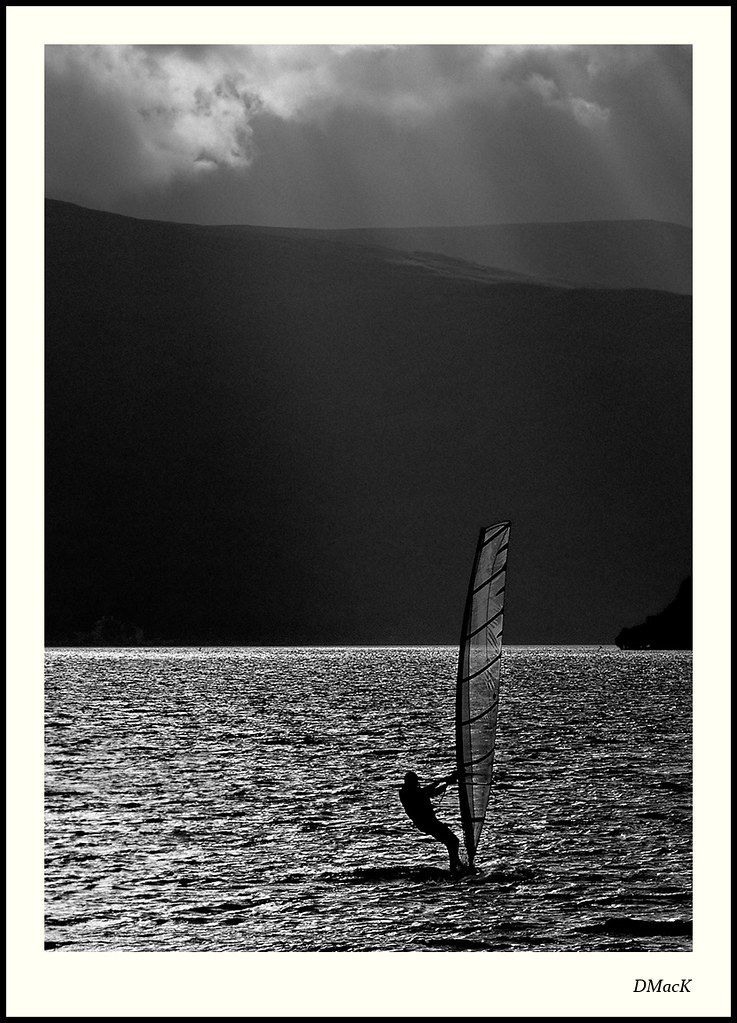
excellent, Donald. These guys look as though they are walking on water. Especially like the second one - pure and perfect.
-
28th July 2010, 04:51 PM #5
Re: Wind Surfing on Loch Lomond
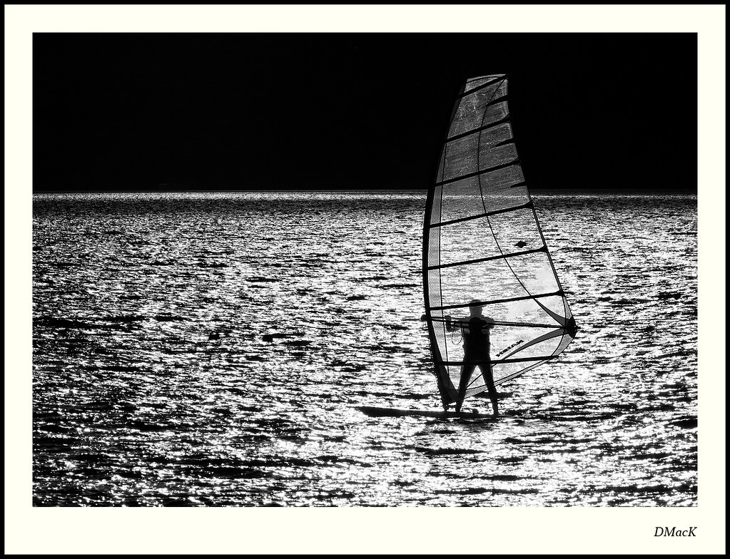
They looks awesome. I love the bottom one.
-
28th July 2010, 06:45 PM #6
Re: Wind Surfing on Loch Lomond
These are very very good, Donald. I absolutely love them.
I really like the exposure which creates these beautiful silhouettes and the deep contrast in the water.
About the top one: As much as I like the clouds and the sun peeking trough it, I feel like they are too far apart to support each other.
What I really would like to see is the top one with the clouds cut of but with a lot of open (black) space at the top, So that you stil have the sunlight over the black mountains but no clouds above it.
Edit:
I did a quick photoshop adaptation. What do you think? (I hope you don't mind me doing this)

The more I look at them the more I don't know about it. Like written before they are quite separated but I don't know if that's that bad at all. And nonetheless the clouds with the sun peeking through it are just beautiful anyway. Maybe that shouldn't be cut of at the first place because of that.Last edited by JK6065; 28th July 2010 at 07:07 PM.
-
28th July 2010, 06:57 PM #7Moderator


- Join Date
- Feb 2009
- Location
- Glenfarg, Scotland
- Posts
- 21,402
- Real Name
- Just add 'MacKenzie'
Re: Wind Surfing on Loch Lomond
Thank you for your comments. Jeroen - I hadn't seen the option that you suggest. I like it. I will redo a version in line with your idea.
EDIT - I see you've done one. That does give it a very different feel. I'll be interested to see if other members come in with some comment on this.Last edited by Donald; 28th July 2010 at 07:16 PM.
-
29th July 2010, 04:59 AM #8
Re: Wind Surfing on Loch Lomond
Donald, I think Jeroen's edit sums up why I liked the second image more than the first - too much info in an image that looked as though it needed less. Now, I really can't decide - they both have tremendous impact.
-
29th July 2010, 07:58 AM #9


 Reply With Quote
