
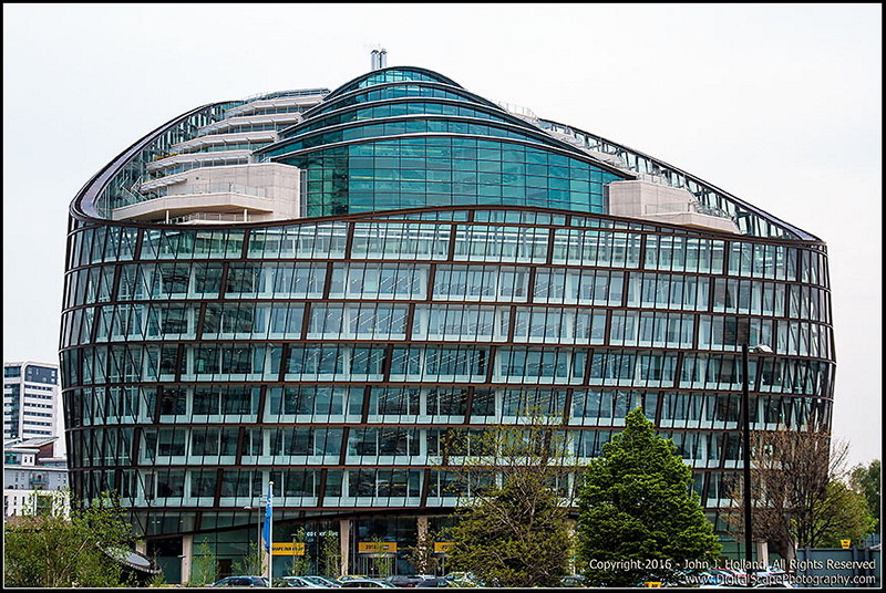
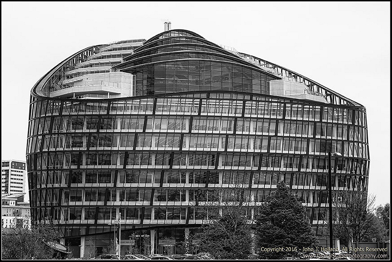
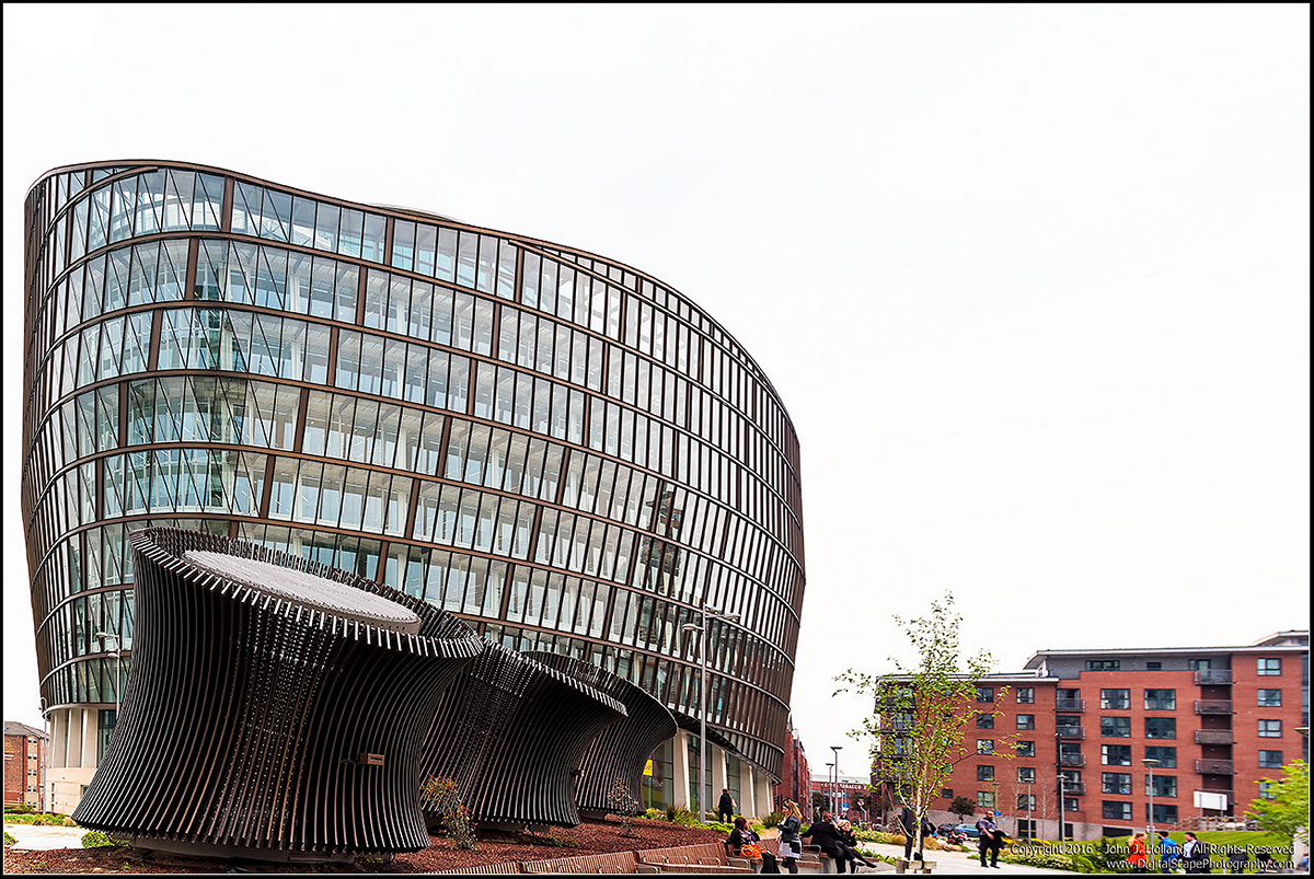
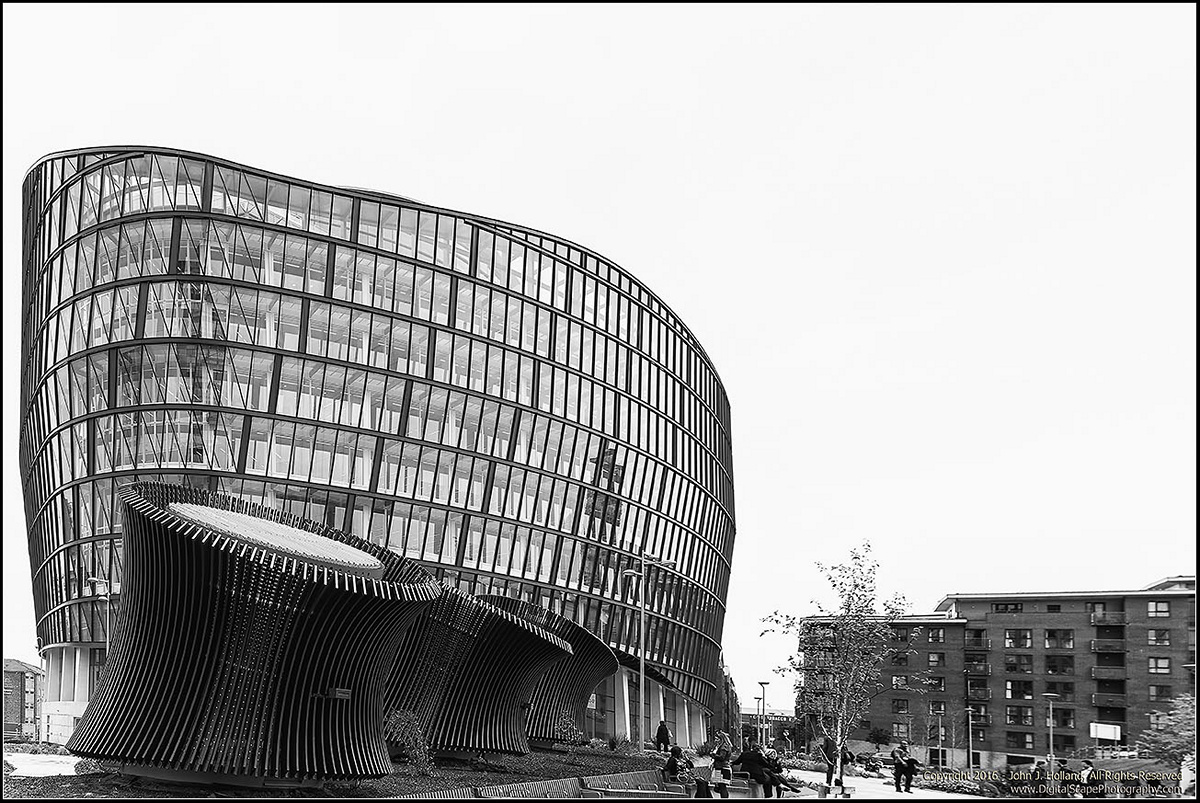
The Co-Operative Building in Manchester. Wandering about Manchester, I came up on this building (the Co-Op) that had a unique architectural style. So I tried a few different angles on it, and since the shy was not going to cooperate (overcast -- until the end of the day), I did some B&W conversions of the images.
Head on from across the street:
A bit closer - along the path to the front of the building (a 4 image composition)
 Helpful Posts: 0
Results 1 to 8 of 8
Thread: The Co-Op
-
2nd June 2016, 08:38 PM #1


- Join Date
- Feb 2014
- Location
- Plano, Texas (USA)
- Posts
- 420
- Real Name
- John
The Co-Op
-
2nd June 2016, 08:49 PM #2
- Join Date
- May 2012
- Location
- northern Virginia suburb of Washington, DC
- Posts
- 19,064
Re: The Co-Op
What an interesting building so very nicely captured. My vote goes strongly for the first one because the color is such an integral part of the design and because of the preferred composition.
Considering that the building is a co-op, it seems unreasonable to me that anything, including the sky, would be uncooperative.
-
2nd June 2016, 11:18 PM #3

- Join Date
- Dec 2009
- Location
- WNY
- Posts
- 36,716
- Real Name
- John
Re: The Co-Op
Nice, 3 and 4 makes the structure seem in danger of toppling over onto the building and gawkers.
-
2nd June 2016, 11:28 PM #4Moderator

- Join Date
- Mar 2012
- Location
- Ottawa, Canada
- Posts
- 22,257
- Real Name
- Manfred Mueller
Re: The Co-Op
Interesting images of an interesting building. When I look at the first image, it almost looks like the building has a roller-coaster track installed...

My only thoughts on the composition is that you've done a very, very tight crop on both sides of the first two images and on the left hand side of the third and fourth one. I suspect a bit more space would probably give a less cramped feel to the images.
-
3rd June 2016, 06:59 AM #5

- Join Date
- Dec 2013
- Location
- Chesterfield, Missouri/Melbourne, Australia
- Posts
- 17,827
- Real Name
- Izzie
Re: The Co-Op
I like the first and second one -- they are the same, aren't they? -- but I think it needs a little bit of perspective straightening to the left side. On the second and third, I prefer the coloured version.
-
3rd June 2016, 10:01 AM #6
- Join Date
- Oct 2015
- Location
- SE Queensland
- Posts
- 679
- Real Name
- Richard
Re: The Co-Op
A really interesting building. I prefer the colour images, they fit a modern building better IMHO. I would delete the leaning tower on the left though.
-
3rd June 2016, 04:15 PM #7
- Join Date
- Dec 2013
- Location
- Turkey
- Posts
- 12,779
- Real Name
- Binnur
Re: The Co-Op
Very interesting shaped buildings indeed, I like the color images
-
3rd June 2016, 07:13 PM #8
- Join Date
- Feb 2014
- Location
- Plano, Texas (USA)
- Posts
- 420
- Real Name
- John
Re: The Co-Op
Thank you everyone for your comments and feedback.

 Reply With Quote