Hi all,
I have, for quite a while, fancied doing a "band shoot", well, I unexpectedly got the chance a couple of weekends ago, my Sunday at the White Waltham Wings, Wheels and Steam show.
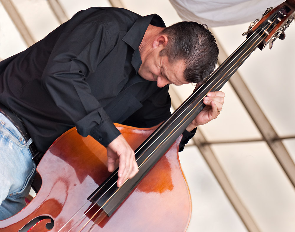
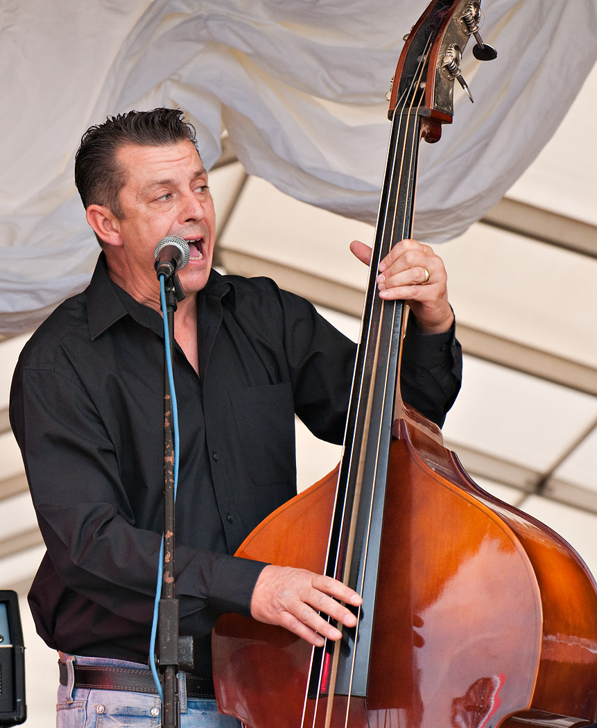
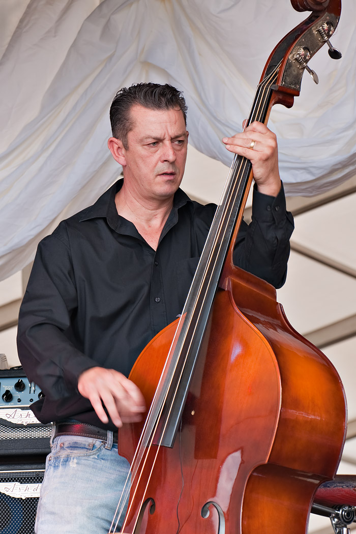
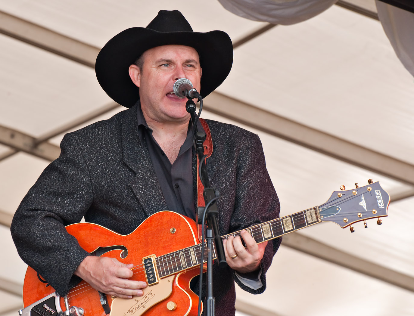
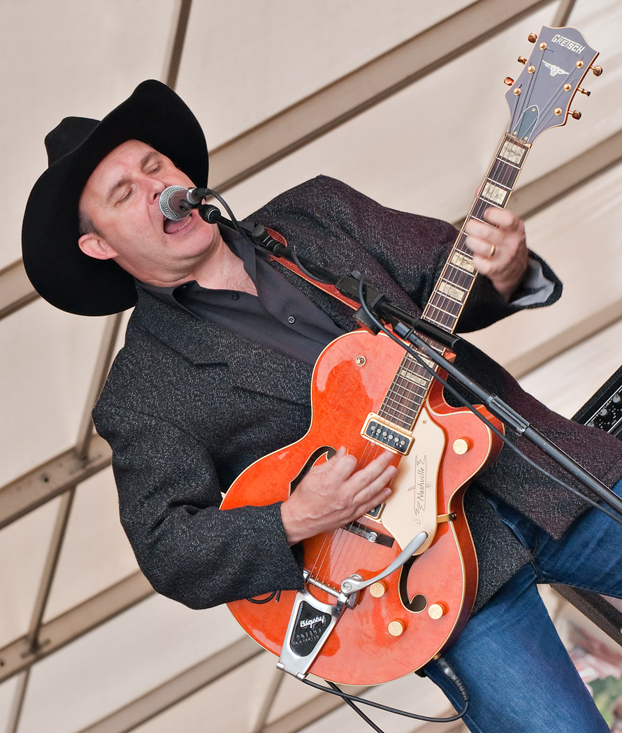
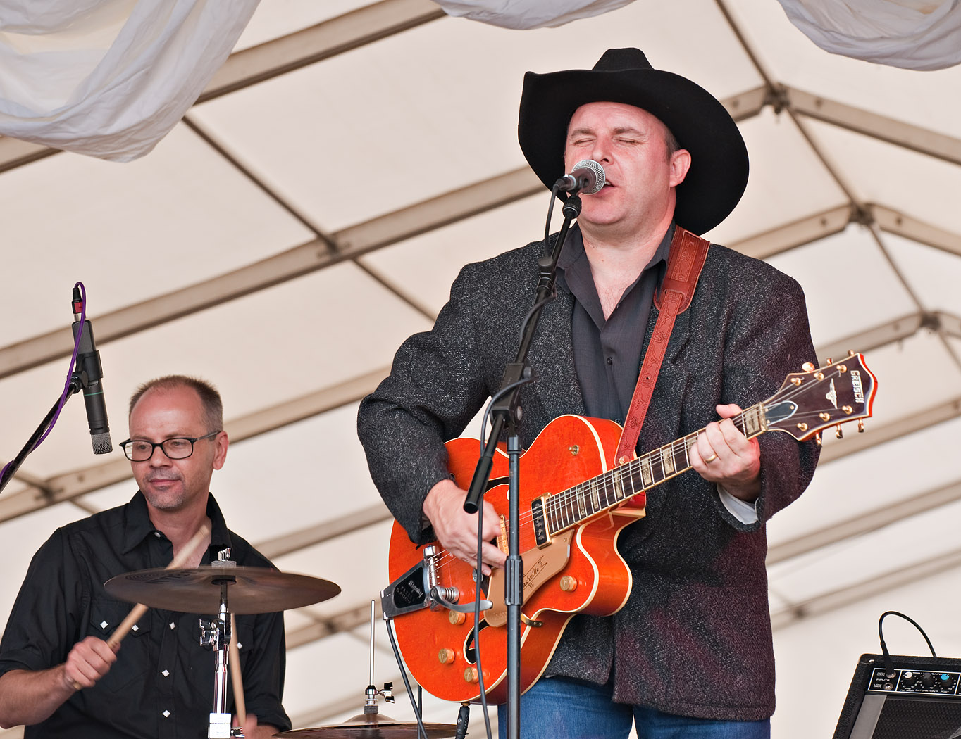
The band playing when I passed the marque was a "Rockability" a 3 piece, from S.E. England called Hot Doggin'.
A fairly successful shoot I thinkusing the Nikon 70-300mm f3.5-5.6 lens with VR - it was on the D5000
I was fortunate to be able to sit on the grass in front of the stage and move around a bit for good angles without spoiling other's views or enjoyment (I hope). I tried a variety of shots, apertures, focal lengths, shutter speeds, etc. anyway, enough waffle, on to the pictures. They are posted larger than 700px, so do hit 'F11' and click the images to use the lytebox as big as possible.
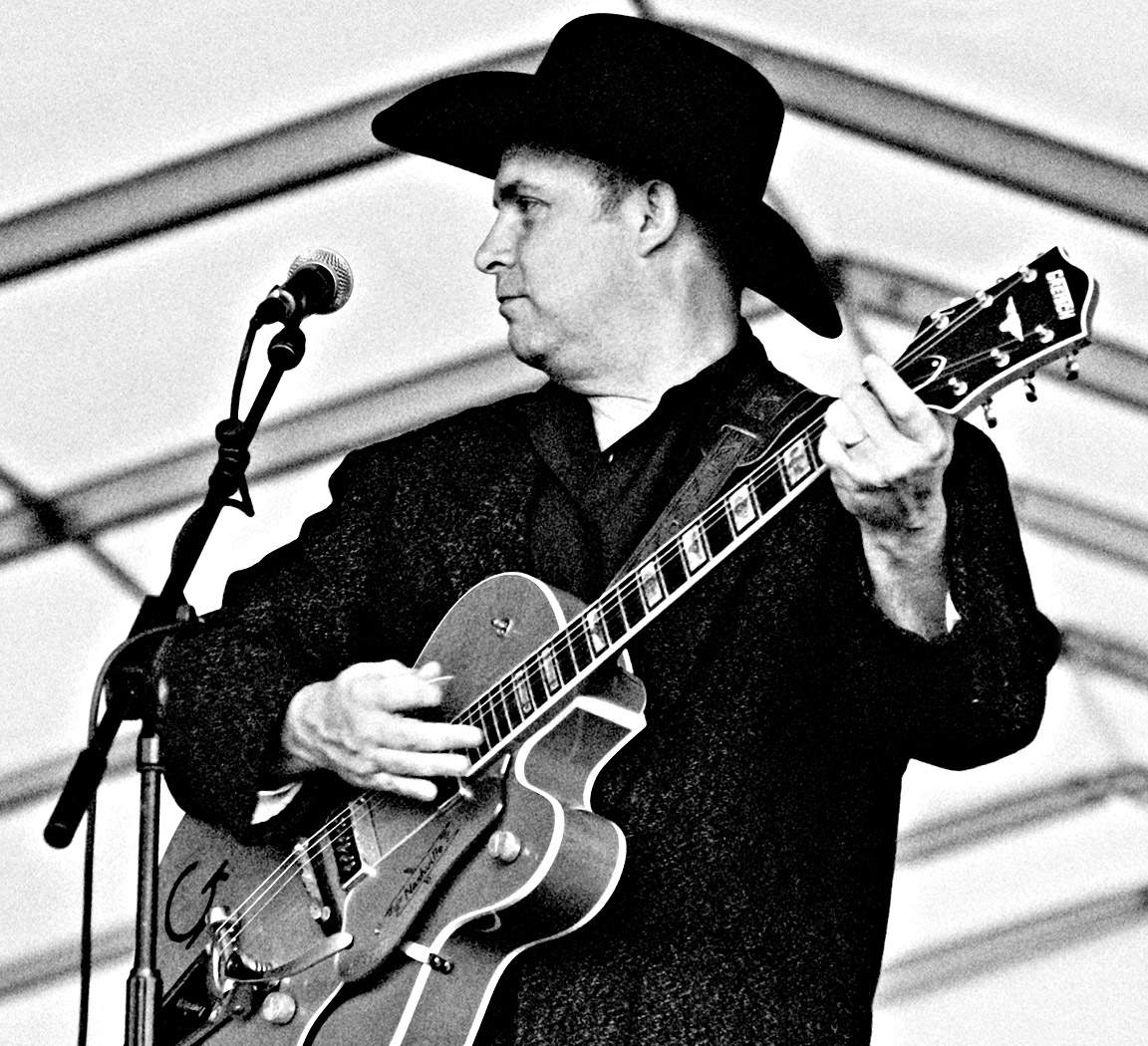
#1 (29108)
1/250s f/8 at 110mm iso800 EC +1 (Shot replaced due to feedback below - thanks Jim)
#2 (29237)
1/180s f/6.7 at 122mm iso200 EC +0.5
#3 (29274)
1/180s f/6.7 at 180mm iso400 EC +0.5
#4 (29187)
1/350s f/4.8 at 112mm iso200 EC +0.5
#5 (29139)
1/500s f/8 at 140mm iso800 EC +0.5
#6 (29261)
1/90s f/6.7 at 125mm iso200 EC +0.5
#7 (29118)
1/250s f/8 at 165mm iso800 EC +1
#8 (29218)
1/90s f/6.7 at 270mm iso200 EC +0.5
#9 (29240)
1/180s f/6.7 at 145mm iso200 EC +0.5
#10 (29107)
1/350s f/8 at 110mm iso800 EC +1
#11 (29205)
1/180s f/4.8 at 125mm iso200 EC +0.5
Sure, there are some aspects of many of these I wish were a little different, but I learnt a lot.
Lessons for next time (learn from my mistakes):
a) Spot meter on faces to get (hopefully) more consistent exposures
b) Shoot the WhiBal card (I did apply the same WB to all shots here in PP)
c) Focus on hands/instruments for some shots
d) Try angles when shooting (rather than in PP)
I'd be really grateful for your views and suggestions, particularly the composition/cropping, etc. - posting images at wacky angles is well outside my comfort zoneAlso; although I was aiming for a bit of hand (or string) movement in the shots, have I overdone it in any? Many thanks.
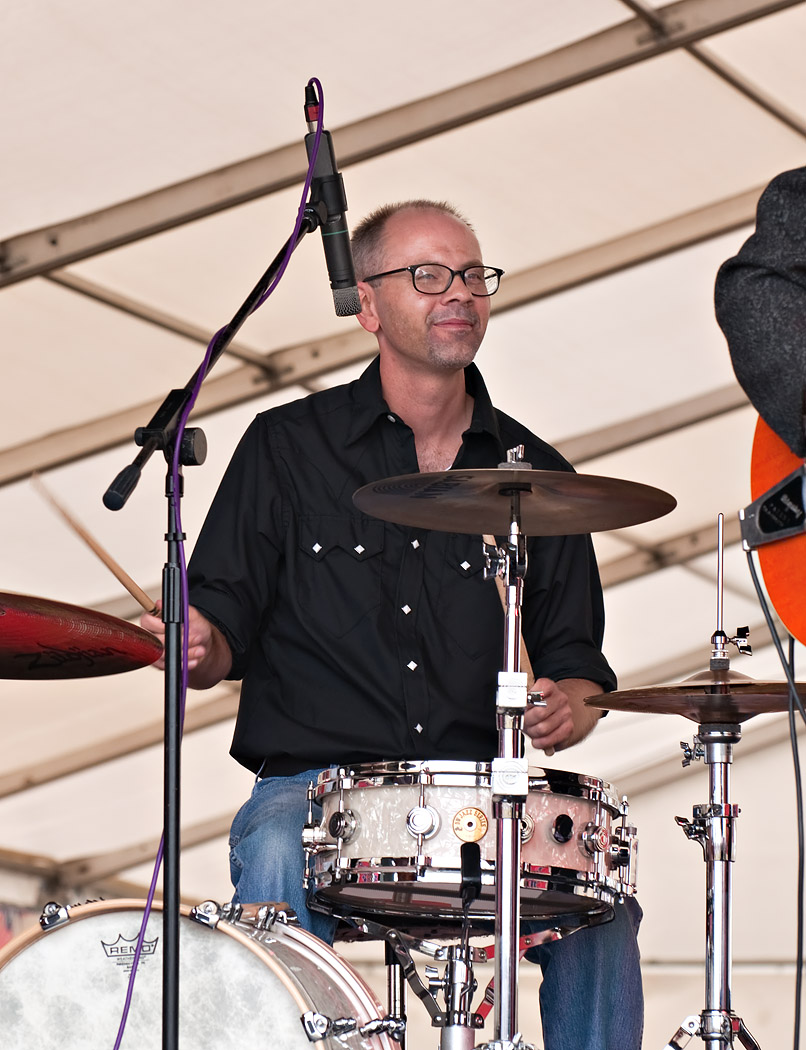
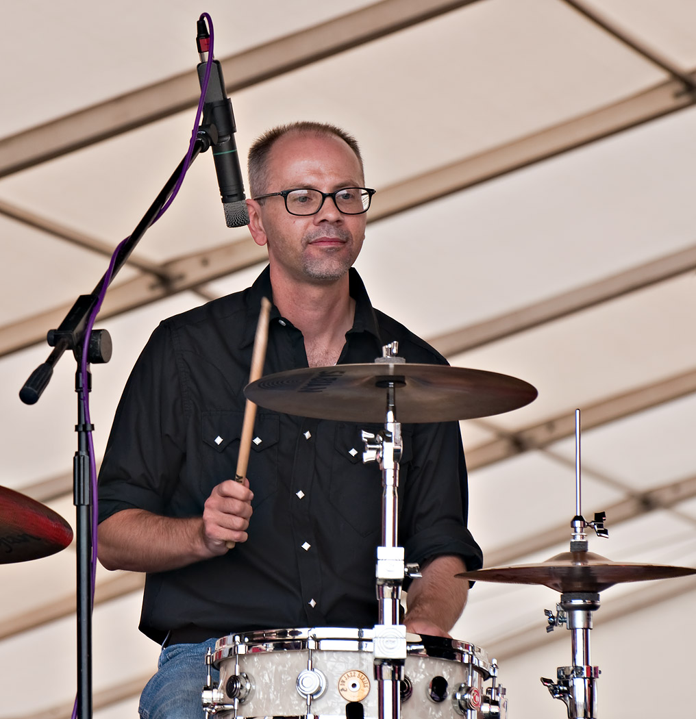
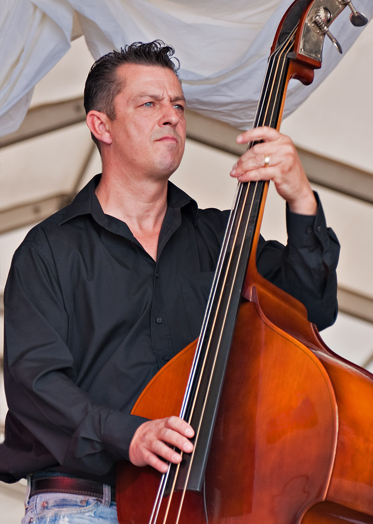
Each shot has had about 1/2 hours worth PP to 'make the most of it' usually by cloning away distractions where I couldn't get a clear shot at capture time. That bass player had an annoying bit of paper taped to it which was in all his shots, but he does have a photogenic stage presence. Having looked at their website, MySpace and FB; they might like a few pics, but I think this drummer was a stand-in though.
I have more shots, but they're pretty similar to the above, so I won't bore y'all with them! (for anyone that has made it this far)
 Helpful Posts: 0
Results 1 to 20 of 33
-
28th August 2010, 02:18 PM #1
Dave shoots band at White Waltham
Last edited by Dave Humphries; 30th August 2010 at 07:47 PM. Reason: Change thread title, seemed to be putting people off
-
28th August 2010, 02:29 PM #2
Re: Hot Doggin' at White Waltham 2010
Nice series Dave and I like your cropping. As to wacky angles ... that's something worth a try.
The muso's look a bit serious ... maybe you should carry the 'spirit bottle' to cheer them up before clicking
Was this at WW airfield 'cause if so, its the place I used to visit as a boy (a long time ago ...) before emigrating down-under. Used to be RAF as I recall.
-
28th August 2010, 02:34 PM #3
-
28th August 2010, 02:48 PM #4
Re: Hot Doggin' at White Waltham 2010
Hi Dave,
Very nice series! Exposures are spot on.I like the angles also.I really like #1,but it looks a little flat.I had a play with it,set black point a little deeper and added slight vibrancy.Give it a try,I think you'll notice a bit more "punch" in the image.
-
28th August 2010, 04:46 PM #5

- Join Date
- Mar 2009
- Posts
- 2,522
Re: Hot Doggin' at White Waltham 2010
Dave, you old rock-a-billy rebel you. Nice y'all got to set awhile. The exposures are spot on as mentioned above and I like the idea of spot metering off the faces. It is certainly a lesson when you are getting blacks and whites so well defined. The tight crops do not bother me one bit. No 3 is my favorite of the bunch with No 4 a very close second (good composition). I must admit my first thought with a set like this would be b/w conversion. Nice and gritty with some film grain added and the contrast touching the red line.
I am always slightly amused by this type of band. If you close your eyes the sound is authentic enough but when you open your eyes there are several blokes all trying to sell you a photocopier. At least there are no pony tails. I got rid of mine when I was 36....and that was way too late
Steve
-
28th August 2010, 07:27 PM #6
Re: Hot Doggin' at White Waltham 2010
Hi Jim, Thanks for the feedback, how is this (a bit more pop) ?
#1a (29108)

1/250s f/8 at 110mm iso800 EC +1
Also I have now made it the same size as the others (1050 high) - I started with this one last night so was obviously not fully in tune to the series, that sounds like another lesson learnt - first practice PP on one or two that aren't really intended to be used.
The exposures through the series took a little extra effort in PP, some needed the odd 1/2 a stop (either more or less), good to know it paid off.
Thanks,
-
28th August 2010, 07:35 PM #7
-
28th August 2010, 08:02 PM #8
Re: Hot Doggin' at White Waltham 2010
Looks good,Dave.
Last 2 are really nice also.I like the the string motion on the standup bass shots.
-
28th August 2010, 08:50 PM #9
Re: Hot Doggin' at White Waltham 2010
-
29th August 2010, 06:23 PM #10

- Join Date
- Mar 2009
- Posts
- 2,522
Re: Hot Doggin' at White Waltham 2010
That would be the crack and special brew...I think they were enjoying themselves
Dave, you have done a cracking job of the conversion. Very newsprint and authentic. What did you use to get the film grain? I usually use a GIMP script but it does not seem to reach to this grittiness.
Cheers
Steve
-
29th August 2010, 07:57 PM #11
Re: Dave shoots band at White Waltham
Thanks Steve,
I use Elements; it has lots of filters (never used 'em before), I think this was Film Grain (or Grain), with 'Clumpy' selected to get bigger lumps.
Due to my inexperience, this put coloured clumpy noise all over my nice mono
 so I had to monochrome it again, then did 'silly things' with USM to get it really contrasty and grainy looking.
I still wasn't sure this was enough grain, but it was visible after downsizing, so I stuck it up for opinions.
It has come out OK really, I'm fairly pleased with it as a first attempt, although to my mind, the modern roof beams spoil the 'classic look'.
Thanks for giving me the nudge,Last edited by Dave Humphries; 30th August 2010 at 07:26 PM. Reason: Change thread title, seemed to be putting people off
-
14th September 2010, 08:48 PM #12
Re: Dave shoots band at White Waltham
Very nice set of images. Well done !

I appreciate the sharpness, the color precision as well as the moments
-
14th September 2010, 10:18 PM #13
Re: Dave shoots band at White Waltham
Thanks Antonio,
I appreciate your comments, the moments were chosen from lots of shots, so there had to be some good ones in the mix
This series represents a couple of "firsts" for me; first time I'd shot a band and the first time I had got an acceptable WB and applied it to a whole series. I am always refining my PP techniques and now just about to land myself where you are, learning CS5!
Thanks again,
-
14th September 2010, 10:23 PM #14
-
15th September 2010, 03:57 PM #15
Re: Dave shoots band at White Waltham
Very nice Dave! Bands are fun to shoot but it can be hard work to keep moving and fing the right angles and look for the right expressions, etc. You did a good job.
Chuck
-
16th September 2010, 09:06 PM #16

- Join Date
- Oct 2009
- Location
- Maryland, USA
- Posts
- 1,015
- Real Name
- Rick
Re: Dave shoots band at White Waltham
Great series, Dave. The crops are fine, as far as I'm concerned. I think some of your problem with contrast and "pop" is light: it's very flat light, diffused from (I take it) overhead, which of course tends to flatten things. Not much you can do about that, unless you want to go strobist on us. D5000 will remotely trigger a Speedlight, right? Put one on a stand.

The compositions are pretty good, I think, except that the drummer appears to have that "I can't move my head" style. Some drummers are apparently taught, or decide themselves, that they should keep their bodies and heads still while their hands move. I'm a drummer, but I have no idea why some people do this. This guy appears especially stiff, but if you say he's a fill-in, maybe he's just trying to concentrate.
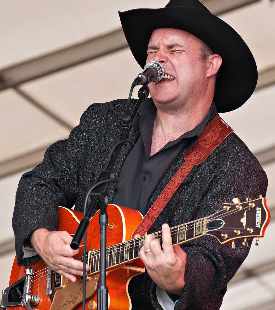
I love 3 & 4. The guitar player in 1 is great: I might crop out the drummer. 5 doesn't work for me, I think because it's ambiguous whether he's looking at the neck or off into the distance: I don't know where he's looking, so what's the shot about? 6, 7, 11, and everything with the drummer look as if no one's having fun: 11 almost looks pensive, but doesn't quite make it. 8 is a nice shot, but not much to grab attention, to be honest. The reflections are too muted, and the action on the guitar isn't anything special: better at a slower shutter speed, maybe, to show some blur? 10 is a nice treatment, but not a good pose, looking down.
I like the two you added as happier - much more energy there. And I love the B&W: it looks like something from the 1948 Nashville Gazette, if there is such a thing.
Cheers,
Rick
-
16th September 2010, 09:35 PM #17
Re: Dave shoots band at White Waltham
Hi Chuck,
Thanks for the kind words.
In hindsight, I do wish I had moved around a bit more, but I was concious of me being between most of the audience and the band and I didn't want to block their view, nor make a spectacle of myself in moving - stiff joints, weighty rucksack on back, etc. The choices were struggling to get up, moving and sitting down again or "chimpanzee style" on all fours - you can just picture it, eh?


Cheers,
-
16th September 2010, 09:49 PM #18
Re: Dave shoots band at White Waltham
Hi Rick,
Thanks for taking the time to give me such a detailed review, I put this up beside the pics (in another tab) so I could switch between and I can see what you mean about most things. Some of your suggestions I probably have alternate shots for anyway, I might look these out - I am amazed I managed to select such a 'static' one for #8, I have some with more movement.
I'll have to have another go (at a band shoot I mean), just not sure when I'll get an opportunity though. I went to another country fayre a couple of weeks later and their 3-4 piece was in a tiny, dull and dingy tent (hardly big enough to call it a marque) and they were so dimly lit, I didn't even try.
Thanks again,
-
18th September 2010, 08:20 AM #19
Re: Dave shoots band at White Waltham
Hi again Rick,
I just discovered the reason, every close up shot I have of the guitar with any movement in, has one hand or the other hidden by the microphone stand, or with the mic stand going right up through the middle of shot - another lesson learnt, forgotten and re-learnt
The other thing I found going back through these is the guitarist rarely smiles while playing; e.g. only when he's talking between the songs and obviously those shots lack the 'dynamic' of the music.
In fact the microphones and their stands account for a large proportion of the unusable shots by getting in the way or obscuring bits of faces at just the wrong moment and that was after I'd got quite close to lessen the problem (or so I thought).
Cheers,Last edited by Dave Humphries; 18th September 2010 at 08:33 AM.
-
18th September 2010, 12:31 PM #20
Re: Dave shoots band at White Waltham
I think this will be the last decent shot from the series, another mono.
#15 (29127)
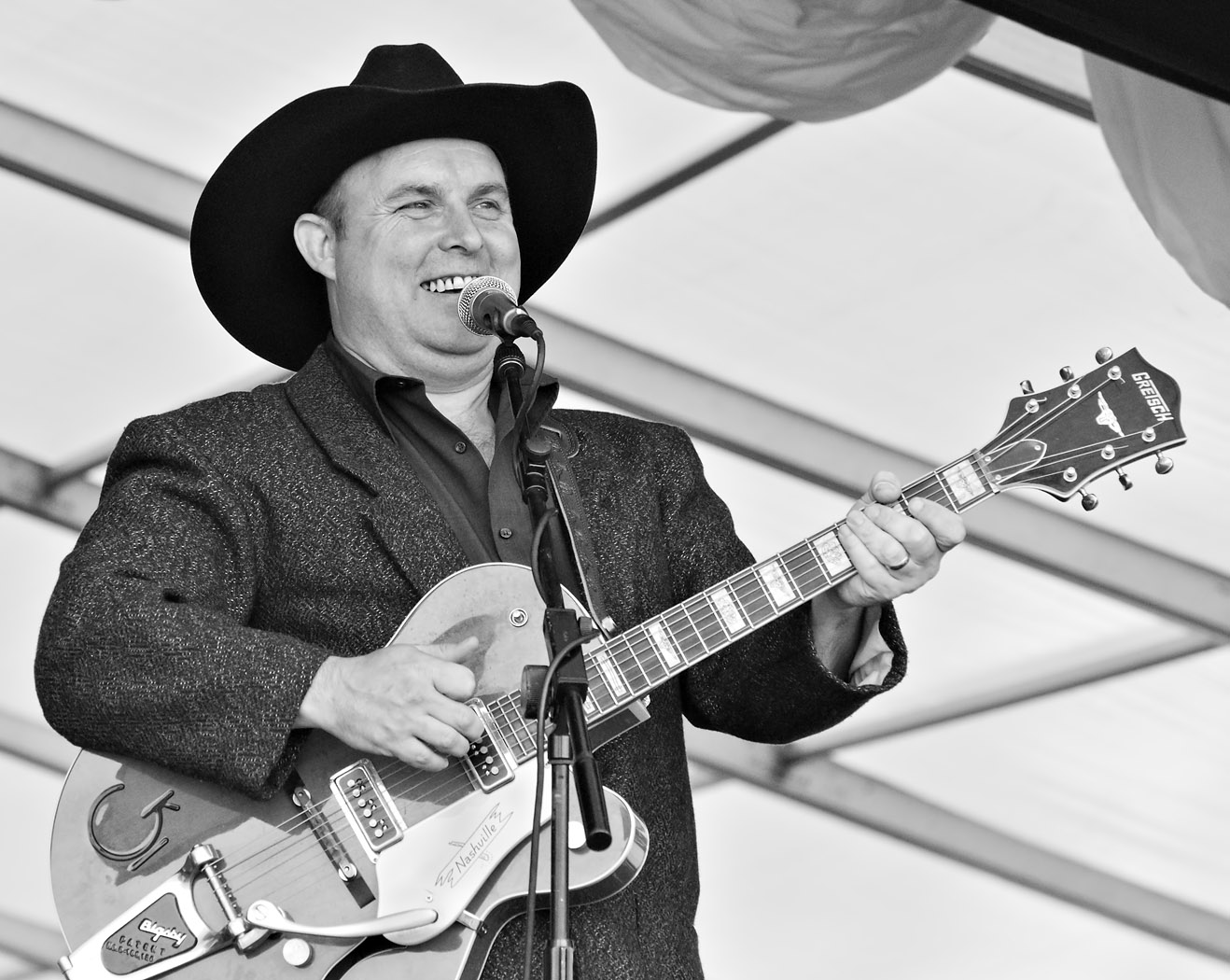
Nikon D5000 + Nikon 70-300mm VR: 1/750s f/8 at 165mm iso800
F11 and click image to see 1050 high
First go at something CS5
(including the mono conversion in ACR)
I am awaiting delivery of 2 books to help
C&C welcome, thanks,



 Reply With Quote

 )
)