Dear All,
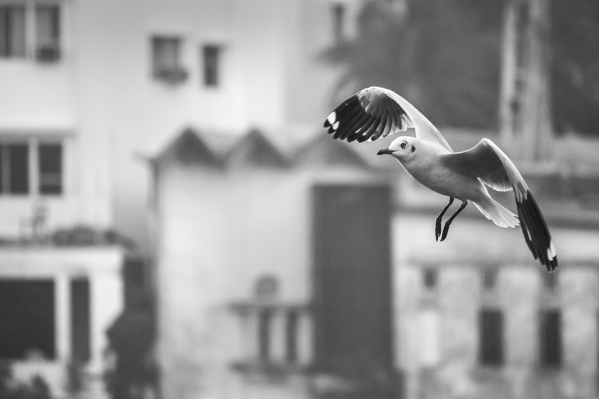
Kindly give your feedback on my below images on suitability for the theme - Nature & Development, where the photograph could illustrate that nature and development can co-exist.
Regards,
Tejal
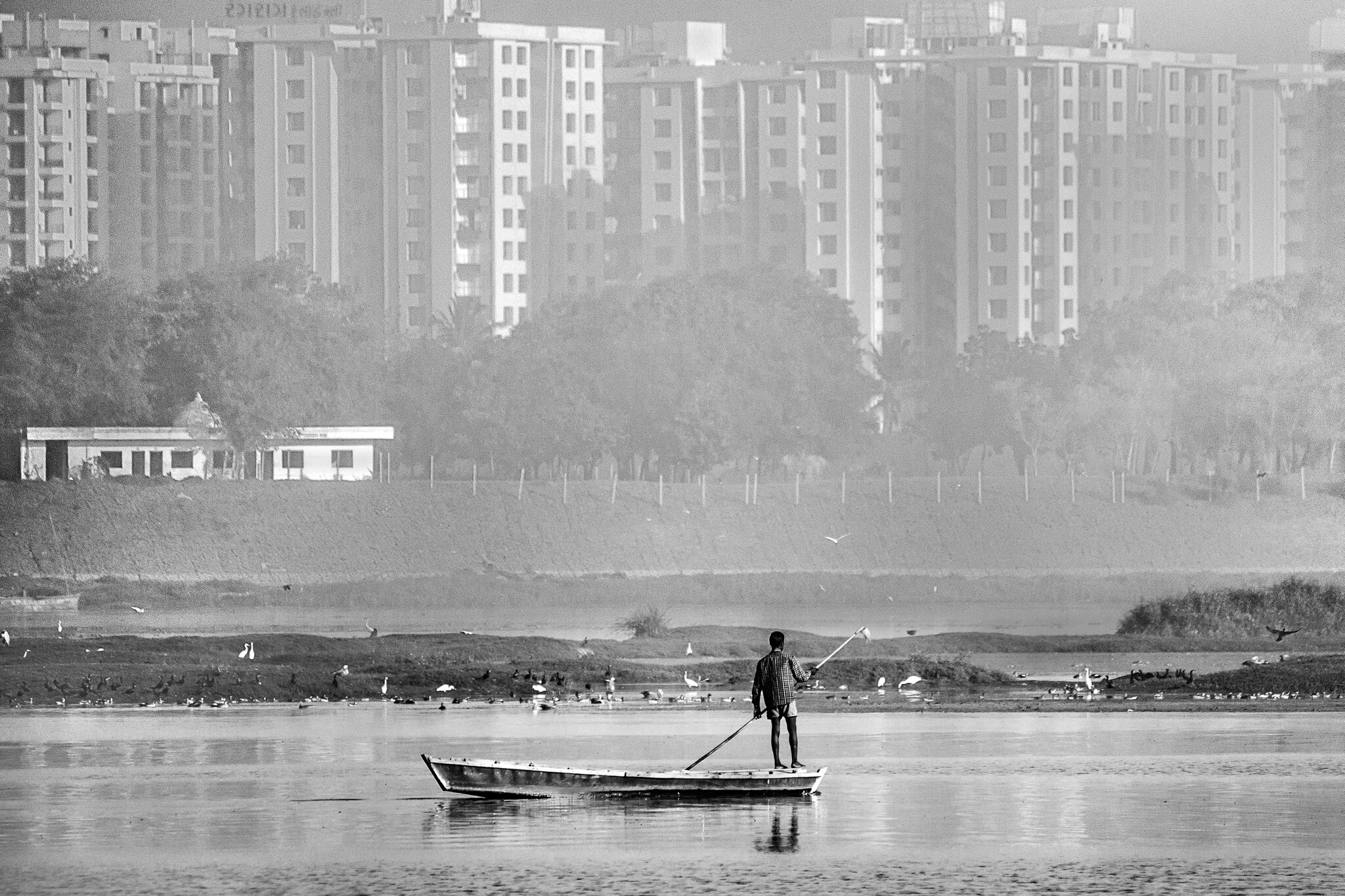
Untitled-5 by Tejal Imagination, on Flickr
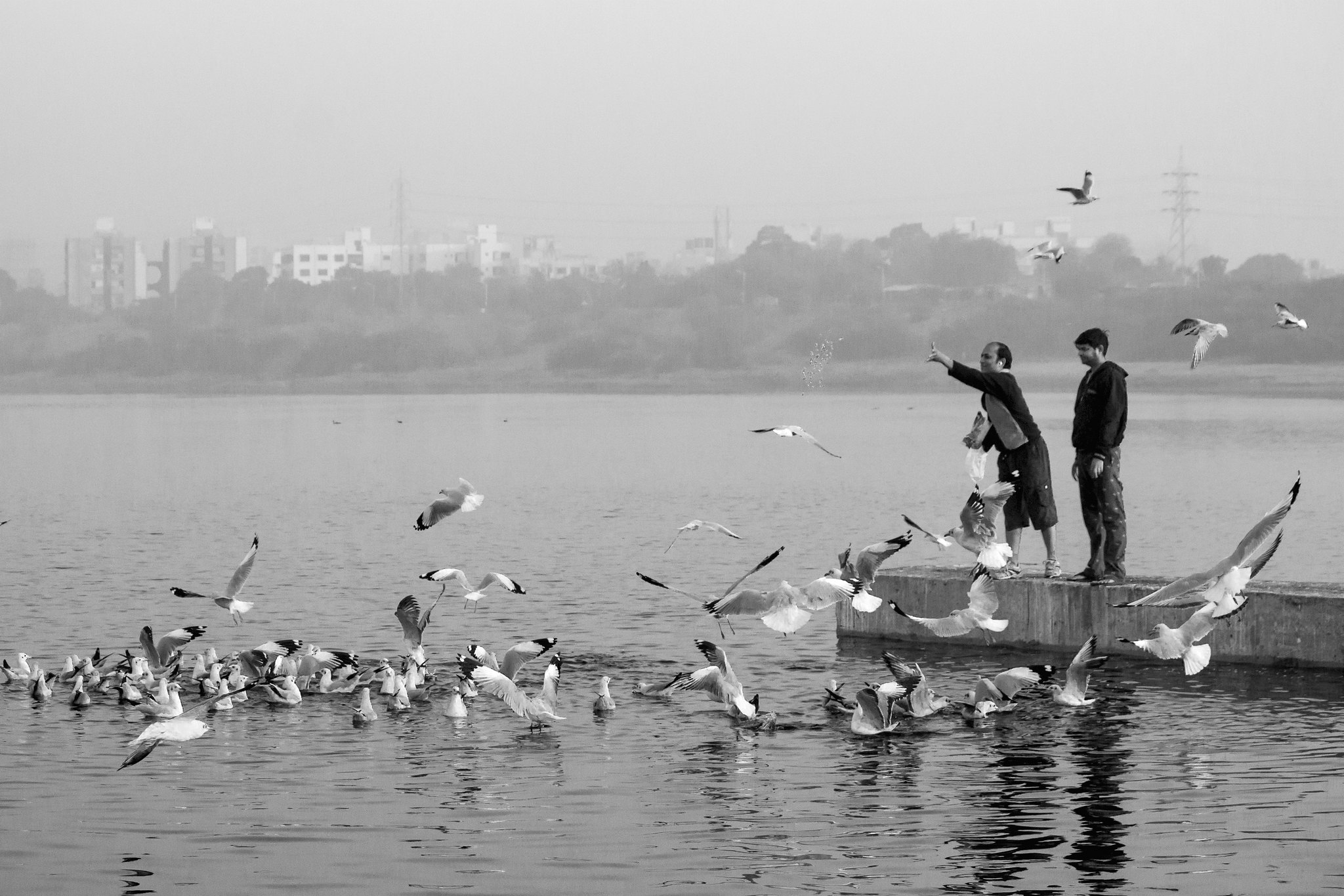
Untitled-4 by Tejal Imagination, on Flickr
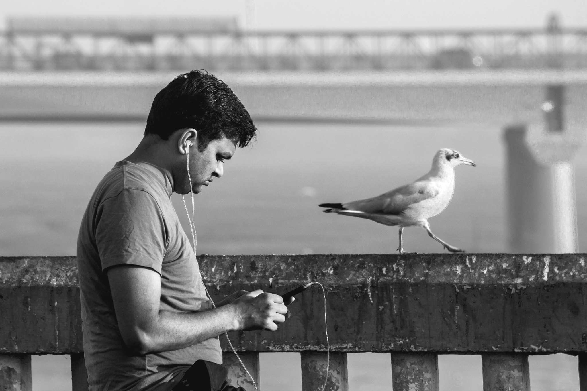
Untitled-3 by Tejal Imagination, on Flickr
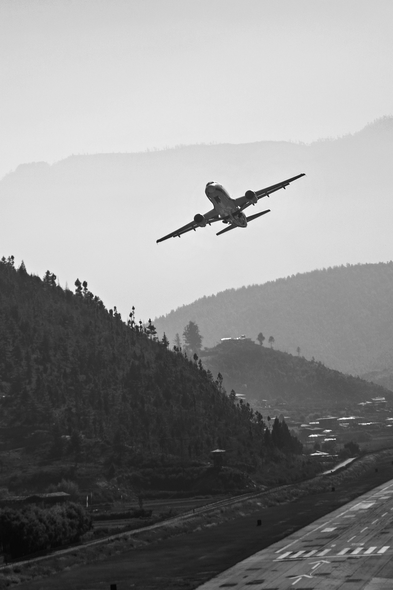
Untitled-2 by Tejal Imagination, on Flickr
Untitled-1 by Tejal Imagination, on Flickr
Results 1 to 7 of 7
-
30th July 2016, 07:29 AM #1
Nature & Development (B&W) - C&C are welcome
-
30th July 2016, 09:33 AM #2
Re: Nature & Development (B&W) - C&C are welcome
Nature and development can coexist, sometimes it has too; but it's not always favorable. For instance, I cringe every time I see someone feeding birds, not only does it bring them dangerously close to others; it affects their (the birds) behavior as well. So perhaps nature and development can't coexist; unless we just do our thing and let them do theirs. Or perhaps we should take more time to see how our development affects other species. Untitled #4 and Imagination both give me cause to cringe, one as I think I'll get pooped on and the other as I think it'll crash into me.
 Nice series.
-
30th July 2016, 09:59 AM #3

- Join Date
- May 2014
- Location
- amsterdam, netherlands
- Posts
- 3,182
- Real Name
- George
Re: Nature & Development (B&W) - C&C are welcome
I didn't react on this and former thread because I'm not sure I understood the word development right.
To my knowledge development is a dynamic process with a beginning and an end. What I see is more human activity in some way.
No problem with the photo's. I like them.
George
-
30th July 2016, 11:52 AM #4
-
30th July 2016, 11:52 AM #5
-
30th July 2016, 02:12 PM #6
Re: Nature & Development (B&W) - C&C are welcome
Hi Tejal,
Now, the pictures in this thread immediately struck me as fitting the theme far better than those in the Colour thread.
In the first (5) the development is plain to see, as is the wildlife. I'd be really picky if I were to suggest that I wonder if there was a better combination of the main elements in the scene. Arguably (i.e. not everyone will agree with me), the white building isn't really necessary and its tone and contrast, being much closer, attracts undue attention to it. I also wondered if it might have been possible to shoot just before the boat had passed half way across the frame? Apart from that, it works for me.
The second (4), works least well for me, perhaps because the entire scene is basically the result of development; concrete jetty and folks feeding birds (although I guess you could say that human is interacting in a positive way with wildlife), plus the high rise building in the city behind.
Possibly my favourite is the third (3) due to the correlation of behaviour between human with smart phone and music and the striding gull
The parallel arrangement of bridges near and far also work well.
In the fourth (2), I think I have seen YouTube videos of 'hairy' landings at that airport, so I may be more familiar with the landscape than this shot alone imparts. Good compositional arrangement of layers of receding depth.
The fifth is another one that, for me, there isn't much nature visible, since the gulls colonise urban (aka developed) environments all too quickly. It is a good composition though and satisfactory conversion (as they all are).
HTH, Dave
-
30th July 2016, 03:38 PM #7

 Helpful Posts:

 Reply With Quote
