 Helpful Posts: 0
Results 1 to 6 of 6
Thread: Happening
-
24th August 2016, 11:01 AM #1

- Join Date
- Sep 2012
- Location
- San Antonio, Texas
- Posts
- 1,749
- Real Name
- Sergio
Happening
-
24th August 2016, 07:09 PM #2
Re: Happening
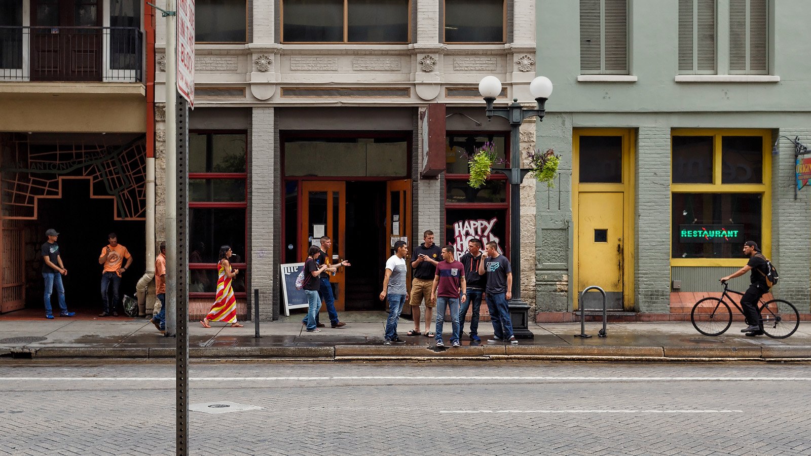
I like this Sergio, it's an interesting scene. I'd consider a more widescreen crop and I would also try cropping so that the foreground sign is cropped out - you'd lose a couple of interesting characters but it would de clutter the left side.
-
24th August 2016, 07:56 PM #3
Re: Happening
Very nice Sergio, remove the bottom line to the white continuous line, this will have more impact as people will appear bigger.
-
24th August 2016, 10:24 PM #4
-
25th August 2016, 12:21 AM #5

- Join Date
- Nov 2012
- Location
- Australia (East Coast)
- Posts
- 4,524
- Real Name
- Greg
-
25th August 2016, 11:26 PM #6

- Join Date
- Sep 2012
- Location
- San Antonio, Texas
- Posts
- 1,749
- Real Name
- Sergio
Re: Happening
Simon, Jean, John, and Greg, thanks for the comments and suggestions.
Sergio


 Reply With Quote
