Results 1 to 18 of 18

Thread: Krys (3), (4) and (5)

  1. #1
    bje07's Avatar
    Join Date
    Aug 2013
    Location
    Lorient France
    Posts
    2,382
    Real Name
    Jean

    Krys (3), (4) and (5)

    In a same thread I propose 3 poses of Krys.
    Thank you for your comments.

    Krys (3): Monochrome sepia treatment
    Krys (3), (4) and (5)

    Krys (4) just Monochrome
    Krys (3), (4) and (5)

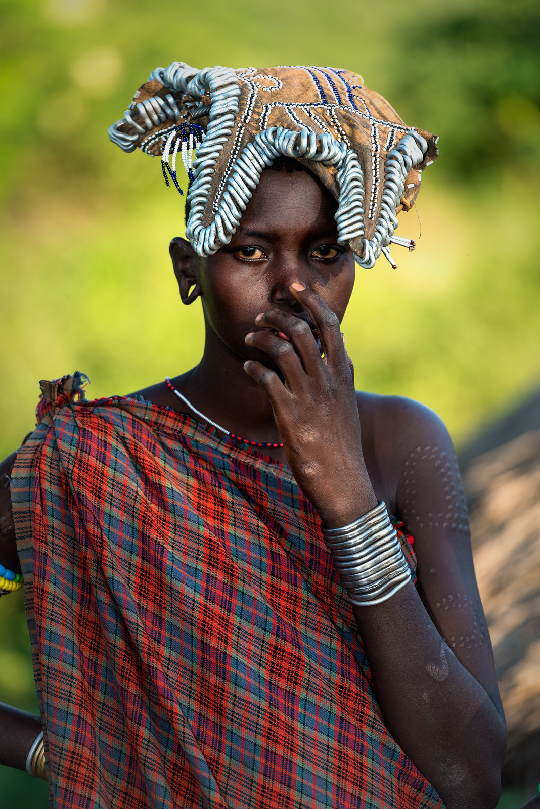
    Krys (5)
    color, an other day, other light setup
    Krys (3), (4) and (5)

  2. #2

    Join Date
    May 2012
    Location
    northern Virginia suburb of Washington, DC
    Posts
    19,064

    Re: Krys (3), (4) and (5)

    The compositions work well and the lighting complements them. Very nice.

    I notice in the color version that her eyes are not the same color. Famous American baseball pitcher, Max Scherzer, has the same genetic cosmetic condition though more pronounced. His dog also has the same condition.

  3. #3
    bje07's Avatar
    Join Date
    Aug 2013
    Location
    Lorient France
    Posts
    2,382
    Real Name
    Jean

    Re: Krys (3), (4) and (5)

    it's not natural, she likes to wear different colored lenses
    for Krys (4)
    I suggest after reflection this version in order to avoid the sleeve

    Krys (3), (4) and (5)
    Last edited by bje07; 26th August 2016 at 01:05 PM.

  4. #4

    Join Date
    Dec 2013
    Location
    Turkey
    Posts
    12,779
    Real Name
    Binnur

    Re: Krys (3), (4) and (5)

    Very nice set Jean Her skin doesn't seem as smooth in #1. May be some more PP would work

  5. #5
    bje07's Avatar
    Join Date
    Aug 2013
    Location
    Lorient France
    Posts
    2,382
    Real Name
    Jean

    Re: Krys (3), (4) and (5)

    Her skin doesn't seem as smooth in #1
    No, no Binnur, I'm sure it's the same picture just cropped

  6. #6

    Join Date
    Dec 2013
    Location
    Turkey
    Posts
    12,779
    Real Name
    Binnur

    Re: Krys (3), (4) and (5)

    My comment was about #1 (the sepia) Jean. Her skin doesn't look as smooth as in the other images. But if you meant that #1 was a cropped version, I haven't seen the original and I'm not able to compare them

    Quote Originally Posted by bje07 View Post
    Her skin doesn't seem as smooth in #1
    No, no Binnur, I'm sure it's the same picture just cropped

  7. #7
    bje07's Avatar
    Join Date
    Aug 2013
    Location
    Lorient France
    Posts
    2,382
    Real Name
    Jean

    Re: Krys (3), (4) and (5)

    Quote Originally Posted by bnnrcn View Post
    My comment was about #1 (the sepia) Jean. Her skin doesn't look as smooth as in the other images. But if you meant that #1 was a cropped version, I haven't seen the original and I'm not able to compare them

    Sorry Binnur I thaught you were speaking of the first version of Krys (4)
    I often receive (not in this forum) comments saying that I smooth too much the skin. This time I did nothing, so with such lighting, skin reveals all details

  8. #8
    Moderator Manfred M's Avatar
    Join Date
    Mar 2012
    Location
    Ottawa, Canada
    Posts
    22,159
    Real Name
    Manfred Mueller

    Re: Krys (3), (4) and (5)

    Krys 3 does not work that well as you have her nose cutting across the cheek. While I have seen a few images where this works, in the majority is looks awkward and unfortunately, that seems to be the case with this image.

    Krys 4 - here the position of the hand in front of the mouth creates a bit of an awkward look as well. The position of the hand and the pearls give her a look that reminds me of the Mursi women in Ethiopia's Omo Valley and their lip plates. Again, just a bit strange. I suspect that had the hand been a couple of cm lower, the image would have looked better to me.

    Krys 5 - this one works well for me and I do like the two different colours of the eyes. I also find that her clothing and head covering are nicely complimented by the background.

  9. #9
    Shadowman's Avatar
    Join Date
    Dec 2009
    Location
    WNY
    Posts
    36,716
    Real Name
    John

    Re: Krys (3), (4) and (5)

    Nice series.

  10. #10
    bje07's Avatar
    Join Date
    Aug 2013
    Location
    Lorient France
    Posts
    2,382
    Real Name
    Jean

    Re: Krys (3), (4) and (5)

    Quote Originally Posted by GrumpyDiver View Post
    Krys 3 does not work that well as you have her nose cutting across the cheek. While I have seen a few images where this works, in the majority is looks awkward and unfortunately, that seems to be the case with this image.

    Krys 4 - here the position of the hand in front of the mouth creates a bit of an awkward look as well. The position of the hand and the pearls give her a look that reminds me of the Mursi women in Ethiopia's Omo Valley and their lip plates. Again, just a bit strange. I suspect that had the hand been a couple of cm lower, the image would have looked better to me.

    Krys 5 - this one works well for me and I do like the two different colors of the eyes. I also find that her clothing and head covering are nicely complimented by the background.

    Ok for your comment on #3
    # 4 Don't you exaggerate about Mursi women????? This is your point of view I don't share. I feel she is thinking

    # no comment

    Thank you for the time you spend on my pictures. I learn every time
    Last edited by bje07; 17th September 2016 at 02:57 PM.

  11. #11
    Moderator Manfred M's Avatar
    Join Date
    Mar 2012
    Location
    Ottawa, Canada
    Posts
    22,159
    Real Name
    Manfred Mueller

    Re: Krys (3), (4) and (5)

    Quote Originally Posted by bje07 View Post
    Ok for your comment on #3
    # 4 Don't you exagerate about Mursi women????? This is your point of view I don't share. I feel she is thinking

    # no comment

    hank you for the time you spend on my pictures. I learn every time
    In the image the hand and mouth are connected and this combination is what is not working for me in this image. The position of the hand connecting to the lip is what gives this image a strange look.


    Krys (3), (4) and (5)

    (And yes, this is a young Mursi)

  12. #12

    Join Date
    Dec 2013
    Location
    Turkey
    Posts
    12,779
    Real Name
    Binnur

    Re: Krys (3), (4) and (5)

    I just want to make a comment about the position of the hand in #4. I'm a woman who wears necklaces from time to time and I play with some of them exactly in the way that your model does Jean. So, that posture doesn't look strange to me at all. Also that Mursi woman's hand covers her nose and mouth completely although the lips and the nose are completely visible in your image. So I like the way she holds the pearls next to her lips and if you asked me I wouldn't crop the image at all because it is nice as is

    Mursi shot doesn't work for me either because of the position of the hand though.

  13. #13
    bje07's Avatar
    Join Date
    Aug 2013
    Location
    Lorient France
    Posts
    2,382
    Real Name
    Jean

    Re: Krys (3), (4) and (5)

    KRYS (6) without hair (wig?) but with the same necklace. New PP

    Krys (3), (4) and (5)

    KRYS (7)

    Krys (3), (4) and (5)

  14. #14

    Join Date
    Dec 2013
    Location
    Turkey
    Posts
    12,779
    Real Name
    Binnur

    Re: Krys (3), (4) and (5)

    I like both shots but I don't like very dark parts under Krys 6's chin and stain-like darks on her right cheek. I think I would prefer the Krys 7 without the armchair . The composition of Krys 6 is really nice though

  15. #15

    Join Date
    Jul 2016
    Location
    Ireland
    Posts
    2,195
    Real Name
    Maurice

    Re: Krys (3), (4) and (5)

    Jean, great images. Can not find fault with any shot.

  16. #16
    bje07's Avatar
    Join Date
    Aug 2013
    Location
    Lorient France
    Posts
    2,382
    Real Name
    Jean

    Re: Krys (3), (4) and (5)

    Thank you Maurice

  17. #17
    bje07's Avatar
    Join Date
    Aug 2013
    Location
    Lorient France
    Posts
    2,382
    Real Name
    Jean

    Re: Krys (3), (4) and (5)

    Quote Originally Posted by bnnrcn View Post
    I like both shots but I don't like very dark parts under Krys 6's chin and stain-like darks on her right cheek. I think I would prefer the Krys 7 without the armchair . The composition of Krys 6 is really nice though

    You are right Binnur for her chin and cheek.
    You are right too for the armchair on # 7
    I'll fix it.

  18. #18
    rpcrowe's Avatar
    Join Date
    Jul 2008
    Location
    Southern California, USA
    Posts
    17,402
    Real Name
    Richard

    Re: Krys (3), (4) and (5)

    I like #5 the best because:

    1. Her skin is the smoothest in this image

    2. The nose rings are least visible in this image, This last is just a fetish that I have which may show my age...

Posting Permissions

  • You may not post new threads
  • You may not post replies
  • You may not post attachments
  • You may not edit your posts
  •