Results 1 to 12 of 12
Thread: Climbing The Walls
-
15th September 2016, 07:46 PM #1
-
15th September 2016, 07:54 PM #2

- Join Date
- Jan 2009
- Location
- South Devon, UK
- Posts
- 14,634
Re: Climbing The Walls
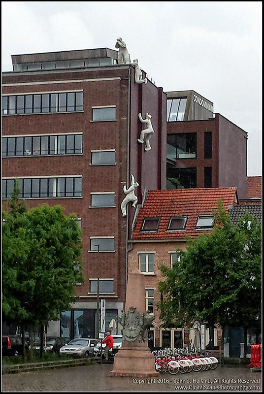
Nice scene with a well thought out composition.
-
15th September 2016, 09:35 PM #3
Re: Climbing The Walls
Hi John,
The thought that occurs to me is that it is a shame about the three areas of bright red which grab my eye, makes me wonder what it would look like in monochrome.
Alternatively, deal with them on a one by one basis by various techniques; e.g. cloning, desaturation and/or colour changing.
Or re-shoot when the car isn't parked there, the chap in the red jacket isn't passing on his bike and the set of barriers isn't in the shot.
In all seriousness, I mention these possibilities for anyone with qualms about cloning (etc.) - in other words; at another moment in time, those three things wouldn't have been in shot anyway.
I agree with Geoff the composition does work - initially I wasn't sure, but tried some alternatives and ended up back where you are.
HTH Dave
-
15th September 2016, 09:59 PM #4

- Join Date
- May 2012
- Location
- northern Virginia suburb of Washington, DC
- Posts
- 19,064
Re: Climbing The Walls
Consider cropping at the bottom just above the top of the store front to simplify the image and to make the climbers stand out more. Also consider converting to monochrome as Dave suggested. The tops of the trees nicely frame and convey the height of the subjects when the image is cropped and converted.
Last edited by Mike Buckley; 15th September 2016 at 10:15 PM.
-
15th September 2016, 10:12 PM #5
Re: Climbing The Walls
Nicely seen and captured.
-
16th September 2016, 07:00 AM #6
-
16th September 2016, 07:37 AM #7
Re: Climbing The Walls
Unless there is a good compositional reason for it, I'm not a fan of (just) cropping the ground out of (basically) an architectural shot, as I feel it takes away the 'foundation' on which it should stand.
Probably explains why I don't shoot buildings much - I don't like the clutter often found at ground level, but won't tilt the camera up a little (or crop) to exclude that. If I have to tilt the camera, it (the tilt) has to be a major aspect of the composition.
There was a great example of this I saw here in last couple of days, but I can't find it now
So I'll give an old shot of mine an airing instead as an example and another.
Cheers, DaveLast edited by Dave Humphries; 16th September 2016 at 07:48 AM.
-
16th September 2016, 09:16 AM #8

- Join Date
- Jul 2016
- Location
- Ireland
- Posts
- 2,195
- Real Name
- Maurice
Re: Climbing The Walls
John, nice shot I like it.
-
16th September 2016, 12:04 PM #9
Re: Climbing The Walls
Thank you everyone for your comments and suggestions/feedback. I also am not found of the distractions in front of the building, but that was what I was given at the time. I should have waited a few seconds more to allow the guy riding the bicycle to clear the frame.
-
16th September 2016, 12:13 PM #10

- Join Date
- May 2012
- Location
- northern Virginia suburb of Washington, DC
- Posts
- 19,064
Re: Climbing The Walls
For me, this isn't an architectural image. In an architectural image, the primary subject is the architecture. In this image, the primary subject is a series of sculptures. Accordingly, the approach can and should be different in my mind. Even so, there are good compositional reasons for cropping to eliminate the ground in this image for the reasons I already mentioned.
-
16th September 2016, 07:50 PM #11

- Join Date
- Dec 2013
- Location
- Turkey
- Posts
- 12,779
- Real Name
- Binnur
Re: Climbing The Walls
What an interesting image, a B&W conversion might work nice too

-
16th September 2016, 08:52 PM #12

- Join Date
- Jan 2009
- Location
- South Devon, UK
- Posts
- 14,634
Re: Climbing The Walls
I'm with Dave regarding this image. For me, the foreground adds just enough 'reality' to the scene, including the cyclist.


 Helpful Posts:

 Reply With Quote
