 Helpful Posts: 0
Results 1 to 4 of 4
Thread: Men at Work
-
9th September 2010, 09:27 PM #1
-
10th September 2010, 12:22 AM #2
-
10th September 2010, 04:13 PM #3
Re: Men at Work
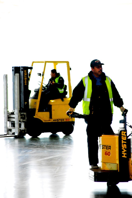
Hi Jason - I like the idea in the first shot - high key with black and yellow. I might be tempted to alter the format to make it square. This would have the effect of bringing the subjects forward and reducing the somewhat redundant white area at the top. Also, is it my eyes or is there a slight blurring in the image? If so it might be worth re-sharpening the original. I'm going to remember the idea though - black, yellow and white.
Cheers
David
-
10th September 2010, 04:28 PM #4
Re: Men at Work
Yeah i see what your saying. the first one is very lightly post processed believe it or not. I was in a large open air warehouse on a cloudy afternoon. The floor was extremely polished so i decided to try blowing out the background completely and it worked out really well. However there is some blur in the shot because of the slower shutterspeed i used. ill try what you said. and by all means if you feel compelled to try pp on this be my guest.
best-
Jason


 Reply With Quote

