Page 1 of 2 12 LastLast
Results 1 to 20 of 27

Thread: At the fish Market - C&C are most welcome

  1. #1
    Tejal's Avatar
    Join Date
    Mar 2015
    Location
    India
    Posts
    2,069
    Real Name
    Tejal

    At the fish Market - C&C are most welcome

    Dear All,

    Herewith I would like to share some shorts which I have taken at a fish market of my city. Kindly share your C&C.

    Regards,

    Tejal

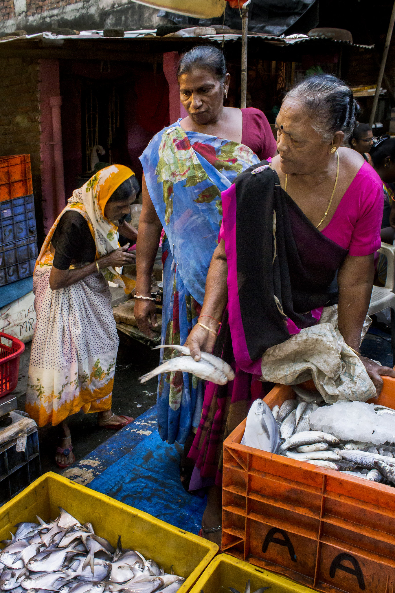
    At the fish Market - C&C are most welcomeUntitled-1-Recovered by Tejal Imagination, on Flickr

    Another shot of the same location -

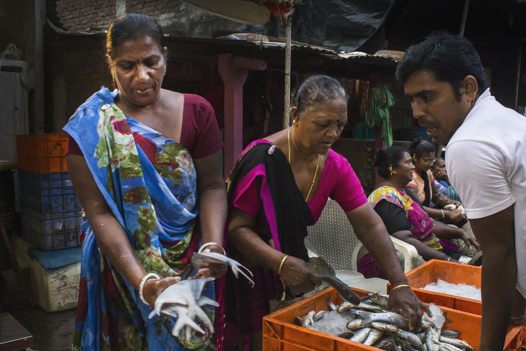
    At the fish Market - C&C are most welcomeIMG_9253 as Smart Object-1 by Tejal Imagination, on Flickr

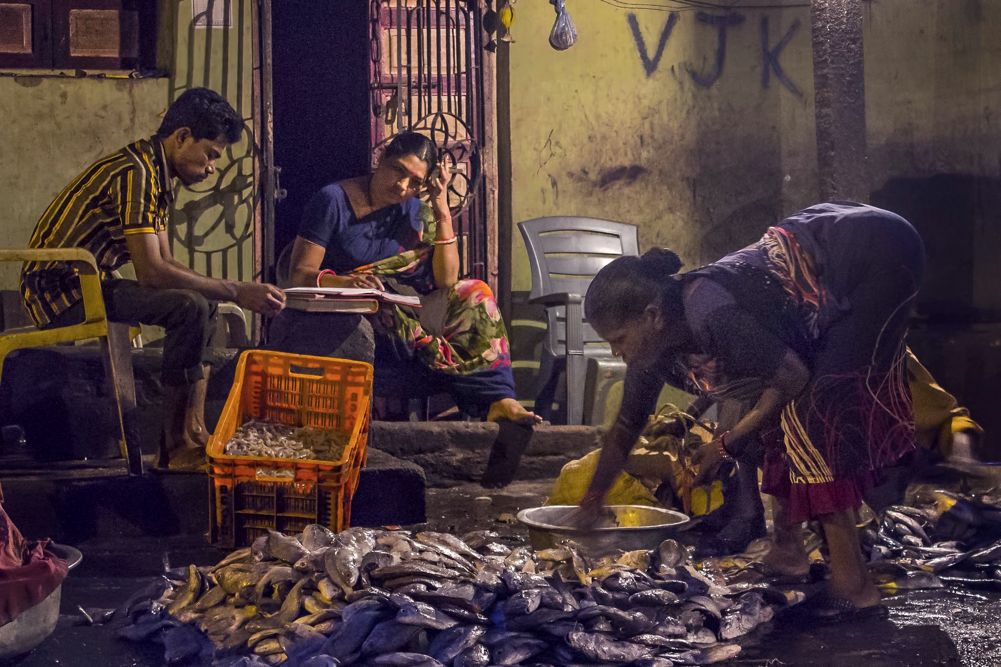
    At the fish Market - C&C are most welcomeIMG_9184 as Smart Object-1 by Tejal Imagination, on Flickr

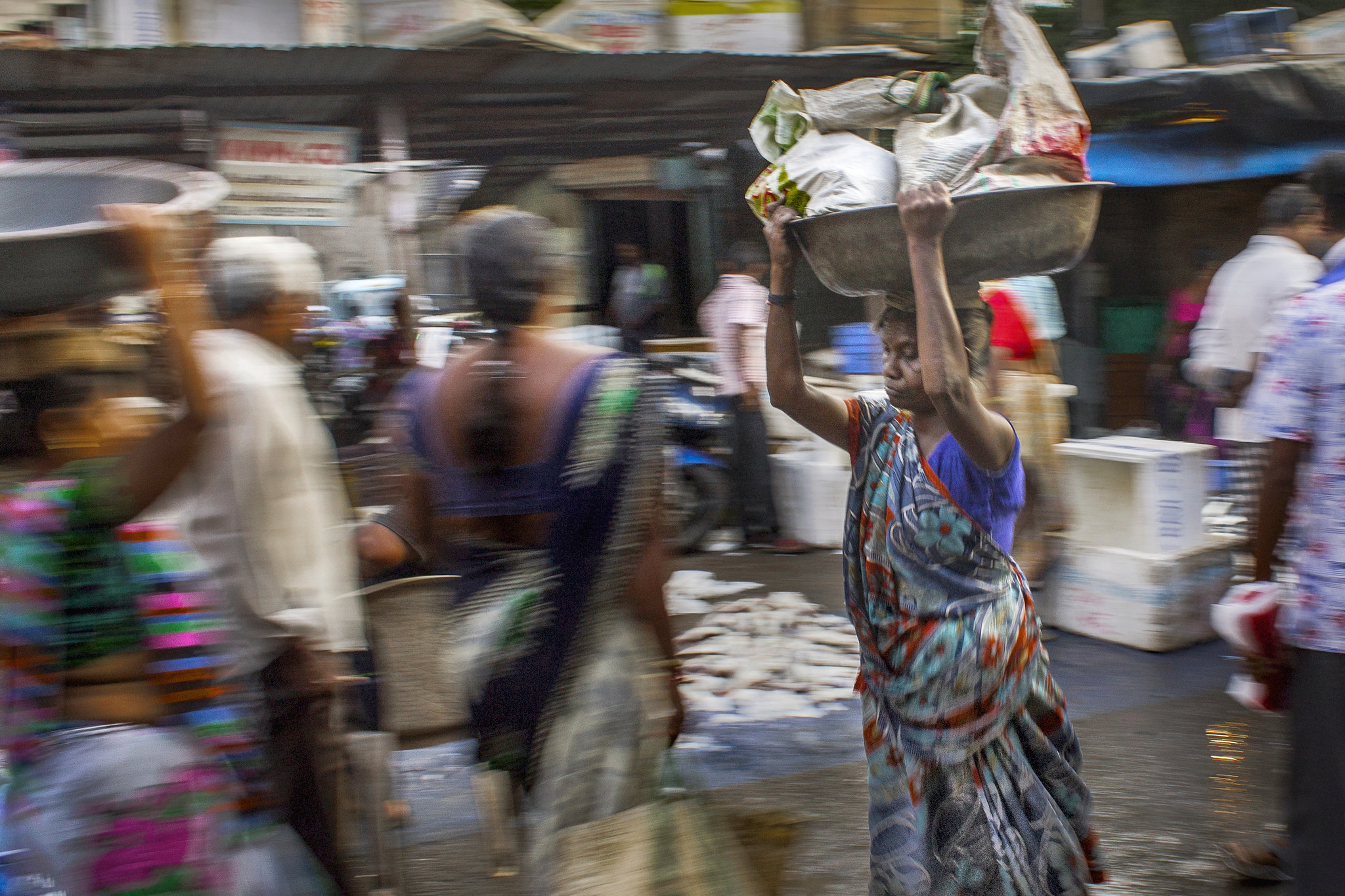
    Panning, I have tried -

    At the fish Market - C&C are most welcomeIMG_9262 by Tejal Imagination, on Flickr

  2. #2
    Shadowman's Avatar
    Join Date
    Dec 2009
    Location
    WNY
    Posts
    36,716
    Real Name
    John

    Re: At the fish Market - C&C are most welcome

    Nice series, good panning. The first three are nicely composed however I feel like the shadows could be livened up a bit.

  3. #3
    Tejal's Avatar
    Join Date
    Mar 2015
    Location
    India
    Posts
    2,069
    Real Name
    Tejal

    Re: At the fish Market - C&C are most welcome

    Quote Originally Posted by Shadowman View Post
    Nice series, good panning. The first three are nicely composed however I feel like the shadows could be livened up a bit.
    thank you John for your feedback. Is it looking over cooked ? I felt I have push it far. But at the same time, i wanted to hide the clutter BG.

  4. #4
    Shadowman's Avatar
    Join Date
    Dec 2009
    Location
    WNY
    Posts
    36,716
    Real Name
    John

    Re: At the fish Market - C&C are most welcome

    Quote Originally Posted by Tejal View Post
    thank you John for your feedback. Is it looking over cooked ? I felt I have push it far. But at the same time, i wanted to hide the clutter BG.
    Hi Tejal,

    Not too overcooked, however I would try to utilize that side lighting; especially in the first image, by increasing the midtones in the subject's faces. If you could do this selectively, apply it to only one or two of the people it would balance the composition from a tonal sense.

  5. #5
    Tejal's Avatar
    Join Date
    Mar 2015
    Location
    India
    Posts
    2,069
    Real Name
    Tejal

    Re: At the fish Market - C&C are most welcome

    Quote Originally Posted by Shadowman View Post
    Hi Tejal,

    Not too overcooked, however I would try to utilize that side lighting; especially in the first image, by increasing the midtones in the subject's faces. If you could do this selectively, apply it to only one or two of the people it would balance the composition from a tonal sense.
    Something like this ? Or still need to work on it ?
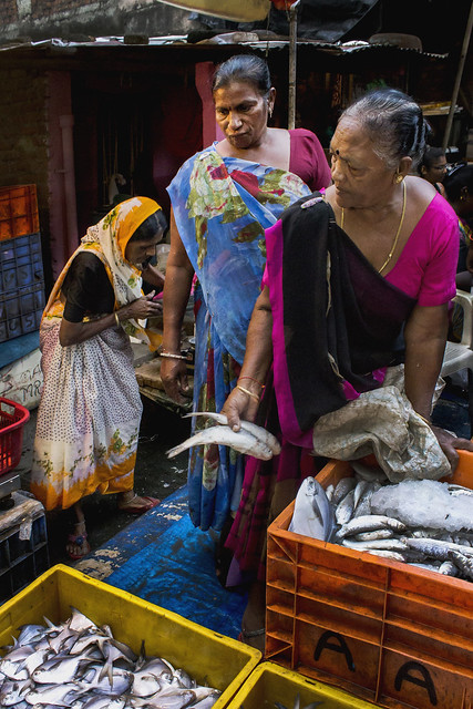
    At the fish Market - C&C are most welcomeUntitled-1-Recovered by Tejal Imagination, on Flickr

  6. #6
    Shadowman's Avatar
    Join Date
    Dec 2009
    Location
    WNY
    Posts
    36,716
    Real Name
    John

    Re: At the fish Market - C&C are most welcome

    Quote Originally Posted by Tejal View Post
    Something like this ? Or still need to work on it ?

    At the fish Market - C&C are most welcomeUntitled-1-Recovered by Tejal Imagination, on Flickr
    That one is fine, more so on the second and third image.

  7. #7
    Tejal's Avatar
    Join Date
    Mar 2015
    Location
    India
    Posts
    2,069
    Real Name
    Tejal

    Re: At the fish Market - C&C are most welcome

    Quote Originally Posted by Shadowman View Post
    That one is fine, more so on the second and third image.
    Oh... Ok. I misunderstood . Thanks for your reply.

  8. #8

    Join Date
    Jan 2009
    Location
    South Devon, UK
    Posts
    14,518

    Re: At the fish Market - C&C are most welcome

    Obviously extremely difficult lighting conditions with these shots, Tejal.

    The first one works well for me.

    It is a pity with the second image that the foreground fish tails are out of focus; otherwise I would have rated it as highly as the first photo.

    Maybe you could try slightly darkening the blacks with #3 to help with clarity. But there is also a bit of subject movement. I suspect your options were very limited due to the poor light levels.

    The last one would probably have worked with me if the subject had been sharp while the background was blurred. But not with everything blurred.

  9. #9

    Join Date
    Jul 2016
    Location
    Ireland
    Posts
    2,195
    Real Name
    Maurice

    Re: At the fish Market - C&C are most welcome

    Bad lighting, good shots. The colours you have in India are brilliant and you make the best of them in your work.

  10. #10
    rpcrowe's Avatar
    Join Date
    Jul 2008
    Location
    Southern California, USA
    Posts
    17,402
    Real Name
    Richard

    Re: At the fish Market - C&C are most welcome

    Nicely done shots of a very interesting environment.

    I copied the first one, opened it in Photoshop CC and then used the NIK Viveza Shadow and Structure sliders to open the shadows on the ladies just a bit... What do you think of this?

    At the fish Market - C&C are most welcome

    BTW: I also put a control point on the fish and reduced the brightness just a tad...

  11. #11
    Hans's Avatar
    Join Date
    Dec 2009
    Location
    New England, NSW Australia
    Posts
    311
    Real Name
    Pete

    Re: At the fish Market - C&C are most welcome

    Nice essay.

    I like the compositions, the light is atmospheric and the contrast is nice, especially on the first, thanks to the natural back light and the bulb somewhere on camera left.

    The second works for me too as there is a strong sense of communication and interaction (decision making) going on between the subjects (for me at least). Something is happening, a story is unfolding and you gave us an insight through the window of the frame.

    My favourite is the third image. The movement, the textural contrast between the movement blur and the sharp figure with the basket on her head, who seems to be mindfully contemplating something within herself within the context of her repetitive unconscious work. I want to know what she is thinking, where she is going, where is she coming from, what story does she live everyday? Excellent lead space (is that what is called) for her to walk into, her position within the frame is pretty much perfect and both exciting and comfortable for me being balanced, but dynamically so. The level of sharpness against the smoother texture of the blur is more than enough to convey her as your main subject here. Again this is where a strong idea trumps technical perfection. The colour is nice, not too saturated, smooth so not so distracting (I think all of these images would work best in black and white, but that's me and there is so much colour in South Asia... what do you do?!... but this third image totally works in colour!). The red blob just behind her might need some toning down as it isn't part of her dress or head dress, and is a little distracting - nit picking here. This is the strongest image for me.

    Thanks so much for sharing and I can't wait for more

    Regards, Pete

  12. #12
    Tejal's Avatar
    Join Date
    Mar 2015
    Location
    India
    Posts
    2,069
    Real Name
    Tejal

    Re: At the fish Market - C&C are most welcome

    Quote Originally Posted by Geoff F View Post
    Obviously extremely difficult lighting conditions with these shots, Tejal.

    The first one works well for me.

    It is a pity with the second image that the foreground fish tails are out of focus; otherwise I would have rated it as highly as the first photo.

    Maybe you could try slightly darkening the blacks with #3 to help with clarity. But there is also a bit of subject movement. I suspect your options were very limited due to the poor light levels.

    The last one would probably have worked with me if the subject had been sharp while the background was blurred. But not with everything blurred.
    Thank you for your feedback. The last one, actually it was not that easy, as place was crowded and i tried it for the 1st time on a walking person. Shutter speed adjustment was not that easy for me. Moreover due to crowd to avoid overlapping was also difficult. But i will surely try my best to get something better next time. .

  13. #13
    Tejal's Avatar
    Join Date
    Mar 2015
    Location
    India
    Posts
    2,069
    Real Name
    Tejal

    Re: At the fish Market - C&C are most welcome

    Quote Originally Posted by madcrow View Post
    Bad lighting, good shots. The colours you have in India are brilliant and you make the best of them in your work.
    Thank you Maurice for your feedback. Yes, light was not good and my camera too is not good enough to shoot in such kind of lights.

  14. #14
    Tejal's Avatar
    Join Date
    Mar 2015
    Location
    India
    Posts
    2,069
    Real Name
    Tejal

    Re: At the fish Market - C&C are most welcome

    Quote Originally Posted by rpcrowe View Post
    Nicely done shots of a very interesting environment.

    I copied the first one, opened it in Photoshop CC and then used the NIK Viveza Shadow and Structure sliders to open the shadows on the ladies just a bit... What do you think of this?

    At the fish Market - C&C are most welcome

    BTW: I also put a control point on the fish and reduced the brightness just a tad...
    Thank you Richard. It is looking nice . And the fish have become just perfect in tone.

  15. #15
    Tejal's Avatar
    Join Date
    Mar 2015
    Location
    India
    Posts
    2,069
    Real Name
    Tejal

    Re: At the fish Market - C&C are most welcome

    Quote Originally Posted by Hans View Post
    Nice essay.

    I like the compositions, the light is atmospheric and the contrast is nice, especially on the first, thanks to the natural back light and the bulb somewhere on camera left.

    The second works for me too as there is a strong sense of communication and interaction (decision making) going on between the subjects (for me at least). Something is happening, a story is unfolding and you gave us an insight through the window of the frame.

    My favourite is the third image. The movement, the textural contrast between the movement blur and the sharp figure with the basket on her head, who seems to be mindfully contemplating something within herself within the context of her repetitive unconscious work. I want to know what she is thinking, where she is going, where is she coming from, what story does she live everyday? Excellent lead space (is that what is called) for her to walk into, her position within the frame is pretty much perfect and both exciting and comfortable for me being balanced, but dynamically so. The level of sharpness against the smoother texture of the blur is more than enough to convey her as your main subject here. Again this is where a strong idea trumps technical perfection. The colour is nice, not too saturated, smooth so not so distracting (I think all of these images would work best in black and white, but that's me and there is so much colour in South Asia... what do you do?!... but this third image totally works in colour!). The red blob just behind her might need some toning down as it isn't part of her dress or head dress, and is a little distracting - nit picking here. This is the strongest image for me.

    Thanks so much for sharing and I can't wait for more

    Regards, Pete
    Thank you Pete . I am glad you liked them.

  16. #16
    Moderator Dave Humphries's Avatar
    Join Date
    May 2008
    Location
    Windsor, Berks, UK
    Posts
    16,748
    Real Name
    Dave Humphries :)

    Re: At the fish Market - C&C are most welcome

    Hi Tejal,

    These are mostly shot at a fairly wide angle (18-20mm of Canon 1100D) and the aperture used is f/8.

    I looked up the EXIF (on Flickr) because I felt that the DoF was too great in IMG_9253 (the second); the chap is sharp, as are the seated women behind, but unfortunately the two main subjects are soft due to their speed of work and the 1/125s shutter speed (ss).

    I appreciate your lens (like mine) probably isn't great quality wide open, but this is an occasion when I feel that would have been better, trading f/8 for f/3.5 would have increased ss to about 1/320 or 1/400s.

    It could be argued that without some subject movement blur, the shot might have looked posed, but it might be worth trying a higher ss (for this type of shot) next time you visit the fish market.


    With the last (IMG_9262), which I also like a lot, you used 1/25s at f/8 and iso 100. DoF isn't an issue here because of the blur caused to the background by the panning and slow ss. A good choice of settings here I think. For me; this shot looks ok when viewed small, but begins to fall apart if viewed at 100%, when the (up/down) stride movement of the subject becomes too obvious (as Richard says).

    Regarding Pete's suggestion to tone down the red blob behind her head - normally I'd agree (or even suggest cloning it out), but when I tried covering it with a thumb, her head became far less 'locatable' in the scene, perhaps some carefully applied localised sharpening might help, but I'd say don't go too far with toning the blob down (and don't remove it completely by cloning).

    HTH, Dave

  17. #17
    Tejal's Avatar
    Join Date
    Mar 2015
    Location
    India
    Posts
    2,069
    Real Name
    Tejal

    Re: At the fish Market - C&C are most welcome

    Quote Originally Posted by Dave Humphries View Post
    Hi Tejal,

    These are mostly shot at a fairly wide angle (18-20mm of Canon 1100D) and the aperture used is f/8.

    I looked up the EXIF (on Flickr) because I felt that the DoF was too great in IMG_9253 (the second); the chap is sharp, as are the seated women behind, but unfortunately the two main subjects are soft due to their speed of work and the 1/125s shutter speed (ss).

    I appreciate your lens (like mine) probably isn't great quality wide open, but this is an occasion when I feel that would have been better, trading f/8 for f/3.5 would have increased ss to about 1/320 or 1/400s.

    It could be argued that without some subject movement blur, the shot might have looked posed, but it might be worth trying a higher ss (for this type of shot) next time you visit the fish market.


    With the last (IMG_9262), which I also like a lot, you used 1/25s at f/8 and iso 100. DoF isn't an issue here because of the blur caused to the background by the panning and slow ss. A good choice of settings here I think. For me; this shot looks ok when viewed small, but begins to fall apart if viewed at 100%, when the (up/down) stride movement of the subject becomes too obvious (as Richard says).

    Regarding Pete's suggestion to tone down the red blob behind her head - normally I'd agree (or even suggest cloning it out), but when I tried covering it with a thumb, her head became far less 'locatable' in the scene, perhaps some carefully applied localised sharpening might help, but I'd say don't go too far with toning the blob down (and don't remove it completely by cloning).

    HTH, Dave
    thank you Dave for your feedback (I eagerly wait to hear from you ).

    I will be careful next time for shutter speed. I also realized that when i saw my pics on computer screen. Actually the place was quite congested and there was quite a lot movement. I personally start feeling uncomfortable at a crowded place and there my mind stops working. Light was also quite less as it was early morning, by 6 am or so.

    For panning, I will work on that red part. Next time I will try my best to get a better result.

    Thanks once again .

  18. #18

    Join Date
    Dec 2013
    Location
    Turkey
    Posts
    12,779
    Real Name
    Binnur

    Re: At the fish Market - C&C are most welcome

    Hi Tejal I just want to say that I like the compositions as a lot of comments have already been made. I think the most important comment was that higher shutter speeds are necessary for moving objects in order to get sharper images

  19. #19
    Tejal's Avatar
    Join Date
    Mar 2015
    Location
    India
    Posts
    2,069
    Real Name
    Tejal

    Re: At the fish Market - C&C are most welcome

    Quote Originally Posted by bnnrcn View Post
    Hi Tejal I just want to say that I like the compositions as a lot of comments have already been made. I think the most important comment was that higher shutter speeds are necessary for moving objects in order to get sharper images
    Thank you for your feedback. Yes I will be careful next time.

  20. #20
    Rebel's Avatar
    Join Date
    Apr 2013
    Location
    Swansea, Wales
    Posts
    3,122
    Real Name
    Matt

    Re: At the fish Market - C&C are most welcome

    These are amazing Tejal, all show how busy and vibrant the place is!


    Sent from my iPhone using Tapatalk

Page 1 of 2 12 LastLast

Posting Permissions

  • You may not post new threads
  • You may not post replies
  • You may not post attachments
  • You may not edit your posts
  •