
 Helpful Posts:
Results 1 to 16 of 16
Thread: Orange Gerbera
-
13th December 2016, 07:49 PM #1


- Join Date
- Feb 2014
- Location
- Plano, Texas (USA)
- Posts
- 420
- Real Name
- John
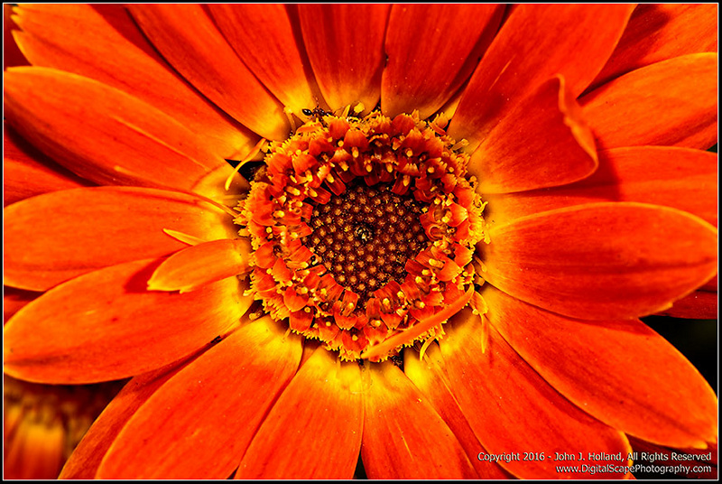
Orange Gerbera
-
13th December 2016, 08:25 PM #2

- Join Date
- Dec 2009
- Location
- WNY
- Posts
- 36,716
- Real Name
- John
Re: Orange Gerbera
Nicely captured.
-
13th December 2016, 08:56 PM #3Moderator

- Join Date
- May 2008
- Location
- Windsor, Berks, UK
- Posts
- 16,749
- Real Name
- Dave Humphries :)
Re: Orange Gerbera
Hi John,
It is nice, but I suspect you lost detail to a blown red channel - unless you did that in post.
If you're not using RGB histograms to confirm correct exposure, it is something you might want to investigate for boldly coloured subjects such as this.
Best regards, Dave
-
13th December 2016, 09:16 PM #4
- Join Date
- Feb 2014
- Location
- Plano, Texas (USA)
- Posts
- 420
- Real Name
- John
Re: Orange Gerbera
Thank you John and Dave for your comments. Dave, I noticed the blown red channel when I uploaded the image to the web - I suspect it has something with the conversion to the sRGB color space - on my monitor (in Photoshop) it is fine.
-
13th December 2016, 10:37 PM #5
- Join Date
- Jul 2016
- Location
- Ireland
- Posts
- 2,195
- Real Name
- Maurice
Re: Orange Gerbera
Nice flower and image.
-
13th December 2016, 10:51 PM #6
- Join Date
- Feb 2012
- Location
- Texas
- Posts
- 6,956
- Real Name
- Ted
Re: Orange Gerbera
Reds are quite awkward because that conversion can bottom both blue and red if the image goes out of gamut. And details do have apparently less contrast in the remaining almost monochromatic red. Originally Posted by DigitalScape

For that reason, I do my editing in sRGB working space so that such effects can be seen up front and be fixed. I don't print, so I don't need Adobe RGB or ProPhoto . . .
Hope this helps . . .Last edited by xpatUSA; 14th December 2016 at 05:11 PM.
-
14th December 2016, 02:11 AM #7

- Join Date
- Aug 2012
- Location
- Kerala, India
- Posts
- 13,862
- Real Name
- Nandakumar
Re: Orange Gerbera
Beautiful...

-
14th December 2016, 12:50 PM #8
- Join Date
- Feb 2014
- Location
- Plano, Texas (USA)
- Posts
- 420
- Real Name
- John
Re: Orange Gerbera
Thank you Maurice, Ted, and Nandakumar for your comments. Ted, I appreciate the tip.
-
14th December 2016, 07:05 PM #9
- Join Date
- Dec 2013
- Location
- Turkey
- Posts
- 12,779
- Real Name
- Binnur
Re: Orange Gerbera
Hi Dave
How did you notice the blown red channel?  When I look at the image I don't see anything blown. Did you check the histogram to see it or what ?
Originally Posted by Dave Humphries
-
14th December 2016, 07:22 PM #10Moderator
- Join Date
- May 2008
- Location
- Windsor, Berks, UK
- Posts
- 16,749
- Real Name
- Dave Humphries :)
Re: Orange Gerbera
Hi Binnur, Originally Posted by bnnrcn
I couldn't reliably make the call from just looking at the image on a monitor (although when something is that bright, it's very likely), so yes; looking at a histogram is usually necessary.
That said, I didn't actually use one for this diagnosis, I used another Add-on tool in FireFox known as "Color Inspector 3D" - I like it, but I have mentioned or linked it here at CiC a couple of times and no-one has expressed any interest.
Here's a screen grab:
You can see clipping must have occurred towards red channel - normal images don't touch the sides.
HTH, Dave
-
14th December 2016, 07:36 PM #11
- Join Date
- Feb 2014
- Location
- Plano, Texas (USA)
- Posts
- 420
- Real Name
- John
Re: Orange Gerbera
Thank you Binnur for your comment, and Dave for the neat browser tool.
-
15th December 2016, 06:17 PM #12
- Join Date
- Dec 2013
- Location
- Turkey
- Posts
- 12,779
- Real Name
- Binnur
Re: Orange Gerbera
Thanks for explaining Dave
Now your answer brings another question to my mind . If clipping is not noticeable by looking at the image, is it necessary to fix it ?
Originally Posted by Dave Humphries
-
15th December 2016, 07:38 PM #13Moderator
- Join Date
- May 2008
- Location
- Windsor, Berks, UK
- Posts
- 16,749
- Real Name
- Dave Humphries :)
Re: Orange Gerbera
Hmmm, well that depends upon whether you're happy with it, assuming it is your own image. If you are, that's fine. Originally Posted by bnnrcn
I think it often is visible, if you know what to look for - and if the viewing conditions allow it (e.g. not viewing on a tablet or phone in broad daylight).
In terms of helping members improve their photography and post processing skills, I'd be lax/lazy if I didn't mention it - although I know this isn't the point you are making.
If there's more detail to be had from a scene, or from a given image capture in PP, usually we want to extract and see it, but there are exceptions such as when creating high or low key images, when we might take liberties with highlights and shadows, or - in terms of saturated colour - when making a bold image, like this.
Cheers, DaveLast edited by Dave Humphries; 15th December 2016 at 07:53 PM.
-
15th December 2016, 07:46 PM #14

- Join Date
- Nov 2016
- Location
- Olympia, WA
- Posts
- 1,953
- Real Name
- Sharon
Re: Orange Gerbera
gorgeous image.
-
16th December 2016, 10:42 AM #15

- Join Date
- Dec 2013
- Location
- Chesterfield, Missouri/Melbourne, Australia
- Posts
- 17,827
- Real Name
- Izzie
Re: Orange Gerbera
Very nice image but the discussion of the Color Inspector is more interesting...and related. I tried to find it in Chrome but they do have anything as cool as the Firefox plug-in...
-
16th December 2016, 01:58 PM #16
- Join Date
- Feb 2012
- Location
- Texas
- Posts
- 6,956
- Real Name
- Ted
Re: Orange Gerbera
Originally Posted by Dave Humphries
An interesting app, Dave.
Certainly confirmed by the 3D CIELAB gamut view compared with sRGB in ColorThink:

Here we see that the yellows are all blown too - er, gamut-clipped. It's common to see some gamut-clipping in the lower lightness levels but this one is blown all the way up !!
The posted image is consistent with being edited in ProPhoto space, maybe even with saturation added to enhance the colorfulness, but then converted to sRGB.

 Reply With Quote