 Helpful Posts: 0
Results 1 to 13 of 13
Thread: need opinions
-
21st September 2010, 05:08 AM #1
-
21st September 2010, 05:25 AM #2

- Join Date
- Aug 2009
- Posts
- 4,049
Re: need opinions
Jason
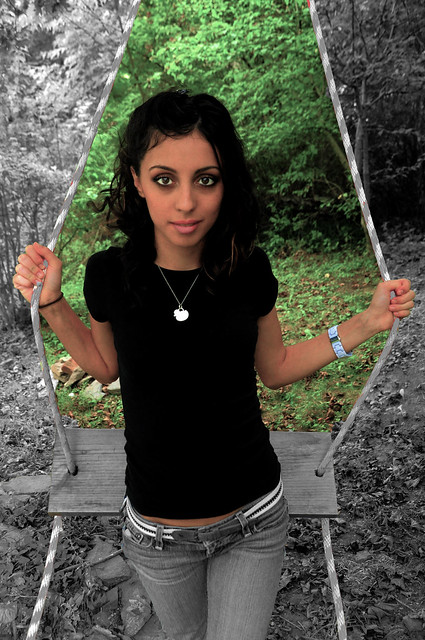
I was never any good at geometry at school (or much else come to that), but the angles look wrong in shot #1. You have shot her from above, and I can see that she has a slim build, but the angles make her look even slimmer as you look down towards her hips. And if you look at the apparent size of the hand/wrist on the left (her right hand) it looks larger than the whole of her upper arm area. It doesn't really flatter what is an attractive model. The colours look a little yellow/green to me, especially on the skin tones.
-
21st September 2010, 06:57 AM #3
Re: need opinions
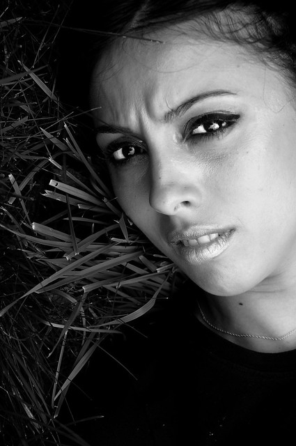
Hi Jason - The second shot is great with good tonal range and a somewhat lucky line of grass stalks helping frame in a diagonal your girlfriends's face. Probably, purists might argue that a bit of cloning to remove stray hair across the forehead and small skin blemishes etc would enhance the shot.
The first shot is more of a problem. I go along with Rob's general points about the geometry and consequent oddness of foreshortening. On the other hand, the idea of framing the model using the ropes and seat of the swing is good, as is the idea of having a "coloured" background. However, to my mind the colour is wrong and overdone. Technically, I think I can see how you've done this: select the central portion via ropes and hands and lower body and then desaturate the inverse selection. What I might have done is select the girl, invert, blur or defocus the background and then put a gradient colour in, preferably a complementary colour to your girlfriend's skin. That would be technically much more challenging.
Anyway, these are just my thoughts.
Cheers
David
-
21st September 2010, 09:30 AM #4
Re: need opinions
Jason,
Nicely done, I see you like to break the rules a bit with the slightly off centered composition of photo#1. This photograph obviously means something to you. You mentioned that another photographer wanted to include your girlfriend in their shoot and that's something to be proud of. Is that what you are trying to convey in this photo?
-
21st September 2010, 09:32 AM #5

- Join Date
- Dec 2008
- Location
- New Zealand
- Posts
- 17,660
- Real Name
- Have a guess :)
Re: need opinions
Hi Jason,
I'll just come right out and say it ... sometimes a great idea just doesn't work, and this is one of those times (talking about the swing shot). All is not lost however ... at least know you know one thing that doesn't work, so you got an education.
Hope you don't mind, but I've been playing around with your girlfrind (just a little)
-
21st September 2010, 11:00 AM #6
Re: need opinions
In my humble opinion, the first shot is not the best set-up. The swing is distracting from the nice girl.
-
21st September 2010, 08:03 PM #7
wow i gotta love this forum. the insight is really helpful. whenever i show my friends photos they say oh wow, thats nice and other things like that. (there chefs not photographers) anyway i would have never noticed how the angle of the shot made her hands look larger than they actually are. its blaring at me now. i also see what your all saying about the saturation. i used the vivid picture control. which in retrospect i should have used neutral.
-
21st September 2010, 08:13 PM #8

- Join Date
- Dec 2008
- Location
- New Zealand
- Posts
- 17,660
- Real Name
- Have a guess :)
Re: need opinions
The first thing I noticed was that the skin tones looked like a fake tan gone horribly wrong. It actually corrected OK, but the rest of the colour / grayscale thing just didn't work for me - and it didn't seem to make a lot of sense; like if the area above the swing, but contained within the ropes is in colour, then why wouldn't the area below the swing that's also contained within the ropes also be in colour? Sometimes though, I find that just keeping one small part in colour can work OK though (eg perhaps just the ropes) (although I'd desaturate them by around 50%).
Just some rambling thoughts from first thing in the morning! - Hope they help
-
21st September 2010, 08:25 PM #9

- Join Date
- Dec 2008
- Location
- New Zealand
- Posts
- 17,660
- Real Name
- Have a guess :)
-
22nd September 2010, 12:11 AM #10
-
22nd September 2010, 12:27 AM #11
-
23rd September 2010, 04:44 PM #12
Re: need opinions
good point. i see what your saying about being distracted by the busyness of the leaves. ill have to do what i can to make her more of a pronounced subject in the future.
-
26th September 2010, 03:09 PM #13
Re: need opinions
I am not really keen on shooting people with wide lenses. The perspective of a rather large head and upper torso with a small and spindly lower body is not appealing to me.


 Reply With Quote

