 Helpful Posts: 0
Results 1 to 18 of 18
Thread: Bus Station in Malta
-
26th September 2010, 10:00 AM #1
-
26th September 2010, 10:08 AM #2Moderator


- Join Date
- Feb 2009
- Location
- Glenfarg, Scotland
- Posts
- 21,402
- Real Name
- Just add 'MacKenzie'
Re: Bus Station in Malta
Rich
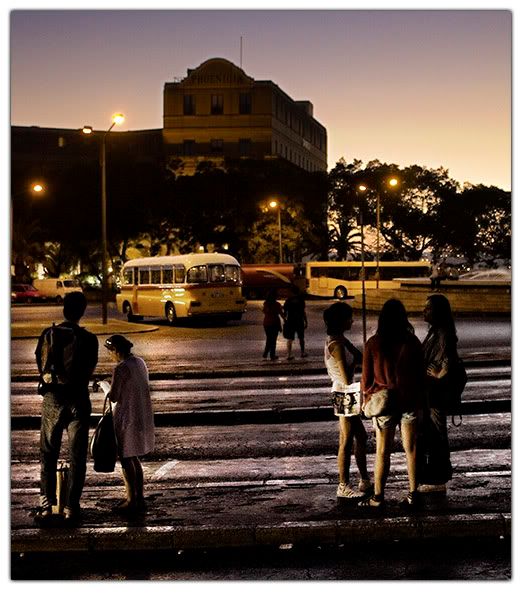
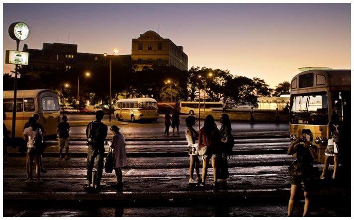
As an example of its genre, it's very well done. You've really brought out all that there is to bring out from the original and you've created a mood and an atmosphere where, in the original there was none ... or very little.
-
26th September 2010, 10:11 AM #3
Re: Bus Station in Malta
An interesting edit, and yes, I think it works.
-
26th September 2010, 10:14 AM #4

- Join Date
- Aug 2009
- Posts
- 4,049
Re: Bus Station in Malta
Richard
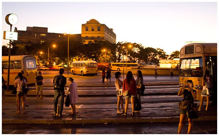
I know you are asking about the processing, but TBH the shot doesn't work too well for me. There is no real focus point of attention, with quite a few disparate elements (groups of people, four buses, the clock etc). And that clock in the TL corner is the brightest thing in the shot, so one's attention is drawn towards it straight away. It might have been much better to focus on one bus (perhaps with the station showing in the background) and just one group of people. Why? because if a general scene like this is not sufficiently interesting/dramatic/amusing etc then the best thing to do is to zoom in and focus more on one or two particular things going on - perhaps, in this case, to capture the expressions on a few individual faces.
That didn't help at all did it? But that's the thing with CiC - you don't get what you ask for, but you do get what you didn't ask for. Sorry about that.
-
26th September 2010, 11:18 AM #5

- Join Date
- Aug 2009
- Location
- Canada
- Posts
- 3,113
- Real Name
- Wendy
-
26th September 2010, 11:43 AM #6
Re: Bus Station in Malta
I like it; it isn't exactly like Derby bus station
 They have a great bus service and I can catch one of the operators buses in Burton a couple of mile walk and then in Derby get on an air conditioned luxury coach with leather seats and wifi to go anywhere for £4.60 and as often as I like and return within a day. Further than Chesterfield costs £8 though and after midnight a pound extra.
Actually they run one every ten minutes and they are queued up, but are always full and make a profit. Where I live the buses look a bit like the ones in your photo, and smell and cost a fortune.
A bit of a digression but nice pic.
-
26th September 2010, 11:55 AM #7

- Join Date
- Mar 2009
- Posts
- 2,522
Re: Bus Station in Malta
I have to disagree with Rob on this one. There are 3 parallel elements to the composition, each with its own story and I like it. I would straighten the building up in the background but apart from that I like the processing.
Steve
-
26th September 2010, 02:27 PM #8
Re: Bus Station in Malta
In the first photo I would say the subject is the edges of light and shadow on the figures and objects. Everything is too well lit in the second photo so everyone could be center of interest. but the bus station does not stand out enough to be considering interesting.
-
26th September 2010, 08:57 PM #9
-
26th September 2010, 10:09 PM #10
Re: Bus Station in Malta
Thanks for the comments, I certainly agree that the composition isn't that great but I can't go back and retake it unfortunately. Rob I'm with you and I have taken a few pictures like that, none are great so not really worth getting c&c on them, I know where they fall down. I think it would probably be possible to get a composition with the same idea as that one and make it work but I don't think I'd find it.
Wirefox Steve, thanks, straightening the building would involve losing (or cutting into) the clock but then again I think we all agree that would be a good thing as it stands. The annoying thing is that there is a great skyline and from where I took the picture (as I ran for the last bus of the day) it's really a detracting element.
Dave I think your version of it is better but I think that it gets rid of both the bad and good elements of the picture to end up with something that's better but less interesting to me. I guess I'm concentrating on the style of the picture to the exclusion of the important things. Then again if yours had a non blown out sky I guess it'd be pretty similar style. Did you deliberately leave the rise in the skyline in the picture on the left hand side? Seems like something to crop out to me. When I see your pic it's just irritating that I didn't take that frame but ten steps to my left with the fountain in it not just poking above the bus in a distracting fashion. Oh well at least I made the bus.
-
26th September 2010, 11:12 PM #11
Re: Bus Station in Malta
This is a jpg, I can't fix the sky you blew
 OK I could make it dimmer, but it's still got no detail. The first time, I tried a different white balance too, but I couldn't, with a blown jpg, make anything sensible from it sadly, so left it as it was (which probably what you wanted anyway). Working from RAW might achieve something though. I definitely prefer your sky in your first (processed) image.
Yes, I see what you mean about the sticky up bit.
How's this? I didn't want to crop further, so I got out the clone brush on that - and a few other things

Oh, and I also did a slight rotate ccw on the first one.
Cheers,
-
27th September 2010, 06:32 AM #12

- Join Date
- Apr 2010
- Location
- North Island New Zealand
- Posts
- 68
- Real Name
- Derek
Re: Bus Station in Malta
Hi Richard
Enjoyed your photos of the bus station in Malta. These have brought back many a happy memory of an ill spent youth. Is the bus depot still situated just outside the entrance to old city of Valletta, and am I correct to think that Valletta would be to the right of the photo. Can't comment on the technicalities of the photo's as I do not know enough to comment, but I like the original photo, as it reflects what I can remember of the evenings there.
Delboy.
-
27th September 2010, 07:58 AM #13
Re: Bus Station in Malta
-
27th September 2010, 08:10 AM #14
Re: Bus Station in Malta
I think you've got it perfect now Richard

still a lot going on - which makes you look a second/third time - I really like those type of shots - (both Steves who posted here have done some really great ones).
Plus to me the overall balance is really appealing now
-
27th September 2010, 09:33 AM #15
-
27th September 2010, 10:03 AM #16

- Join Date
- Aug 2009
- Posts
- 4,049
-
27th September 2010, 01:15 PM #17
Re: Bus Station in Malta
Yep, I agree, this is the best crop by far
-
27th September 2010, 01:25 PM #18

- Join Date
- Aug 2009
- Posts
- 4,049
Re: Bus Station in Malta
And if you compare this one with the original (which I was rather critical of) you can see, I think, a world of difference. And perhaps it would have been better to shot it like this in camera at the time. It reinforces the point, I think, that you need to think about what you are shooting before you shoot it. You can't always do that - the sudden flight of a bird, or that momentary ideal position of an individual in a candid shot - but in most cases you do have time to think about it.
I love analysing other peoples shots!


 Reply With Quote

