 Helpful Posts: 0
Results 1 to 13 of 13
Thread: Need some opinions
-
28th September 2010, 09:40 PM #1
-
28th September 2010, 09:43 PM #2
Re: Need some opinions
No:2 makes sense and I like. Not sure about the other two.
-
28th September 2010, 09:44 PM #3
Re: Need some opinions
Hi Jason,
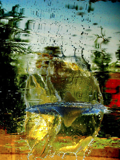
I haven't yet figured out #1
Favourite is #2, but #3 isn't bad either.
Good work,
-
28th September 2010, 11:29 PM #4
Re: Need some opinions
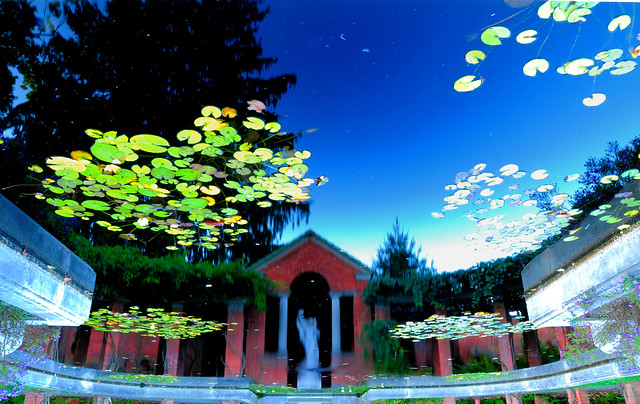
I like them, I guess #3 can be assumed to convey movement.
-
29th September 2010, 12:16 AM #5
Re: Need some opinions
Hi Jason,
#2 appears the best because we can work it out. Abstract needs possibly more creativity and while I like #2 I can see what you are trying to do with colour and movement in the others. I think #3 works - there is good balance and proportion with the elements in the image. I think #1 has potential but whatever is happening on the right hand side needed a larger proportion of the image - it's just hanging there at the moment.
Don't stop you have something to work with here.
Keep trying
-
29th September 2010, 12:52 AM #6
Re: Need some opinions
Jason,
Whatever your inspiration was for these shots, force it on us to see your vision. Don't interpret, lead us but let us find your vision.
-
29th September 2010, 02:28 AM #7
The second picture is my favorite as well but i feel like its not quite right. I liked how the dust or whatever the floating stuff looked like stars. I might try to get more stuff floating on the top to make it appear as the night sky.
this one might be a little too out there but ill try it out anyway. it might be too abstract. I really like the colours though.
also I've wanted a critique on this one for the longest time but until recently i haven't been able to upload photos.
Thanks for the comments everyone.
-
30th September 2010, 10:45 AM #8

- Join Date
- Feb 2009
- Location
- Bucharest,Romania
- Posts
- 1,367
Re: Need some opinions
Hi,
For me the fifth and the third are on the first place.
Radu Dinu
-
30th September 2010, 11:39 AM #9
Re: Need some opinions
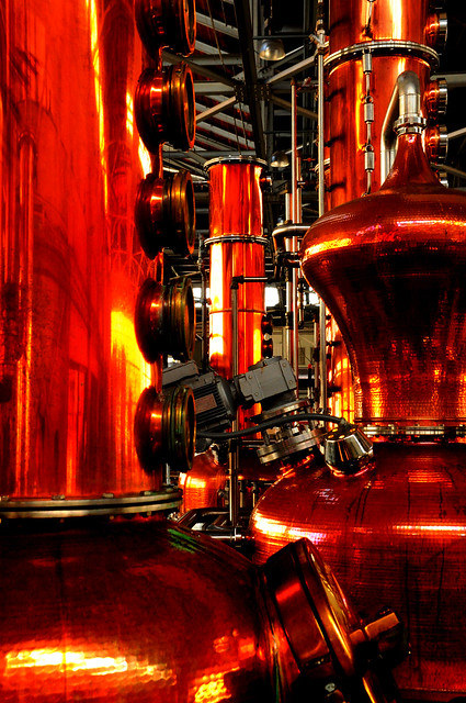
I really like the distillery (I assume it is anyway) shot. To my mind the really great bit is the detail near the bottom right 2/3rd point it has really nice specular reflections and I also like the structure of the two stills. I think those two elements compete a little and by spacing out the two stills a bit it might have emphasised that the first still is separate as I think it loses a sense of depth as it stands. Also were they that red? In my mind I picture them as being more copper, I did play around with a selective colour filter to make them more copper and it improved it to my taste, but possibly just because I expect them to be copper to begin with. I also reckon with so much detail in the background it could have done with less depth of field.
The abstract photos work well to my mind and I bet a graphic designer could put them to good use.
-
30th September 2010, 12:47 PM #10
Re: Need some opinions
Last two for me; I got locked in a brewery once, I was delivering a tanker but security locked up and went home forgetting I was still inside.

I like #5 the most.
-
30th September 2010, 04:33 PM #11
Re: Need some opinions
Rich you are correct it is a distillery they were not that red. its shameful to say but i do not know how to calibrate my monitor. On my screen at home it looks the way it should. However when i went to school last night and took a look at the forum on their fancy imac computers which are calibrated for photography and noticed how off the colours were.
the best part about this distilery was that there was, from the best that i can discribe, a waterfountian coming off the line with, of all things whiskey. and very high quality whisky at that. it was an amazing expierence. To top the tour off we had a liquor tasting of 16 spirits. Needless to say my entire class, including our teacher was wrecked by the end. Thank god we had a bus back to the hotel. By the way i go to culinary school and thats why we get to do these types of things
arith- getting locked in a brewery is a dream of mine. which one was it?
-
30th September 2010, 04:52 PM #12
Re: Need some opinions
I have to confess I'm the same and I'm using a mac book so I probably see it similar to how it is on the iMac.
-
30th September 2010, 06:48 PM #13





 Reply With Quote
