No. It where 3 trees grew together at the base and the middle never gets sun. It is common in FL because of the humidity and temp. One side stays damp and the other is completely dry. I did not think of it until it was in PP. I will PP another that does not have a side that is black. This was his best pose as he not very into having a picture taken.
Side note. I have picked up a book by Scott Kelby for Ligtroom3. Of course I got after the picture was done and posted. It is very good book and written in just my style. Finger paint and crayons.
 Helpful Posts: 0
Results 81 to 100 of 116
-
10th October 2010, 09:42 AM #81
Re: "School of Portraiture" - Lesson 05 - Introduction to Flash & Some Inspiration!
-
10th October 2010, 12:08 PM #82
Re: "School of Portraiture" - Lesson 05 - Introduction to Flash & Some Inspiration!
Hi Sam,
I think you've missed the point, it is really dark on the left, with the trees and subject merging together, have you checked the histogram?

It shouldn't be 'all piled up' against the left hand end like that.
I think your monitor must have the brightness set too high and it is causing you to set the blacks too low when viewing your efforts in PP - if you recall there were similar issues with your (lovely) wife's hair earlier.
Have a read of Sean's tutorial if you're not sure about histograms.
Oh, and reset the monitor!
This should help
How to Calibrate Your Monitor for Photography
Cheers,
-
10th October 2010, 07:47 PM #83
Re: "School of Portraiture" - Lesson 05 - Introduction to Flash & Some Inspiration!
Thankyou again - I opened 2 windows put both Zoe's up side by side and could see what you meant -another on Josh looked just like it had been washed with the grey socks! - so I gave up on that totally!
All 3 kids had quite different complexions so lots of learning potential there.....lucky for me it's cricket season, as long as I turn up and take those, they'll be putty in my hands
I think my monitor is pretty close it's been spidered and things look really bad on BC's across the desk....so blame all down to me I think.
-
10th October 2010, 09:16 PM #84

- Join Date
- Dec 2008
- Location
- New Zealand
- Posts
- 17,660
- Real Name
- Have a guess :)
Re: "School of Portraiture" - Lesson 05 - Introduction to Flash & Some Inspiration!
It's just one of those things one has to "develop an eye for". Usually the best way is to just move each of the sliders in ACR too far, and see if any portions of the scene actually improve anywhere along the way. It's really easy to think you have something looking it's best, and it's not until you test a few adjustments that you can find it has a LOT more potential; Skin tones are the classic for this, both in terms of colour and levels.
Yes - I see that quite a lot in my work too - especially in a weathered face of day, and a much lighter face of a young child.All 3 kids had quite different complexions so lots of learning potential there.....lucky for me it's cricket season, as long as I turn up and take those, they'll be putty in my hands
Ah - that's good. Sorry, but I'm losing track of who's got what. Hopefully you can see that without a profiled screen this kind of thing becomes a lottery.I think my monitor is pretty close it's been spidered and things look really bad on BC's across the desk....so blame all down to me I think.
-
10th October 2010, 11:52 PM #85
Re: "School of Portraiture" - Lesson 05 - Introduction to Flash & Some Inspiration!
Oh said the blind man. I will have to get a "Spider" to calibrate the monitor. I will get this eventually. I do thank you for your time spent on this and I have learned alot. I wish I had more time to do it.
Sam
-
11th October 2010, 01:16 PM #86
Re: "School of Portraiture" - Lesson 05 - Introduction to Flash & Some Inspiration!
Hi Sam,
I agree that a Spyder (or similar) is the best way (not that I have), but I can't help feeling that a look at the light and dark scale patches on that "How to Calibrate Your Monitor for Photography" and a careful play with the monitor settings would bring some immediate (and free) relief to the issue.
Cheers,
-
11th October 2010, 07:17 PM #87
Re: "School of Portraiture" - Lesson 05 - Introduction to Flash & Some Inspiration!
Thanks Dave. I plan on trying it this evening after work, but my problem is it may look good me but
still not be right. It will be good to see if i can tell the difference.
-
11th October 2010, 07:29 PM #88

- Join Date
- Dec 2008
- Location
- New Zealand
- Posts
- 17,660
- Real Name
- Have a guess :)
Re: "School of Portraiture" - Lesson 05 - Introduction to Flash & Some Inspiration!
That's one of the frustrating things about using a colorimeter ... you fork out all that money and the difference it makes may be minimal - but- I've also seen differences of several stops. I profiled a monitor for a professional photographer once ... before I did it I asked him "why have these images all got large areas of blown highlight?" He replied "I have to do it like that so that they print properly" Warning bells anyone?
By the time I'd finished "all was as it should have been".
I agree with Dave though - if you don't have a colorimeter, then getting your screen as close as you can using the other methods is well worth the effort.
-
11th October 2010, 11:26 PM #89
Re: "School of Portraiture" - Lesson 05 - Introduction to Flash & Some Inspiration!
I am doing it tonight and have a younger set of eyes than mine to actually look and see the small lines and fine details. This will have to do until I get a colorimeter. Stupid question again. Is using a dvi connection to a monitor better or worse for photos. I think it is still RGB but the difference is the electron flow.
Colin- Thank you for taking time with my photo.
-
12th October 2010, 02:25 AM #90
-
12th October 2010, 09:35 AM #91
Re: "School of Portraiture" - Lesson 05 - Introduction to Flash & Some Inspiration!
I have manually calibrated my monitor. I didn't notice a big difference. I am ordering a "Spider" this week. Thanks everyone for all the help.
-
14th October 2010, 02:16 PM #92
Re: "School of Portraiture" - Lesson 05 - Introduction to Flash & Some Inspiration!
Hi all, hopefully I'll be able to get some portraits done this week and post them for CC (Hopefully Colin will see an improvement in the skintones!). Just reading through Color Management atm, interesting stuff! Anyways, great portraits everyone! Nice to see some more portraits posted in here

-
16th October 2010, 03:32 AM #93

- Join Date
- Sep 2010
- Posts
- 23
- Real Name
- Scott
Re: "School of Portraiture" - Lesson 05 - Introduction to Flash & Some Inspiration!
Finally chased the 'model' down and got him to stand in one place for 100 miliseconds. Here's 'flash' homework for this week teacher... Let me know what you like/dislike about the shots. Obviously, there is very little photoshop with these ... just very slight 'lightroom' tweaks of the raw files. I also left the 'exif' information with the jpegs. Thanks.

or angled with bit less light on the face

Scott
-
16th October 2010, 05:58 AM #94

- Join Date
- Dec 2008
- Location
- New Zealand
- Posts
- 17,660
- Real Name
- Have a guess :)
Re: "School of Portraiture" - Lesson 05 - Introduction to Flash & Some Inspiration!
Hi Scott,
The exposure and skin tones all look good to me ... just not quite so sure about the composition. What do you think of it?
-
16th October 2010, 04:39 PM #95

- Join Date
- Sep 2010
- Posts
- 23
- Real Name
- Scott
Re: "School of Portraiture" - Lesson 05 - Introduction to Flash & Some Inspiration!
Hi Colin - They were test shots with new light and lens. So, I'm glad to hear the exposure and skin tones were fine. Yes, the composition is boring, mug-shot like and they are centered. Will try zooming out a little and putting the subject more into a third and from different angles. I also used two lights (2:1) so might try just one light and play more with shadow.
Scott
-
16th October 2010, 08:37 PM #96

- Join Date
- Dec 2008
- Location
- New Zealand
- Posts
- 17,660
- Real Name
- Have a guess :)
Re: "School of Portraiture" - Lesson 05 - Introduction to Flash & Some Inspiration!
Hi Scott,
The "book" says that with the female gender you'd typically run 3:1 lighting ratio, and with the male gender something higher like 5:1, but more recently I've been running much higher ratios for more contrasty shots, and liking what I'm getting.
So ideally get your key light at a high angle (like the sun) but make sure it illuminates both eyes. What lights do you have by the way? Small flashes? Studio strobes?
Here's a shot done with a front-on snoot, with a soft box above and behind for a hair/kicker light ...

-
17th October 2010, 02:05 AM #97

- Join Date
- Sep 2010
- Posts
- 23
- Real Name
- Scott
Re: "School of Portraiture" - Lesson 05 - Introduction to Flash & Some Inspiration!
Colin - Very nice blending of 'hard light' straight on with highlights in the hair. Love it. And pale skin against black background is always nice. You make it look so simple ... yet it is so hard to get all pieces to work together...
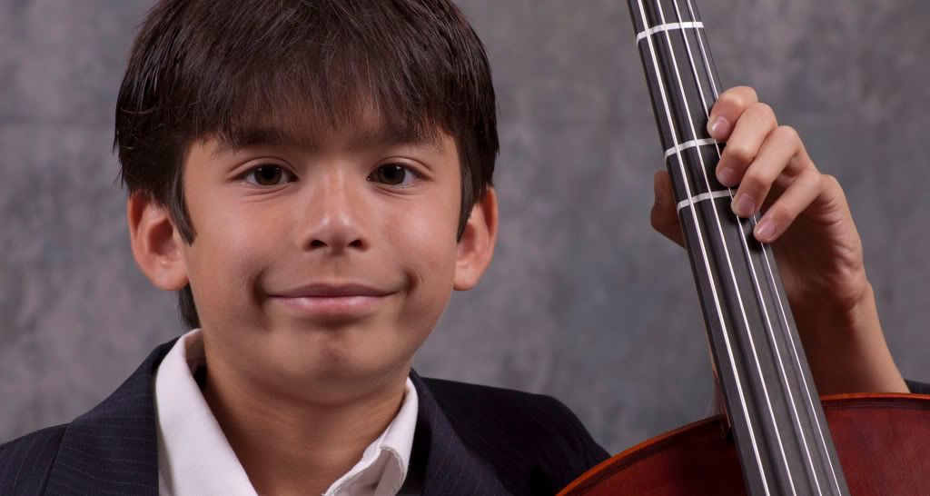
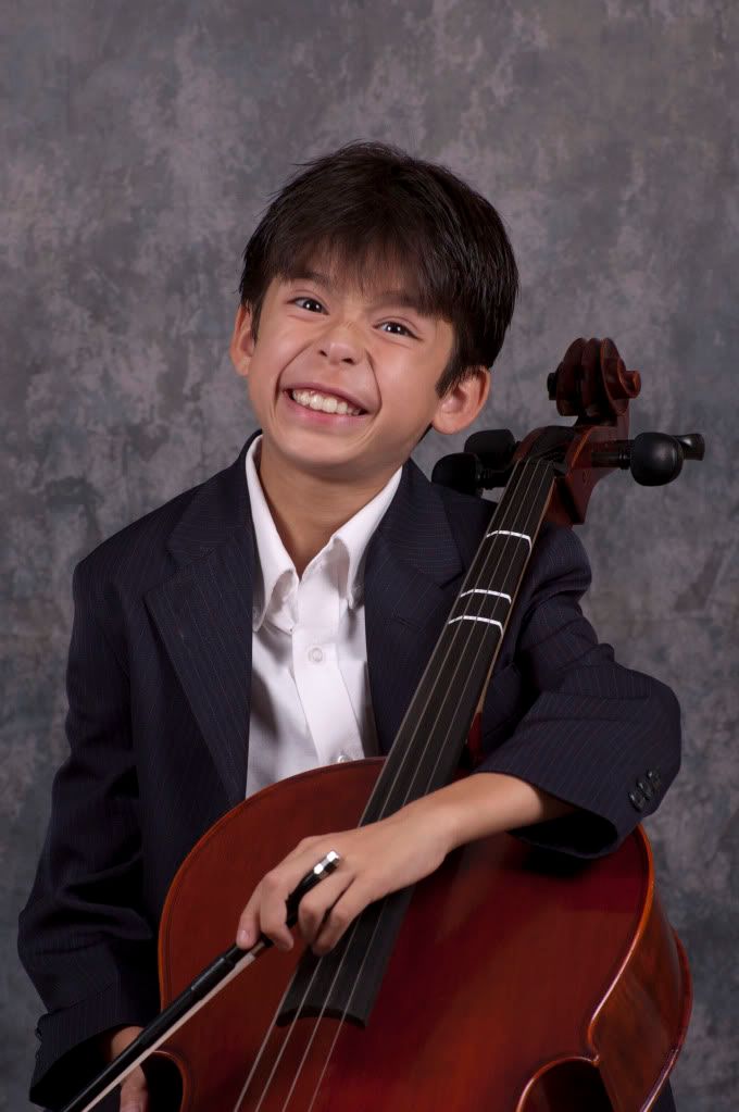
Here are three variations of my second son with 4:1 lighting ratio. For this homework assignment I was mostly trying to figure out what lighting and composition brought out the best of him and his Cello. Completely missed the poorly buttoned shirt, etc but working on scheduling a retake...


Scott
-
17th October 2010, 05:39 AM #98

- Join Date
- Dec 2008
- Location
- New Zealand
- Posts
- 17,660
- Real Name
- Have a guess :)
Re: "School of Portraiture" - Lesson 05 - Introduction to Flash & Some Inspiration!
Hi Scott,
Great stuff - now for the fun part (well it's fun for me anyway!)
Of the three shots, I think the 3rd one has the most character; The first shot is "OK" but it strikes me as more of a "slice of life" type shot - perhaps something that might be used on a promotional brochure where it needed to be a certain shape to fit in with layout requirements, but probably not a composition you'd frame and hang on your wall. The 2nd shot has too much headroom (a common mistake), but that aside, your son's expression probably isn't one I'd associate with a "keeper" (please don't take offence to that - I eliminate 95% of my shots for this reason). The third is a real winner though.
Some thoughts on #3 ...
- Don't be afraid to try a few variations on a theme when you have a shot like this; we ended up with a 1/2 smile looking at the camera, but I think a very powerful alternative would have been a serious shot, looking down at the instrument (perhaps capturing the emotion of playing it). Props like this make portraiture so so so much easier, and when you capture an emotional interaction with the prop then it takes it to a new level again because photography is all about emotions (either capturing them or invoking them).
- I thought your relatively contrasty lighting was great - it certainly adds character to the shot.
- I thought the overall tone was a touch too subdued and a touch too contrasty (well more an issue with slightly under-developed shadow areas than contrast per sec), so I've raised the overall levels a touch and added a touch of fill light.
- Something I like to do - but I don't see often here - is to add a broad vignette to draw the eye towards the face and body, and to de-emphasize the right hand side of the instrument. It protuded onto the face a little too much so I rolled that part back using the history brush, and also burned the midtones down the side to further "control" the light.
- Gentle sharpen 100 @ 0.3
- Added drop shadow (in my mind, presentation IS important. Restaurant food and army food may be the same meat and vegetables, but I know which one LOOKS better).
But very well done - this is definately professional standard!
-
17th October 2010, 07:55 AM #99
Re: "School of Portraiture" - Lesson 05 - Introduction to Flash & Some Inspiration!
Hi Scott,
#2 would, however, make a good one for the family album, so to speak.
#3 especially is very good work, and really shows what great progress you have made, well done.
Very wisely you have tackled one problem at a time and mastered that before (swiftly) moving on to the next.
Cheers,
-
18th October 2010, 08:25 PM #100

- Join Date
- Sep 2010
- Posts
- 23
- Real Name
- Scott
Re: "School of Portraiture" - Lesson 05 - Introduction to Flash & Some Inspiration!
@Colin - Thank you for the detailed critique and as always with your touch up showing how to make an image look even better. Your advice and encouragement have been invaluable.
PS I had tried some sharpening but found that the strings looked less straight and had a slight jagged look to them.
@Dave - Just couldn't keep track of all the variables in my brain at once so isolated the main areas I wanted to focus on and working them one by one.
Given your advice, I'll work on composure next and try to capture some emotion in the portrait. e.g. Son looking at cello whilst playing a complicated movement or eyes closed 'looking' off into the distance playing one he's already mastered kinda thing. Wonderful advice.
Thanks
Scott


 Reply With Quote
