
 Helpful Posts:
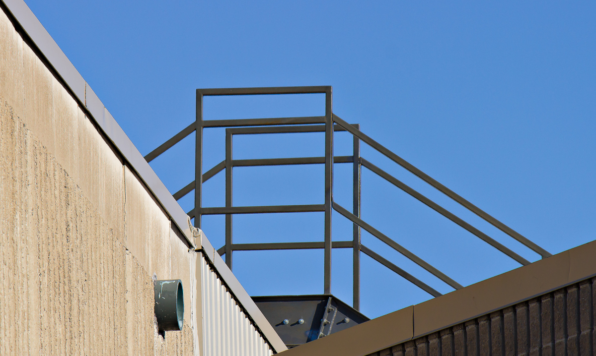
 This is a photo that I took about a year ago and relegated to my large "maybe some day I'll look at it" pile. Well, that day has come and to my surprise, I quite like it now. It is unusual for me to take a photo that does not have a clear subject. However this purely graphic composition of strong lines, shapes, color and textures now appeals to me.
I would welcome your opinions.
#1
André
Results 1 to 20 of 21
Thread: Roof Lines
-
12th April 2017, 01:16 PM #1


- Join Date
- Apr 2015
- Location
- Ottawa, Ontario, Canada
- Posts
- 1,395
- Real Name
- André
Roof Lines
-
12th April 2017, 01:24 PM #2
- Join Date
- May 2012
- Location
- northern Virginia suburb of Washington, DC
- Posts
- 19,064
Re: Roof Lines
The subject is very clear to me: the railings at the top are strongly supported by the lines beneath them. Consider making this a monochrome to make the image more about lines by reducing the impact of the color.
-
12th April 2017, 07:43 PM #3

- Join Date
- Aug 2013
- Location
- Lorient France
- Posts
- 2,382
- Real Name
- Jean
Re: Roof Lines
I like this color version, but for me I'll delete the bottom until the right oblique (or small almost horizontal line)
But why not try a monochrome version with strong contrast?
-
12th April 2017, 08:46 PM #4

- Join Date
- Oct 2015
- Location
- Sheridan, Wyoming
- Posts
- 1,241
- Real Name
- Paul David
Re: Roof Lines
I like it. I have one that I will post in a different thread.
-
12th April 2017, 11:15 PM #5

- Join Date
- Dec 2009
- Location
- WNY
- Posts
- 36,716
- Real Name
- John
Re: Roof Lines
Nicely done.
-
13th April 2017, 08:31 PM #6Moderator

- Join Date
- May 2008
- Location
- Windsor, Berks, UK
- Posts
- 16,755
- Real Name
- Dave Humphries :)
Re: Roof Lines
I'd rotate it a bit (clockwise) Andre
Dave
-
14th April 2017, 05:21 AM #7
- Join Date
- Nov 2016
- Location
- ex Auckland, now Porirua, New Zealand
- Posts
- 957
Re: Roof Lines
Well, Andre, monochrome - yes; rotation, for a moment I thought it was just me, but agree a bit clockwise. Additionally, I would go for a slightly tighter crop. But, yes, good call to bring out of the archives.
-
14th April 2017, 12:26 PM #8
- Join Date
- Apr 2015
- Location
- Ottawa, Ontario, Canada
- Posts
- 1,395
- Real Name
- André
Re: Roof Lines
Thank you Mike, Jean, Paul, John, Dave and Jim.
Mike - It had not occurred to me that a graphic element could be the subject of a photo. I had always thought that the subject had to be intrinsically interesting. Thanks for pointing that out. With regard to B & W, I tried it without much success which is not surprising since I generally prefer colour. To me, the visual impact of the blue sky is an important element that gets lost in the conversion.
Jean - The crop that you suggest is a big improvement. Thank you.
Dave - That is a tough call. I had a choice of alignment between the vertical members and the horizontal members of the railing. I picked the vertical ones but could just as easily have used the horizontal ones. Trying to line up the texture in the walls did not work at all.
Jim - I think that a tighter crop will work well.
I will reprocess this photo keeping all of your suggestions in mind and post the result. In the mean time, if anybody would like to do a B & W version, please don't be shy.
André
-
14th April 2017, 03:14 PM #9
- Join Date
- May 2012
- Location
- northern Virginia suburb of Washington, DC
- Posts
- 19,064
Re: Roof Lines
A successful subject for any photo probably does have to be intrinsically interesting, though I've never given that any thought. (It can be interesting without being attractive; it might even be ugly.) For me, the railing has intrinsic interest because it has a graphic characteristic. Originally Posted by Round Tuit

Last edited by Mike Buckley; 14th April 2017 at 04:31 PM.
-
14th April 2017, 04:09 PM #10

- Join Date
- Sep 2015
- Location
- Langley, WA USA
- Posts
- 1,603
- Real Name
- Judith
Re: Roof Lines
Here are two Flickr groups I belong to that emphasize the graphic elements. I have been surprised to see so little of this type of photography on Cambridge. The first group is more tightly moderated.
https://www.flickr.com/groups/linescurves/pool/
https://www.flickr.com/groups/lessismore/pool/
-
14th April 2017, 04:50 PM #11
- Join Date
- Dec 2009
- Location
- WNY
- Posts
- 36,716
- Real Name
- John
Re: Roof Lines
Hi Judith, Originally Posted by Urbanflyer
Graphic elements has been displayed on this forum in the past and often in the in the competition threads, it is a style I do practice from time to time having been introduced to it by Joe McNally. One of McNally's exercises was to isolate portions of a lighthouse as it presented a different perspective of your usual examples.
-
14th April 2017, 05:19 PM #12
- Join Date
- Sep 2015
- Location
- Langley, WA USA
- Posts
- 1,603
- Real Name
- Judith
Re: Roof Lines
Well--I am always learning and b & W conversion is only slowly creeping into my skill set. So your invitation was a challenge to get some feedback. I did not do any of the crops and adjustments others recommended though I agree some are worthwhile. Just focused on the conversion. Agree that the sky is an important element so took it lighter than I might otherwise have done. Would love C & C from those of you who are so much more experienced at this than I. Originally Posted by Round Tuit

-
14th April 2017, 05:32 PM #13
- Join Date
- May 2012
- Location
- northern Virginia suburb of Washington, DC
- Posts
- 19,064
Re: Roof Lines
That conversion works very nicely for me, Judith. Now get going with conversions of your own images!
-
14th April 2017, 09:04 PM #14
- Join Date
- Sep 2015
- Location
- Langley, WA USA
- Posts
- 1,603
- Real Name
- Judith
Re: Roof Lines
Aye, Aye! Thanks for the feedback! Originally Posted by Mike Buckley
-
15th April 2017, 12:08 AM #15

- Join Date
- May 2013
- Location
- Vanuatu
- Posts
- 709
- Real Name
- Robert (ah prefer Boab) Smith
Re: Roof Lines
Hi Judith,
Ah prefer the colour version. Don't think there's enough tonal range for the B+W conversion, especially with all that sky (necessary for the central structure). Ah'd look at trying tae dramatise the colours, combined with using bits of software, tae create a vibrant abstract.
-
15th April 2017, 12:11 AM #16
- Join Date
- Sep 2015
- Location
- Langley, WA USA
- Posts
- 1,603
- Real Name
- Judith
Re: Roof Lines
I. too, prefer the color version. doing the conversion was a personal challenge. Originally Posted by tao2
-
15th April 2017, 12:32 AM #17
- Join Date
- May 2013
- Location
- Vanuatu
- Posts
- 709
- Real Name
- Robert (ah prefer Boab) Smith
Re: Roof Lines
Hi Judith, Originally Posted by Urbanflyer
been playing around with your colour version. Ah can post it in the thread, if ye like. Gonna have a go at a b+w version...if that's OK.
-
15th April 2017, 01:52 AM #18
- Join Date
- Sep 2015
- Location
- Langley, WA USA
- Posts
- 1,603
- Real Name
- Judith
Re: Roof Lines
That photo was not mine originally--It was taken by Andre in Ottawa--see first post in this thread. While others offered ideas to improve the color version, one person suggested a B & W conversion. Andre said he wasn't going to try the B & Originally Posted by tao2
W but if others wanted to do so, have at it. That was the genesis of my B & W. It would be interesting to see your take on a conversion.
-
15th April 2017, 12:17 PM #19
- Join Date
- Apr 2015
- Location
- Ottawa, Ontario, Canada
- Posts
- 1,395
- Real Name
- André
Re: Roof Lines
Thank you all for your continued interest and valuable contributions.
Judith - Your B & W conversion is much better than anything I had tried. I still prefer the colour version but that is a good conversion.
Boab - Please do post your colour and B & W visions for this image. Judging by the originality of your usual post, it will be interesting to see.
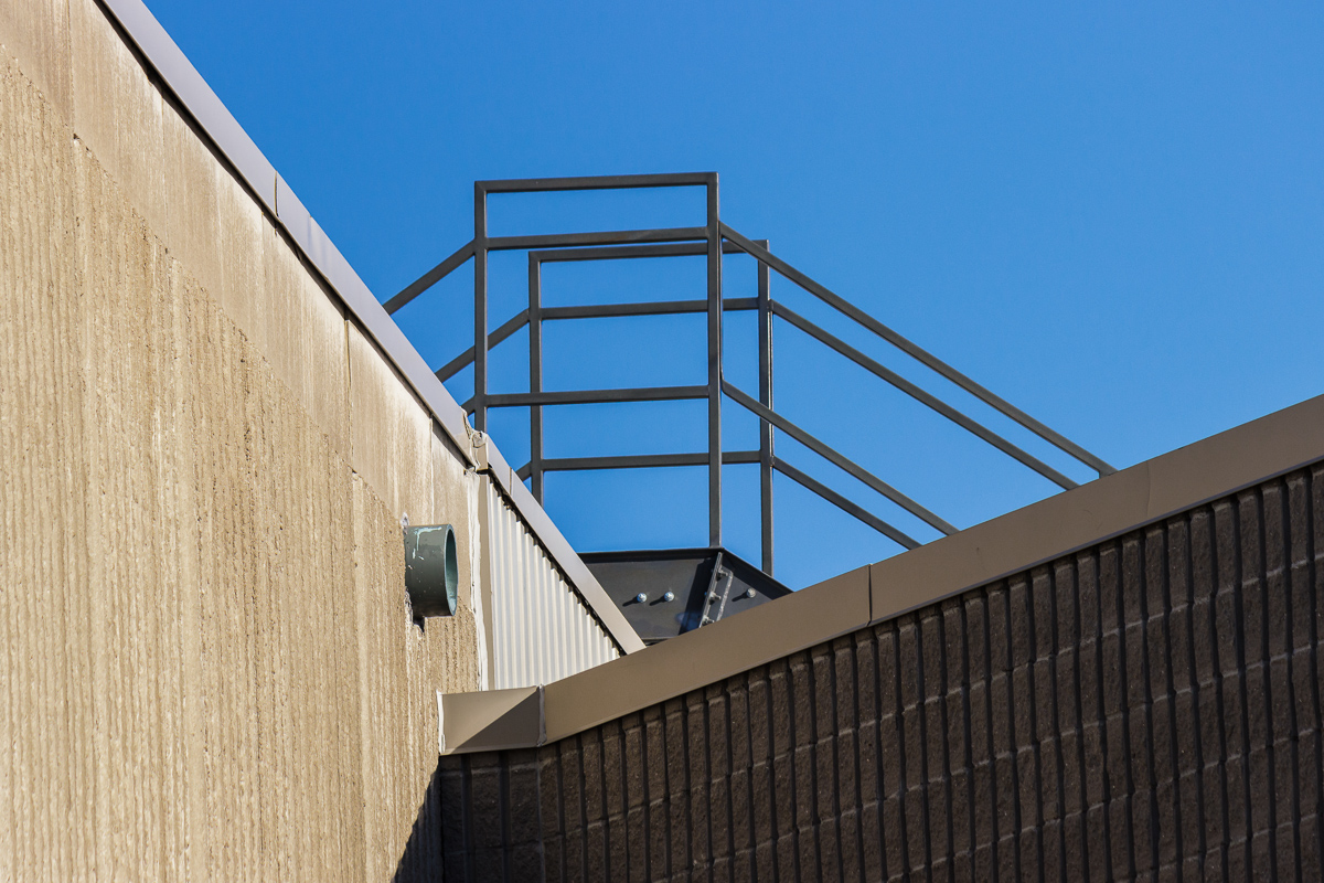
I have tried the tighter crop along the line suggested by Jean and Jim. It did not work as well as I had expected. I find that the railing is a bit too prominent and the context not quite as effective. Here it is:
#2 (of my images)
Just to reiterate, all edits and revisions will be most welcomed.
-
15th April 2017, 02:31 PM #20
- Join Date
- May 2013
- Location
- Vanuatu
- Posts
- 709
- Real Name
- Robert (ah prefer Boab) Smith
Re: Roof Lines
Hi André,
Tae emphasize the abstract over the function and form, ah prefer bold,brash and bright as opposed tae natural - especially if there isn't a large range of tones tae use...so...


 Reply With Quote