Results 1 to 8 of 8
-
6th May 2017, 06:43 AM #1

- Join Date
- Oct 2013
- Location
- Philippines
- Posts
- 12,181
- Real Name
- Brian
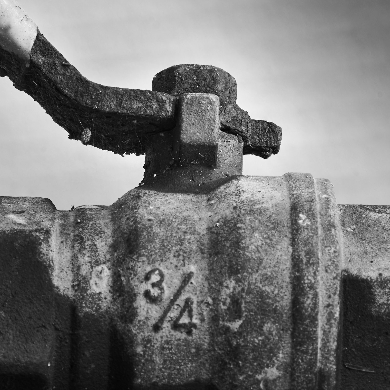
3/4: A different Direction & maybe a better shot
Last edited by JBW; 6th May 2017 at 01:22 PM.
-
6th May 2017, 09:06 AM #2
Re: 3/4: A different Direction & maybe a better shot
Brian, I think you have the base there for a very good image but to me it still looks flat, unless that was your intention.
Your subject is a rusty old valve, especially the handle and nut so why not bring that out and emphasise it in the image?
The background shade compliments things very well and I would leave as is but try adding some pop to the valve with both adjustment of B & W levels and some LCE (coarse sharpening).
PS, is that a bug on the left?
-
6th May 2017, 09:51 AM #3

- Join Date
- Oct 2013
- Location
- Philippines
- Posts
- 12,181
- Real Name
- Brian
-
6th May 2017, 10:00 AM #4
Re: 3/4: A different Direction & maybe a better shot
Brian, look here in CiC tutorials https://www.cambridgeincolour.com/tu...nhancement.htm
I did it on your image using the 'structure' function in Viveza. It is also not always necessary to do the entire subject, you can just pick out certain areas.
-
6th May 2017, 10:38 AM #5

- Join Date
- Oct 2013
- Location
- Philippines
- Posts
- 12,181
- Real Name
- Brian
-
6th May 2017, 01:47 PM #6
Re: 3/4: A different Direction & maybe a better shot
One can get fairly similar results using the clarity slider in LR, for those who use it, as well as "structure" in Nik software and the local contrast enhancement using unsharp mask in the tutorial.I did it on your image using the 'structure' function in Viveza. It is also not always necessary to do the entire subject, you can just pick out certain areas.
-
6th May 2017, 08:58 PM #7
-
7th May 2017, 12:28 AM #8

- Join Date
- Oct 2013
- Location
- Philippines
- Posts
- 12,181
- Real Name
- Brian

 Helpful Posts:


 Reply With Quote


