Results 1 to 17 of 17
Thread: Off to the Hunt
-
13th May 2017, 06:25 AM #1
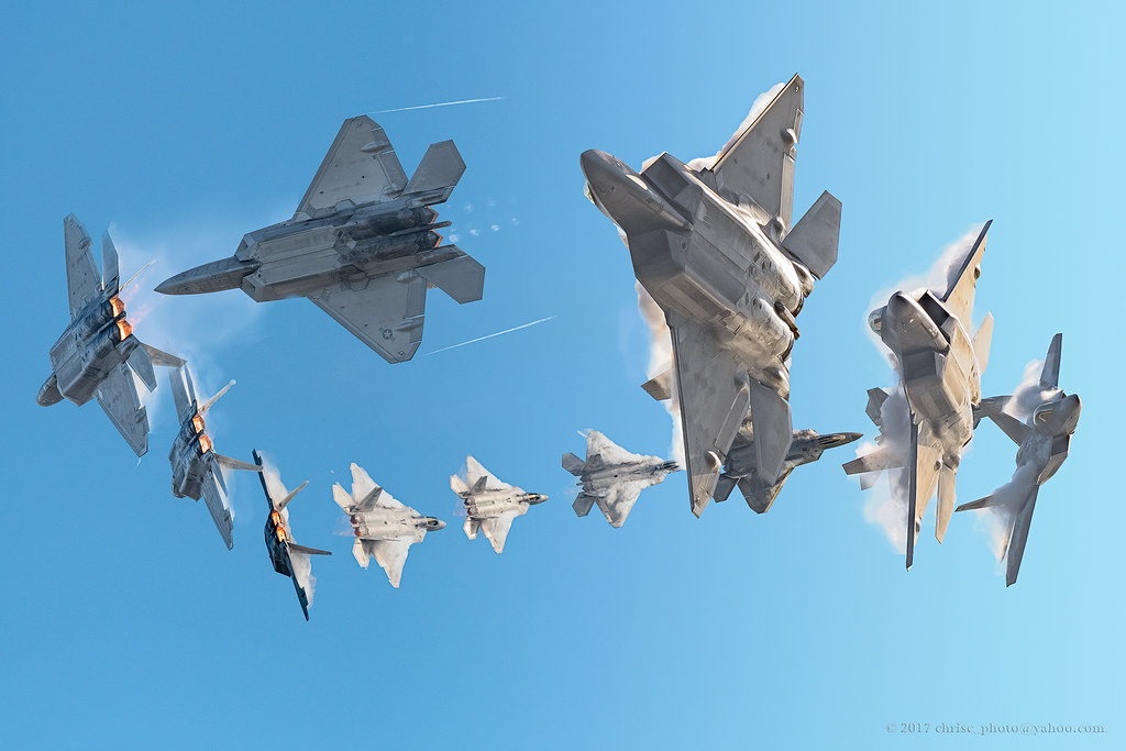
Off to the Hunt
-
13th May 2017, 10:29 AM #2
-
13th May 2017, 11:40 AM #3

- Join Date
- May 2011
- Location
- SE Michigan
- Posts
- 4,511
- Real Name
- wm c boyer
Re: Off to the Hunt
Ya might want to put some space between them.
-
13th May 2017, 12:11 PM #4
Re: Off to the Hunt
Beautiful.
-
13th May 2017, 01:36 PM #5
-
13th May 2017, 02:29 PM #6
Re: Off to the Hunt
Chris, i think there is a point in what Boyer had mentioned; due to overlap, it appears a bit confusing; for a while i thought it is a herd of birds in flight, mostly because of overlapping.

-
13th May 2017, 10:08 PM #7

- Join Date
- May 2011
- Location
- SE Michigan
- Posts
- 4,511
- Real Name
- wm c boyer
-
13th May 2017, 11:07 PM #8
-
14th May 2017, 02:44 AM #9
Re: Off to the Hunt
But in this image distinction is very clear and it it works well.....
-
14th May 2017, 03:41 AM #10
Re: Off to the Hunt
And as much as I respect your opinions, all, I still like how I've posted it. Beauty is in the eye of the beholder....of the camera.
-
14th May 2017, 05:33 AM #11
Re: Off to the Hunt
The real thing is that taker's eyes and viewer's eye are different; taker knows what he is presenting; but viewer has to discern what he is seeing...taker may not understand that difficulty

-
14th May 2017, 06:20 AM #12


- Join Date
- Dec 2013
- Location
- Chesterfield, Missouri/Melbourne, Australia
- Posts
- 17,827
- Real Name
- Izzie
Re: Off to the Hunt
You both got good arguments there. I like the clean conversion though..
-
14th May 2017, 05:32 PM #13
Re: Off to the Hunt
This image, while it did receive good remarks here was panned in two other forums. To date, this has been my highest selling image. The panner's thought it didn't have enough depth to the arc or didn't complete the arc and that it was too contrived. The idea was to present a scale of a Raptor's ability to make an incredibly tight turn at an also incredible speed. I am not sure there is an F22 pilot, or crew that doesn't have one of this print hanging somewhere in their house or office. Even the Air Force has used it in several Instagram's and I am currently in a dialogue with Lockheed. It is a nice kudo but I think it also proves my point that we all will perceive things differently, else we become brainless automons and that it is always the perception of the taker that should be first approved unless there is an exposure or focus issue. But, again, I will not pretend to tell you how you should view an image, only defend my position as to why I chose that composition. Smiles!

-
14th May 2017, 05:39 PM #14
Re: Off to the Hunt
I respect your view, no doubt; i was just mentioning what i felt when i saw the image; it does not mean the image has a bad composition; i had some doubt about it; that's all . This image of yours you now posted is superb and a marvel of composition....!!!!
-
14th May 2017, 05:52 PM #15
Re: Off to the Hunt

-
14th May 2017, 07:30 PM #16

- Join Date
- Dec 2011
- Location
- Athens GR
- Posts
- 126
- Real Name
- Patrik
-
14th May 2017, 07:51 PM #17
Re: Off to the Hunt
Explain, perhaps, but there is no reason to defend. We all have our own taste. It would be boring if we didn't.I will not pretend to tell you how you should view an image, only defend my position as to why I chose that composition.
For my taste: I don't like the image. I find it off-putting that the rearmost bird has no heard or neck. It's obviously closer than the middle one, so the head can't be hidden by the wing, and if it were and they were flying that close, the middle bird would whack the one in the back on the head. The image seems very cramped as well as unnatural.
To each her or his own.

 Helpful Posts:

 Reply With Quote


