Results 1 to 20 of 41
-
28th May 2017, 09:18 AM #1

- Join Date
- Oct 2013
- Location
- Philippines
- Posts
- 12,181
- Real Name
- Brian
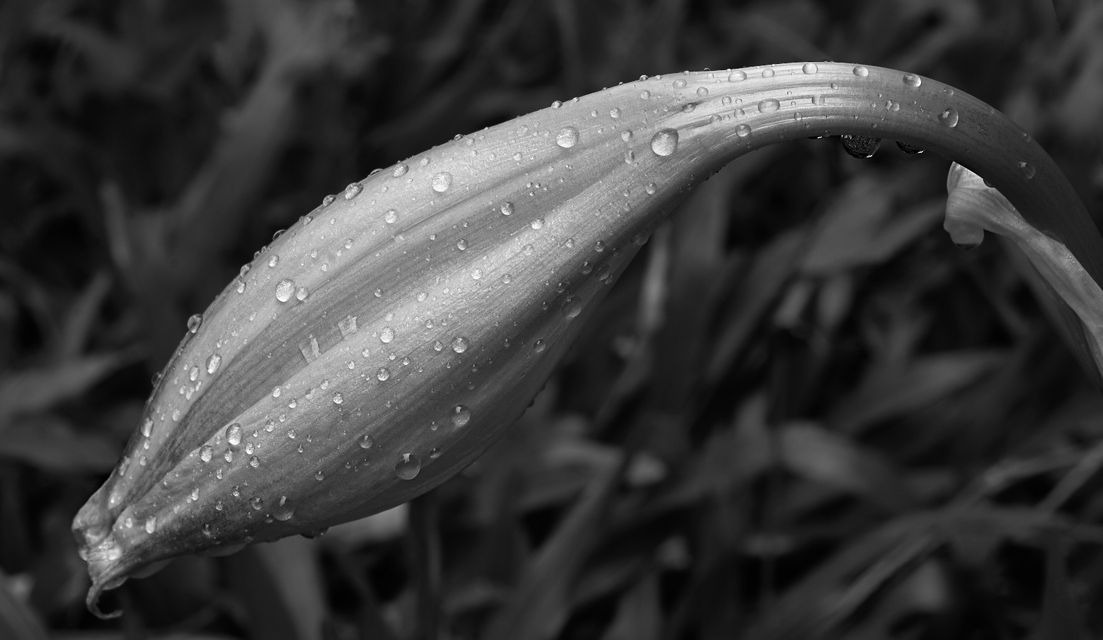
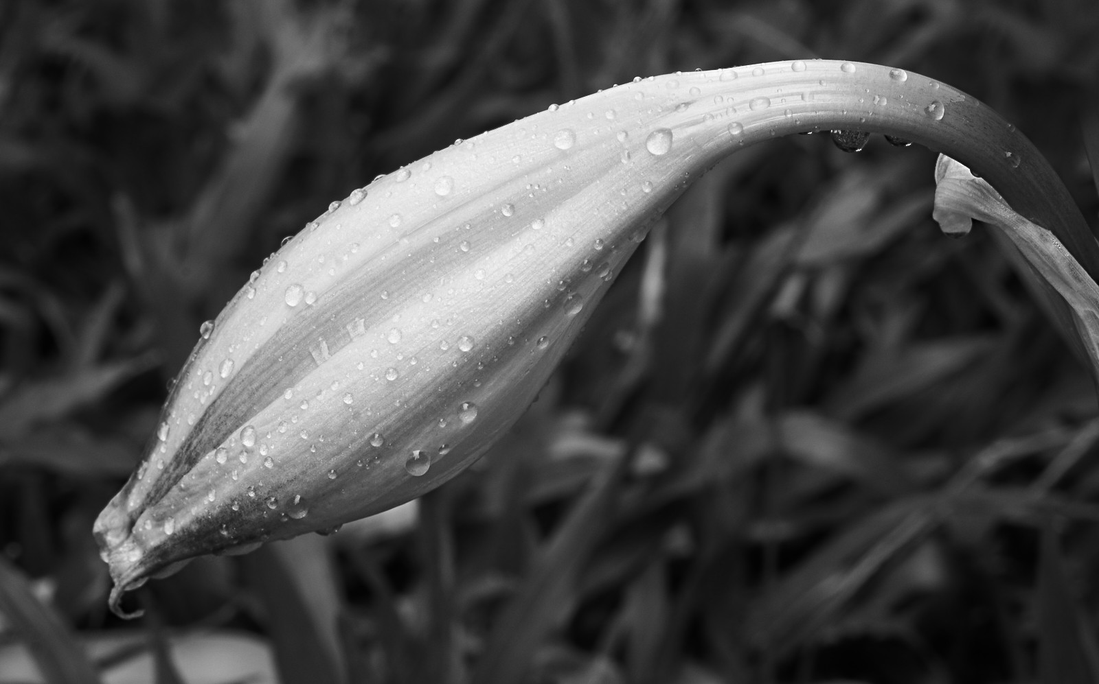
Practicing the craft: Monochromatic red and white striped lily
-
28th May 2017, 11:33 AM #2
Re: Practicing the craft: Monochromatic red and white striped lily
Looks good, very sharp capture and smooth conversion.
-
28th May 2017, 12:15 PM #3

- Join Date
- Oct 2013
- Location
- Philippines
- Posts
- 12,181
- Real Name
- Brian
-
28th May 2017, 07:07 PM #4

- Join Date
- Jan 2009
- Location
- South Devon, UK
- Posts
- 14,553
Re: Practicing the craft: Monochromatic red and white striped lily
A tricky subject for monochrome.
Maybe lose a little from the right side and replace it with some 'negative space' on the left and bottom; so the tip isn't quite so close to the frame edges?
-
28th May 2017, 07:17 PM #5
Re: Practicing the craft: Monochromatic red and white striped lily
+1 to Geoff's comment. I know some people do monochrome shots of flowers, but in general I find that the colours are why we like flowers, so throwing that aspect of the image away generally does not work for me.
-
28th May 2017, 10:54 PM #6

- Join Date
- Oct 2013
- Location
- Philippines
- Posts
- 12,181
- Real Name
- Brian
-
28th May 2017, 10:55 PM #7

- Join Date
- Oct 2013
- Location
- Philippines
- Posts
- 12,181
- Real Name
- Brian
Re: Practicing the craft: Monochromatic red and white striped lily
Which is the challenge. To find the beauty behind the colors. Just to mix a little apples and oranges: Casablanca is a horrible movie when it's colorized.
Living, working and loving on the north coast of B.C. taught me that the subtlest of colors can be as beautiful as the boldest. A good monochromatic shot tends to run from pure black to whitest white. To me this means all the colors are there. They're just really really subtle.
-
28th May 2017, 10:57 PM #8

- Join Date
- Nov 2016
- Location
- ex Auckland, now Porirua, New Zealand
- Posts
- 957
Re: Practicing the craft: Monochromatic red and white striped lily
Very good Brian - it gives us a new slant on things!
-
28th May 2017, 11:00 PM #9

- Join Date
- Oct 2013
- Location
- Philippines
- Posts
- 12,181
- Real Name
- Brian
-
28th May 2017, 11:16 PM #10

- Join Date
- Feb 2012
- Location
- Texas
- Posts
- 6,956
- Real Name
- Ted
Re: Practicing the craft: Monochromatic red and white striped lily
If you're going into grayscale, Brian, the following might be of interesting albeit not exactly simple:
http://cadik.posvete.cz/color_to_gray_evaluation/
Of interest is the very first example (red peppers) and scrolling right and left to see the various conversion methods and their results, vis-a-vis converting red things to grayscale. Other rows below that are of interest vis-a-vis other types of image content.
I found it to be quite fascinating, dispelling any idea that conversion from RGB to grayscale is simply a matter of choosing between de-saturation and luminance methods . . .
-
28th May 2017, 11:31 PM #11

- Join Date
- Oct 2013
- Location
- Philippines
- Posts
- 12,181
- Real Name
- Brian
-
28th May 2017, 11:35 PM #12
-
29th May 2017, 12:07 AM #13

- Join Date
- Feb 2012
- Location
- Texas
- Posts
- 6,956
- Real Name
- Ted
-
29th May 2017, 12:33 AM #14
Re: Practicing the craft: Monochromatic red and white striped lily
An interesting study. I've downloaded the full length academic paper for future perusal. Having only an extremely quick look at the page in Ted's link, I didn't see any reference to Silver Efex, which I believe is the software used by Donald and some others for their B&W work.
-
29th May 2017, 12:37 AM #15

- Join Date
- Oct 2013
- Location
- Philippines
- Posts
- 12,181
- Real Name
- Brian
-
29th May 2017, 02:04 AM #16
Re: Practicing the craft: Monochromatic red and white striped lily
My take on this is slightly different. When one converts to B&W one potentially throws away 99.998% of the data one paid for when one bought the camera. When you display a B&W jpeg, you are limited to 256 tonal values, rather than the 16.7 million colours that a colour jpeg image can have. I need a really good reason to do this.
-
29th May 2017, 02:30 AM #17

- Join Date
- Oct 2013
- Location
- Philippines
- Posts
- 12,181
- Real Name
- Brian
Re: Practicing the craft: Monochromatic red and white striped lily
-
29th May 2017, 03:20 AM #18

- Join Date
- Oct 2013
- Location
- Philippines
- Posts
- 12,181
- Real Name
- Brian
-
29th May 2017, 03:43 AM #19
Re: Practicing the craft: Monochromatic red and white striped lily
That is a rather interesting and unique view Brian.
When I first got into serious photography, I shot B&W pretty well exclusively for the first couple of years. That was in the film days so the tools I got to use were much more primitive than a modern digital camera. Black, white and all the shades between and contrast control were the only variables one had to worry about with a well exposed negative. In the days of printing in the wet darkroom, there were a few more variables; paper base colour, texture and toning. All of this was considerably less complex and simpler to get great images than colour has ever been. About 5% of my work continues to be in B&W.
There are far more variables in colour work, from white balance to colour grading. I find doing colour well takes a lot more time, effort and knowledge (colour theory) than B&W does.
-
29th May 2017, 04:07 AM #20

- Join Date
- May 2012
- Location
- northern Virginia suburb of Washington, DC
- Posts
- 19,064
Re: Practicing the craft: Monochromatic red and white striped lily
When choosing whether to make a monochrome image or a color image, I need only one reason: that I like it better.
I can't perceive 16 million colors, so it doesn't do me any good that so many of them are being displayed. If I had to make a choice between making only black-and-white images or only color images the rest of my life, I'd definitely go with black-and-white.Last edited by Mike Buckley; 29th May 2017 at 04:31 AM.

 Helpful Posts:

 Reply With Quote


