https://en.wikipedia.org/wiki/Opium
No fun at all . . .. . . I do not take drugs nor smoke nor drink alcohol.
Results 21 to 33 of 33
Thread: Poppies
-
18th June 2017, 07:57 PM #21

- Join Date
- Feb 2012
- Location
- Texas
- Posts
- 6,956
- Real Name
- Ted
Re: Poppies
-
18th June 2017, 10:00 PM #22
Re: Poppies
I too like #2 much more. It's a truly unique image, and the lighting and DOF are good. I agree about the errant anther. When I do macros like that, I sometimes take a fine tweezer and remove things like that problematic anther. It's sometimes much easier to do it physically than with PP.
I'm less fond of #1. It's less unusual, of course, but the lighting also seems a bit harsh, and I think it would be better with more separation from the foliage in the back. I think the latter would be easy to do in PP. You might be able to tone down the lighting a bit in PP also, but I find that hard to do.
-
19th June 2017, 01:41 AM #23

- Join Date
- Oct 2013
- Location
- Philippines
- Posts
- 12,181
- Real Name
- Brian
Re: Poppies
Childhood memories, we had poppies in our backyard. Would you consider opening up the crop on #1. Not the width but the height. Part of me wants to tone down the brilliant green leaves in #2. The rest of me says don't be a fool it would ruin the shot. Perhaps just a touch of purple? mauve? blue? in the background to blend with the top of the iced doughnut structure?
-
22nd June 2017, 11:36 AM #24
Re: Poppies
Hi Izzie, and Ted
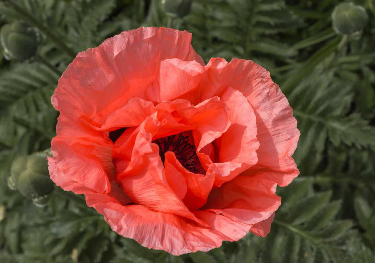
This is an ornamental poppy, I doubt very much that it would produce much if any opium as it is quite legal to grow.
Dan,
I know that I should have been more careful with the second shot but this was a spur of the moment shot. Lesson learned. As for the first, you are right that the sunlight was too strong for best results.
Brian,
I hope they were good childhood memories. I haven't been able to get good results with adding colours to the background. Would you care to demonstrate what you meant.
Thank all for your comments.
This is a revised picture of #1 incorporating what I could from Dan and Brian's suggestions.

André
-
22nd June 2017, 12:16 PM #25
Re: Poppies
For me your red color is too close to pink.
The ones I shot were more vivid red.
I like your second shot
-
22nd June 2017, 02:08 PM #26

- Join Date
- Oct 2013
- Location
- Philippines
- Posts
- 12,181
- Real Name
- Brian
-
22nd June 2017, 02:30 PM #27

- Join Date
- Feb 2012
- Location
- Texas
- Posts
- 6,956
- Real Name
- Ted
Re: Poppies
"Pink" is more or less a tint of pure red: sRGB: 255,192,205 - HSV:350deg,25%,100%
https://en.wikipedia.org/wiki/Pink
On the other hand, poppies tend a little toward orange:
In other words, there is significant reflectance below "red". In RT, not surprisingly therefore, the OP color shows as 13deg,94%,100% tending toward orange. Official "pink" (350deg,25%,100%), on the other hand, tends toward magenta.
My example spectrum is from papaver dubium record #2112. Your French species may be different, as might the OP's.The ones I shot were more vivid red.
See here for other spectra of the species papaver:
http://www.reflectance.co.uk//simple...search=papaver
Perhaps the apparently lighter tint is due to lighting or perhaps post-processing . . .Last edited by xpatUSA; 22nd June 2017 at 02:45 PM.
-
22nd June 2017, 02:38 PM #28

- Join Date
- Feb 2012
- Location
- Texas
- Posts
- 6,956
- Real Name
- Ted
-
22nd June 2017, 09:04 PM #29
-
23rd June 2017, 12:06 PM #30
-
23rd June 2017, 12:09 PM #31
-
23rd June 2017, 12:12 PM #32
-
23rd June 2017, 04:36 PM #33
Re: Poppies
You are right. It is not a petal but a sepal. In Poppies, these typically fall off as soon as the flower opens. This one must have been trapped by the bracts (green things).
Thanks, I am happy to accept your (and Binnur's) opinion on this.Now to answer your question. I find the anther distracting because it span the gap between the two green things(I think that this is the technical term!) at an angle that clashes with the mostly circular symmetry of the picture and because part of it is very bright.
André
John

 Helpful Posts:

 Reply With Quote


