 Helpful Posts: 0
Results 1 to 13 of 13
Thread: Vancouver City at Night/Evening
-
11th December 2008, 06:42 PM #1
-
12th December 2008, 03:41 PM #2
Re: Vancouver City at Night/Evening
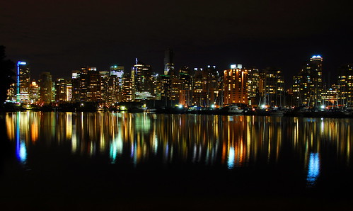
Hi Ajith - Your first shot of Vancouver City from Stanley Park looks spectacular. It has some interesting optical effects apart from its general nature. Have you noticed that the reflections of the lights in the water, as well as being diffuse as they should be (i.e. not sharp like the actual lights in the city) show a magnification of the lights towards the top of the source. That sounds a bit odd, let me explain further. Looking at the right hand side, there is a tower in the cityscape with two small dimples of light on the top. Now look at its reflection in the water and the two dimples are huge blue-white streaks. The reason why this occurs is obvious so I needn't go into it. But what a nice example.
Cheers
David
-
15th December 2008, 01:27 AM #3
-
15th December 2008, 05:23 AM #4
Re: Vancouver City at Night/Evening
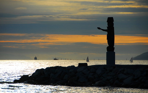
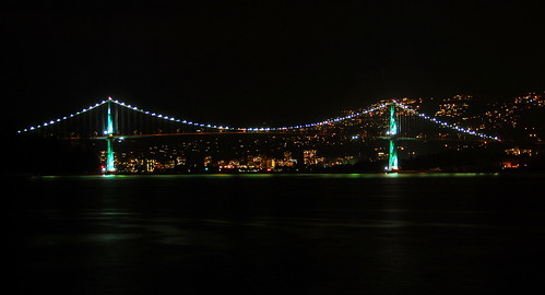
the second pic frm the top is my favorite.........the first pic is my second favorite.......the third is third........its always the exposure that counts in a night shot! getting it clear and not burning the lights out is vital....
-
15th December 2008, 08:01 AM #5

- Join Date
- Dec 2008
- Location
- New Zealand
- Posts
- 17,660
- Real Name
- Have a guess :)
Re: Vancouver City at Night/Evening
Good job

The only suggestion that I'd like to make - especially with respect to your first image - is that these types of image often suit a small change in aspect ratio. If you're keen, open it up in photoshop and re-sample it so that the width is twice the height (2:1 aspect ratio as compared to the current 1:1.5).
Here's a link to a similar shot of mine where I've used the same technique:
http://backup.cambridgeincolour.com/...073/medium.jpg
... would be interested to know what you think.
Hope this helps,
Cheers,
Colin - pbase.com/cjsouthernLast edited by Colin Southern; 12th January 2009 at 06:23 AM.
-
22nd December 2008, 08:15 PM #6
Re: Vancouver City at Night/Evening
Thanks Colin.
The aspect ratio in you pic is good as the pic is shot with a wide angle, but I still doubt it suits the first pic as it is not a wide angle shot ..comments please..
-
22nd December 2008, 08:16 PM #7
Re: Vancouver City at Night/Evening
Thanks Taken..
-
23rd December 2008, 12:43 AM #8

- Join Date
- Dec 2008
- Location
- New Zealand
- Posts
- 17,660
- Real Name
- Have a guess :)
Re: Vancouver City at Night/Evening
Hiya,
It's a judgement call - all I can say is it's a technique I use a lot - and customers tell me that they like it - even to the point of wanting to swap-out some of my earlier work that was shot at 1:1.5 once they'd seen the 1:2 aspect ratio version.
Hope you don't mind, but I've taken the liberty of extending your 1st shot to show you what I mean - just imagine this on a canvas a couple of feet high, and about 5 feet long. Although you may not have shot WA, this gives it a psudo WA effect which, personally, I like - be interested to hear what you and others think.
Cheers,
Colin - pbase.com/cjsouthernLast edited by Colin Southern; 12th January 2009 at 06:23 AM.
-
23rd December 2008, 04:20 AM #9
Re: Vancouver City at Night/Evening
#1 is a fantastic photograph - but I do like the WA aspect ratio from Colin.
Cheers, Richard.
-
23rd December 2008, 04:28 AM #10

- Join Date
- Dec 2008
- Location
- New Zealand
- Posts
- 17,660
- Real Name
- Have a guess :)
Re: Vancouver City at Night/Evening
With all due respect to Ajith, I didn't appreciate that the image was already cropped top/bottom a little - tending it towards a psudo-panoramic look - anyway.
So in doing what I've done I've turned it in to something probably close to a 1:2.5 which is more than I'd normally do for my own work, but in my opinion, this type of image handles it very very well - which is the point I was trying to make to Ajith.
On a side note - little tip for landscape photographers - if you want to go for a panoramic look (say 1:2 aspect ratio), but you don't want to stretch the image in PP, a quick and dirty trick is simply to aim the camera higher so that you capture more sky than you need - simply crop this excess off, and "job-done" - instant panorama look.
Hope this helps.
Cheers,
Colin - pbase.com/cjsouthernLast edited by Colin Southern; 12th January 2009 at 06:23 AM.
-
29th December 2008, 11:58 PM #11
-
30th December 2008, 12:34 AM #12
Re: Vancouver City at Night/Evening
I really like all three shots. Perhaps the first one best of all. They are sharp and dramatic. I can imagine that first one printed large on metallic paper. A bit of black border on the ends might help set the image back from the edges.
Chuck
-
30th December 2008, 01:04 AM #13


 Reply With Quote

