 Helpful Posts: 0
Results 1 to 5 of 5
Thread: The re-do
-
21st October 2010, 08:43 PM #1
-
22nd October 2010, 09:29 PM #2

- Join Date
- Mar 2009
- Posts
- 2,522
Re: The re-do
Jason
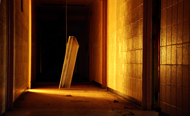
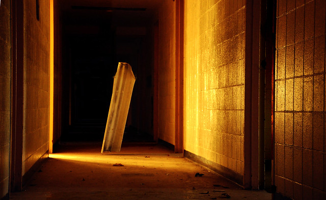
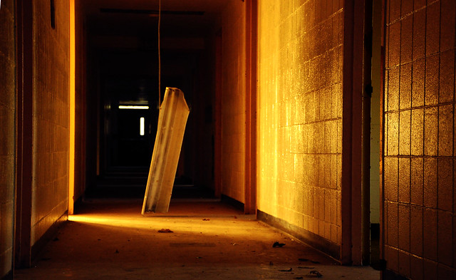
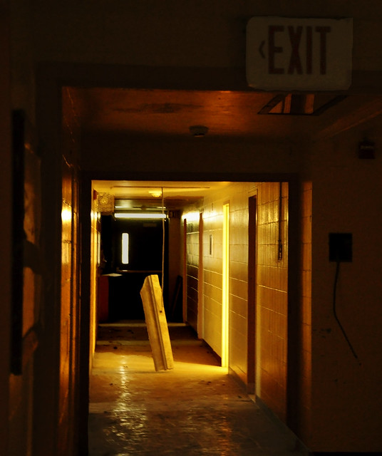
To be honest I find it difficult to provide critique on these images. I think I know what you are trying to achieve but I am not certain they are quite getting there. For me number 1 has the most potential. Its aspect is taking me on a journey. The other two I am a bystander observing from the left. For me No1 needs the wire and the windows cloning out to give a uniform blackness a journey into the void. I like the idea of having to dodge around the light fitting to get to the void. 2 and 3 also give me a contradiction because I am told it is an exit but I feel it is an entrance. This contradiction could work if the images were taken from the same view point as No1
I am not a fan of posterising and the posterising in No3 appears to have been created by heavy manipulation of the tonal curve which gives these patchy results. No 4 is too busy with its planes and angles and the posterisaton adds to the confusion.
Yes, pending the cloning of the distracting elements, I do like number one
Steve
-
23rd October 2010, 01:33 AM #3
Re: The re-do
So I took your advice about the first one and did some cloning

sometimes a small change makes a big difference and I think this is one of those times. I will probably do the same to the second picture. I had considered doing that but a second opinion definitely helped.
as for the posterized ones I definately see what your saying. although i kinda like the album coverish look to the third picture. although i definitely agree with what your saying about the person on the left composition.
-
23rd October 2010, 06:17 PM #4

- Join Date
- Mar 2009
- Posts
- 2,522
Re: The re-do
Jason
I agree this looks much cleaner and far more mysterious. I still think you should lose the wire but its a minor detail. Very nice image. It is now a walk in image and as I have said before that is very difficult to achieve.
-
23rd October 2010, 06:41 PM #5
Re: The re-do
Ok so I had to see how it would look without the wire and i have to say i definately agree with taking it out. I feel like it added more mystery since after you look at it for a few you realize that the light fixture is floating about two inches off the ground. Then it makes you ask questions.

again great advice


 Reply With Quote
