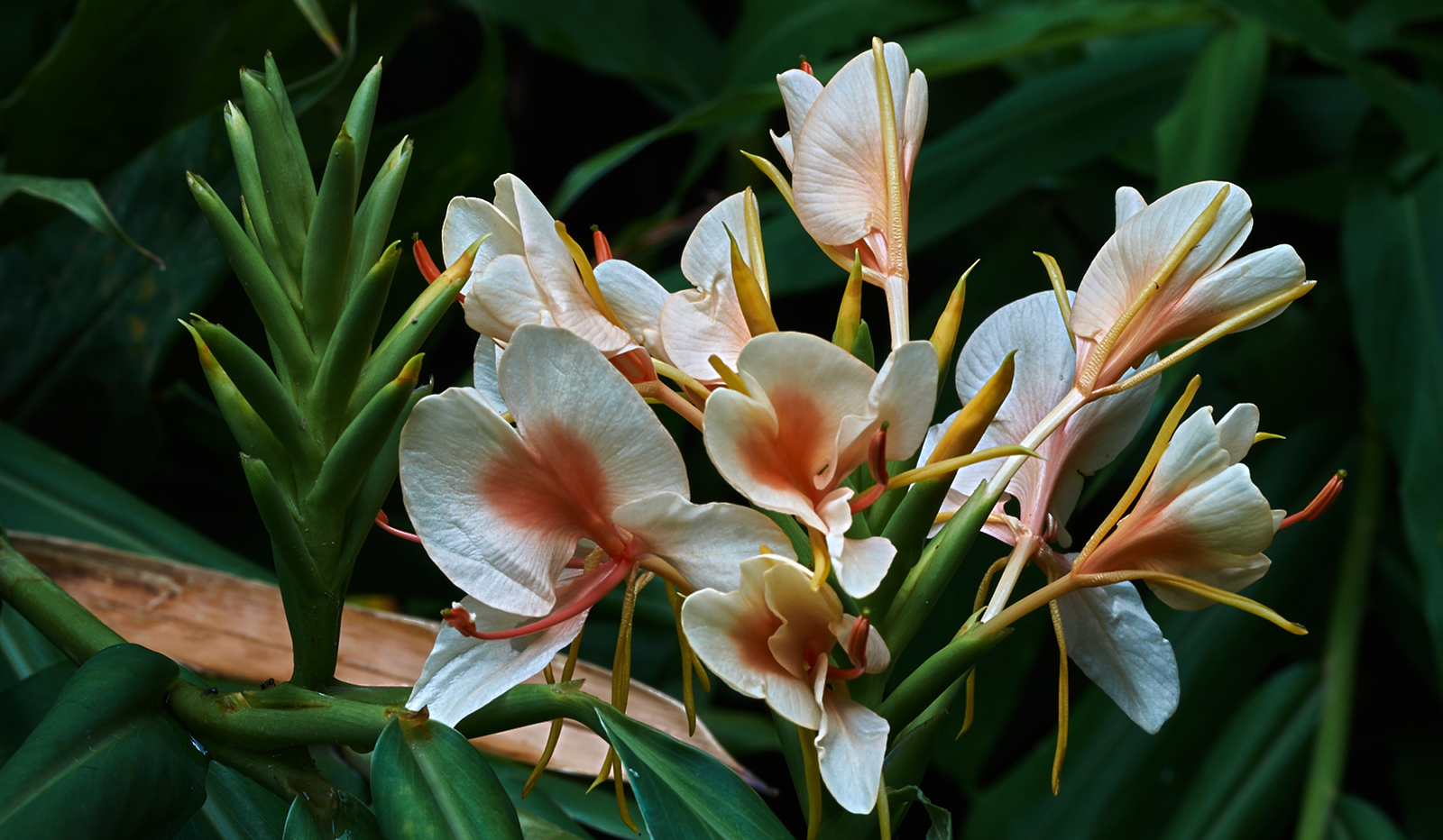
This was shot on auto focus. It was a calm day but with a smattering of clouds. Every time I focused the camera picked a different set of focus points. Seemes like a good time to try auto focus stacking. This is 10 shots stacked in Fiji.
ISO 100 ~ Shutter Speed 0.1s ~ Natural Light ~ 10 Shot Stack In Fiji ~ Sony Alpha a58 ~ Tamron 90mm 272E
Results 1 to 12 of 12
Thread: A walk on the bright side
-
10th August 2017, 02:20 AM #1

- Join Date
- Oct 2013
- Location
- Philippines
- Posts
- 12,181
- Real Name
- Brian
A walk on the bright side
-
10th August 2017, 04:17 AM #2

- Join Date
- Aug 2014
- Location
- Melbourne, Australia
- Posts
- 3,008
- Real Name
- Ole
Re: A walk on the bright side
Brian, you have returned from the dark side.
Cheers Ole
-
10th August 2017, 05:00 AM #3

- Join Date
- Oct 2013
- Location
- Philippines
- Posts
- 12,181
- Real Name
- Brian
-
10th August 2017, 08:35 AM #4
Re: A walk on the bright side
Nicely done.
-
10th August 2017, 08:53 AM #5

- Join Date
- Jun 2013
- Location
- North West of England
- Posts
- 7,178
- Real Name
- John
Re: A walk on the bright side
A good result Brian. Prefer this to your dark side. Maybe crop a little from the LHS?
-
10th August 2017, 11:31 AM #6

- Join Date
- Oct 2013
- Location
- Philippines
- Posts
- 12,181
- Real Name
- Brian
-
10th August 2017, 11:33 AM #7

- Join Date
- Oct 2013
- Location
- Philippines
- Posts
- 12,181
- Real Name
- Brian
-
10th August 2017, 12:21 PM #8Moderator


- Join Date
- Feb 2009
- Location
- Glenfarg, Scotland
- Posts
- 21,402
- Real Name
- Just add 'MacKenzie'
Re: A walk on the bright side
The lights on the flower head on the left, is beautiful. It sclupts itself wonderfully well around the about-to-explode flower heads.
-
10th August 2017, 01:42 PM #9
Re: A walk on the bright side
Very cool Brian...maybe try pick one of the best flowers and try get in close..little to much happening..love that red/orange colour in middle...and the white contrasts well..maybe try get that across to viewer. Your image doesnt have to look like flowers..we know its a flower..try focus on the light and lines and shapes on it.
Personally..i like the lines of the one round the middle...(its actually turned away from us, sort of mid top..little to right side) but something about it really attracts me...i think the light is the best on that one (See how the veins really come out?), try make just that flower be the only thing in ya image..think would look epic.
The one thats in middle and little to left also very cool...its seems like largest one thats open.
-
10th August 2017, 01:57 PM #10

- Join Date
- Oct 2013
- Location
- Philippines
- Posts
- 12,181
- Real Name
- Brian
-
10th August 2017, 01:58 PM #11

- Join Date
- Oct 2013
- Location
- Philippines
- Posts
- 12,181
- Real Name
- Brian
-
10th August 2017, 07:34 PM #12

- Join Date
- Dec 2013
- Location
- Turkey
- Posts
- 12,779
- Real Name
- Binnur
Re: A walk on the bright side
Very nice


 Helpful Posts:

 Reply With Quote

