 Helpful Posts: 0
Results 1 to 18 of 18
Thread: Little trains
-
11th December 2008, 10:59 PM #1
Little trains
-
12th December 2008, 01:45 AM #2

- Join Date
- May 2008
- Location
- Pittsburgh PA, St. Augustine FL
- Posts
- 136
Re: Little trains
I really like the clarity and the brightness of the colors....
Overall the processing is great and well presented.....
-
12th December 2008, 03:43 PM #3
Re: Little trains
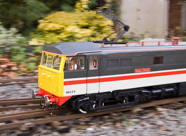
Hi Dave - The first one is my favourite because of the movement. Very good processing all round.
Cheers
David
-
12th December 2008, 04:07 PM #4

- Join Date
- Dec 2008
- Location
- Crawley
- Posts
- 98
Re: Little trains
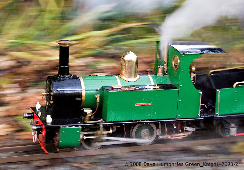
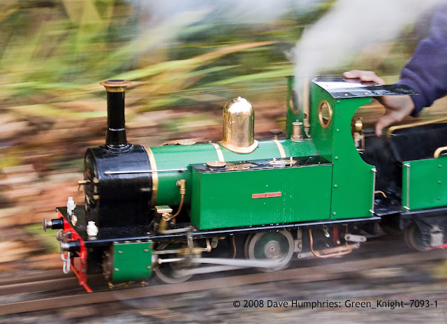
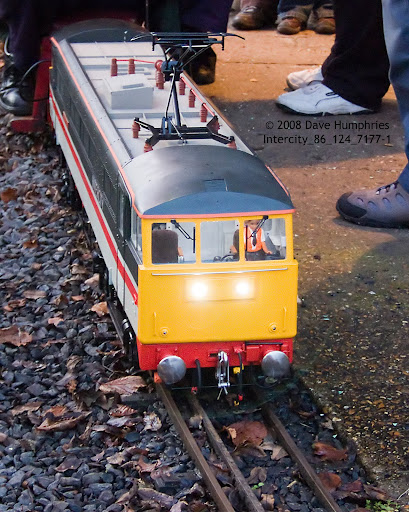
Well, I like #1 the best as well. This photo captures a real sense of movement. #3 is nearly as good, but the background is less blurred and so more distracting.
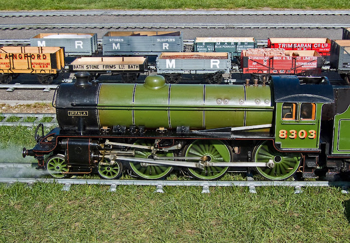
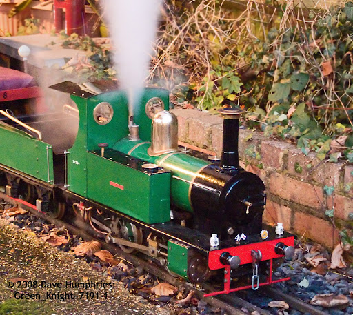
#2 is an interesting case. The colours are really vibrant as willgoss has said already. I think, though, that because the train is leaving the photo it's less interesting. All the others have the trains coming into the shot, and for me they work better.
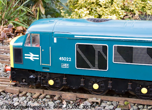
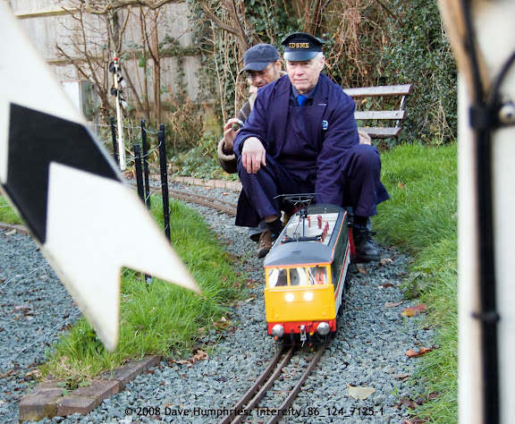
#4 and #5 I find the signal and feet too distracting. I'd consider cropping #4 down to just the driver, losing the signal and the pipe on the right in the process. (Divide photo in 5 vertical strips, and take the 3rd and 4th strips only).
Great focusing and depth of field. Nice!
-Dendrophile
-
12th December 2008, 06:24 PM #5
Re: Little trains
I like #1, as it shows speed ..could have cropped the hand as it is distracting ..
~Ajith
-
12th December 2008, 07:08 PM #6
Re: Little trains
Will, David, thank you
For the record, my post processing workflow on these was;
Copy RAW pictures from camera to HDD
Scan through using Irfan view and delete the real duffers
Note down which DSCF file numbers were which locos
Rename all the files so they sort together for same loco name
Do another scan through with all of one loco together, deleting the all but the workable ones for each
Transfer to a folder that PS Elements can 'see'
Start that up and let them get imported into its database
Go through all and give them star ratings (2 - 4)
Filter for 4 stars only, then for each;
Open in ACR 4.3.1, auto correct exposure, etc. with manual tweaking if necessary
Use the eye dropper to manually white balance on something white in shot
Open Image in PS Elements 6
Crop and rotate in one go to recompose a little and get the verticals or horizontals right
Tweak mid-range contrast a little if it looks 'flat'
Clone out anything I can that spoils the composition
Burn, Blur and/or Desat anything else that distracts
Neat Image to noise reduce (these were mainly 400 and some1600 ISO and my sensor is tiny)
USM to sharpen
Apply copyright text
Flatten image and Save as a 'Q10' jpg.
Time per photo: 10 - 30 mins, (av. 15) mainly depending if extensive cloning is reqd
Probably not the best workflow, could perhaps be streamlined??
Hope the above is useful, DaveLast edited by Dave Humphries; 12th December 2008 at 07:11 PM.
-
12th December 2008, 07:14 PM #7
-
12th December 2008, 07:27 PM #8
Re: Little trains
Hi dendrophile,
Thanks for the commenting on each; they are valid points.
#3 was an attempt to take something more than a pic of a passing train, but as you say, the best bit is the driver (who built the exquisite model).
Anyone interested in the EXIF data can see it where the pics are hosted on Picasa here, you need to go into a picture, then click the 'more info' link on the right hand panel, that sticks as you then arrow through the rest (and 3 more than here). Multiply the focal length shown by approx. 5 (five) to get the 35mm equivalent.
To get the panned shots, I am lucky enough to know someone at this location that gets me 'trackside'.
The station shots were taken with the aid of a mono-pod held firmly against a metal fence, there being not enough room to use a three legged 'pod without getting in the way of the other patrons.
Best wishes, DaveLast edited by Dave Humphries; 12th December 2008 at 07:42 PM.
-
13th December 2008, 06:29 PM #9
Re: Little trains
Just to show I have looked Dave and for what its worth, no 1 with the hand removed would be the best. However although the scale modelling is brilliant, you are never going to get the detail to set it up as a 'realistic' shot against the landscape (unless perhaps by cutting out and pasting/sizing against an appropriate landscape from elsewhere). There must be an appropriate mode of presenting the skill of the engineers, but would be inclined to try studio approach with neutral background....oh bother have done crit of something I know nothing about after all
Chris
-
13th December 2008, 09:04 PM #10
-
13th December 2008, 09:16 PM #11
Re: Little trains
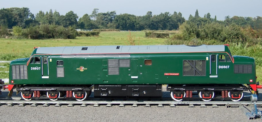
don't have many rails, but...
-
14th December 2008, 08:02 AM #12

- Join Date
- Dec 2008
- Location
- New Zealand
- Posts
- 17,660
- Real Name
- Have a guess :)
Re: Little trains
This is definately from the "personal taste" department, but personally, I'd lke to see a bit more output sharpening (especially necessary after down-resing an image).
If you're keen, chuck an image back into PSE and dial in a USM with amount = 50%, radius = 4 pixels, and a threshold of 0 levels. Vary the amount from about 50% to around 150% whilst toggling preview, and see if you like any of the results better. Possibly also try radius a little higher as these are relatively low frequency images.
Bit hard for me to tell exactly as I'm on my home monitor without my reading glasses, but my gut feeling was they'd pop a bit more with the above applied - but as I say, it's a personal thing - so not necessarily right or wrong.
Happy to process one for you as a contrast if it helps.
Hope this helps,
Cheers,
Colin - pbase.com/cjsouthernLast edited by Colin Southern; 12th January 2009 at 06:17 AM.
-
16th December 2008, 01:01 AM #13
Re: Little trains
Hi Colin,
I must admit to being lazy
I tend to sharpen the full sized image with a radius around 1.5 - 2.2, amount 80 - 110% and threshold approx. 2 -8 depending on the picture content and noise. So it looks good on my screen at full res. and is OK if printed.
However, when I do the export from Picasa to the website, it downsizes to 1600 width and uploads them, quick and dirty. The #1 pic in question was about 2700 x 2000 when I applied the USM, which is significantly under what you suggest.
I think I'll have to have another go with #1 and do it properly!
BTW Thanks for the rails Chris.
Regards to you both, Dave
-
16th December 2008, 01:05 AM #14

- Join Date
- Dec 2008
- Location
- New Zealand
- Posts
- 17,660
- Real Name
- Have a guess :)
Re: Little trains
You're welcome Dave

I hate the degradation imposed on my images when I have to down-sample them for the web - and to be honest, I'm not overly good at compensating for it.
Still something that needs to be done though, darn it!
Cheers,
Colin - pbase.com/cjsouthernLast edited by Colin Southern; 12th January 2009 at 06:17 AM.
-
27th December 2008, 09:54 PM #15
-
28th December 2008, 09:18 PM #16
Re: Little trains
Great little trains, like the two panned ones the best.
Somehow I don't find the hand that distracting. For me it gives a relation to the size of the train.
Cheers
Ronny
-
4th January 2009, 12:44 PM #17
Re: Little trains
Oh dear we now have a runaway driverless train......

It continues to be the drive motion on the wheels that makes this shot.
-
4th January 2009, 05:36 PM #18


 Reply With Quote
 Dave
Dave
