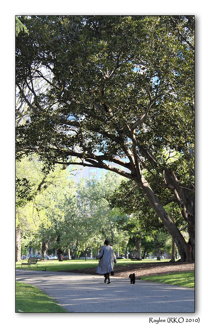
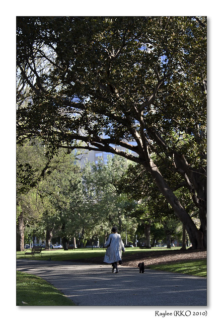
I'm interested in feedback on this photo.
I'm not happy with the clarity of the image. It was taken late in the afternoon and there seems to be a little bit of haze. I've sharpened it as much as I can. But I do like the scene. I tend to discard photos that are not perfect in terms of focus, DOF, clarity etc but do you think this one works despite it's shortcomings?
Thanks!
 Helpful Posts: 0
Results 1 to 10 of 10
Thread: City park
-
30th October 2010, 02:34 AM #1
City park
-
30th October 2010, 04:18 AM #2
Re: City park
Hi Raylee,
I like the composition but the lights wrong. The viewers eye is drawn to the brightest spot and this is the threes in the background. You are drawn away from the subject. I think if you burnt in the trees to even out the light and you might lighten the ladies raincoat a little to draw the eye to her, after all she is the subject.
The path leads the eye down to the bench then you notice the distracting white car in the background (again the brightest point). I would try and clones these out, particularly the red light or whatever it is. A little but of red goes an awful long way in an image. This also draws the eye away from the subject.
I would like to see your re-work of this as I agree I think it should work nicely.
-
30th October 2010, 05:28 AM #3
-
30th October 2010, 05:44 AM #4
Re: City park
That looks great now!
-
30th October 2010, 06:10 AM #5Moderator


- Join Date
- Feb 2009
- Location
- Glenfarg, Scotland
- Posts
- 21,402
- Real Name
- Just add 'MacKenzie'
Re: City park
Kay
I agree 100% with Peter's comment at post #2 above.
I think the composition is brilliant. It's a wonderfully timed capture. The large tree beautifully frames the lady and the dog. The whole thing has depth and we can see way ahead to where she's going.
There is a broad dynamic range in the scene. You could make two images from the one frame (which you've done) and blend. But there are no clean lines so that would be a big paint job. Peter's idea of dodge and burn would be the way I would go. There's, no doubt, some fancy bit of software that would dooit all for you - but that's not so much fun.
-
30th October 2010, 06:58 AM #6
Re: City park
Not too dark really. You have to think about the viewer and what you want them to look at. Now my eye settles on the lady and the dog. If you wanted to show the bright airy background the first does that but I like this. I think it is a very good shot and works well. The building is now visible but muted and fills in a vacant background and adds to the story. Well done. All you have to do now is print and frame.
-
30th October 2010, 07:56 AM #7
-
30th October 2010, 02:02 PM #8

- Join Date
- Sep 2010
- Posts
- 2,064
Re: City park
This is so lovely! I just wanted to put my two cents in, please. When I scrolled down to the second one, not only did my eye go immediately to the lady and her dog, but, then, a split second later, I took in the fact that she's walking in dappled shade which then drew my eye to the tree and, then.......
 it all became a heart jumping story. I love walking in the shade of the park. The tree has become a lovely supporting character - reaching out to shade her. All in the blink of an eye!
  Lovely days.....
-
30th October 2010, 04:09 PM #9

- Join Date
- Sep 2010
- Posts
- 2,064
Re: City park
I'm back for a short break and, as I was off doing whatever, the back of my mind kept telling me that I hadn't really finished my thought up above.
 As I was saying, I look at the lady and the shade on her shoulder, then, I look up to the tree and it is arching over her in a lovely way and my eye follows the branch around but, now, it gets caught on the building, instead of going back around to her. Now, my sister (the artist
  ) and I were talking the other day about how everyone brings something different to a piece of art - once it's out there - it takes on a life of its own. Well, when I see the building, I'm disappointed because that's what I like about parks - they're a world unto themselves in the middle of chaos - away from the city. So, I went on a little emotional ride with your second photo.
  I wouldn't know if that's how everyone feels or not. I wouldn't know what is "right or wrong". Also, it totally depends on what story you're intending to tell. I just noticed that my eye got stuck in the middle of the photo on the building trying to discern more of it, rather than going back down to her for a closer look and I just thought that I should throw it out there and see if I learn something.
I will consider myself lucky if someone comments about this.
-
31st October 2010, 12:30 AM #10
Re: City park
Thanks for the comments Katy. I find it really interesting to hear what other people see in a photo. It helps me a lot when assessing images.
I've studied the scene with your comments in mind and to me, the building sets the context of where the park is. To me it says in the middle of a big city is this tranquil park for getting away from the hustle and bustle. I agree with you though that art brings out different emotions in people and our reactions to this photo show that. I think that is a good thing - I'm glad you felt something looking at this photo, even if it may not have been as positive a feeling for you as would have liked. Your comments are much appreciated as they have made me think more about what I see and feel. Thanks!


 Reply With Quote

