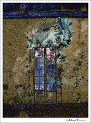
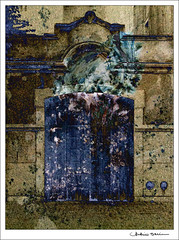
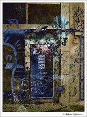
Hello Elise
In my monitor is looks a bit too bright.
However, the image is quite interesting. You have used some kind of very soft texture on it, haven't you ?
Results 241 to 260 of 464
-
29th December 2010, 12:10 PM #241
Re: Something different? Post your working with textures shots here.
-
29th December 2010, 12:46 PM #242
-
29th December 2010, 12:50 PM #243
Re: Something different? Working with textures.
-
29th December 2010, 01:06 PM #244
Re: Something different? Working with textures.
Nasseem,
Have a look here if you please
-
29th December 2010, 04:26 PM #245
Re: Something different? Working with textures.
Naseem, I don't right-click and save, I go to the pull-down "Actions" menu and click "View all sizes," then download the original size, which are usually quite large (I just looked at one of Jerry's square textures and it was 2000+ on each side). I've had trouble with other people's textures being small, but not Skeletal Mess's.
I'll try a less-saturated version of the tulips today -- I think one problem is that I was editing on my laptop, which I prefer to do, but the colors are not right -- for "serious" editing, I have to use my desktop. I think the laptop undersaturates, so things come out looking oversaturated on another monitor. I should have thought about that . . .
Antonio, I used Flypaper textures (my favorite), four or five of them with very intense colors (and names like "Balthamos Blue" and "Absinthe Vert"). I kept layering them (and turning the various ones on and off, taking other layers away) until I got something I liked.
-
29th December 2010, 05:05 PM #246
-
31st December 2010, 01:31 AM #247
Re: Something different? Working with textures.
Thank you Elise. I actually went to the rocky beach near my house yesterday and got some beautiful textures. I am not quite familiar with the process of layers/masks/blending which this is all about. I can only appreciate the possiblities one can generate using this technique. Any way I tried one yesterday. Its lousy but I was only happy to be able to complete the process.
Thanks
Nasseem
-
31st December 2010, 01:39 AM #248
Re: Something different? Working with textures.
Nasseem, if you're using Photoshop and are used to using layers, it's quite easy. Start with your main photograph on the "bottom," then add textures, each on its own layer (use the move tool to move each layer on top of the main photo). Then you experiment with 1) the different blending modes (try "Overlay," "Soft Light," "Multiply," etc.), 2) the opacity of the texture layer, and 3) using the brush tool to "brush away" some of the texture on the main subject, if that seems appropriate (using a layer mask), and you can vary the opacity of that too (up at the top of the brush tool). Other things you can experiment with are adding gradient maps in various colors, solid color fill layers and "exclusion" layers, and so on.
If any of this doesn't make sense or if I can help you with it, let me know via PM. I'm happy to help.
-
31st December 2010, 02:02 AM #249
-
31st December 2010, 02:43 AM #250
Re: Something different? Working with textures.
Naseem, it looks really nice. I wish I could see it larger on flickr, but it looks great. I like that the center looks sharper and less textured. I like the soft colors.
-
31st December 2010, 09:41 AM #251
-
31st December 2010, 12:21 PM #252
-
1st January 2011, 07:57 AM #253
Re: Something different? Working with textures.
Thank you Elise,
Its certainly my next area of interest. I just need to do more layers/ masks etc before I feel comfortable with it.
Nasseem
-
1st January 2011, 08:01 AM #254
-
1st January 2011, 08:37 AM #255
-
1st January 2011, 10:48 AM #256
-
1st January 2011, 11:52 AM #257

- Join Date
- Mar 2009
- Posts
- 2,522
Re: Something different? Working with textures.
No need to rip it to pieces it works very well indeed. A bit like viewing through old glass. The only crit I have is that the buds on the right are distracting but very easy to remove when using these techniques. Composites and textures are very forgiving to a bit of cloning.Here is my first attempt using a texture of mine off a beach rock. The soft look. Please feel free to rip it to pieces.
Raylee, I have commented on the sensuality of the original image and you have managed to retain that here also. I think I like the original best but I love your presentation with the wide border. This is definitely a wall hanger.
Elise, I think this works really well with the vibrant colours the strong structure of the tulips suits this treatment. Having seen Raylee's presentation I think that a bold border would work wonders here too.Still working on my bouquet of tulips -- I was trying for a kind of Impressionist feel on this one. Is it too bright?
-
1st January 2011, 05:26 PM #258
Re: Something different? Working with textures.
Thanks, Steve -- I have rarely thought about putting borders on my pics for the web, since I'm always thinking in terms of prints.
Raylee, I like your picture very much -- the only suggestion I have is to (if possible) brush most of the texture off the left side of the stamen (I think that's a stamen . . . ). Just MHO, but I like to see the texture more on the background and less on the main subject (to varying degrees, of course).
-
2nd January 2011, 12:11 AM #259
Re: Something different? Working with textures.
-
4th January 2011, 01:55 AM #260

- Join Date
- Nov 2010
- Location
- Panama City, FL
- Posts
- 3,540
- Real Name
- Chris
Re: Something different? Working with textures.

 Helpful Posts:
 Reply With Quote


