 Helpful Posts: 0
Results 1 to 11 of 11
Thread: The Shaman
-
10th February 2018, 07:13 PM #1
The Shaman
-
11th February 2018, 12:45 AM #2
Re: The Shaman
Fine image. I wonder what a slight vignette would do...
-
11th February 2018, 01:24 AM #3
Re: The Shaman
Last edited by Manfred M; 11th February 2018 at 01:58 AM.
-
11th February 2018, 02:30 AM #4
Re: The Shaman
Hi Manfred ~ Even though the 1st has a brighter background, I prefer it over the second one. The Shaman seems to have a sort of glow(?) around him in the 2nd.... Something is bothering me about it. Just my 2 cents of course!

ps: I really like his hat!
-
11th February 2018, 03:24 AM #5
Re: The Shaman
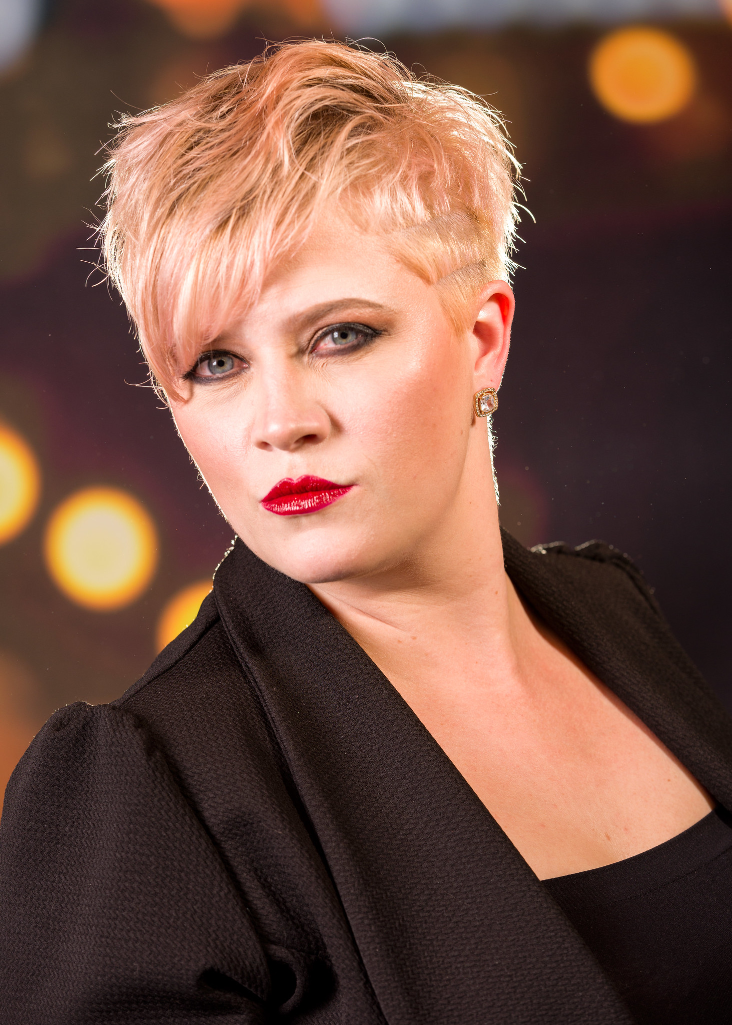
The shot is strongly back-lit so the light wraps around the subject. It's less noticeable when the background is still fairly bright, but once it darkens up, it starts to look strange. If you look at the first image, that light wrap is there, just not as noticeable because of the bright background.
This is a fairly common studio technique and when used there it is referred to as a "rim light" as the photographer has a light hidden behind the subject to create an edge of light that wraps around.
Take a look at this studio shot. I had a small flash set up right behind the model's head. Notice how the neck and the cheek and parts of the jacket have this bright edge. The same thing is happening to the Shaman, except with a larger light source, so the effect is more prevalent.

-
11th February 2018, 03:56 AM #6
Re: The Shaman
Thanks for explaining what I was noticing. (light around the Shaman...)
For some reason, the second pic of the Shaman just doesn't quite work for me especially after seeing how the lighting works in your picture for your model.
I do like the effect of the light in your model's picture (beautiful) much better than the lighting in the Shaman's. Maybe it has a lot to do with the background behind the Shaman (busy and bright) as compared to the model.
-
11th February 2018, 04:13 AM #7
Re: The Shaman
Manfred, I agree with you now that I have seen the vignette...
-
11th February 2018, 09:39 AM #8

- Join Date
- Aug 2014
- Location
- Melbourne, Australia
- Posts
- 3,013
- Real Name
- Ole
Re: The Shaman
Manfred, I do prefer the second version. I like the light on the Shaman's hands and stool for some reason. Most people would have emphasized his face I expect.
The coloured scarf works so well against the predominant grey background. I like this picture a lot.
Cheers Ole
-
11th February 2018, 02:49 PM #9
Re: The Shaman
A wonderful image. I am going to end up in the middle somewhere. I waited until I could put the two images side-by-side on my calibrated monitor. When I did that, I found that I preferred the first. However, I do find some of the extremely bright areas in that version distracting. However, in the ideal case, I think I would try darkening some of them with selective burning, not a more powerful vignette. The stronger vignette darkens areas I would leave as is, e.g., the shoe to our left.
That's in the idea case. I'm not sure it would work here. The histogram indicates that highlights aren't blown in this image, but parts of the background look a bit unrealistic even in the first, and I suspect burning would make that more extreme.
On my monitor, I see roughly vertical cyan bands in both, roughly at a level with the shaman's hips.
-
11th February 2018, 11:59 PM #10
-
12th February 2018, 12:54 AM #11
Re: The Shaman
Yes, that's why I thought perhaps only in the ideal case. I have tried your technique--copying the mask used to burn to a saturation layer--and that can help some, but extreme burning seems to be a problem no matter what.


 Reply With Quote


