Results 1 to 19 of 19
Thread: Variation on a theme: eath tones
-
7th April 2018, 06:39 AM #1

- Join Date
- Oct 2013
- Location
- Philippines
- Posts
- 12,181
- Real Name
- Brian
Variation on a theme: eath tones
-
7th April 2018, 09:36 AM #2
Re: Variation on a theme: eath tones
Nice tones and composition.
-
7th April 2018, 09:42 AM #3

- Join Date
- Oct 2013
- Location
- Philippines
- Posts
- 12,181
- Real Name
- Brian
-
7th April 2018, 02:04 PM #4
Re: Variation on a theme: eath tones
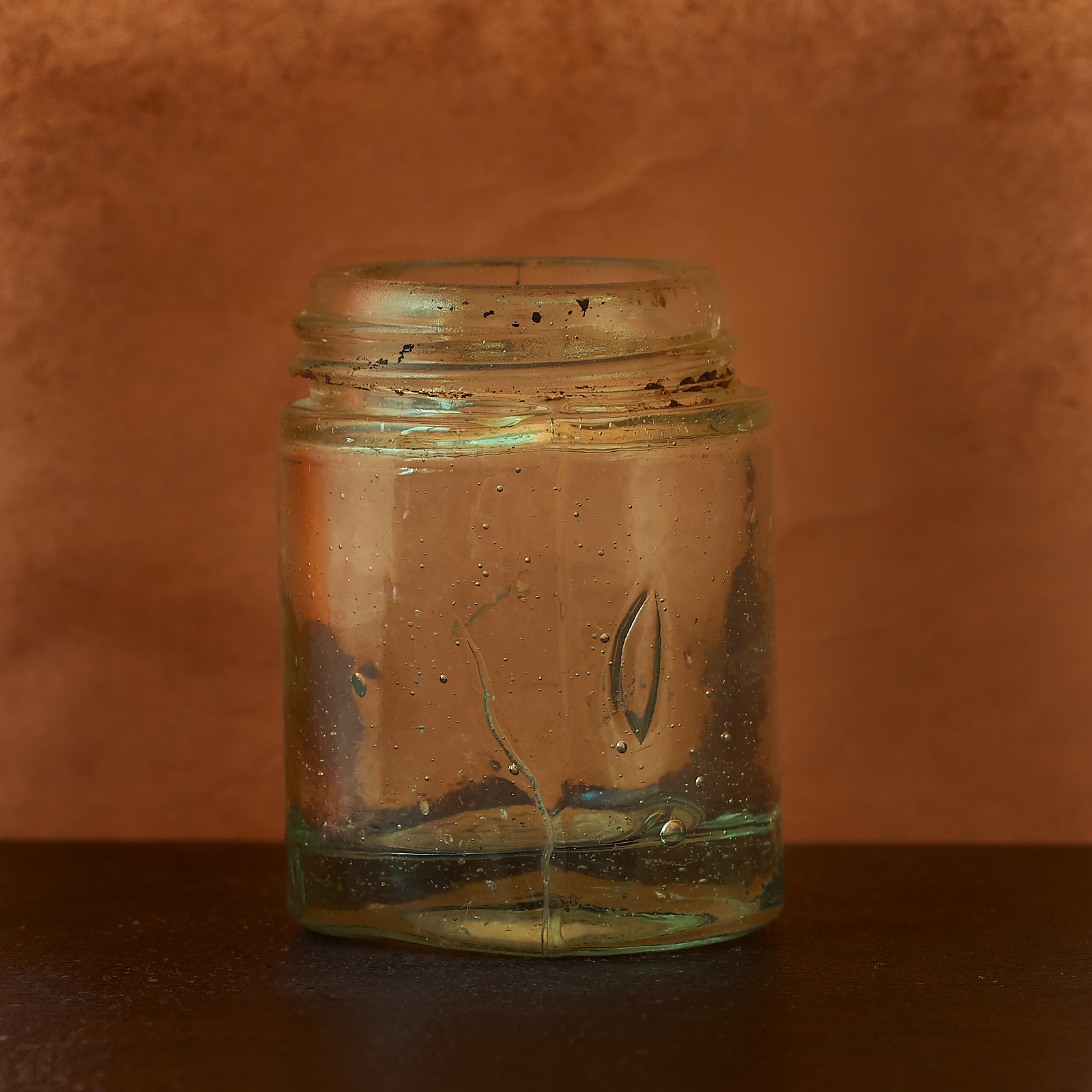
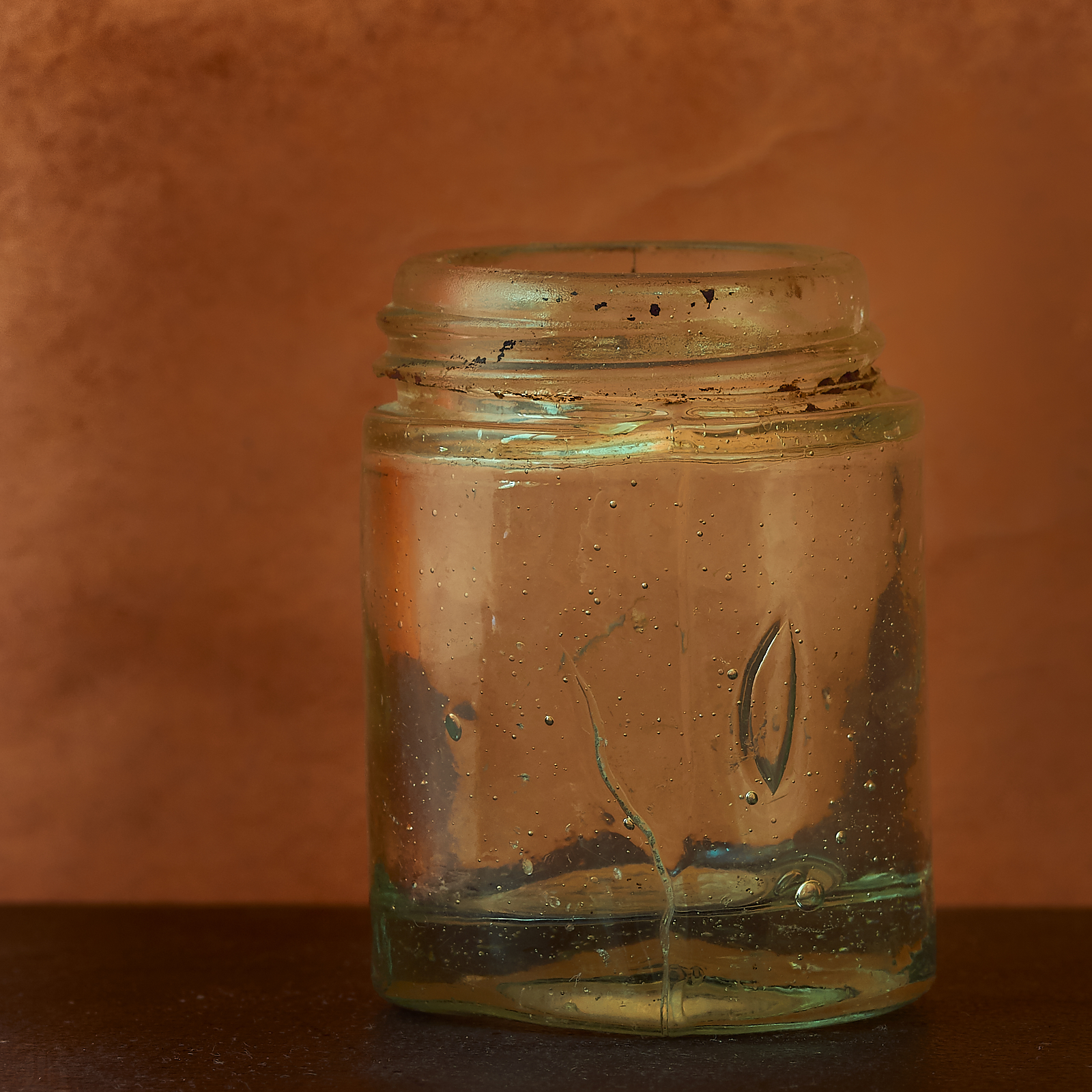
Getting better. I like the amount of negative space in the image. Have you played with its position in the frame? I suspect having the bottle more off-centre would be something you might want to play with too.
-
7th April 2018, 02:40 PM #5

- Join Date
- Oct 2013
- Location
- Philippines
- Posts
- 12,181
- Real Name
- Brian
-
7th April 2018, 03:13 PM #6

- Join Date
- Oct 2013
- Location
- Philippines
- Posts
- 12,181
- Real Name
- Brian
-
7th April 2018, 03:14 PM #7
Re: Variation on a theme: eath tones
Why? What compositional reason do you have to do that? Wouldn't the "rule of thirds" would have you place the crack so that it is around 1/3 of the way into the image.

I'm not saying it works better or worse, but rather "I like" is not a particularly good reason. "It works well and here's why" is where you should be trying to take your thought process when putting together an image.
-
7th April 2018, 03:18 PM #8
-
7th April 2018, 04:10 PM #9
Re: Variation on a theme: eath tones
I know that this might be a different shot but, I might think of a two light setup with the lights coming in from the sides of the jar and also hitting the background. Perhaps masking the lights from the camera lens. It seems that the rim lighting might just show the jar to the bast advantage...
A local discount hardware store (Harbor Freight) is giving these lights free with and purchase. I think that if one would diffuse the light somehow (perhaps with the light shining through a mesh or velum) a couple of these lights might be nice for small parts and table top photography.
https://www.harborfreight.com/27-led...ght-69567.html
I always have something I need, in the line of hardware so, the free price of these lights is a good deal...
One could easily make a diffusing screen from screen mesh or some other such material such as tracing paper, waxed paper, or velum (my wife uses velum for baking)...
-
8th April 2018, 12:25 AM #10

- Join Date
- Oct 2013
- Location
- Philippines
- Posts
- 12,181
- Real Name
- Brian
Re: Variation on a theme: eath tones
Actually Manfred, as an amateur photographer which means I do it for passion and love the only reason for composing a shot any way is because it pleases me. I like it when others enjoy my work but when push comes to shove it is my passion that needs to be answered.
As for the rule of thirds if you lay a frame over the shot you will see that in the original the right side is very close to a thiords line and that the top right thirds cross falls directly on the outside of the thread. You will also not that the top mold falls on or darn near to on the top third line. I did use it. But I used it as an enhancement of what I wanted not as a chiselled in stone commandment.
I would have thought that as a trained observer you would have seen my application of the rule of thirds?
-
8th April 2018, 12:33 AM #11

- Join Date
- Oct 2013
- Location
- Philippines
- Posts
- 12,181
- Real Name
- Brian
-
8th April 2018, 01:23 AM #12
Re: Variation on a theme: eath tones
I can't argue with that. However, if you decide to share an image it is no longer just for yourself and that is when the critics come out, especially on a site like CiC, which is dedicated to learning about photography.
Nothing wrong with your thinking, but if you post, the members are going to comment on your work.
Perhaps your interpretation of the rule of thirds is a bit looser than I would, give the tight framing in the image. The classical view is to have the third line running close to the centre of interest of the object, not just barely touching it.
The reason is that to this "trained observer", it does not look like you applied the "rule of thirds".
-
8th April 2018, 01:44 AM #13

- Join Date
- Oct 2013
- Location
- Philippines
- Posts
- 12,181
- Real Name
- Brian
Re: Variation on a theme: eath tones
Manfred, I post here because this is the group that I belong to and this is the group that has taught me so much. If i wasn't critiqued it would not6 make much sense to post here.
The problem is not my accepting critiques, because I do. The problem is that some people see only one way to create and that is their way. "The reason is that to this "trained observer", it does not look like you applied the "rule of thirds". But i did apply it. Just not in a way that satisfies your understanding of the rule. Fair enough. But there are as many ways to apply the rule of thirds as there are to cook a chicken.
So please do continue to critique my work. Just remember that after 5 years and give or take 50,000 shots that I have (for better or worse) created my own style and I will read and apply your critiques in the light of 'how will this enhance my vision'.
-
8th April 2018, 04:14 AM #14

- Join Date
- Feb 2012
- Location
- Texas
- Posts
- 6,956
- Real Name
- Ted
-
8th April 2018, 04:21 AM #15
Re: Variation on a theme: eath tones
Makes sense.
I cannot not agree with this statement, there are many ways to accomplish a goal and there is no single right answer.
That being said, there are many paths that will not lead you to your goal too. An incremental, systematic approach is going to work to get you to the goal, but that takes discipline. I'm not convinced you are there yet.
Again, I can only conclude that you do not understand how the "Rule of Thirds" works. Where I do agree is that it, like many other "photographic rules", it's more of a suggestion than a rule. The reason I like it (but virtually never use it in my own work) is that most people understand it reasonably well. You seem to be the exception here.
I prefer to call it asymmetrical positioning of the subject. That's just a fancy way of saying that centring the subject in the frame is usually not the strongest composition. The shape of the object, the flow and balance of the image all play a role here.
You are putting the cart before the horse. Vision is important, but is not particularly useful unless one knows how to realize that vision. It's hard to write a piece of music unless one plays an instrument, just as it is hard to create a strong image without understanding how to arrange all the piece in the frame.
Learning and design work (which is essentially what we are doing in photography; designing an image) is incremental and iterative. Build on what you know and add to that knowledge incrementally. I'm not sure that this is the approach you are using.
-
8th April 2018, 08:40 AM #16

- Join Date
- Oct 2013
- Location
- Philippines
- Posts
- 12,181
- Real Name
- Brian
Re: Variation on a theme: eath tones
Manfred you are simply going to have to accept the fact that you and I don't think the same way.
"You are putting the cart before the horse. Vision is important, but is not particularly useful unless one knows how to realize that vision. It's hard to write a piece of music unless one plays an instrument, just as it is hard to create a strong image without understanding how to arrange all the piece in the frame.
Learning and design work (which is essentially what we are doing in photography; designing an image) is incremental and iterative. Build on what you know and add to that knowledge incrementally. I'm not sure that this is the approach you are using. "
The Vision in my reality must come first. How else would I see what I must learn. You and I do not shoot the same subjects nor share the same style. We don't even come from the same background. And this is as it should be because the world doesn't need two of you or me.
I live in an Intuitive world, you live in a Numbers world. You shoot architecture and nudes, I shoot bugs and flowers. You shoot on a large canvas I shoot on a tiny one.
Just for the record: Very few of my shots are symmetrical. And please do not confuse what you do in photography with what must be done in PHOTOGRAPHY.
Brian
PS as I am approaching 70 and I have lived a life that few can even imagine let alone survive, please don't be offended when I don't do everything your way.
B.
-
8th April 2018, 08:42 AM #17

- Join Date
- Oct 2013
- Location
- Philippines
- Posts
- 12,181
- Real Name
- Brian
-
8th April 2018, 09:39 AM #18

- Join Date
- Feb 2012
- Location
- Texas
- Posts
- 6,956
- Real Name
- Ted
Re: Variation on a theme: eath tones
Ta! And we could take the discussion a bit further on from your little glass jar to irregularly-shaped objects like bushes, flowers, potatoes, fauna.
Where does one put the virtual cross for aligning such an object with some fixed x,y position suggested by some rule of thumb?
I might go for the center of area of the object in the image plane; others might not. What if the object is unevenly lit; would a weighting be applied to move the cross elsewhere? I have a feeling that considerations like that take place subconsciously in the minds of artistic folks such as your good self.
The jar itself puts me in mind of wabi-sabi with it's interesting imperfections, evidence of honest usage and solitary existence in an almost-empty space. You are perhaps familiar with that philosophy, eh?Last edited by xpatUSA; 8th April 2018 at 11:07 AM.
-
8th April 2018, 02:13 PM #19

- Join Date
- Oct 2013
- Location
- Philippines
- Posts
- 12,181
- Real Name
- Brian

 Helpful Posts:

 Reply With Quote


