Results 1 to 13 of 13
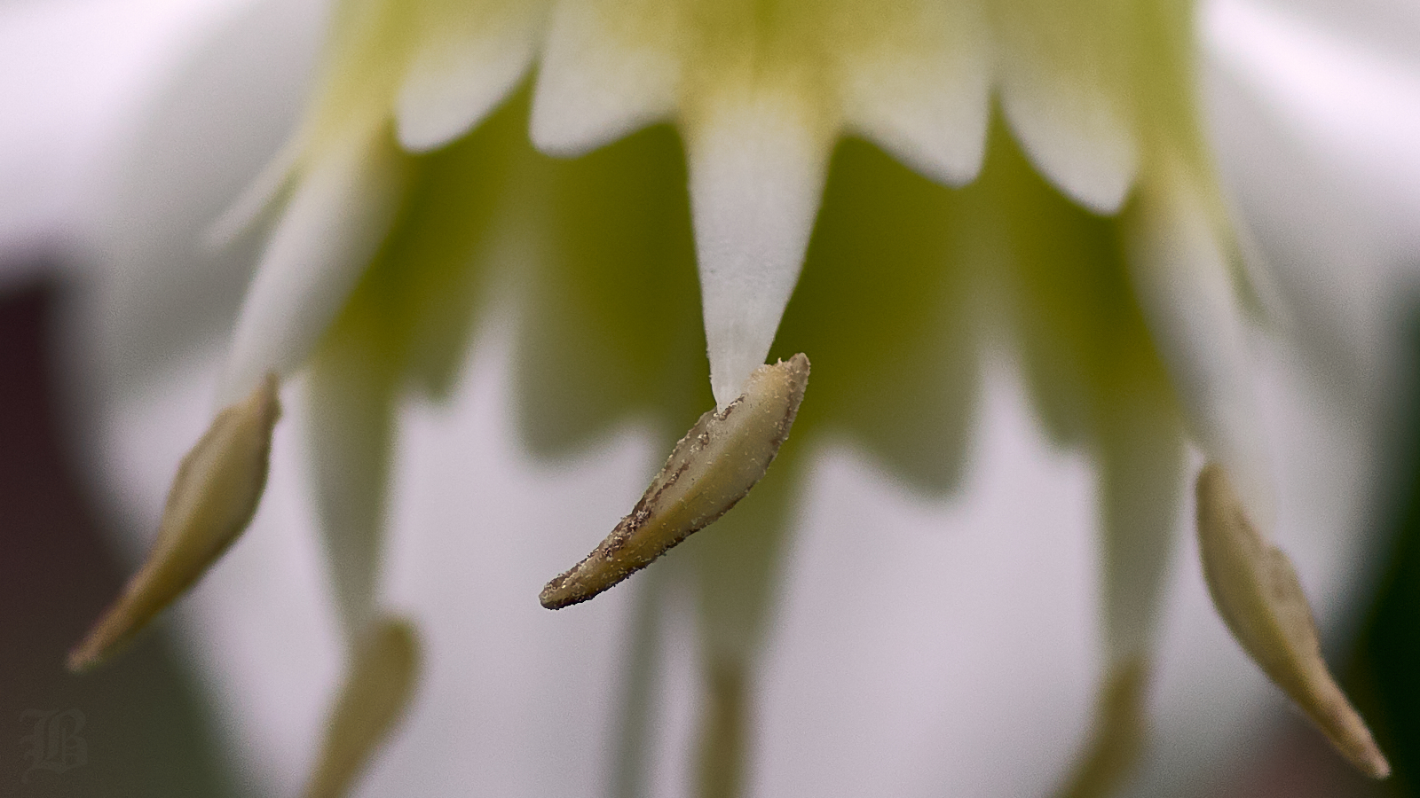
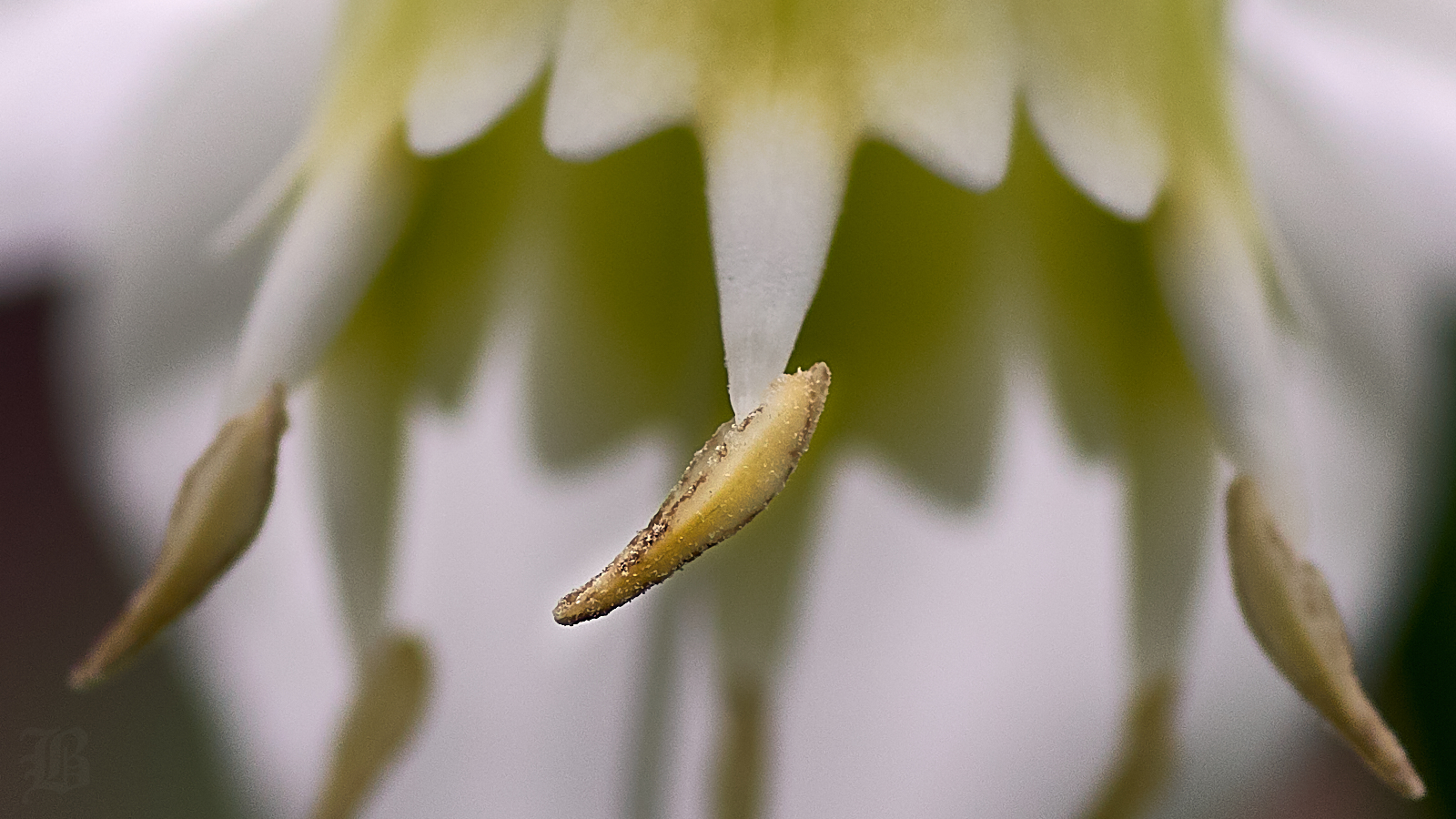
Thread: Macro shot of an Alfonso Anther
-
14th April 2018, 03:40 PM #1

- Join Date
- Oct 2013
- Location
- Philippines
- Posts
- 12,181
- Real Name
- Brian
Macro shot of an Alfonso Anther
-
14th April 2018, 04:17 PM #2
-
14th April 2018, 05:02 PM #3
Re: Macro shot of an Alfonso Anther
Manfred, I think that Brian is referring to the several posts (for example this) he made before this one, many of which feature a lot of red in the subject matter.
-
14th April 2018, 05:04 PM #4
Re: Macro shot of an Alfonso Anther
Brian - clearly you are enjoying the A58
 .
.
-
14th April 2018, 05:56 PM #5

- Join Date
- Mar 2018
- Location
- In the Tropics
- Posts
- 161
- Real Name
- Oscar
Re: Macro shot of an Alfonso Anther
It looks a tad underexposed?
-
14th April 2018, 11:32 PM #6

- Join Date
- Oct 2013
- Location
- Philippines
- Posts
- 12,181
- Real Name
- Brian
-
14th April 2018, 11:36 PM #7

- Join Date
- Oct 2013
- Location
- Philippines
- Posts
- 12,181
- Real Name
- Brian
-
14th April 2018, 11:38 PM #8

- Join Date
- Oct 2013
- Location
- Philippines
- Posts
- 12,181
- Real Name
- Brian
-
15th April 2018, 01:21 AM #9

- Join Date
- Nov 2012
- Location
- Australia (East Coast)
- Posts
- 4,524
- Real Name
- Greg
-
15th April 2018, 01:25 AM #10
-
15th April 2018, 04:07 AM #11

- Join Date
- Oct 2013
- Location
- Philippines
- Posts
- 12,181
- Real Name
- Brian
-
15th April 2018, 04:11 AM #12

- Join Date
- Oct 2013
- Location
- Philippines
- Posts
- 12,181
- Real Name
- Brian
-
15th April 2018, 08:23 AM #13

- Join Date
- Oct 2013
- Location
- Philippines
- Posts
- 12,181
- Real Name
- Brian

 Helpful Posts:

 Reply With Quote


