 Helpful Posts: 0
Results 1 to 7 of 7
-
14th April 2018, 09:46 PM #1
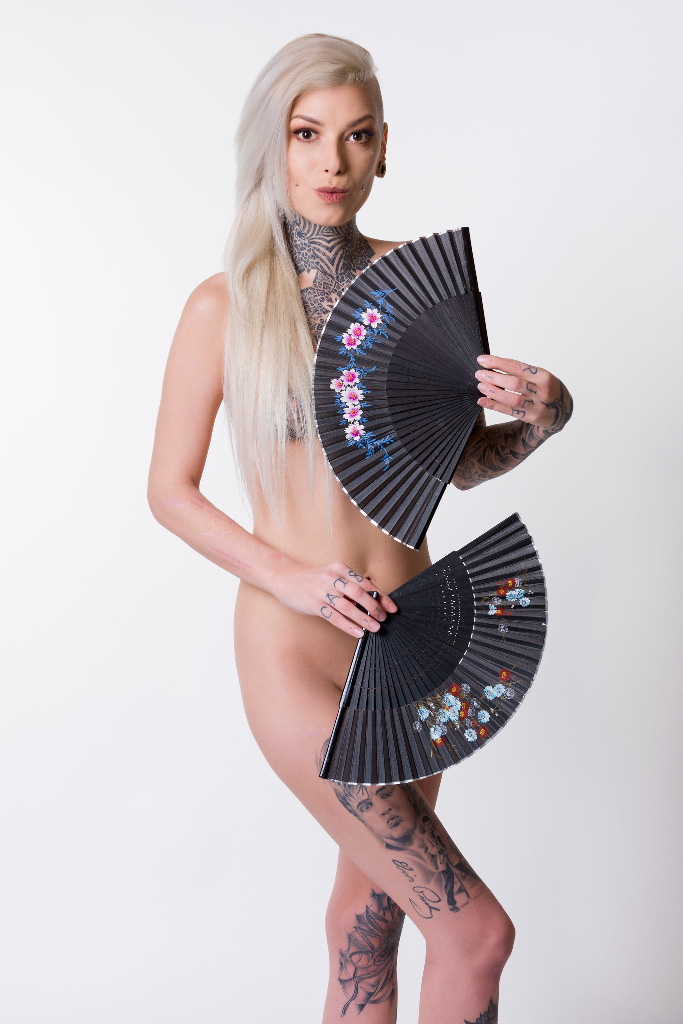
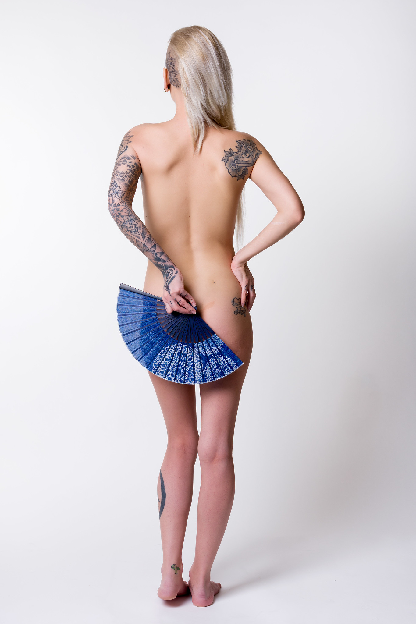
Stephanie Katharine - Implied Nudes
-
15th April 2018, 03:48 AM #2
Re: Stephanie Katharine - Implied Nudes
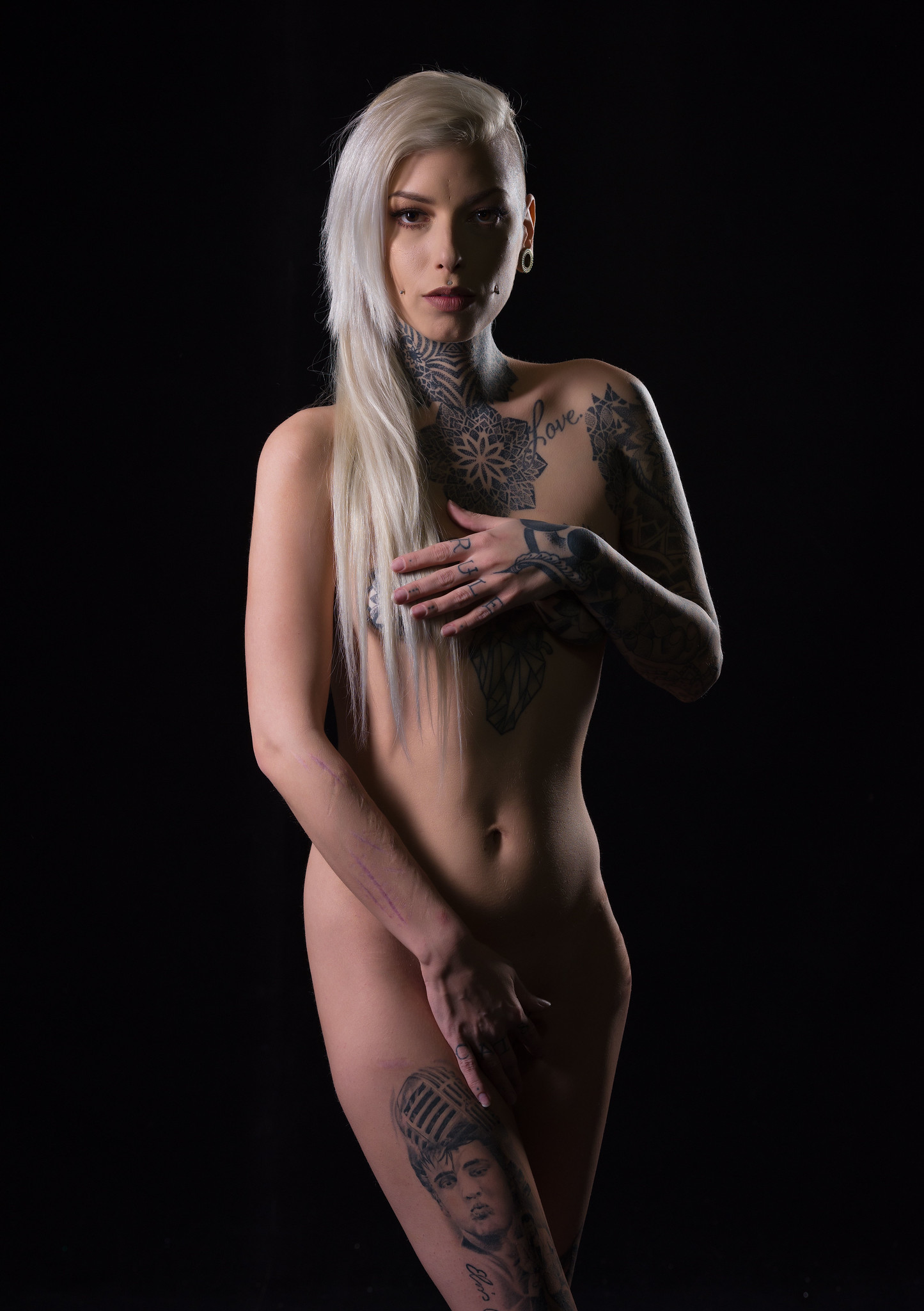
I prefer #3 only because I favor a lower key look. The pose in #1 is best however.
-
15th April 2018, 12:11 PM #3
Re: Stephanie Katharine - Implied Nudes
Thanks Rick - I shot with both a light and dark background on this shoot. I know black works well with nudes as it gives the models / scene a dark and moody look. I find it works especially well for a model with Stephanie's looks. A lot of photographers will desaturate the image a bit to enhance this look. My main issue is that the look has been so widely adopted, it seems to be the "go to" default for many photographers.
I'm not someone who tends to like the dark and moody approach, regardless of the genre. I've tended to go for a brighter look where I try to push my images to cover the full range from the very bright colours down through the deep shadow detail, hence my personal preference for the light background.
-
15th April 2018, 12:28 PM #4
Re: Stephanie Katharine - Implied Nudes
Nice series, scars less noticeable in these, 3rd image should be part of another series as fans are not utilized.
-
15th April 2018, 12:35 PM #5
Re: Stephanie Katharine - Implied Nudes
Could have, but as the theme is implied nudes, it works for me. I shot four different looks; Japanese screen, white background, black background and Venetian carnival mask and I suppose I could have broken things down that way, but I decided that I would stick with three images only and frankly I was not all that happy with the Japanese screens (to distracting) or the masks (not personal enough), so I stuck what I posted.
I prefer the light background, but decide to throw one traditional black background, lower key style shot in as many people are used to that look.
-
15th April 2018, 03:40 PM #6
Re: Stephanie Katharine - Implied Nudes
I much prefer "implied nude photos" rather than nude because implied allows us to look at beauty without the "in your face" exposure. I don't have a favorite of these but perhaps #1 draws my eye simply because she looks like she is having fun. She is a beautiful lady.
-
22nd April 2018, 07:15 PM #7

- Join Date
- Feb 2016
- Location
- Chile South America
- Posts
- 268
- Real Name
- Javier Ramirez
Re: Stephanie Katharine - Implied Nudes
Nice capture


 Reply With Quote

