Results 1 to 7 of 7
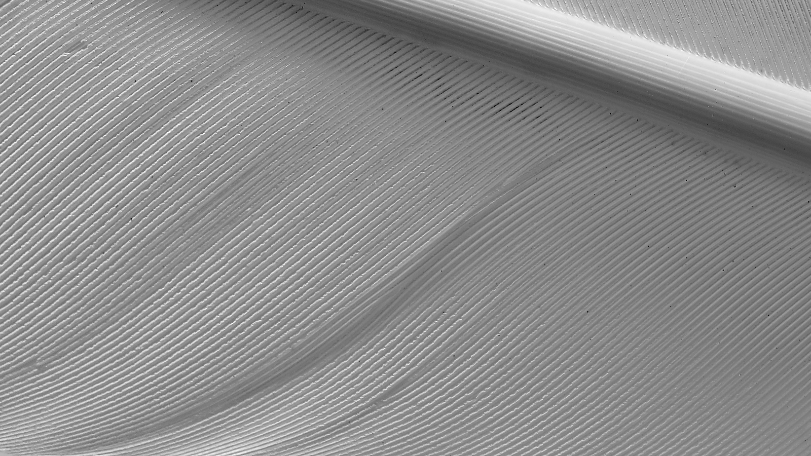
Thread: Mono Macro Turkey Feather Shot
-
9th May 2018, 10:40 AM #1

- Join Date
- Oct 2013
- Location
- Philippines
- Posts
- 12,181
- Real Name
- Brian
Mono Macro Turkey Feather Shot
-
9th May 2018, 12:45 PM #2
Re: Mono Macro Turkey Feather Shot
Interesting minimalist patterns. However, look at the histogram:

that confirms what the image shows: very little contrast, which makes the patterns not stand out. Simply adjusting the black point to get a more complete tonal range would do wonders, but you could then add contrast with an S-curve and local contrast to get more pop. I don't have software on this computer, so I can't show this.
This can be done with pretty much any basic editing software. The one thing that varies from software to software is local contrast, or something similar. In LR and ACR, the closest thing is "clarity". In many software packages, you can increase local contrast using unsharp mask, using a very large radius. A starting point could be 20%, radius 50, threshold 0 (see https://luminous-landscape.com/contrast-enhancement/). There is a nice tutorial about this on this site, https://www.cambridgeincolour.com/tu...nhancement.htm.Last edited by DanK; 9th May 2018 at 12:59 PM.
-
9th May 2018, 01:05 PM #3

- Join Date
- Oct 2013
- Location
- Philippines
- Posts
- 12,181
- Real Name
- Brian
Re: Mono Macro Turkey Feather Shot
Dan, it's a turkey feather. There isn't a lot of contrast. But yes I could have processed it for pop. Actually I did. Didn't look very good. looking at the histogram shows me a well balanced albeit not a fully stretched out histogram.
In the full colour version the histogram stretches out to both ends.
-
9th May 2018, 01:29 PM #4
Re: Mono Macro Turkey Feather Shot
Brian,shows me a well balanced albeit not a fully stretched out histogram.
It's all a matter of taste, and if you prefer this image with low contrast, then that's how you should process it.
However, the quote above suggests to me that you don't fully understand the function of a histogram. I assume that what you mean by "balanced" is that with the exception of the right-side tail, the histogram is roughly symmetrical. There is no reason why a symmetrical histogram is in the general case better than an asymmetrical one. The histogram simply represents the proportion of pixels at different luminance values. Sometimes an ideal exposure is highly skewed, and sometimes it has two or more peaks. For example, this image should have a big peak at the left end and then a tail stretching out to the right because I deliberately made the background pure black, and there is a lot of background:
[IMG]
[/IMG]
So the question isn't 'is this symmetrical,' but rather 'does it give me information about how I can change the image to make it look more like I want?' In the case of your image, narrow histogram is just one more indication that the image has relatively little tonal range, which means that the lines and contrast that usually make B&W images interesting (to me, not necessarily to anyone else) are not made to stand out. The symmetry of the larger mass didn't give me any useful information at all.
Dan
-
9th May 2018, 03:06 PM #5

- Join Date
- Dec 2012
- Location
- Alaska
- Posts
- 7,604
- Real Name
- Dan
Re: Mono Macro Turkey Feather Shot
I had to click on this thread just to see what could possibly be interesting about a turkey feather. What a pleasant surprise. You you chose a great composition. And the decision to go with B/W was a good one IMO. I did try simply kicking up the clarity slider a touch in LR and it pulls even more detail, Clarity in B/W effectively moves the black and white points out as suggested by DanK.
I guess if the photo is intended to be all about the geometry then mission accomplished. If it's about the texture, then a bit more contrast is a good idea. Either way it's really cool. Very creative idea.
-
10th May 2018, 02:03 AM #6

- Join Date
- Oct 2013
- Location
- Philippines
- Posts
- 12,181
- Real Name
- Brian
-
10th May 2018, 02:04 AM #7

- Join Date
- Oct 2013
- Location
- Philippines
- Posts
- 12,181
- Real Name
- Brian

 Helpful Posts:

 Reply With Quote

