Results 1 to 11 of 11
-
10th May 2018, 02:10 AM #1

- Join Date
- Oct 2013
- Location
- Philippines
- Posts
- 12,181
- Real Name
- Brian
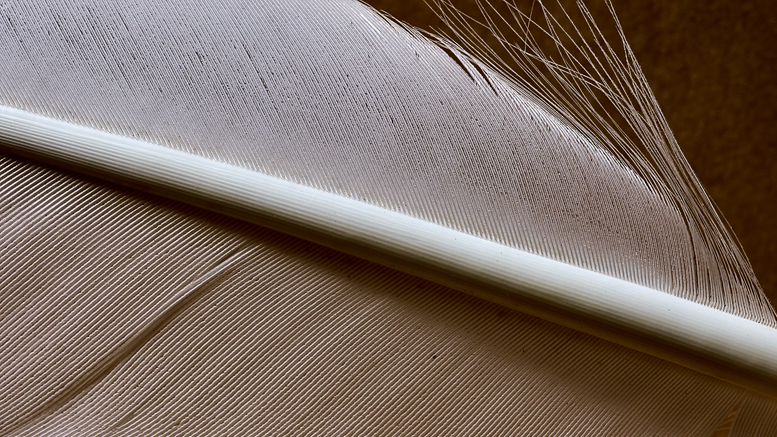
For Dan & Dan: My Tina Turner technique turkey feather shot
-
10th May 2018, 08:52 AM #2
Re: For Dan & Dan: My Tina Turner technique turkey feather shot
Nicely captured, I've never read someone claiming you didn't have a style in fact you have a very recognizable style; part of this thing we do (photography) should be about enjoying what we create; take the criticism for the technical aspects only not the artistic; if artists allowed their creativity to be altered we wouldn't have had the works of Dali, Dado, or Baldhus. Regarding your feather images, the first to me was merely a study in textures and light, this particular image moves closer to fine art and the only difference being the inclusion of shadow, hint of background, a slight curl, and raised edge.
-
10th May 2018, 11:49 AM #3
Re: For Dan & Dan: My Tina Turner technique turkey feather shot
I certainly have never suggested you don't have a style.
This one and the previous one are quite different as compositions, but I will comment only on the topic of the last thread: luminance. Compare the histograms of the two shots. This one makes use of the full tonal range. The previous one didn't. The result is that the beautiful patterns created by the feather's barbs are much more apparent in this photo. In my opinion, that makes this one much more interesting to look at.
-
10th May 2018, 11:55 AM #4

- Join Date
- Oct 2013
- Location
- Philippines
- Posts
- 12,181
- Real Name
- Brian
-
10th May 2018, 11:57 AM #5

- Join Date
- Oct 2013
- Location
- Philippines
- Posts
- 12,181
- Real Name
- Brian
-
10th May 2018, 11:13 PM #6

- Join Date
- Nov 2012
- Location
- Australia (East Coast)
- Posts
- 4,524
- Real Name
- Greg
Re: For Dan & Dan: My Tina Turner technique turkey feather shot
I agree with John and Dan. In addition, what makes this image superior to the mono version is the compositional elements - the subtle use of diagonals and assymetry. Each quadrant is different and therefore rewards the viewers' effort.
-
10th May 2018, 11:39 PM #7

- Join Date
- Oct 2013
- Location
- Philippines
- Posts
- 12,181
- Real Name
- Brian
-
11th May 2018, 03:21 AM #8

- Join Date
- Dec 2012
- Location
- Alaska
- Posts
- 7,604
- Real Name
- Dan
Re: For Dan & Dan: My Tina Turner technique turkey feather shot
The two shots are significantly different in bot composition and technical execution. It is immediately apparent that this one is a feather. And it shows more different aspects of the feather. The first image took at least a moment or two of thought to recognize what it was. The details are sharper in this one.
I'll give you this, Brian, it's always interesting to see what you'll come up with next
-
11th May 2018, 04:59 AM #9

- Join Date
- Oct 2013
- Location
- Philippines
- Posts
- 12,181
- Real Name
- Brian
-
11th May 2018, 04:51 PM #10
Re: For Dan & Dan: My Tina Turner technique turkey feather shot
Lovely image

-
12th May 2018, 02:30 AM #11

- Join Date
- Oct 2013
- Location
- Philippines
- Posts
- 12,181
- Real Name
- Brian

 Helpful Posts:

 Reply With Quote

