Results 1 to 18 of 18

Thread: Back to my roots: The Dark Side

  1. #1

    Join Date
    Oct 2013
    Location
    Philippines
    Posts
    12,181
    Real Name
    Brian

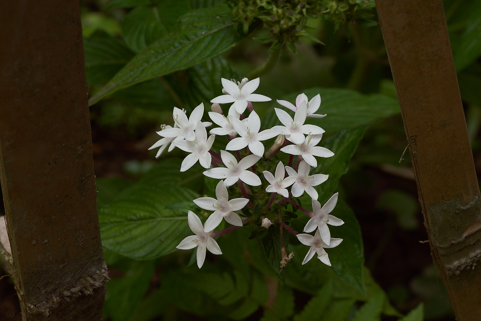
    Back to my roots: The Dark Side + the original

    Back to my roots: The Dark Side

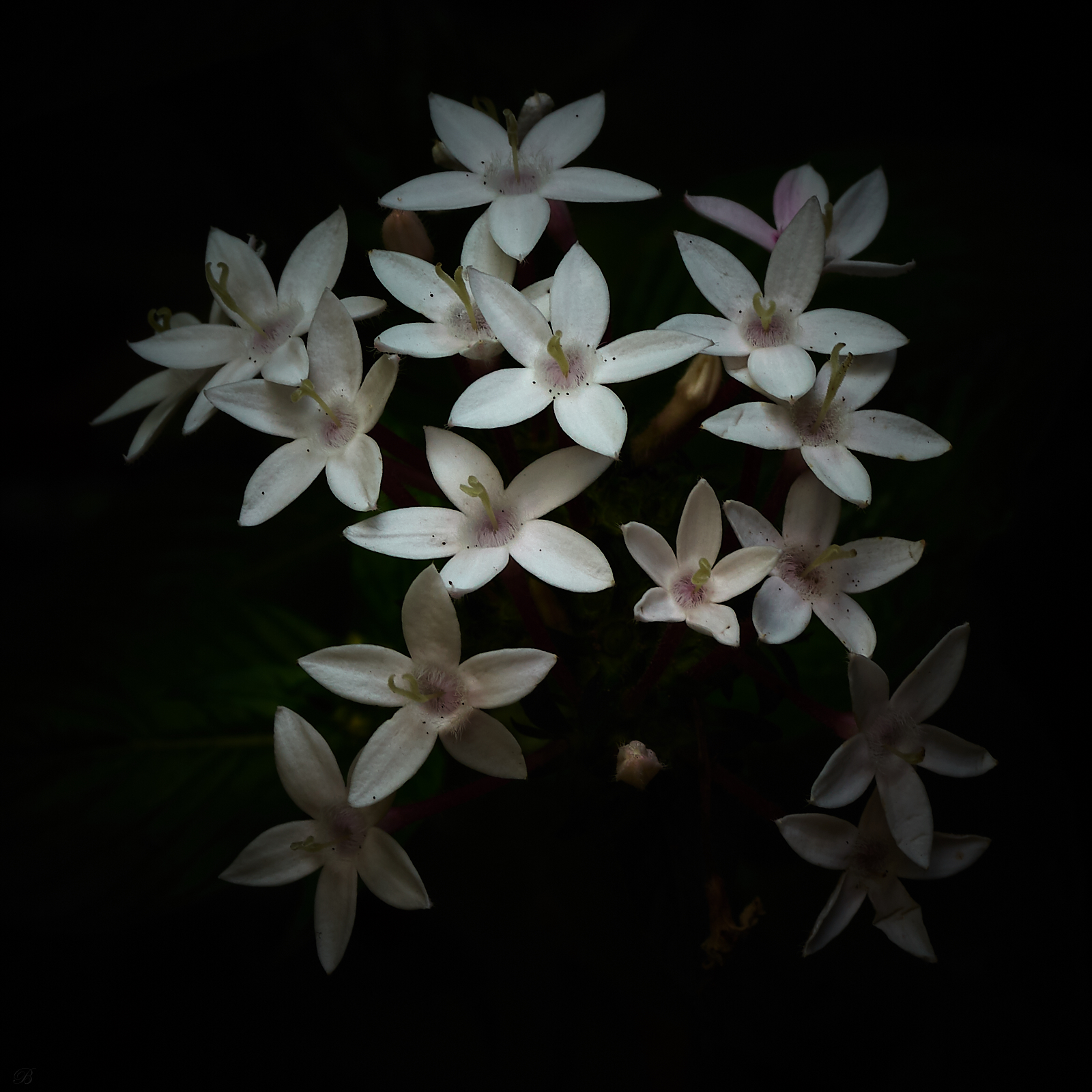
    Manfred, I don't know how to get a dark bg without the histogram showing underexposed. So here's the SOOC. Can you or anyone else suggest a way to get a dark bg without having the histogram showing underexposed?

    Back to my roots: The Dark Side
    Last edited by JBW; 24th May 2018 at 03:52 AM.

  2. #2
    Moderator Manfred M's Avatar
    Join Date
    Mar 2012
    Location
    Ottawa, Canada
    Posts
    22,162
    Real Name
    Manfred Mueller

    Re: Back to my roots: The Dark Side

    Back to my roots: The Dark Side

  3. #3
    Cogito's Avatar
    Join Date
    Sep 2012
    Location
    Fenland
    Posts
    343
    Real Name
    Tony

    Re: Back to my roots: The Dark Side

    Brian, I assume your non-use of any flash was deliberate. Did you really want those underexposed blossoms?

  4. #4

    Join Date
    Oct 2013
    Location
    Philippines
    Posts
    12,181
    Real Name
    Brian

    Re: Back to my roots: The Dark Side

    Quote Originally Posted by Manfred M View Post
    Back to my roots: The Dark Side
    ?

  5. #5

    Join Date
    Oct 2013
    Location
    Philippines
    Posts
    12,181
    Real Name
    Brian

    Re: Back to my roots: The Dark Side

    Quote Originally Posted by Cogito View Post
    Brian, I assume your non-use of any flash was deliberate. Did you really want those underexposed blossoms?
    Yes it was very deliberate. I simply don't like flash, even a well regulated flash. And truth be told I didn't need flash for this shot.

    I wanted to place all of the emphasis on the two central flowers.

    I used a circular crop and specific sharpening and brightening on the two flowers. More on the top one.

    I could lessen the circular crop and get more flowers brighter as well by playing with levels and curves but then it would become possibly a technically better shot but certainly a very different shot than I intended.

  6. #6
    Moderator Manfred M's Avatar
    Join Date
    Mar 2012
    Location
    Ottawa, Canada
    Posts
    22,162
    Real Name
    Manfred Mueller

    Re: Back to my roots: The Dark Side

    Quote Originally Posted by JBW View Post
    ?
    Exposure? The blue indicates areas of the image that are so significantly underexposed that there is no shadow detail at all. Generally this level of blocked shadow detail is not considered to be good.

    Also, I assume the flowers are white. Brightest readings I see are just above 200. That would also suggest underexposure.

  7. #7

    Join Date
    Oct 2013
    Location
    Philippines
    Posts
    12,181
    Real Name
    Brian

    Re: Back to my roots: The Dark Side

    Quote Originally Posted by Manfred M View Post
    Exposure? The blue indicates areas of the image that are so significantly underexposed that there is no shadow detail at all. Generally this level of blocked shadow detail is not considered to be good.

    Also, I assume the flowers are white. Brightest readings I see are just above 200. That would also suggest underexposure.
    It was much brighter but I decided to go with an almost pure black bg. The flowers have more than a bit of purple in them.

  8. #8
    Wavelength's Avatar
    Join Date
    Aug 2012
    Location
    Kerala, India
    Posts
    13,862
    Real Name
    Nandakumar

    Re: Back to my roots: The Dark Side

    In spite of all technicality, i liked it very much

  9. #9
    Cogito's Avatar
    Join Date
    Sep 2012
    Location
    Fenland
    Posts
    343
    Real Name
    Tony

    Re: Back to my roots: The Dark Side + the original

    Quote Originally Posted by JBW View Post
    Manfred, I don't know how to get a dark bg without the histogram showing underexposed. So here's the SOOC. Can you or anyone else suggest a way to get a dark bg without having the histogram showing underexposed?
    Briam, you don't need the histogram. Don't get me wrong, it's very, very useful but simple pp can solve the problem! Here's a screenshot of maybe 2-3 minutes work - adjusting exposure, shadows, highlighlights whites and blacks...

    Back to my roots: The Dark Side

  10. #10
    Stagecoach's Avatar
    Join Date
    Jun 2012
    Location
    Suva, Fiji
    Posts
    7,076
    Real Name
    Grahame

    Re: Back to my roots: The Dark Side + the original

    Brian,

    The histogram is going to show the status of the image in real time as you are working on it. The histogram is also going to show the distribution of brightness levels and in addition any loss of detail that has occurred at each end.

    One advantage in using the histogram whilst you are making your images "on the dark side" (or bright side) is that you can see if areas have completely lost detail without relying upon your eye site, screen calibration accuracy and viewing lighting conditions.

    It may very well be that you want all detail lost, e.g. black in some areas.

  11. #11

    Join Date
    Feb 2012
    Location
    Texas
    Posts
    6,956
    Real Name
    Ted

    Re: Back to my roots: The Dark Side + the original

    Quote Originally Posted by JBW View Post
    Back to my roots: The Dark Side

    Manfred, I don't know how to get a dark bg without the histogram showing underexposed. So here's the SOOC. Can you or anyone else suggest a way to get a dark bg without having the histogram showing underexposed?

    Back to my roots: The Dark Side
    Brian, it bothers me a bit when people associate stuff to the left of a histogram as being "under-exposed". For exposure, I look at a sensor raw histogram, not a review image histogram ...

    For example, all this histogram tells me about your OOC image is that there is a lot of dark area and a bit of bright-ish area, no more no less.

    Back to my roots: The Dark Side

    As to darkening the background ... I looked at the top flower in ImageJ and note the minimum value for it as 93/255. Cranking the lower slider to that same value in FastStone Levels gets you a black background for playing around with ... all good simple stuff, eh?

    Back to my roots: The Dark Side

  12. #12

    Join Date
    Oct 2013
    Location
    Philippines
    Posts
    12,181
    Real Name
    Brian

    Re: Back to my roots: The Dark Side + the original

    Quote Originally Posted by xpatUSA View Post
    Brian, it bothers me a bit when people associate stuff to the left of a histogram as being "under-exposed". For exposure, I look at a sensor raw histogram, not a review image histogram ...

    For example, all this histogram tells me about your OOC image is that there is a lot of dark area and a bit of bright-ish area, no more no less.

    Back to my roots: The Dark Side

    As to darkening the background ... I looked at the top flower in ImageJ and note the minimum value for it as 93/255. Cranking the lower slider to that same value in FastStone Levels gets you a black background for playing around with ... all good simple stuff, eh?

    Back to my roots: The Dark Side
    indeed simple stuff which is pretty much hat my brain needs.

  13. #13

    Join Date
    Oct 2013
    Location
    Philippines
    Posts
    12,181
    Real Name
    Brian

    Re: Back to my roots: The Dark Side + the original

    Quote Originally Posted by Stagecoach View Post
    Brian,

    The histogram is going to show the status of the image in real time as you are working on it. The histogram is also going to show the distribution of brightness levels and in addition any loss of detail that has occurred at each end.

    One advantage in using the histogram whilst you are making your images "on the dark side" (or bright side) is that you can see if areas have completely lost detail without relying upon your eye site, screen calibration accuracy and viewing lighting conditions.

    It may very well be that you want all detail lost, e.g. black in some areas.
    sometimes lost detail is good. There seems to be a significant split in opinion. Some say thyat the histogram is critical in pp and others that feel it is one more tool.

  14. #14
    DanK's Avatar
    Join Date
    Dec 2011
    Location
    New England
    Posts
    8,837
    Real Name
    Dan

    Re: Back to my roots: The Dark Side + the original

    Quote Originally Posted by JBW View Post
    sometimes lost detail is good. There seems to be a significant split in opinion. Some say thyat the histogram is critical in pp and others that feel it is one more tool.
    The histogram is information. It's not the only information one wants, but it is still information. Personally, I don't see any value in throwing information out by ignoring the histogram, but it's all in the service of a good image, so in that sense, it's a tool.

  15. #15
    Moderator Manfred M's Avatar
    Join Date
    Mar 2012
    Location
    Ottawa, Canada
    Posts
    22,162
    Real Name
    Manfred Mueller

    Re: Back to my roots: The Dark Side + the original

    Brian - while you call this a return to your roots, I'd have to disagree as this piece is head and shoulders above what you used to produce. Those images were simply underexposed and often muddy looking. This piece is crisp, clean and has good tonal range.

    The main reason I posted the ACR screen shot and histogram was to bring up two thoughts and that is trying to get an image that has a bit more realism to it. The first thought was the colour of the petals and the setting of your white point. I was taught to be a bit of a "paint by numbers" retoucher, so I tend to pay more attention to the histogram and spot readings than some of the others that have written here. What I tend to look for are the brightest areas of the image and to see what the values there are. If the flowers are normally very bright, tending to white, I will check their actual value. If they are getting to fairly high values, but generally below 255 or pure white, great. If not, the white point may require a bit of a tweak to ensure that they do not look too gray. My initial reading of the lightest tones in your original shot was a bit above a value of 210, so probably just a bit too gray for such a high contrast image.

    At the other end is the black point. The question I ask myself is about the speed that things go to black based on what the light is doing in the original scene. If the leaves are in close proximity to the flowers, are they going to be totally black or will there be a bit of dark green visible? If the area is totally black, it does not look real. That's what I see in the ACR screen shot; the light drop-off is not going to behave like that in real life and one would expect to be able to catch some more texture than you are showing and I would be thinking about dodging some of the areas just to get away from the pure black (or really dark green) to get a bit of texture and more realism into the image.

    Likewise, I would probably not take the background quite as black as you did, but would stop at some point where the dark green is still showing and burn those areas down, rather than using a global adjustment all the way. That too would help preserve a bit more texture.

    As one local master printers said to me recently, the difference between a good image and a great image is the local, rather than global adjustments.
    Last edited by Manfred M; 25th May 2018 at 02:45 PM.

  16. #16

    Join Date
    Oct 2013
    Location
    Philippines
    Posts
    12,181
    Real Name
    Brian

    Re: Back to my roots: The Dark Side + the original

    Quote Originally Posted by Manfred M View Post
    Brian - while you call this a return to your roots, I'd have to disagree as this piece is head and shoulders above what you used to produce. Those images were simply underexposed and often muddy looking. This piece is crisp, clean and has good tonal range.

    The main reason I posted the ACR screen shot and histogram was to bring up two thoughts and that is trying to get an image that has a bit more realism to it. The first thought was the colour of the petals and the setting of your white point. I was taught to be a bit of a "paint by numbers" retoucher, so I tend to pay more attention to the histogram and spot readings than some of the others that have written here. What I tend to look for are the brightest areas of the image and to see what the values there are. If the flowers are normally very bright, tending to white, I will check their actual value. If they are getting to fairly high values, but generally below 255 or pure white, great. If not, the white point may require a bit of a tweak to ensure that they do not look too gray. My initial reading of the lightest tones in your original shot was a bit above a value of 210, so probably just a bit too gray for such a high contrast image.

    At the other end is the black point. The question I ask myself is about the speed that things go to black based on what the light is doing in the original scene. If the leaves are in close proximity to the flowers, are they going to be totally black or will there be a bit of dark green visible? If the area is totally black, it does not look real. That's what I see in the ACR screen shot; the light drop-off is not going to behave like that in real life and one would expect to be able to catch some more texture than you are showing and I would be thinking about dodging some of the areas just to get away from the pure black (or really dark green) to get a bit of texture and more realism into the image.

    Likewise, I would probably not take the background quite as black as you did, but would stop at some point where the dark green is still showing and burn those areas down, rather than using a global adjustment all the way. That too would help preserve a bit more texture.

    As one local master printers said to me recently, the difference between a good image and a great image is the local, rather than global adjustments.
    Sorry about the slow reply our power company is doing some needed upgrading which means 12 hour brown outs today and probably tomorrow.

    I have recently started doing more local adjustments rather than global. C1's masking technology has improved. Dodge and burn is a skill set I'm working on.

    I agree it is a vast improvement over where I started. I often argue but I always pay attention and try to incorporate the advice I'm given here.

    I still don't know exactly how to define 'muddy' but I'm getting whiter whites and brighter brights

  17. #17

    Join Date
    Feb 2012
    Location
    Texas
    Posts
    6,956
    Real Name
    Ted

    Re: Back to my roots: The Dark Side + the original

    Quote Originally Posted by DanK View Post
    The histogram is information. It's not the only information one wants, but it is still information. Personally, I don't see any value in throwing information out by ignoring the histogram, but it's all in the service of a good image, so in that sense, it's a tool.
    Agree that the histogram should not be ignored - it is a most useful tool.

    However, there are several different types of "the histogram": some of which actually split out channels from an image thereby removing luminosity from the distribution (a pity, because luminosity is the basis of this thread's discussion). Conversely, a luminosity histogram does not display channel color levels correctly and is less likely, for example, to show blown blue levels.
    Last edited by xpatUSA; 26th May 2018 at 10:44 PM.

  18. #18
    Moderator Manfred M's Avatar
    Join Date
    Mar 2012
    Location
    Ottawa, Canada
    Posts
    22,162
    Real Name
    Manfred Mueller

    Re: Back to my roots: The Dark Side + the original

    Quote Originally Posted by xpatUSA View Post
    Agree that the histogram should not be ignored - it is a most useful tool.

    However, there are several different types of "the histogram": some of which actually split out channels from an image thereby removing luminosity from the distribution (a pity, because luminosity is the basis of this thread's discussion). Conversely, a luminosity histogram does not display channel color levels correctly and is less likely, for example, to show blown blue levels.
    While I understand where you are coming from, but in the case of the image in this thread, I would have to say "who cares?".

    Brian has pushed his image so hard that channel clipping is neither here nor there. He's crushed the blacks across all channels, so what an individual channel does is somewhat of a moot point.

Tags for this Thread

Posting Permissions

  • You may not post new threads
  • You may not post replies
  • You may not post attachments
  • You may not edit your posts
  •