 Helpful Posts: 0
Results 1 to 4 of 4
Thread: Insomnia
-
26th May 2018, 07:41 AM #1

- Join Date
- May 2018
- Location
- I live in Russia, in a rural place on the river Volga
- Posts
- 76
- Real Name
- Vladimir
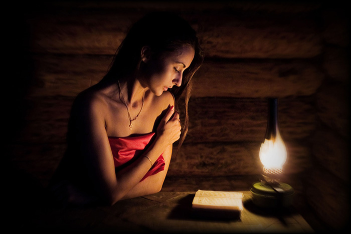
Insomnia
-
27th May 2018, 12:38 AM #2
Re: Insomnia
Very peaceful.
-
27th May 2018, 12:53 AM #3

- Join Date
- Aug 2014
- Location
- Melbourne, Australia
- Posts
- 3,022
- Real Name
- Ole
Re: Insomnia
Good shot.
Cheers Ole
-
27th May 2018, 03:38 AM #4
Re: Insomnia
This image is very effective. The background is simple and the three main objects; model, book and lamp are well connected compositionally. The shadows falling on your model give a nice three-dimensional look. The warm tones in the image work well with the wooden walls. You've created good separation between your model and background.
This is a well composed and taken image!


 Reply With Quote
