Results 1 to 20 of 21
-
11th June 2018, 03:09 AM #1

- Join Date
- Oct 2013
- Location
- Philippines
- Posts
- 12,181
- Real Name
- Brian
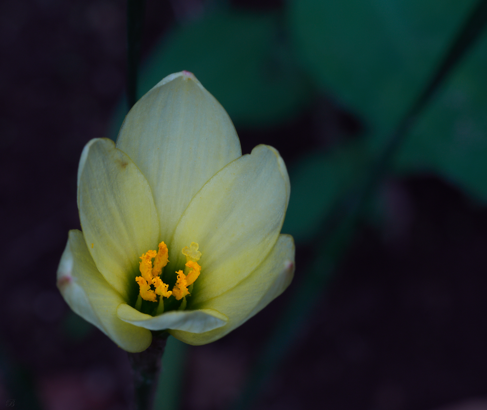
2 groups of six and a rule of thirds = a pretty good macro/closeup
-
11th June 2018, 08:44 AM #2
Re: 2 groups of six and a rule of thirds = a pretty good macro/closeup
Nice composition, I think this is a subject where "rule of thirds" can be ignored and theoretically it was for this composition, although your subject resides on the invisible line it encompasses so much more real estate that you are also utilizing the "golden mean" to balance your image.
-
11th June 2018, 11:53 AM #3

- Join Date
- Oct 2013
- Location
- Philippines
- Posts
- 12,181
- Real Name
- Brian
-
11th June 2018, 03:13 PM #4

- Join Date
- Feb 2012
- Location
- Texas
- Posts
- 6,956
- Real Name
- Ted
Re: 2 groups of six and a rule of thirds = a pretty good macro/closeup
AKA 'the golden ratio', 'harmonic mean', etc., it occurs a lot in Art and Architecture.
Frowned on a lot in Photography because, although it is said to be more pleasing to the eye than 1/3, 2/3 (0.333, 0.667), the ratio is actually 0.618 or so - much too difficult for 'Most of Us' to visualize.
RawTherapee does provide some cropping guides called harmonic means and even golden triangles which saves us having to deal with funny numbers . . . If you're interested, I can post a screenshot.Last edited by xpatUSA; 11th June 2018 at 03:21 PM.
-
11th June 2018, 04:26 PM #5
Re: 2 groups of six and a rule of thirds = a pretty good macro/closeup
My question would be to ask if the rule of thirds is appropriate for this shot.
Working with a particular rule of composition will only work if the composition suits using a particular rule.
I agree with Ted regarding the Golden Mean; it is easy to apply in architecture or painting or drawing in situations where it is easy to apply the appropriate guides to the drawings or canvas. Much more challenging to try to do this in camera and frankly not generally all that useful. I have seen some editing software that had this functionality, but none of the current tools that I use do. I think Corel Paintshop Pro might have had it, but I'm not 100% certain.
-
11th June 2018, 05:02 PM #6

- Join Date
- Feb 2012
- Location
- Texas
- Posts
- 6,956
- Real Name
- Ted
-
11th June 2018, 08:03 PM #7
Re: 2 groups of six and a rule of thirds = a pretty good macro/closeup
As my composition professor used to say, the rule of thirds does not have to be adhered to slavishly. Close will often result in a stronger composition than being metrologically 100% accurate.
Then there is also your point; what part of the subject should be sitting where a horizontal and vertical third line intersect?
-
11th June 2018, 08:21 PM #8

- Join Date
- Feb 2012
- Location
- Texas
- Posts
- 6,956
- Real Name
- Ted
-
11th June 2018, 09:07 PM #9
Re: 2 groups of six and a rule of thirds = a pretty good macro/closeup
Brian,
Here are two overlays from Lightroom using your image, as others have stated much easier to visual in post than in-camera but perhaps in your vision you saw something else within the composition otherwise you would've framed differently.

Brian's Image by JOHN, on Flickr
-
12th June 2018, 12:07 AM #10
Re: 2 groups of six and a rule of thirds = a pretty good macro/closeup
Brian has done the obvious and placed the bright yellow central parts of the flower (stamen?) on the intersection line of the bottom and left third.

Does this result in a well composed image? I'd have to say no, because the other parts of the image have not really come together. If I were to suggest the main issue with this shot is that the lighting is not particularly interesting and is not showing the flower off in a particularly interesting way.
For a rule of composition to work (any rule, not just the rule of thirds), the material going into the composition have to be strong.
I'd probably almost try to treat this image as a portrait of the flower much like a head shot.

Last edited by Manfred M; 12th June 2018 at 12:21 AM.
-
12th June 2018, 12:18 AM #11
Re: 2 groups of six and a rule of thirds = a pretty good macro/closeup
Once a year, I visit the superb impressionist collection at the Clark Museum in Williamstown, MA. It's interesting to see how often these masters followed the rule of thirds closely. The answer: not very often. Sometimes they seemed to follow it approximately. Sometimes not at all.
-
12th June 2018, 12:25 AM #12
Re: 2 groups of six and a rule of thirds = a pretty good macro/closeup
Exactly - what the masters did was to understand that merely following a set of rules was not going to give them a strong image that connects with their viewers. They studied composition and understood how to assemble an image so that it worked. Sometimes the rules of composition would be used (especially in how to get the colour palette right) and how to use optical techniques (something we tend to call the rules of composition) to catch and hold the viewer's attention.
-
12th June 2018, 01:49 AM #13

- Join Date
- Jun 2015
- Location
- Philippines
- Posts
- 26
- Real Name
- Jay-Ar
Re: 2 groups of six and a rule of thirds = a pretty good macro/closeup
Light, Composition, and Emotion. Those three are my personal criteria when judging an image.
For this particular image:
1. Light - could have been better. If it were my image, I would find a way to emphasize the subject. Like more light from the light source, maybe brighten the subject more, or create a subtle influence on viewer's tunnel vision through subtle vignette.
2. Composition - Shallow DOF is good to remove distractions, but creates more negative space. In this particular image, if it were me, I would crop more the negative space since it's not value adding (in this case) to the whole image. I like how Manfred cropped it. I would probably do the same thing.
3. Emotion - For me, this image's message is the beauty of nature. That could/should have been the goal of the image, to capture the viewers in awe of nature's wonders. The original is good, but it could have been better. The focal point, for me, to evoke the viewers' emotion is through the vivid part of the flower, which is the stamen. It should have been emphasized more, if not through colors, maybe through magnification. So #2 criteria already solved #3 in this case.
That is how I would probably have done it. Regardless, it's already a good image.
-
12th June 2018, 04:00 AM #14

- Join Date
- Feb 2012
- Location
- Texas
- Posts
- 6,956
- Real Name
- Ted
-
12th June 2018, 08:56 AM #15

- Join Date
- Oct 2013
- Location
- Philippines
- Posts
- 12,181
- Real Name
- Brian
Re: 2 groups of six and a rule of thirds = a pretty good macro/closeup
I did try to emphasize 'pretty good'. I am eading and considering all the advice offered.
My emphasis was on getting away from the I'm going to place things in the center to I'll try asymmetrical. I also put a lot of emphasis on the yellow stamens.
The light was sunlight no real way to change it. I adjusted the flower exposure but left the bg alone.
I do like all the empty space.
Feel free to take this thread where it will go.
-
12th June 2018, 10:52 AM #16

- Join Date
- Oct 2013
- Location
- Philippines
- Posts
- 12,181
- Real Name
- Brian
Re: 2 groups of six and a rule of thirds = a pretty good macro/closeup
-
12th June 2018, 01:21 PM #17
Re: 2 groups of six and a rule of thirds = a pretty good macro/closeup
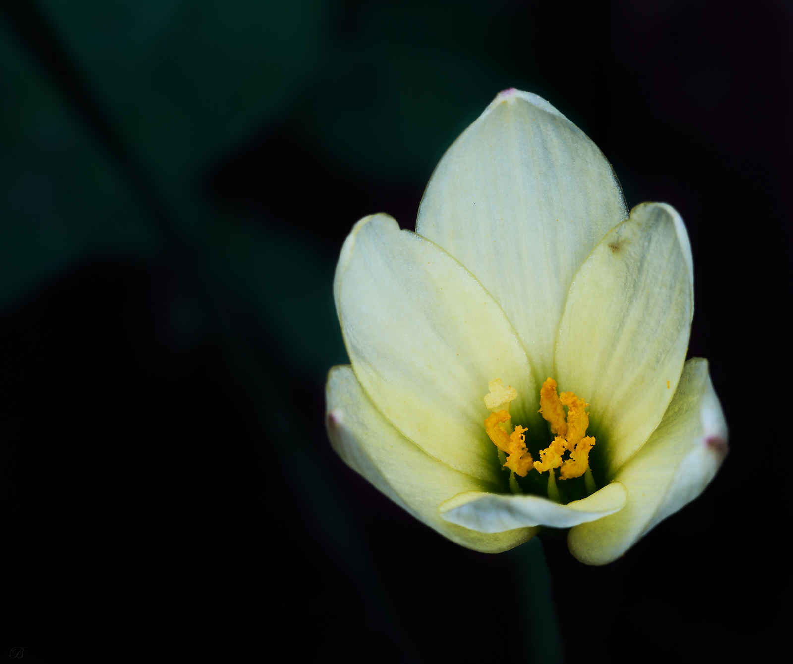
The new one has better tonal variation--the flower is brighter and stands out better from the background--but I don't think it works well. First, the crop is very tight on the right. Second, as has often been noted here, negative space on the left often feels unbalanced, and it does here. I have no idea why that is; there has been speculation that it's because we read left to right in European languages, but we have never had a native speaker of Arabic, Hebrew, or any other language read right-to-left respond to this. Whatever the reason, this feels very unbalanced to me, perhaps in part because of the tight crop on the right. Finally, everything other than the anthers is out of focus. Sometimes people use OOF areas to good effect in flower macros, but in this case, it doesn't seem appealing to me. Then again, this is just a matter of taste.
Personally, I would center this on the horizontal.
-
12th June 2018, 01:41 PM #18

- Join Date
- Oct 2013
- Location
- Philippines
- Posts
- 12,181
- Real Name
- Brian
Re: 2 groups of six and a rule of thirds = a pretty good macro/closeup
-
12th June 2018, 02:48 PM #19
Re: 2 groups of six and a rule of thirds = a pretty good macro/closeup
Brian,
If you don't want C&C, it might be best to say so when you post an image.
In case you do want C&C, I'll respond to your points below, and then I'll stop.
Dan
Yes. I couldn't find the exif, so I don't know the aperture. you can increase DOF up to a point that way, but beyond that, you would have to stack. In any case, it's a matter of taste. I don't find that the degree of OOF areas works for me. Then again, my taste runs to crisp focus in macro images, and not everyone's does.
Fair enough, but I don't think this one works. Perhaps a less extreme asymmetry would.I'm trying to find my way in asymmetrical composition
[QUOTEI ddon't see it as a particularly tight crop.[/QUOTE]
Again, it's a matter of taste, but on my screen, this image is about 13.5 cm across, and the cropped area is about 1 cm. That looks tight to me.
Often, asymmetrical compositions have some other material that gives some weight to the areas that are not the main focal point, so the overall image looks balanced. This one doesn't--again, just in my opinion.Asymmetrical is by definition unbalanced
Brian
-
12th June 2018, 02:58 PM #20

- Join Date
- Oct 2013
- Location
- Philippines
- Posts
- 12,181
- Real Name
- Brian
Re: 2 groups of six and a rule of thirds = a pretty good macro/closeup
Again, it's a matter of taste, but on my screen, this image is about 13.5 cm across, and the cropped area is about 1 cm. That looks tight to me.
Often, asymmetrical compositions have some other material that gives some weight to the areas that are not the main focal point, so the overall image looks balanced. This one doesn't--again, just in my opinion.[/QUOTE]
Anyone can give C&C. But C&C requires a conversation. If there is no conversation it is simply a lecture.
As for not being able to find the EXIF... it is posted underneath the shot.

 Helpful Posts:

 Reply With Quote


