
 Helpful Posts:
Results 1 to 10 of 10
Thread: Days Work Done - Colour
-
31st January 2019, 10:51 PM #1

- Join Date
- Jun 2013
- Location
- North West of England
- Posts
- 7,178
- Real Name
- John
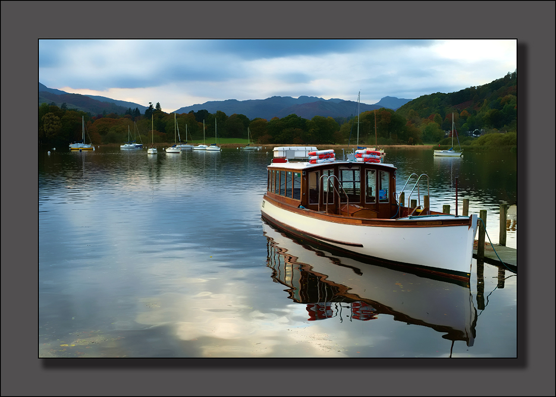
Days Work Done - Colour
-
1st February 2019, 09:40 AM #2

- Join Date
- Dec 2009
- Location
- WNY
- Posts
- 36,716
- Real Name
- John
Re: Days Work Done - Colour
Nicely processed.
-
1st February 2019, 10:17 AM #3
- Join Date
- Apr 2018
- Location
- lancashire UK
- Posts
- 342
- Real Name
- roy
Re: Days Work Done - Colour
I like it
Roy
-
1st February 2019, 11:41 AM #4

- Join Date
- Feb 2012
- Location
- Charlbury, Oxfordshire, UK
- Posts
- 1,864
- Real Name
- Kaye Leggett
Re: Days Work Done - Colour
Very nice. Lake Windermere ?
-
1st February 2019, 12:42 PM #5

- Join Date
- Dec 2011
- Location
- New England
- Posts
- 8,995
- Real Name
- Dan
Re: Days Work Done - Colour
A nice and peaceful image. I think it would have been better had you composed it to have the negative space in front of the boat rather than behind.
-
1st February 2019, 08:06 PM #6
- Join Date
- Jan 2009
- Location
- South Devon, UK
- Posts
- 14,636
Re: Days Work Done - Colour
I agree with Dan. Maybe crop a bit from the left side? Also, is the top right corner cloud a bit over exposed now?
Otherwise, this version looks OK to me.
-
1st February 2019, 09:52 PM #7Moderator

- Join Date
- Mar 2012
- Location
- Ottawa, Canada
- Posts
- 22,288
- Real Name
- Manfred Mueller
Re: Days Work Done - Colour
+1 to Dan and Geoff's comments from me too John.
The visual balance is not working for me with this image. The visual content seems to be riding too far too the right. Cropping the left side of the image would give you a stronger composition.
-
2nd February 2019, 03:19 AM #8
- Join Date
- Nov 2012
- Location
- Australia (East Coast)
- Posts
- 4,524
- Real Name
- Greg
Re: Days Work Done - Colour
I like the colourful processing John and the way you have used the reflected clouds to convey the feeling of the end of the day.
-
2nd February 2019, 09:20 AM #9
- Join Date
- Jun 2013
- Location
- North West of England
- Posts
- 7,178
- Real Name
- John
Re: Days Work Done - Colour
Thanks all for the comments.
Dan/Geoff/Manfred. If only they boat had been parked bow out on the other side of the jetty.............. As it stands however, I'm reasonably happy with the comp. My intent was to take the eye to the boat, then to the yachts in the middle distance and finally to the recession of the hills. i.e. a classic zig zag to keep the eye within the frame. So I didn't see the LHS as negative space. I think cropping it on the LHS would weaken that to a degree.
-
2nd February 2019, 01:37 PM #10

- Join Date
- Jan 2011
- Location
- Osoyoos, British Columbia Canada
- Posts
- 2,819
- Real Name
- Trevor Reeves
Re: Days Work Done - Colour
Consider a crop on a line just above the mountain top on the left thus making a more rectangular shape This strengthens the lines you were talking about (and I agree), removes the bright spot of cloud and makes the boat a stronger element. I like the subtle colours and tones a lot.

 Reply With Quote