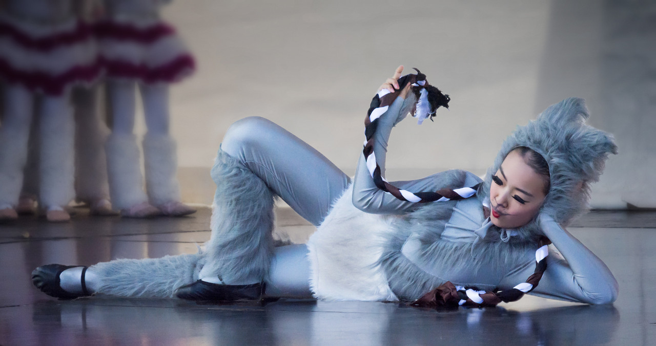
I took this photo yesterday at the Northcote Chinese and Korean Festival, here in Auckland.
DSC_0730-Edit Cat at Northcote Chinese and K Fest by Jim A, on Flickr
[/url]Cat at Festival HSH B&W by Jim A, on Flickr
 Helpful Posts: 0
Results 1 to 11 of 11
Thread: Colour version or B&W?
-
10th February 2019, 12:56 AM #1

- Join Date
- Nov 2016
- Location
- ex Auckland, now Porirua, New Zealand
- Posts
- 957
Colour version or B&W?
-
10th February 2019, 01:27 AM #2

- Join Date
- Feb 2012
- Location
- Texas
- Posts
- 6,956
- Real Name
- Ted
Re: Colour version or B&W?
Monochrome for me. More contrast but with less intrusive face and less distraction from background colors.
Miaow ...
-
10th February 2019, 01:42 AM #3
Re: Colour version or B&W?
I tend to agree with Ted on this one. The bright colours of the background are a bit of a distraction.
-
10th February 2019, 02:17 AM #4
Re: Colour version or B&W?
B&W for me as well.
-
10th February 2019, 02:41 AM #5
-
10th February 2019, 02:46 AM #6

- Join Date
- Nov 2012
- Location
- Australia (East Coast)
- Posts
- 4,524
- Real Name
- Greg
Re: Colour version or B&W?
I prefer the colour image - it's a festival after all. Try pulling the light down in the background so the cat becomes the main focus of attention.
-
10th February 2019, 04:35 AM #7

- Join Date
- Nov 2016
- Location
- ex Auckland, now Porirua, New Zealand
- Posts
- 957
Re: Colour version or B&W?
Hi Manfred, Whilst I love your "take", it is hard to replicate (though not impossible), the border to our left of the cat. I can do it using short 'bursts' of the cloning tool, but it is mind-numbing. I suspect that you have an easier method, which you are okay to share??
Looking at the image, refreshed, with your edits, I think that I should try to replicate what you have done (difficult), then clone in an addition to the forefront and also crop the headspace, so that the image is more to the centre. Then a subtle vignette - what do you think please?
-
10th February 2019, 12:01 PM #8
Re: Colour version or B&W?
This was a super easy edit. I used the rectangular marquee tool and made a selection between the leg of the cat and the other members in the background, right down to the floor. I copied and pasted that area and then resized (stretched) the selection all the way to the left. All I needed to do was a tiny bit of retouching afterwards. The whole thing took less than a minute to do.
-
10th February 2019, 05:19 PM #9
Re: Colour version or B&W?
The monochrome helps offset the distracting background but would prefer a color version.
-
11th February 2019, 10:47 PM #10

- Join Date
- Jun 2013
- Location
- North West of England
- Posts
- 7,178
- Real Name
- John
-
11th February 2019, 11:22 PM #11
Re: Colour version or B&W?
I suggest that you try Monochrome, but not Black and White, Blue Tint is my suggestion - that makes the image sort of retro; nukes the harsh bacground and will keep the chilly flavour.
WW


 Reply With Quote


