Results 1 to 16 of 16
Thread: Cable spacer
-
30th April 2019, 01:35 PM #1

- Join Date
- Feb 2016
- Location
- Cambridge, UK
- Posts
- 928
- Real Name
- David
Cable spacer
-
30th April 2019, 01:55 PM #2
Re: Cable spacer
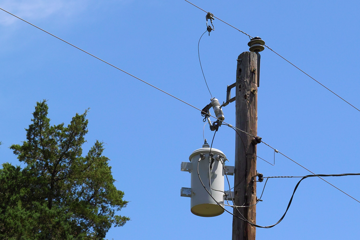
I think paraphrasing Albert Einstein sums up my view on this image; "Things should be as simple as possible, but not simpler".
Sorry David, there really is little of interest in holding the viewer's attention in this shot, in my view. Yes, you've worked the diagonal lines and there is something to draw the viewer's attention, but overall the shot is lacking something.
I've move two of your posts into this thread, which is a better fit in the forums.
-
30th April 2019, 10:11 PM #3

- Join Date
- Feb 2016
- Location
- Cambridge, UK
- Posts
- 928
- Real Name
- David
-
1st May 2019, 01:53 AM #4

- Join Date
- Aug 2014
- Location
- Melbourne, Australia
- Posts
- 3,008
- Real Name
- Ole
Re: Cable spacer
I think it would look stunning using Nik's Silver Efex film noir 3 or something similar. I think it could work, at least have a go because I believe it is worth it.
Cheers Ole
-
1st May 2019, 02:10 AM #5
Re: Cable spacer
Its OK, but imagine if you had a tiny lonely bird on one of them....
-
1st May 2019, 06:43 AM #6

- Join Date
- Feb 2016
- Location
- Cambridge, UK
- Posts
- 928
- Real Name
- David
-
1st May 2019, 09:44 AM #7

- Join Date
- Aug 2014
- Location
- Melbourne, Australia
- Posts
- 3,008
- Real Name
- Ole
Re: Cable spacer
How about that!

Cheers Ole
-
1st May 2019, 11:46 AM #8
Re: Cable spacer
Shows up the sensor dust near the top edge quite nicely. That was in the original, but not nearly as noticeable.
While there are definitely cases where a B&W conversion will improve an image, this one is so close to monochrome already, that aspect of going to pure B&W isnt going to gain much. The downside is there is a significant risk of over processing and in my view that is all that has happened. The distracting dark areas in the corners dont appear to help.
-
1st May 2019, 01:32 PM #9

- Join Date
- Feb 2012
- Location
- Texas
- Posts
- 6,956
- Real Name
- Ted
Re: Cable spacer
Nice shot. The gray-scale shot brought out the spacer more, I thought. At first I imagined a longer lens but then that's how spacers are - set apart on long runs of cable ...
I like power pole stuff. So uncompromisingly mechanical in appearance and yet so often with a contrasting sky or foliage background. No shortage of either, here in rural Texas. In fact, all I have to do is walk down the drive and there is my very own residence's 13kV split-phase transformer up on a pole with all it's odd-looking appurtenances.

-
1st May 2019, 02:15 PM #10
Re: Cable spacer
Sorry, but this doesn't work for me. I tend to like minimalist shots, but there isn't enough in this one for my taste. The spacer isn't interesting, and it only breaks up the lines.
-
1st May 2019, 03:36 PM #11

- Join Date
- Feb 2016
- Location
- Cambridge, UK
- Posts
- 928
- Real Name
- David
Re: Cable spacer
Thank you for pointing that out. I have cleaned the lens and activated the sensor cleaning a couple of times to see if this helps as the spots were pointed out to me on another of my images. I will see if it has improved on my next outing.
The B&W version is simply what Nik's Silver Efex film noir 3 produced, dark areas in the corner and all. I had not used the software before but had it to hand as I downloaded it recently when a link to the free edition was provided in another thread here; so thought I would follow up Ole's suggestion and give it a go.
-
1st May 2019, 08:00 PM #12

- Join Date
- Jan 2009
- Location
- South Devon, UK
- Posts
- 14,552
Re: Cable spacer
Is the perspective wrong with this image?
What if you flipped it? Or cropped slightly differently? So the narrowing wires are definitely going away from the main point of view. Somehow I seem to feel it is the wrong way around and attempting to look at it by twisting my head does look better?
-
1st May 2019, 08:21 PM #13
Re: Cable spacer
A spot with such a defined edge is almost certainly on the sensor, not the lens.I have cleaned the lens and activated the sensor cleaning a couple of times to see if this helps as the spots were pointed out to me on another of my images. I will see if it has improved on my next outing.
-
1st May 2019, 10:45 PM #14

- Join Date
- Feb 2016
- Location
- Cambridge, UK
- Posts
- 928
- Real Name
- David
-
1st May 2019, 11:19 PM #15

- Join Date
- Aug 2014
- Location
- Melbourne, Australia
- Posts
- 3,008
- Real Name
- Ole
Re: Cable spacer
It is better but I don't think colour works here. I think it could be improved further by experimenting with black and white.
Cheers Ole
-
1st May 2019, 11:48 PM #16

- Join Date
- Feb 2012
- Location
- Texas
- Posts
- 6,956
- Real Name
- Ted

 Helpful Posts:

 Reply With Quote


