Results 1 to 17 of 17
Thread: Igreja de São Martinho
-
21st June 2019, 07:48 PM #1

- Join Date
- Jun 2013
- Location
- North West of England
- Posts
- 7,178
- Real Name
- John
Igreja de São Martinho
-
21st June 2019, 08:23 PM #2

- Join Date
- Feb 2012
- Location
- Texas
- Posts
- 6,956
- Real Name
- Ted
Re: Igreja de São Martinho
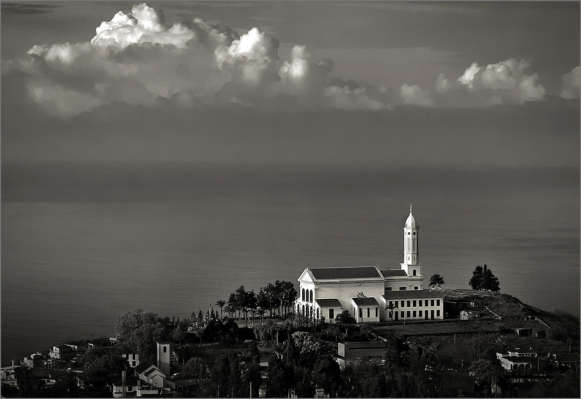
Nice, the contrast between the church and it's surrounding buildings and the same matching contrast between the cloud tops and the sky below.
Last edited by xpatUSA; 21st June 2019 at 09:17 PM.
-
21st June 2019, 10:09 PM #3
Re: Igreja de São Martinho
Nicely captured and processed.
-
22nd June 2019, 10:36 AM #4
Re: Igreja de São Martinho
The Church, the clouds...a really magnificent capture!!!
-
22nd June 2019, 11:04 PM #5

- Join Date
- Jun 2013
- Location
- North West of England
- Posts
- 7,178
- Real Name
- John
Re: Igreja de São Martinho
Thanks Ted, thanks John, thanks Nandakumar.
-
23rd June 2019, 12:42 AM #6
Re: Igreja de São Martinho
John, nice photograph.
Bruce
-
23rd June 2019, 04:58 AM #7
Re: Igreja de São Martinho
Lovely image... What would you think lifting the foreground shadows a bit and also adding some structure and contrast to the clouds...

Ever since I have been working with my wife on her Portuguese genealogy, it always amazes me how similar yet how different the Portuguese and Spanish languages are.
Igreja de São Martinho would be Iglesia de San Martino in Spanish...
Here's more than you want to know about the language differences...
https://www.youtube.com/watch?v=miZUE4oF9jsLast edited by rpcrowe; 23rd June 2019 at 05:14 AM.
-
23rd June 2019, 08:31 AM #8
Re: Igreja de São Martinho
To me both John's and Richard's interpretations have merit but with different results. John's really isolates the church and shows the rest as a context that is subtle and subservient to the building.
Richard's give a wider context for the subject, taking in the surroundings of the church and giving them a greater part in the expression.
I think they each work, and they are both excellent.
-
23rd June 2019, 07:48 PM #9
Re: Igreja de São Martinho
Another excellent image John.
I had been thinking along the same lines as Richard and now that I see what he has done, I prefer it to your original. Opening up the shadows in the surrounding town provides a slightly different viewpoint, but I like the balance better.
-
24th June 2019, 08:54 AM #10

- Join Date
- Jun 2013
- Location
- North West of England
- Posts
- 7,178
- Real Name
- John
Re: Igreja de São Martinho
Thanks all for the comments. Quite like your version Richard. I am perhaps less sure about the clouds. I think that I prefer them softer. Raising the shadows would normally be a given for me but in this case as I think Trev has realised, I was seduced by the thought of the early morning light picking out the church. Taken in its own right however, as Manfred suggests, Richards version has more balance.
-
24th June 2019, 09:01 AM #11

- Join Date
- Aug 2014
- Location
- Melbourne, Australia
- Posts
- 3,023
- Real Name
- Ole
Re: Igreja de São Martinho
I prefer the original. In Richard's version I think there is too much emphasis on the clouds and therefore it becomes 'too balanced' and thus, impact is lessened.
Cheers Ole
-
24th June 2019, 10:33 AM #12

- Join Date
- Aug 2008
- Location
- Ariege, France
- Posts
- 558
- Real Name
- Paul
Re: Igreja de São Martinho
I too prefer the original, the softer clouds and the church has more emphasis in the image. A very nice shot.
-
25th June 2019, 08:10 AM #13

- Join Date
- Jun 2013
- Location
- North West of England
- Posts
- 7,178
- Real Name
- John
Re: Igreja de São Martinho
Thanks Ole, thanks Paul.
-
25th June 2019, 04:09 PM #14New Member

- Join Date
- Jun 2019
- Posts
- 8
Re: Igreja de São Martinho
i prefer the original. it gives more emphasis to the church. beautiful rich tones.
-
26th June 2019, 08:24 AM #15

- Join Date
- Jun 2013
- Location
- North West of England
- Posts
- 7,178
- Real Name
- John
Re: Igreja de São Martinho
Thanks Pepper.
-
26th June 2019, 01:30 PM #16
Re: Igreja de São Martinho
I like both of the versions with a nod to the original.
Richard, that is an interesting point. There were a lot of Portugese and Italians in the area where I grew up. They could communicate with each other pretty well. My grandparents both spoke Russian so they had no idea of what they were saying.
-
27th June 2019, 08:30 AM #17

- Join Date
- Jun 2013
- Location
- North West of England
- Posts
- 7,178
- Real Name
- John
Re: Igreja de São Martinho
Thanks Paul.

 Helpful Posts:

 Reply With Quote

