Beautiful!!!
Results 21 to 40 of 93
Thread: Project 52 - Q3 - David (Rufus)
-
23rd July 2019, 04:24 AM #21
Re: Project 52 - Q3 - David (Rufus)
-
24th July 2019, 06:45 PM #22

- Join Date
- Jan 2009
- Location
- South Devon, UK
- Posts
- 14,619
Re: Project 52 - Q3 - David (Rufus)
When there is a confusing forest of masts it is difficult to decide where to crop, but this looks fine to me.
-
24th July 2019, 08:27 PM #23

- Join Date
- Feb 2016
- Location
- Cambridge, UK
- Posts
- 928
- Real Name
- David
Re: Project 52 - Q3 - David (Rufus)
I chose the crop carefully so I am glad it works for you.

It was an afterthought on my part but, having shot the image, I thought the masts and rigging might be particularly suitable areas to check the degree of sharpness I had achieved, and I am open to comments on that.
-
2nd August 2019, 03:38 PM #24

- Join Date
- Feb 2016
- Location
- Cambridge, UK
- Posts
- 928
- Real Name
- David
Re: Project 52 - Q3 - David (Rufus)
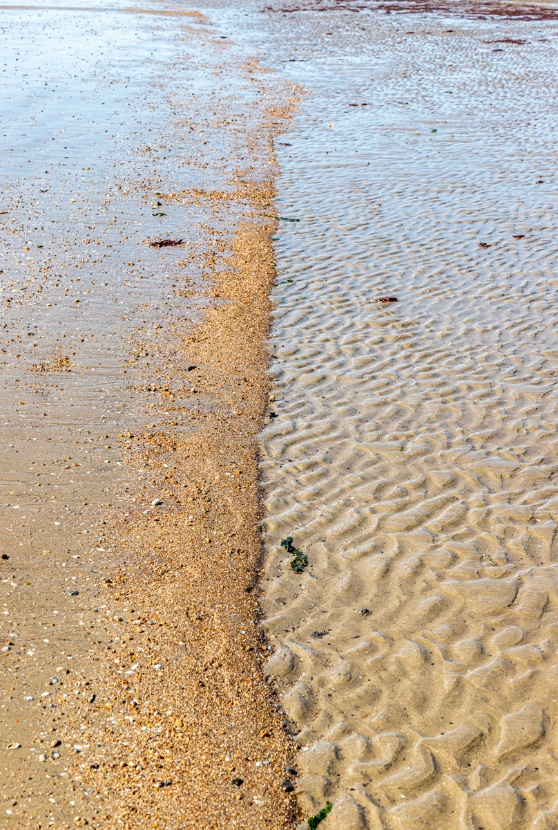
The image for week 30 is perhaps more akin to a record shot than anything else. I was taken by the line of fine gravel along the beach with rippled wet sand on one side and smooth wet sand on the other. I think the effect of the sea as the tide went out changed according to the slope of the beach.
Week 30 # 74 Beach at Sandwich Bay (1/125 sec at f/8 and ISO 100; focal length set at 55mm):
Last edited by Rufus; 2nd August 2019 at 03:46 PM.
-
2nd August 2019, 11:50 PM #25
Re: Project 52 - Q3 - David (Rufus)
Hi David - I like the texture you've spotted and captured! The only thing I might have done is crop the very little bit at the top of the image but that is only a personal observation.
Well done!
-
5th August 2019, 01:30 AM #26
Re: Project 52 - Q3 - David (Rufus)
This image is awesome
-
5th August 2019, 10:20 AM #27

- Join Date
- Feb 2016
- Location
- Cambridge, UK
- Posts
- 928
- Real Name
- David
Re: Project 52 - Q3 - David (Rufus)
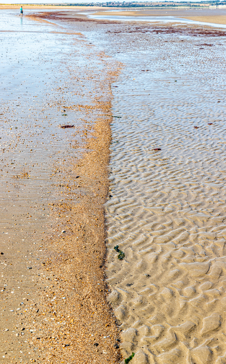
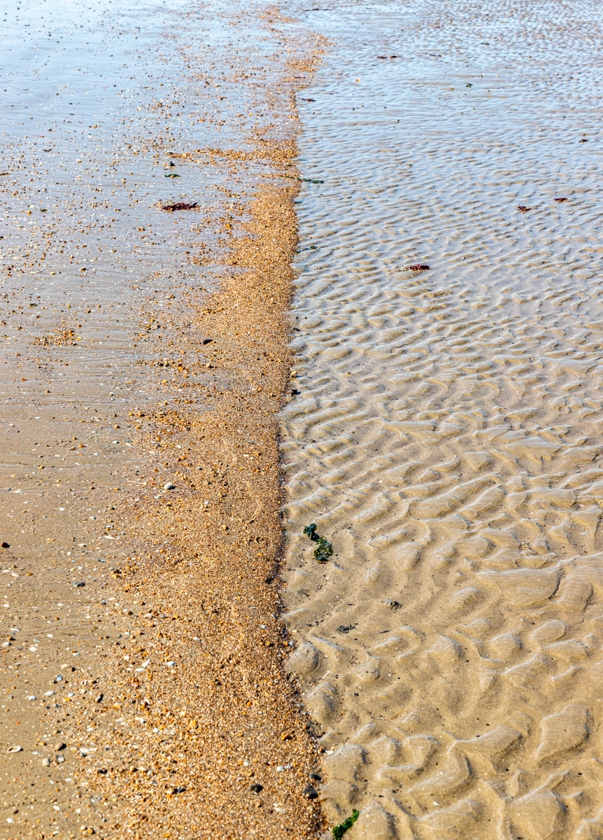
Thank you for commenting, Sandy. I was in two minds about the crop. I have already cropped a little from the top - a very small band of sky and distant coastal town. The far distance was not in focus and my target this quarter is to get harp images so I was cheating! I chose to leave what remains at the top as a way of stopping the eye travelling ever upwards and to show that the ridge of fine shingle deviated from the straight and narrow. But I am not precious about the crop at all.
Uncropped:
Cropped along the lines of Sandy's suggestion:
-
5th August 2019, 10:21 AM #28

- Join Date
- Feb 2016
- Location
- Cambridge, UK
- Posts
- 928
- Real Name
- David
-
5th August 2019, 12:05 PM #29
Re: Project 52 - Q3 - David (Rufus)
Tough decision on where to crop, if at all! The distant village and the person standing on the shore could be removed as they are distracting but otherwise it all works for me.
Last edited by joebranko; 5th August 2019 at 12:11 PM.
-
5th August 2019, 07:16 PM #30

- Join Date
- Feb 2016
- Location
- Cambridge, UK
- Posts
- 928
- Real Name
- David
-
5th August 2019, 07:38 PM #31

- Join Date
- Feb 2016
- Location
- Cambridge, UK
- Posts
- 928
- Real Name
- David
Re: Project 52 - Q3 - David (Rufus)
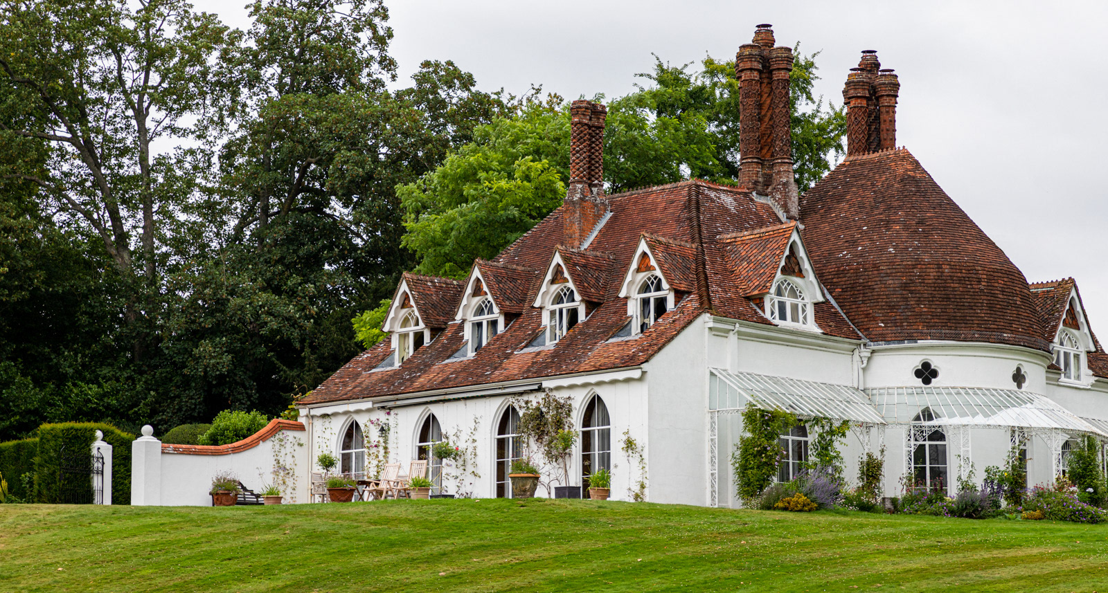
This week's subject was built around 1790 and probably intended as a fishing lodge. It is said to be the UK's best surviving example of an 18th century Cottage Orné, and one of the earliest, the style being popular for the following 25 years. I felt it was rather grand for a fishing lodge
 .
.
Week 31 #75 - Houghton Lodge (1/250 sec at f/8 and ISO 250; focal length set at 85mm):
-
5th August 2019, 10:09 PM #32
Re: Project 52 - Q3 - David (Rufus)
Hi David - I actually like the uncropped version of the beach scene even better than the closer crop I suggested. Adding the person, and scenery back in gives me more perspective. The close cropped one does show me lots of texture. In my estimation, each version of the image tells a story. So my thought is that it comes down to what you want to show the viewer.
 It is an excellent image to work with! Well done!
Fun stuff - photography!
-
5th August 2019, 10:17 PM #33
Re: Project 52 - Q3 - David (Rufus)
A couple of quick thoughts for you on the two most recent shots:
Week 30 - This type of shot is begging for a polarizing filter to kill some of the glare on the water. The next time you have a chance to shoot this type of scene, try having the line between the rough area and fine area on a diagonal rather than a vertical. That often give a stronger composition.
If you look up Dutch tilt, that is why that technique is used.
Week 32 - Try taming the sky a bit; it's bright and if you could introduce a bit more texture into it, the image would be stronger.Last edited by Manfred M; 6th August 2019 at 01:59 AM.
-
7th August 2019, 12:41 PM #34

- Join Date
- Feb 2016
- Location
- Cambridge, UK
- Posts
- 928
- Real Name
- David
Re: Project 52 - Q3 - David (Rufus)
Thanks Sandy. The different crops certainly provide different interpretations. My better half was recently tasked with an excercise to create 5 paintings based in varying crops of an original image. Needless to say, the source image was carefully chosen to facilitate that.

-
7th August 2019, 12:56 PM #35

- Join Date
- Feb 2016
- Location
- Cambridge, UK
- Posts
- 928
- Real Name
- David
Re: Project 52 - Q3 - David (Rufus)
-
10th August 2019, 06:46 AM #36
Re: Project 52 - Q3 - David (Rufus)
Lovely building... it would have been better if the other end of the lodging is also within the frame...
-
10th August 2019, 04:02 PM #37

- Join Date
- Feb 2016
- Location
- Cambridge, UK
- Posts
- 928
- Real Name
- David
Re: Project 52 - Q3 - David (Rufus)
-
10th August 2019, 05:26 PM #38
Re: Project 52 - Q3 - David (Rufus)
Nice effort, agree about the abrupt ending to the building.
-
10th August 2019, 10:21 PM #39

- Join Date
- Feb 2016
- Location
- Cambridge, UK
- Posts
- 928
- Real Name
- David
-
11th August 2019, 09:15 PM #40

- Join Date
- Feb 2016
- Location
- Cambridge, UK
- Posts
- 928
- Real Name
- David
Re: Project 52 - Q3 - David (Rufus)
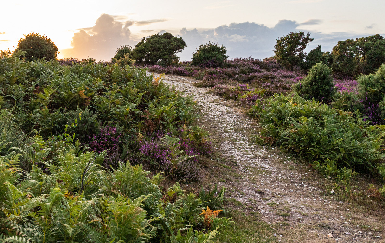
Week 32 - This week's image did not succeed at being in sharp focus throughout the relevant depth of field. Putting that to one side, however, it raises a question on a different aspect.
The shot was taken into the sun which was quite well hidden behind the bush (top left). I would not normally shoot into the sun but decided to throw caution to wind and try it out. It appears that light is bending round the leaves giving rise to the orange haze. The poor focus at the distance may not help. Are there steps to take to avoid this fringing (if that is the right word), other than pointing the camera away from the sun? The aperture was not very small and lens corrections were applied automatically in Lightroom.
Week 32 - #76 - Burley Landscape (1/250sec f/8 and ISO 400 - focal length set at 24mm):

 Helpful Posts:
 Reply With Quote


